Brand guidelines
- All
- Brand guidelines
- Brand strategy
- Brand visualisation
- Business strategy
- Campaign strategy
- Copywriting
- Culture change
- Design systems
- Digital design
- Digital marketing
- eCommerce
- Employer branding
- Film
- Illustration
- Logo design
- Marketing
- Naming
- Photography
- Print collateral
- Tone of voice
- UX
- Verbal identity
- Visual identity
- Web design
- Web development
Latest
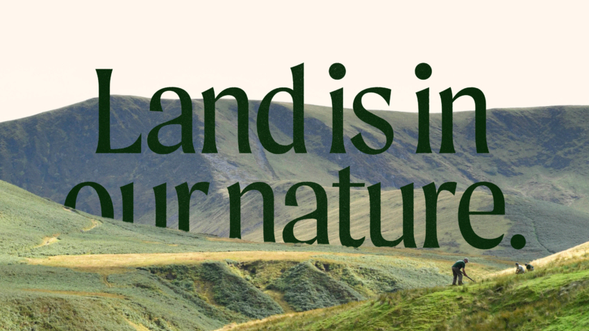
The Ernest Cook Trust
Telling the story of a brand new strategic direction, rooted in the land.
UnitedUs met the Ernest Cook Trust at a time when the organisation's brand and strategy were both in need of a fresh perspective. Working alongside the charity's strategy development, we cultivated a new brand positioning that was both rooted in the charity's enduring heritage and brought new life to its emerging strategy.
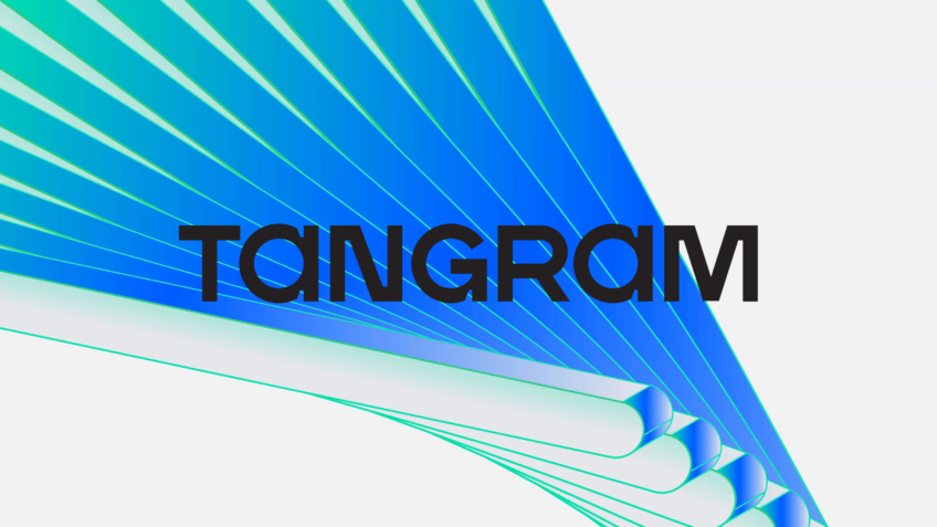
Tangram Therapeutics
Generating investor and patient interest in RNAi medicine discovery through a relentlessly creative identity.
Tangram Therapeutics is driven by a persistent pact: to realise life-transforming drugs faster. The company, which realises the collaborative code for relentless medicine discovery, required a new name, positioning and brand identity to form a platform for the organisation’s expedited exploration in RNAi drugs.

RM2
Supporting business owners to “own it” when it comes to shifting ownership of their business.
RM2 guides owners through one of the biggest decisions they can make about their business, handing it over to employees. The RM2 rebrand and website embody the clarity and confidence necessary to support people through shifts into employee ownership, restoring brand belief in the UK’s most experienced organisation dedicated to providing these services.

Prept
Naming and branding for an educational charity to impact food culture across the UK.
By equipping a Sussex educational charity with an impactful name and identity, we crafted a high-quality brand to help the organisation scale, secure new partners, and serve food culture in the UK. Built on foundations of food and engaging cooking experiences, Prept now inspires a new generation to live happier and healthier lives.

Spectrum.Life
A full spectrum brand for a global healthtech to engage new audiences, internally and externally.
We enabled innovative healthtech, Spectrum.Life, to engage, empower and transform across three main sectors — radiating the new energy needed to fuel international ambition. This identity, website and digital toolkit enhances their ability to communicate full spectrum support as a whole-of health partner.

Mr and Mrs Clarke
Designing a discerningly different estate agency brand for acquisition by a leading UK Group.
Disillusioned with the traditional estate agency model and the way the property industry treats house buyers, husband and wife Paul and Alex Clarke, had a vision for a different way to connect with homeowners, because buying and selling a home is so much more than a chain transaction. Although they had the ambition and belief, they lacked the brand to change an industry. That’s where the UnitedUs investment arm, UnitedUs Heavy Industries, stepped in.

Brompton House
Baking joy into a sweet treat brand to engage and diversify business and consumer audiences.
Warmly welcoming people to the home of sweet treats, we brought the Brompton House brand to the forefront of minds and shelves. Baking moments of joy into the brand, Brompton House now has a clear, fun and consistent identity capable of increasing brand awareness and capitalising on market share.

LEGO
Producing a digital design system for the original creators of play design systems.
LEGO is one of the most iconic brands in the world, originators of a functional design system that embodies unbound potential of creativity. Without a digital design system to call their own, LEGO Group came to us to build a consistent and coherent framework that enables them to design with unified components. Based on principles firmly rooted in the functionality and fun of LEGO bricks, we championed LEGO Group to work well – creating their first ever digital design system.

Harlaxton
Positioning a US study abroad centre on a UK estate with a brand that pursues the extraordinary.
Steeped in a history of activist owners, eccentric patrons and challengers of the status quo, Harlaxton Manor’s radical history has been continuously punctuated by transformations. Now home to the University of Evansville’s study abroad centre, Harlaxton College, we were invited to mark a new chapter in its fascinating history. Our aim: to develop a brand that prioritises personality, flexibility and inclusivity across the university campus, wedding events and wider Manor grounds. Eclectic yet unified, building Harlaxton’s identity meant communicating the changing demographic of US education systems, differentiating the Manor from other heritage sites and ensuring that extraordinary remains at its heart.

OneFamily
Building a modern family finance brand for a £7.5 billion financial services company.
OneFamily has firm roots in putting customers first. Owned by its customers and with no third-party shareholders, the business was created by the merger of Family Investments and Engage Mutual in 2015 – a joint heritage that combines 80 years in financial services and the management of over £7.4billion for their customers. OneFamily was the mutual bank that no one had heard of. They needed to advance the look and feel of their brand to mark the next step in their evolution, launching new products that help families reach financial goals. We worked with them to enable future growth of the business by developing a brand identity that centred a new ethos: modern family finance.

Hyve
Building a place brand for key workers and healthcare professionals to live well.
We worked with leading UK health and care property developer, Prime, to imagine key worker housing that feels like home, waving goodbye to inadequate housing for healthcare professionals. Attracting the world’s best doctors, nurses and clinicians to work at your hospital while offering student-digs-style accommodation is the reality for most healthcare environments across the UK; but it doesn't have to be. With a new concept, brand and experiential identity that flows throughout each building, we're working with Prime to improve wellbeing. Welcome to Hyve, key worker accommodation that provides residents with a real sense of place and community.
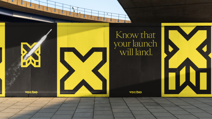
Vox.Bio
Pushing a healthcare market research brand to be bold and break the category mould.
Having established their healthcare and life sciences brand, Vox.Bio had intentions to re-think market research in the sector – but their certainty to provide decision makers with confidence wasn’t showing up. Through the delivery of astute brand assets and icons, we pushed Vox.Bio forward as a confident choice for life science organisations – so they know their strategy will succeed with market research that breaks the mould.

Solici
Forming a new strategic competitive intelligence arm to live within a healthcare house of brands.
Having determined what the future of Cambridge Healthcare Research brand architecture should look like, we formed a strategic competitive intelligence division to sit with the house of brands. Backed by an ambitious board, bringing Solici to life meant bringing opportunity to light for Cambridge Healthcare Research and their new brand’s clients.

CHR
Invigorating a scaling healthcare research organisation's employer brand across the UK and US.
Cambridge Healthcare Research is leading healthcare and life science research in the UK and US. After doubling their employee numbers during the pandemic, they approached us to inject a compelling thread across their brand and wider offering, including competitive intelligence and market research divisions – to ensure their unrivalled clinical commercial knowledge was referenced with confidence.

Loft
Uniting a new team and elevating next-level product design for an innovative American agency.
A decade into their journey as a product design agency, Loft had gathered a wealth of experience under their wings, working with major players in consumer tech and developing forward-thinking product ideas for start-ups. But after a recent shift at the top of their shop, we helped them take their brand identity to new heights, uniting their American team around a brand that better represented their technical yet creative approach to next level design.
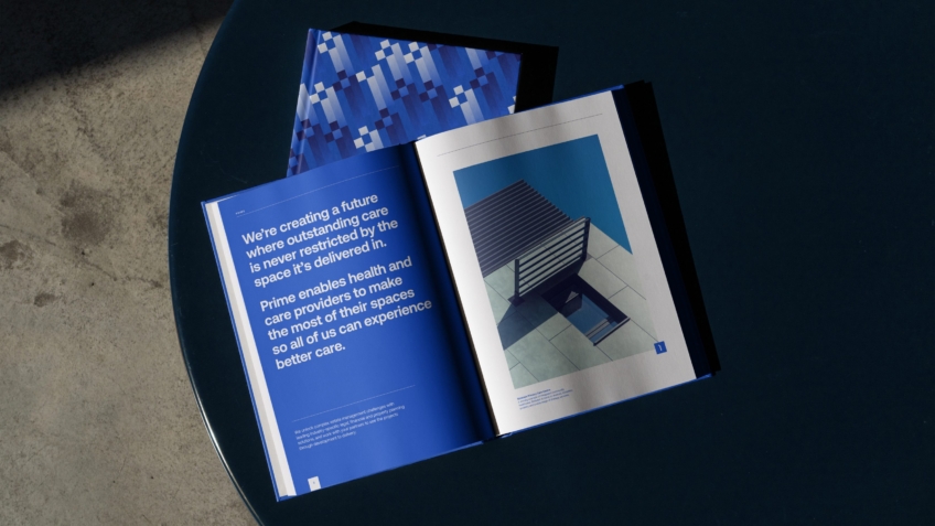
Prime
Developing a property brand to create transformational change in UK health and care.
Against a background of uncertainty – a looming Brexit and changing political leadership – Prime had been quietly enabling health and care providers across the country to navigate their way through the mire and make transformational changes to their estates. Garrotted by complicated ownership models, bureaucracy, and funding cuts, health and care providers across the UK have struggled to do more to their estates than simply keep the lights on.
Hunter Gather Cook
Custom type and brand identity that captures the wild spirit of foraging and fire cooking.
Like many who choose to explore living a life off the land, Nick Weston’s off-grid story is one that may seem eccentric on the surface. But his unique personality doesn’t serve to unnerve those who experience the way he delivers skills and knowledge of the wild. The mantra ‘respect is everything’ is firmly rooted in the brand and seasoned across everyone who spends time at Hunter Gather Cook. We offered a steady hand to craft a story of the expertise and consideration needed to source, prepare and share food as nature intended.

8build
A brand of infinite possibilities for a fit out and construction firm to expand into Asian markets.
8build's 'white-glove' attitude to fit out and construction enables them to deliver enviable spaces before their clients realise there was a builder in the area. Embracing the unbound potential of what could happen in their spaces, we helped 8build’s expansion into Asian markets – showcasing that fit out and construction projects needn’t be daunting and insurmountable, but instead provide infinite possibilities.
OKIN Facility
A multilingual brand that helps a facilities management company to care for all their people.
Our relationship with OKIN began back in 2020, when reinvigorating the brand of a global outsourcing firm quickly transitioned into uniting a portfolio of companies under a masterbrand set on making work better. With OKIN Group now equipped with a flexible brand architecture that enabled any of its portfolio companies to effectively communicate their unique area of expertise, it was time to turn our attention to helping their most complex company – OKIN Facility – achieve its expansion ambitions through a rebrand reflective of its people, purpose and potential.

MamaGin
Driving the brand for a mobile bar empire to mix vintage style with modern allure.
You say “Gin?”… we say “We’re in!”. That’s pretty much how it went when Eliot came to us in the process of fitting out his third custom food and drink truck – each one specialising in a different service offering: gin, coffee, food (also known as the trifecta of joy!). The task was clear: design a visual identity for the trucks that would work for the high-end, hipster crowd. Whether he’s hosting a drinks reception at a wedding or providing tipples to visitors of Le Mans, the brand needed to be effortlessly cool, enticing and legible across a field.
Sentry Funding
Funding justice through a strong brand for the UK’s first AI litigation portal.
Litigation funding is plagued with a host of backwards practices that make the process cumbersome and biased towards those with large bank accounts. With Sentry Funding, we have developed a product and brand that is funding justice with a clear emblem to protect people as they seek legal help – a guardian for both solicitors and their clients to take efficient action.

Helpforce
Doubling the number of NHS volunteers in a month with a nationwide print campaign.
How do you radically transform the way we experience healthcare in the UK? How do you enable more people to experience the benefits of altruism; becoming closer to the communities they live in and feeling supported, cared for and valued? How do you enable the world’s fifth-largest employer, and most prolific social care system, to iterate at scale?

OKIN Process
Uniting an emerging portfolio of companies with a new multinational masterbrand.
What began as a project to reinvigorate the brand of a global outsourcing firm as their organisation pivoted away from a legacy contract, quickly transitioned into defining a new organisational architecture and branded house for an emerging portfolio of companies.

The Circle
Supporting a movement of global feminism through a brand that amplifies female voices.
A new Chief Executive, armed with a new strategy, and inheriting a huge legacy of impact, community and prestige. The brief to rebrand The Circle was not only to unite its audiences of community members, celebrity supporters, partners and donors around the new focus - to end violence against women and girls and support the economic empowerment of women - but to amplify its impact and the voices behind the name. The Circle needed a brand that called people to action around the globe, in solidarity for women and a new movement of feminism.
