
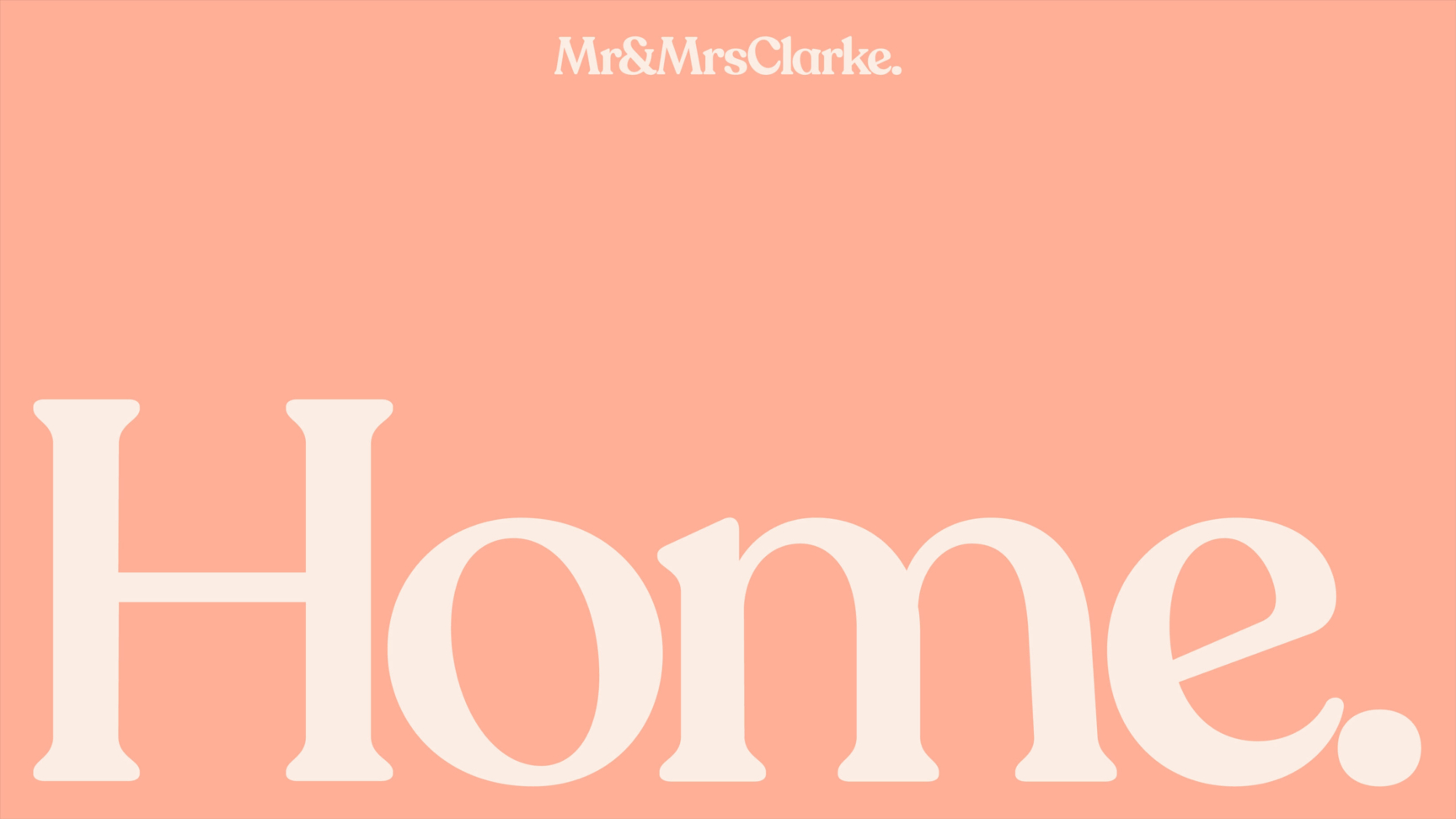
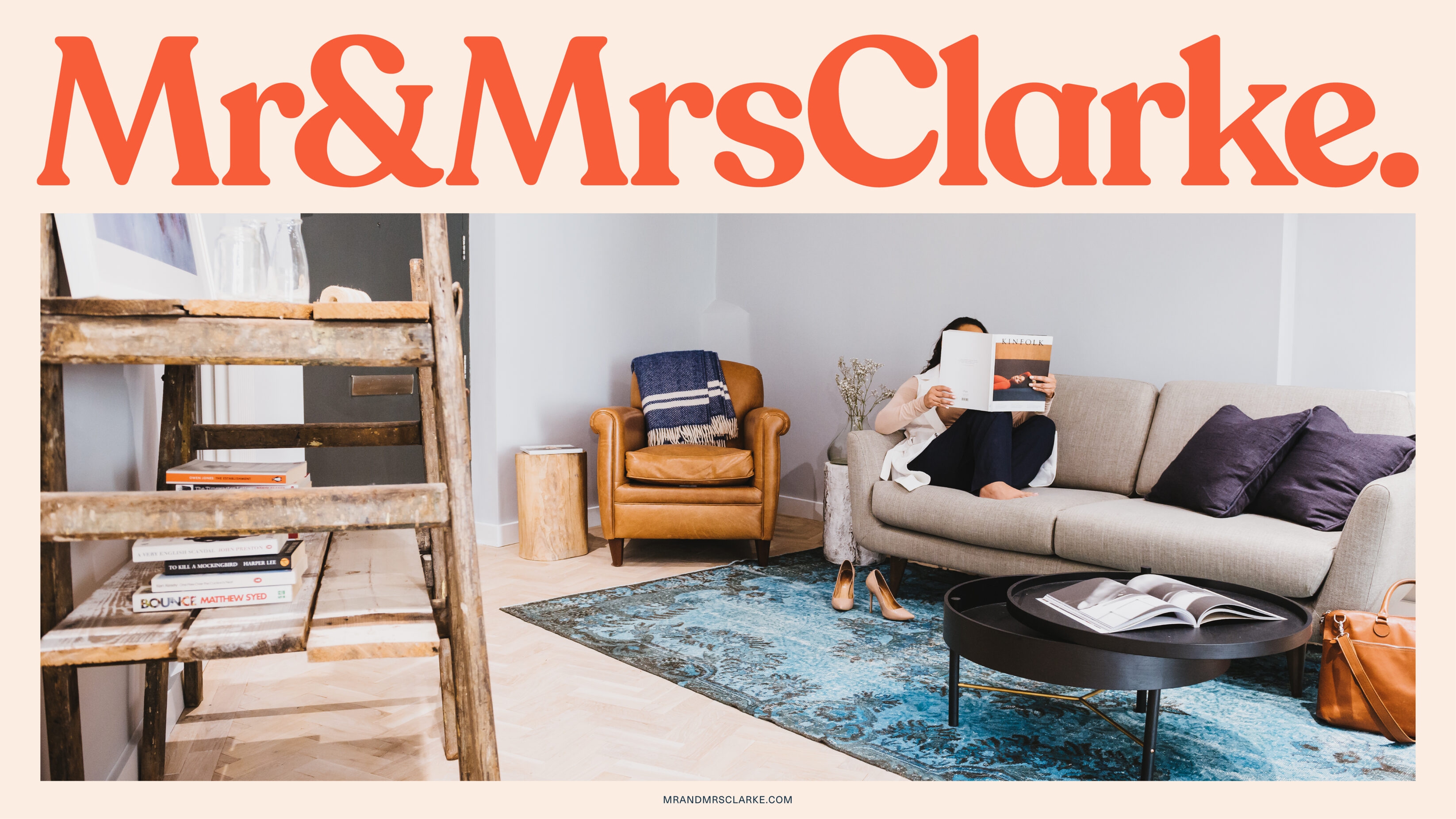
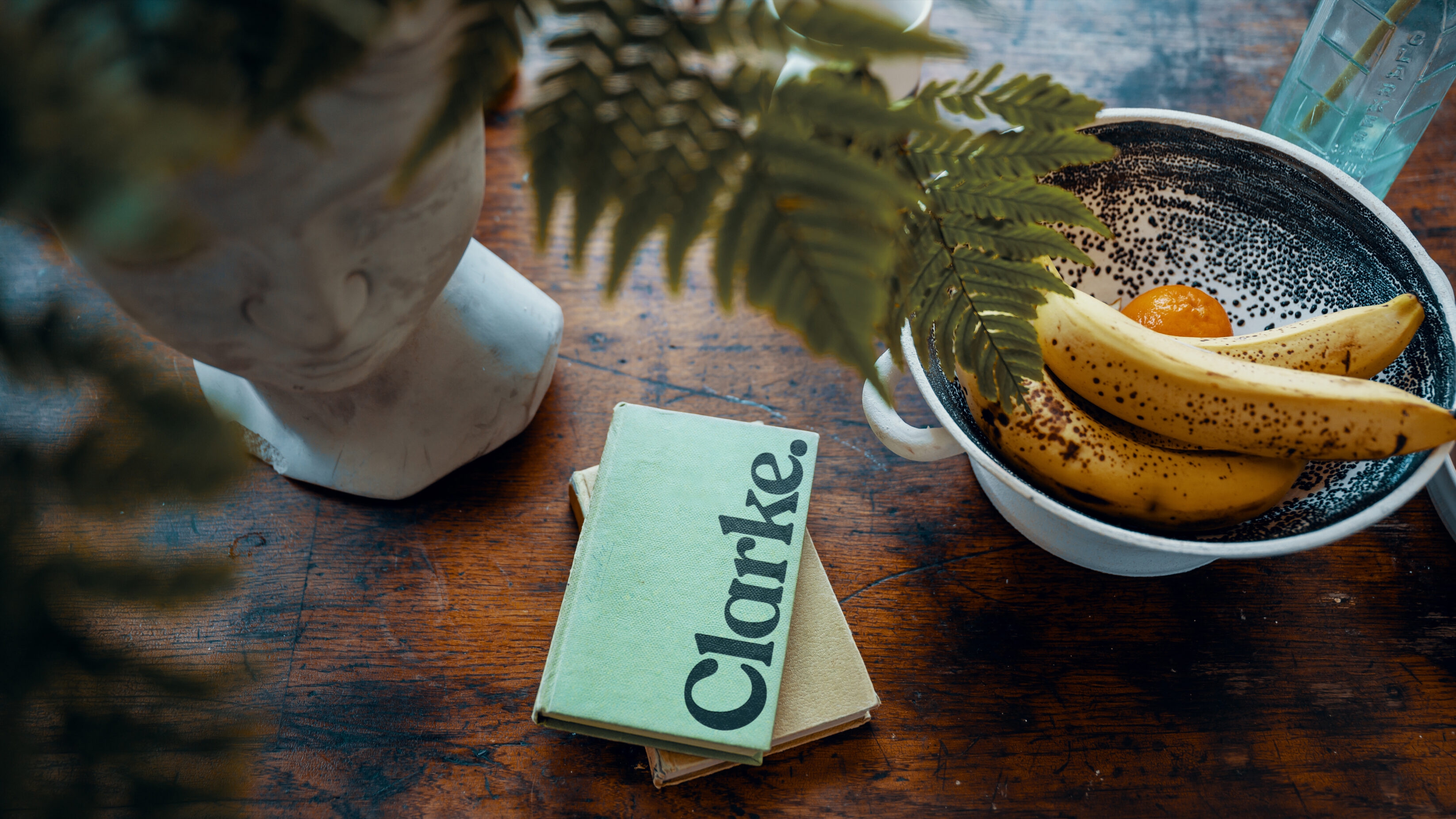
Mr and Mrs Clarke
Designing a discerningly different estate agency brand for acquisition by a leading UK Group. Disillusioned with the traditional estate agency model and the way the property industry treats house buyers, husband and wife Paul and Alex Clarke, had a vision for a different way to connect with homeowners, because buying and selling a home is so much more than a chain transaction. Although they had the ambition and belief, they lacked the brand to change an industry. That’s where the UnitedUs investment arm, UnitedUs Heavy Industries, stepped in.
Brand guidelines Brand strategy Business strategy Campaign strategy Copywriting Digital design Digital marketing Employer branding Marketing Photography Print collateral Tone of voice Visual identity Web design Web development
Built environment Professional services
UK
Tapping into the zeitgeist of online-only agents and market opportunity for a hybrid estate agency, Mr and Mrs Clarke were looking to fill a gap with something new for the property industry. By focusing their business on an exceptional online shopfront, the Clarkes negated the need for a high street presence, but they still needed an affable brand that could attract affluent buyers and sellers of luxury homes. Especially those outside of London.
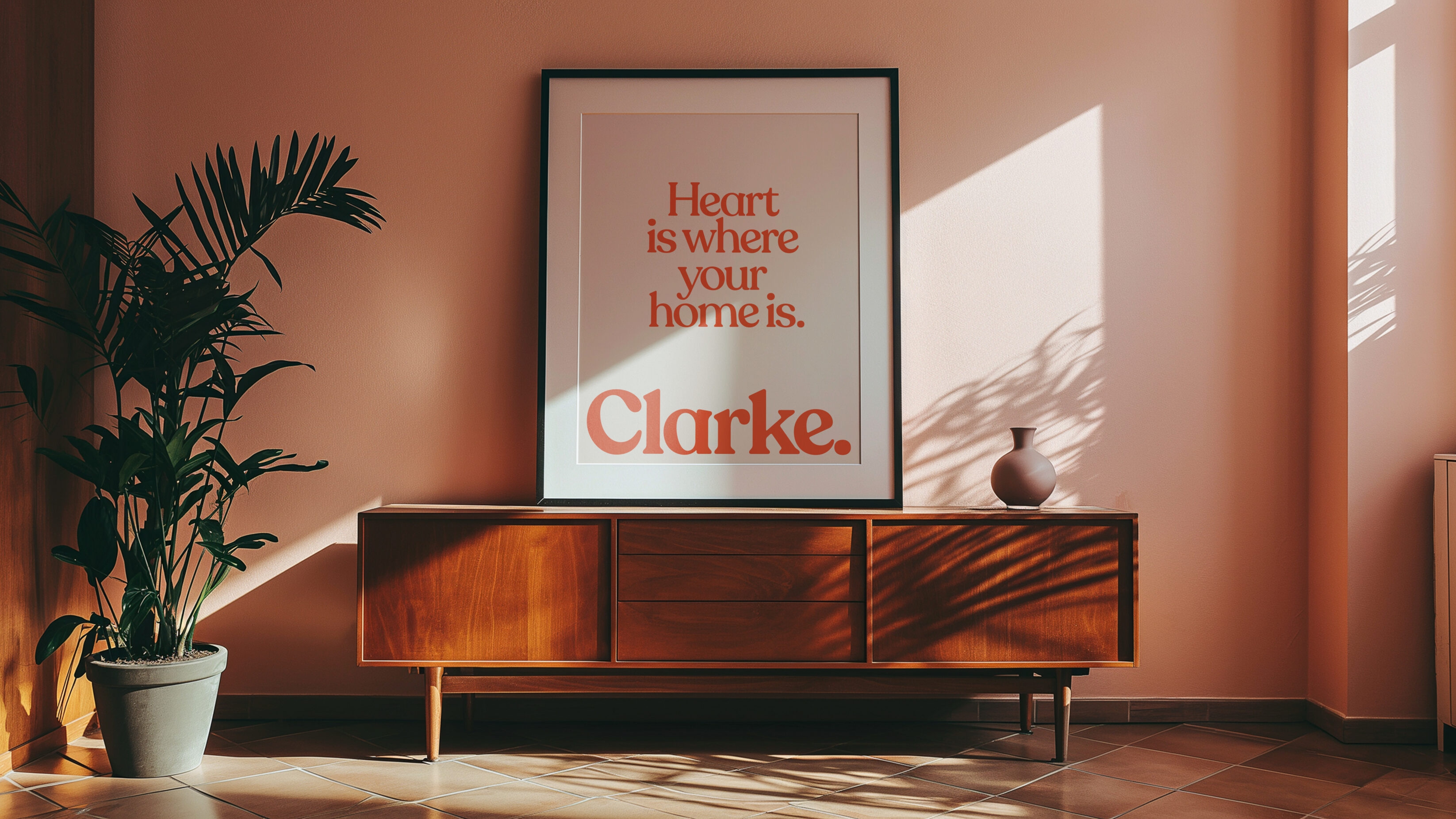
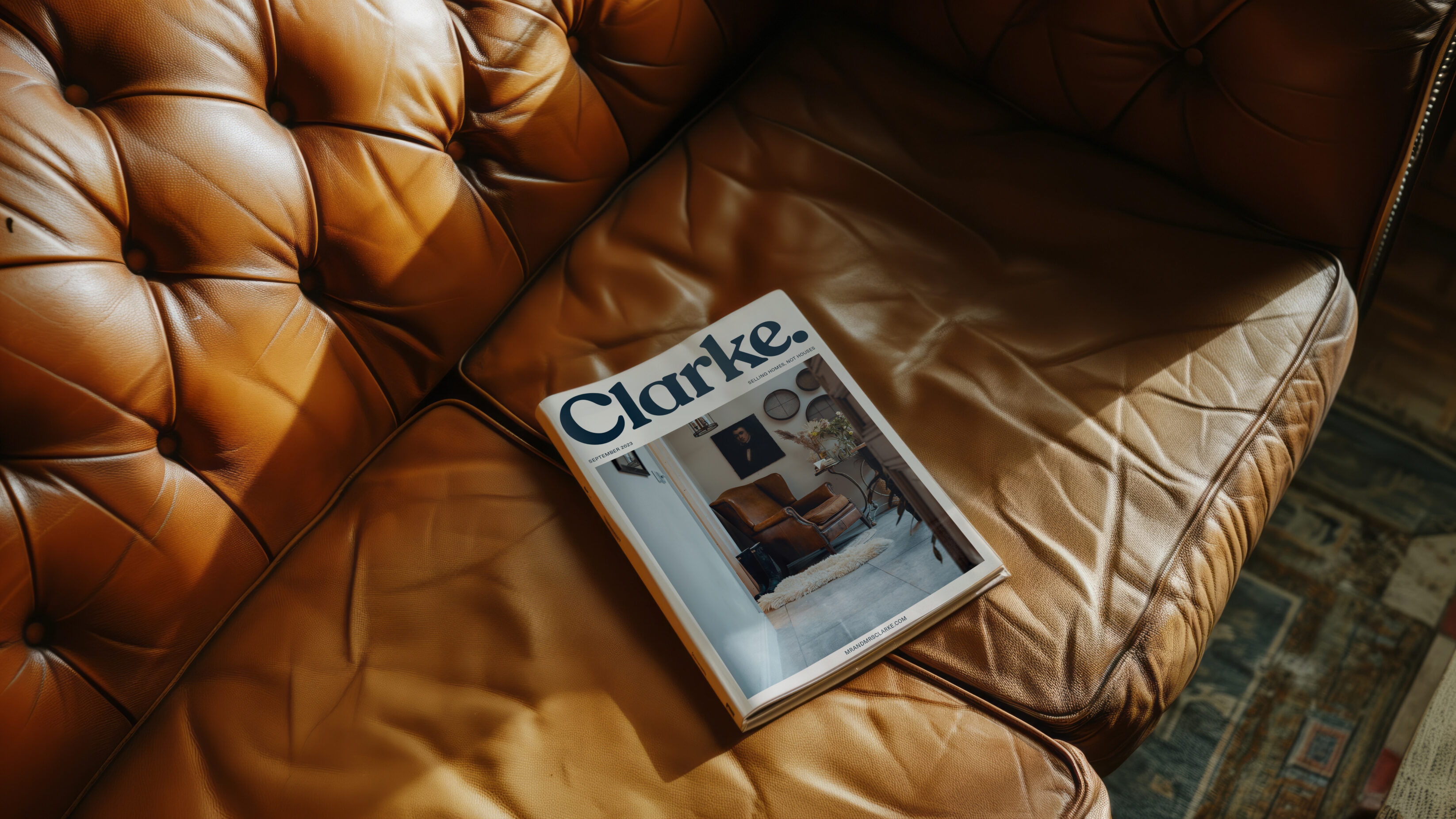
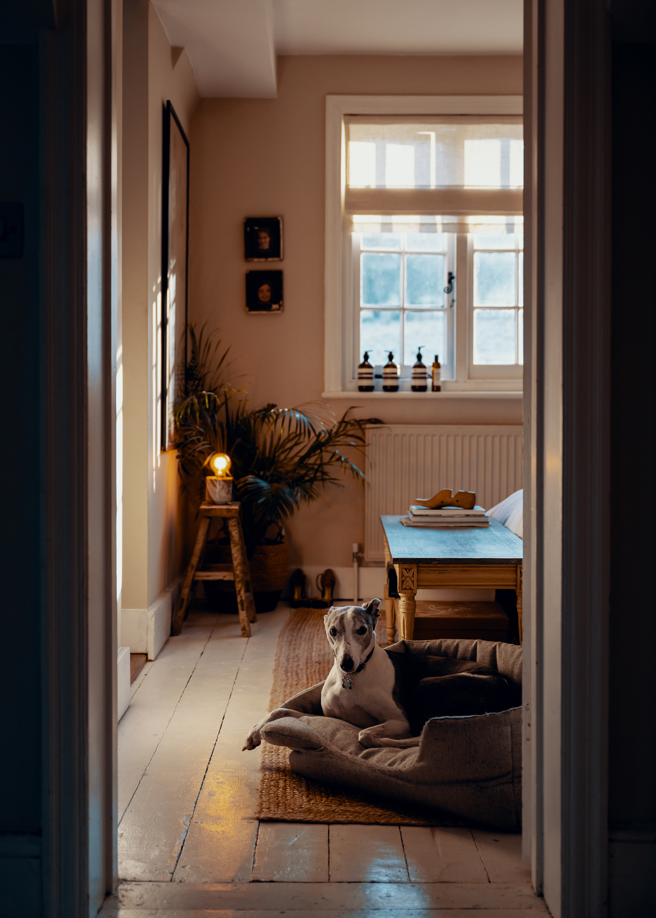
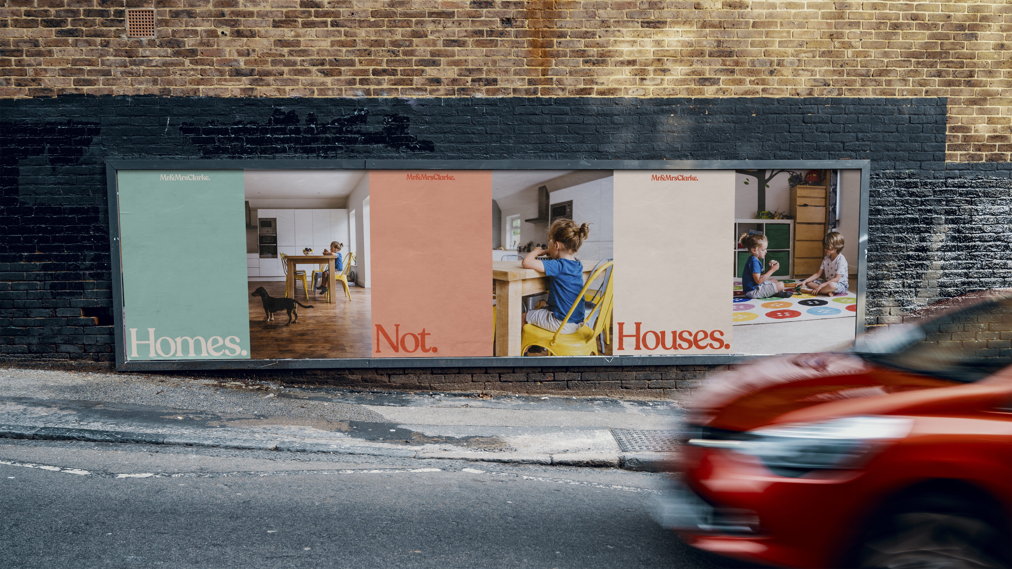
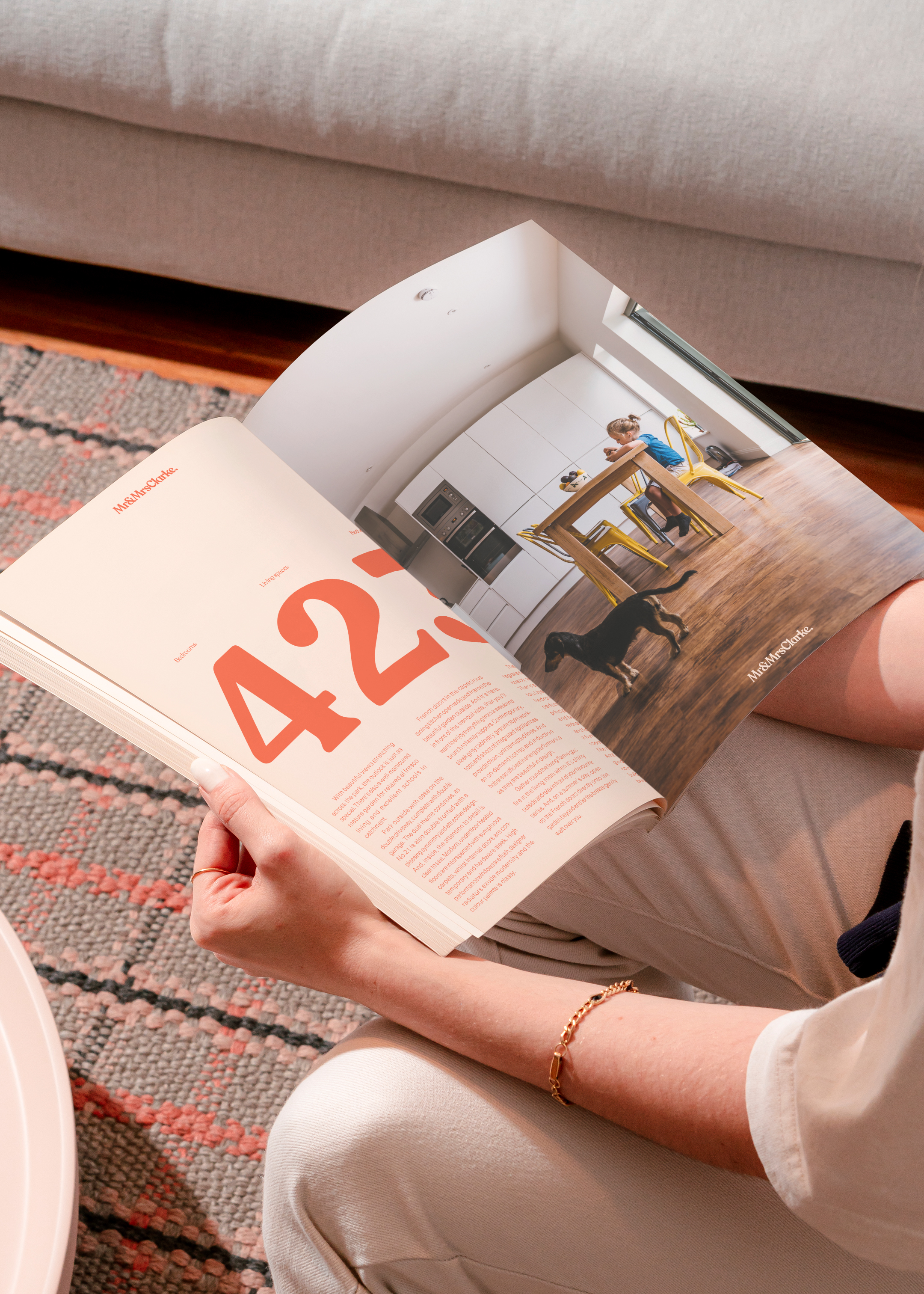
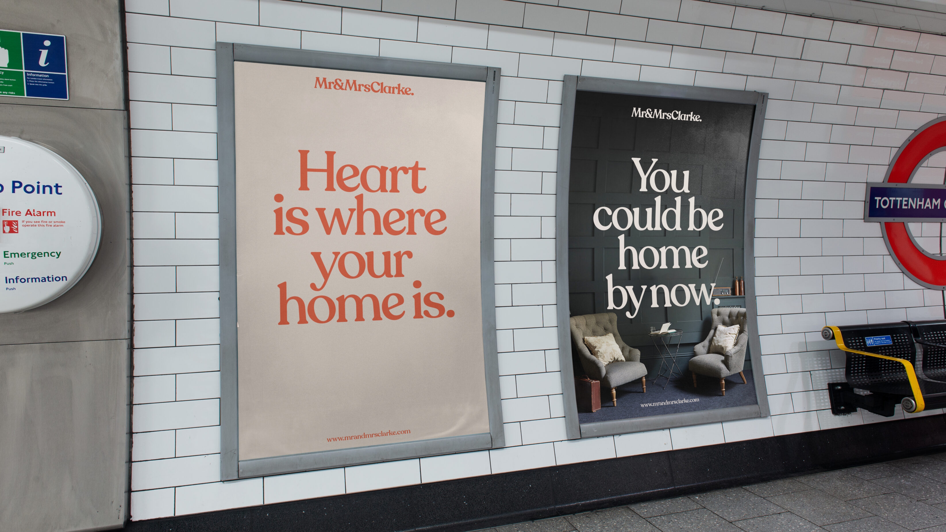
Having approached us to deliver an industry leading brand, they were struck by the consultative value of UnitedUs being involved at the board level. In a world were you buy with your eyes first, a unique brand proposition is a vital USP in the sales conversation. With this in mind, we set about building a brand that focussed on a core value of “Selling homes not houses” which has been so often overlooked by estate agents who speak of square feet and electric outlets.
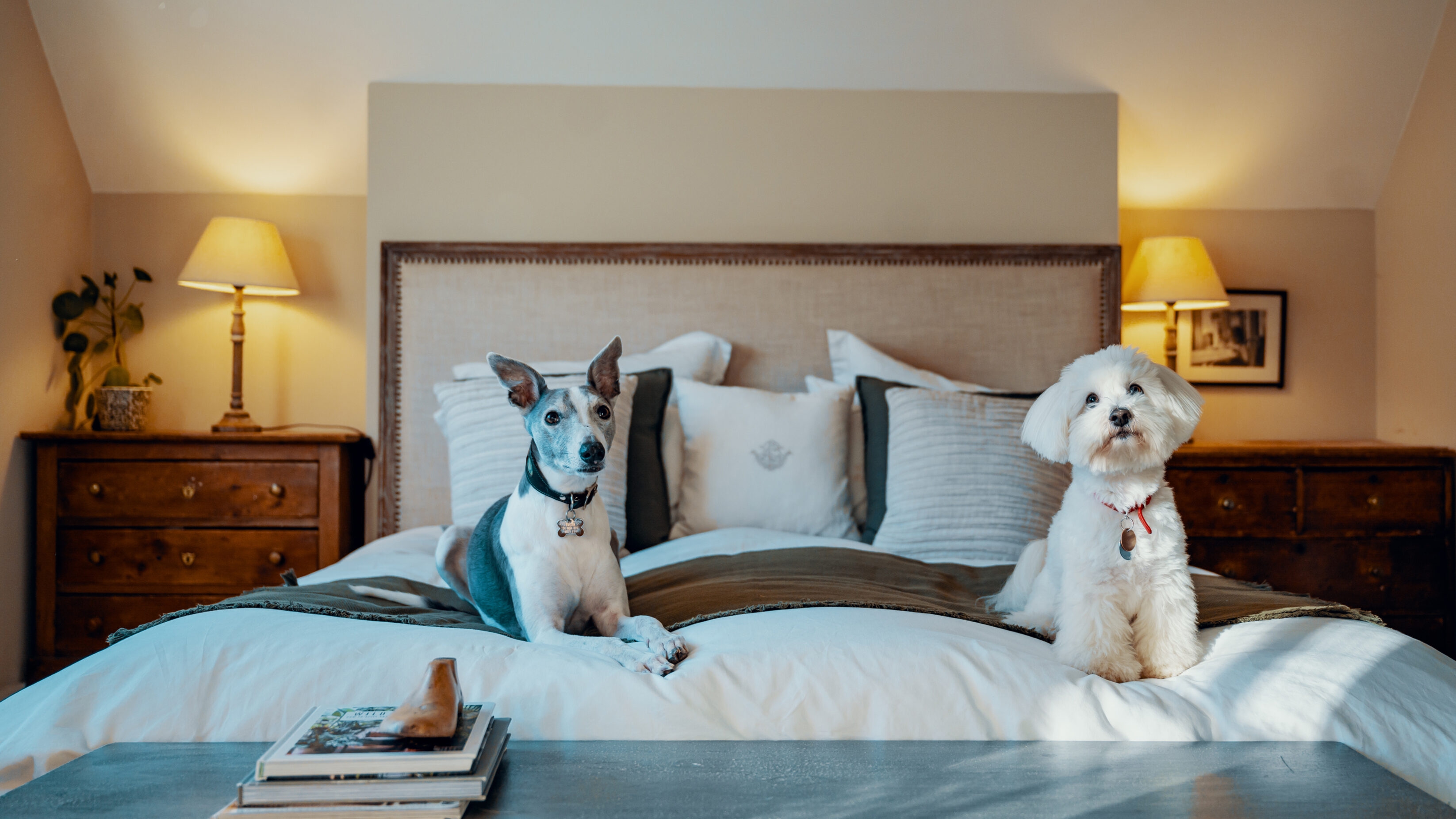
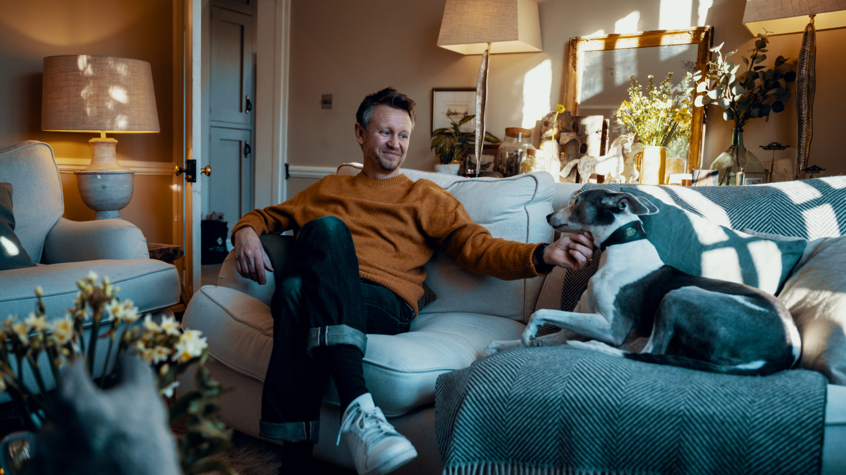
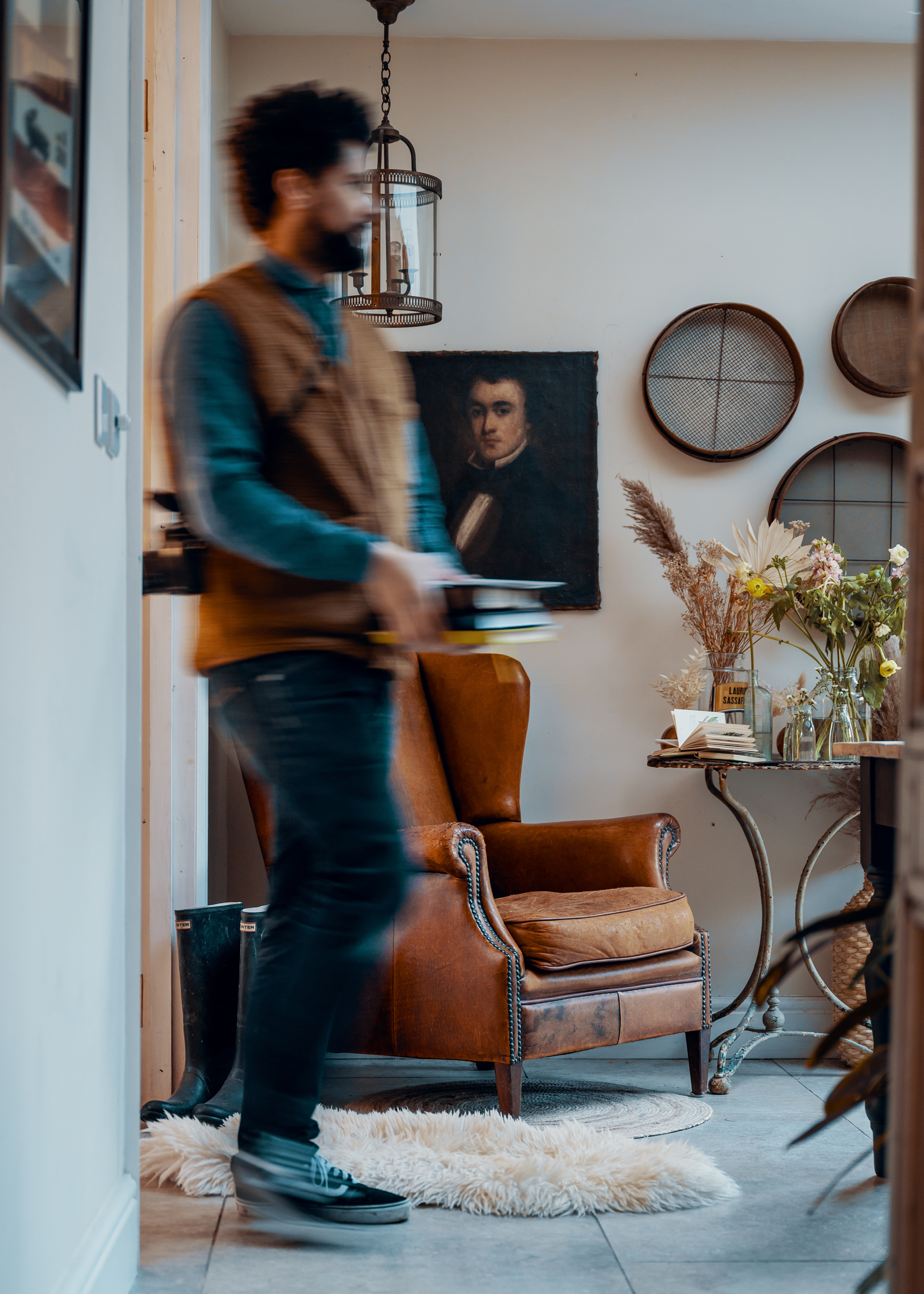
For too long homes have been sold as commodities; a series of wall measurements and internal floorplans, ignoring the fact that a beautifully loved and cared for home full of character will sell quicker than the same property in an unloved state. People who love their home often tend to want to sell to people who love their home as much as they do, and that’s the type of people Mr and Mrs Clarke wanted to champion: the passionate homeowner. The entire brand was crafted to share the joy of beautiful homes and the discerning difference Mr and Mrs Clarke buyers and sellers were looking for in every stage of their home buying journey.

DISCERNINGLY DIFFERENT
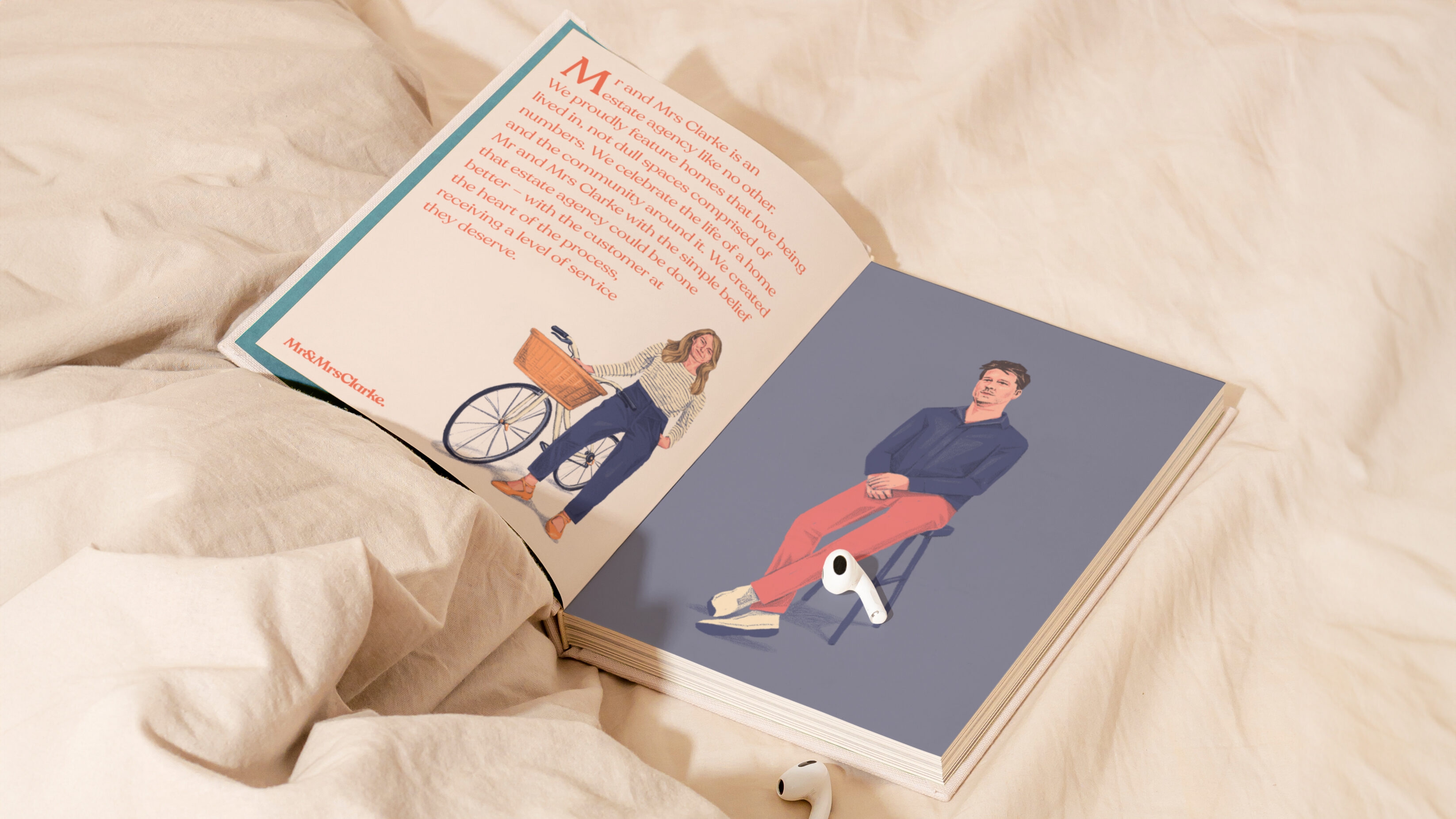
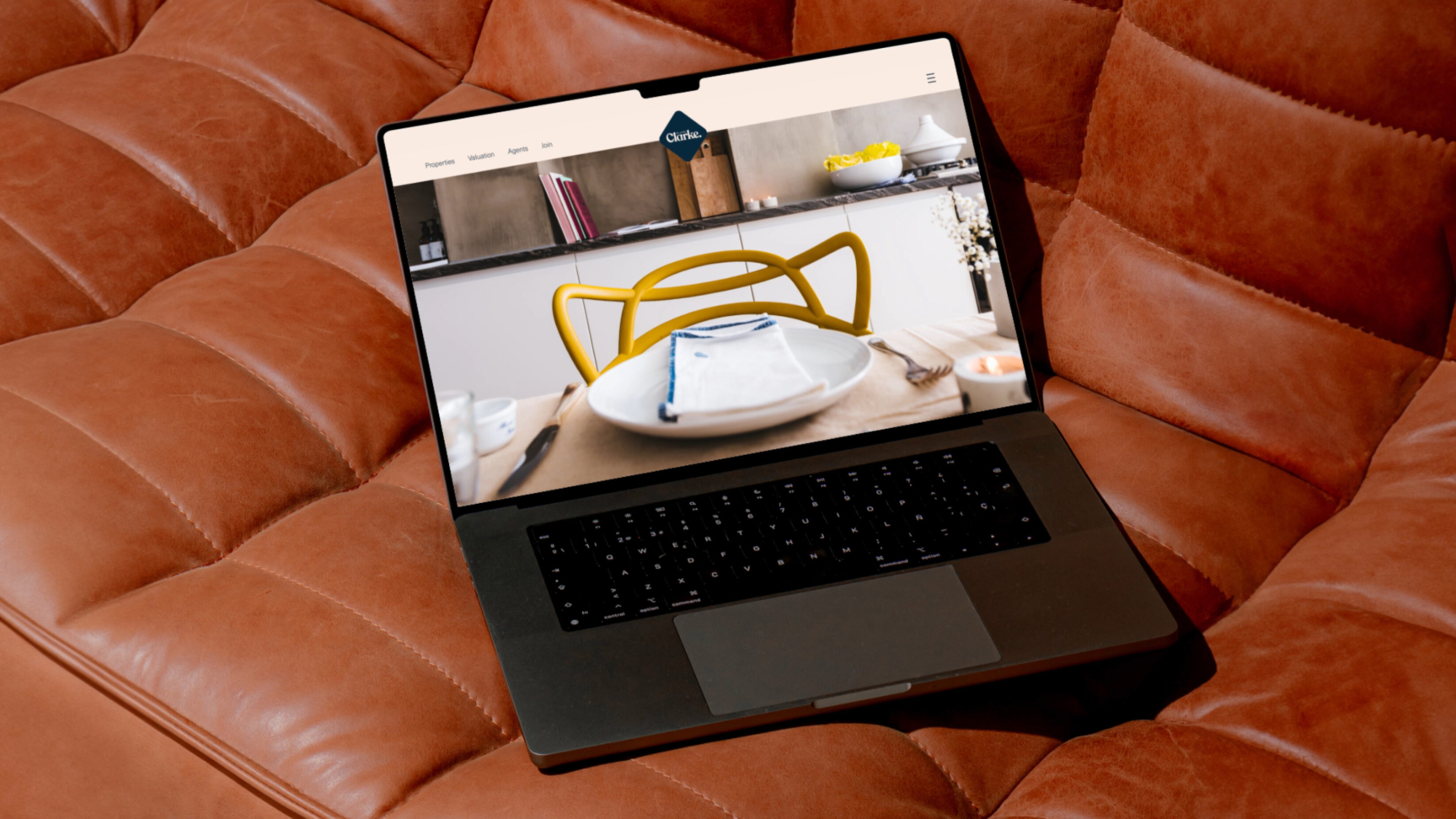
When your brand message is focussed on being Discerningly Different, this mantra must be built into every expression to be authentic. That’s why discerning difference shows up in each element of the brand, from visual identity to tone of voice, photography to website and most importantly, our Mr and Mrs Clarke agents. Having built a dedicated team of Partners across the UK who pride themselves on a discerningly high level of service for their customers our brand identity needed to be reflected of them, their unique characteristics that made them the elite estate agent in the area, and also champion their love of homes.
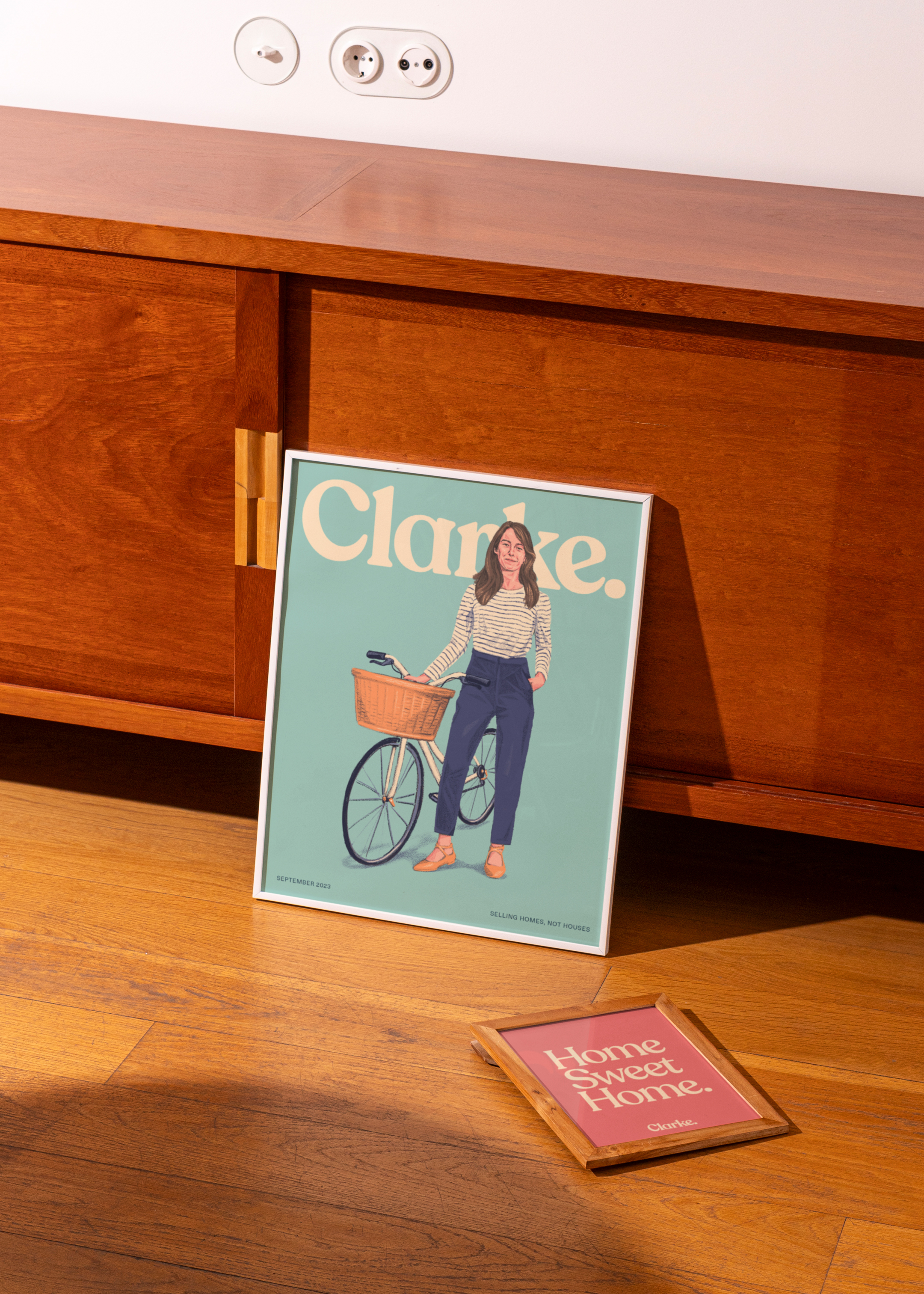
Drawing inspiration from the work of beloved author and illustrator Shirley Hughes, the brand puts the Mr and Mrs Clarke partners at the forefront of the agency, using illustrations that convey a softer, more crafted style – completely reflective of their customer service, attention to detail and truly different approach to the traditional concept of estate agency. The illustrations also allowed Mr and Mrs Clarke to use imagery of the Partners in promotional material without feeling overtly salesy. Mr and Mrs Clarke sellers loved the illustrations too, often sighting them as the reason for the initial engagement with the brand. It was a real first for the industry to use illustration with a nostalgic sentiment, but it wasn’t the only first to be realised by Mr and Mrs Clarke — we were also proudly the:
- First to focus on home and location with shops/cafes/landmarks in the locality included in sales listings. With the surrounding community going a long way in selling a home, we created mini-area guides which supported the property information.
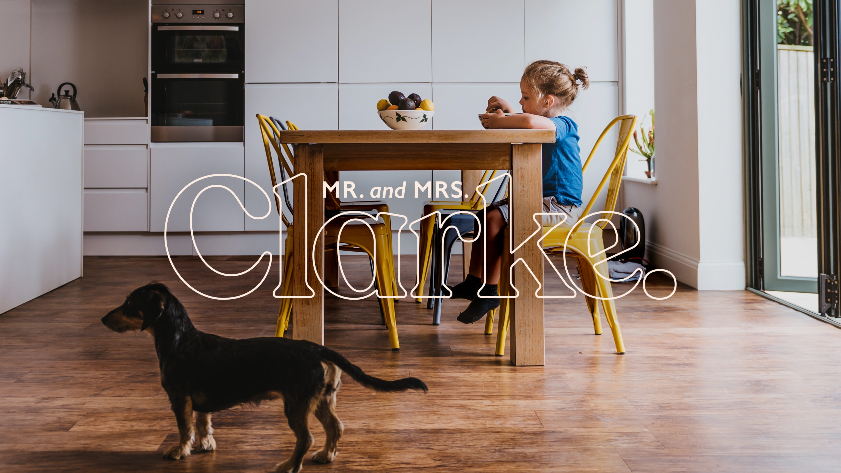
- Trend setter in placing people at the heart of home photography, no more wide angle lens, instead we focussed on the idea of homes not houses, sharing a snippet into the life you could lead in that home.
- First to sell a house on instagram via DM’s. No property listing, just exceptional photography and a service level to deliver a sale. So much so The Times called us “The Instagram Estate Agent”.
In championing a discerningly different model in estate agency, Mr and Mrs Clarke went from strength to strength, building a network of Partners (who collaborated via our custom built internal social network) and creating a brand reputation for showcasing beautifully curated homes with the unique offer of art directing and styling homes ready for listing.


GETTING WITH THE TIMES
Mr and Mrs Clarke flips the script on what it means to be an estate agency, through both reputation and culture. It disrupted an outdated industry that clings onto the passé image of shiny-shoed, clipboard wielding sales people, instead, communicating the trustworthy personalities of a caring couple. People who are supportive in sharing the experience of stepping into, or passing on, a dream home.
As a specialist concierge-style personal estate agency network, Mr and Mrs Clarke is consistently noticed by customers, franchise owners and national press. Thanks to it’s industry defining brand and award-winning business model, Mr and Mrs Clarke was acquired by national property industry giant, Belvoir, in 2022. In their acquisition of Mr and Mrs Clarke, the UK’s leading property and mortgage group were able to diversify their portfolio with a multi-franchise industry player that has a unique business model, a vibrant brand and clear potential for growth.
The branding has literally been a game-changer for us, we get compliments about it every day and people calling from all over the country who want to be a part of it. The branding is spot on — we absolutely love it! The UnitedUs team is innovative, creative and caring. They are full of interesting and well-thought-out ideas and they understood the brief. They continue to be a pleasure to work with.
Paul Clarke
The acquisition of Mr and Mrs Clarke provides the Group with a new service offering, which will recognise the breadth of ways in which our customers want to interact with their estate agent and the different ways in which potential new franchisees or partners want to operate. Paul and Alex have created a really positive, vibrant brand that stands out from the crowd.
Dorian Gonsalves
A great brand opens the door to improved business outcomes, whether that’s opportunity for organisational growth or making a business more attractive for acquisition. We put this principle into practice with Mr and Mrs Clarke, building its brand as a business within the UnitedUs Heavy Industries portfolio. If you’d like to find out more about our other UnitedUs ventures, head to our Heavy Industries page or get in touch with our co-founder Luke Taylor for a chat.
Related projects
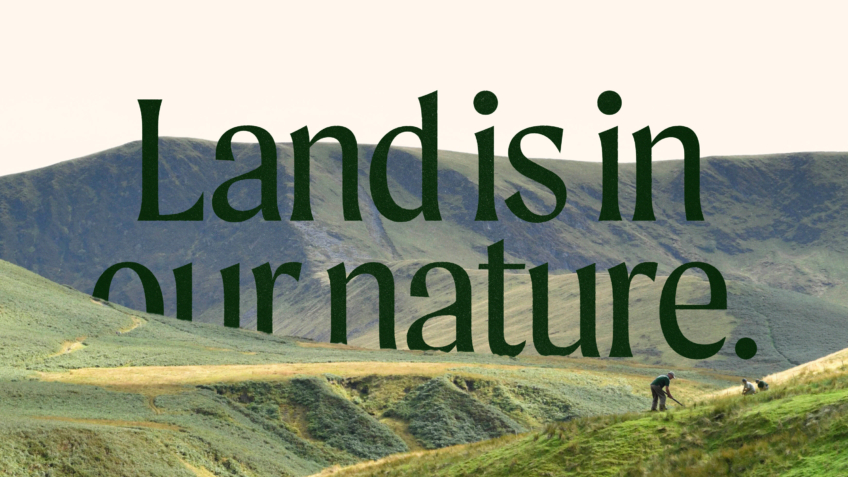
The Ernest Cook Trust
Telling the story of a brand new strategic direction, rooted in the land.
UnitedUs met the Ernest Cook Trust at a time when the organisation's brand and strategy were both in need of a fresh perspective. Working alongside the charity's strategy development, we cultivated a new brand positioning that was both rooted in the charity's enduring heritage and brought new life to its emerging strategy.
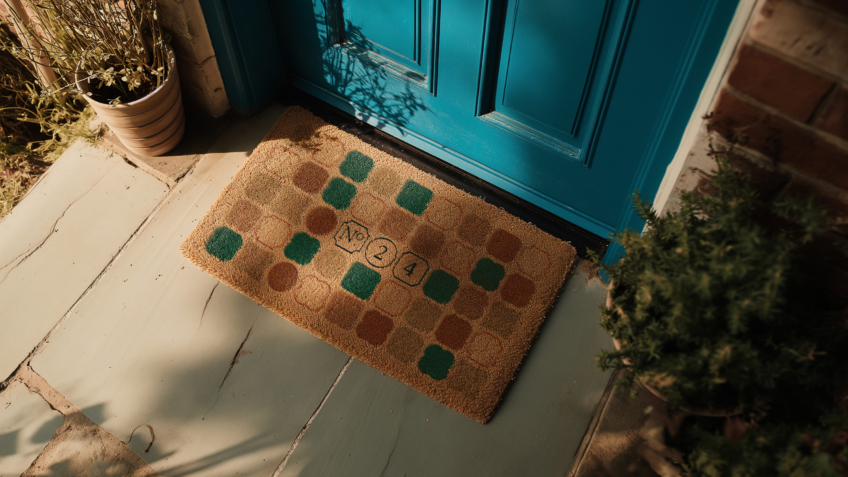
Number Twenty Four
Raising the status of a modern property agency to increase sales of luxury period property.
Bringing classic homes beautifully up to date, Brighton-based start up Number Twenty Four specialise in buying and selling homes with period features. We crafted an enticing brand and website that positions the start up as an efficient estate agency, composing service and character to exchange luxury homes across the UK’s seaside Regency city.
Want to build your brave brand with us?
