
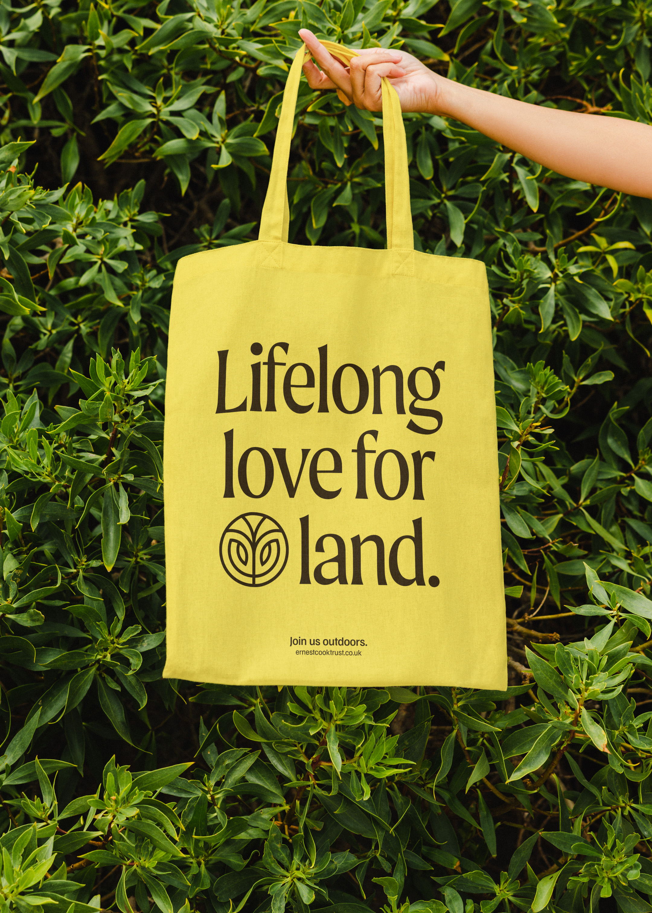
The Ernest Cook Trust
Telling the story of a brand new strategic direction, rooted in the land. UnitedUs met the Ernest Cook Trust at a time when the organisation's brand and strategy were both in need of a fresh perspective. Working alongside the charity's strategy development, we cultivated a new brand positioning that was both rooted in the charity's enduring heritage and brought new life to its emerging strategy.
Brand guidelines Brand strategy Copywriting Digital design Illustration Logo design Print collateral Tone of voice UX Visual identity Web design Web development
Built environment Charity Education
Cotswolds UK
THE BRIEF
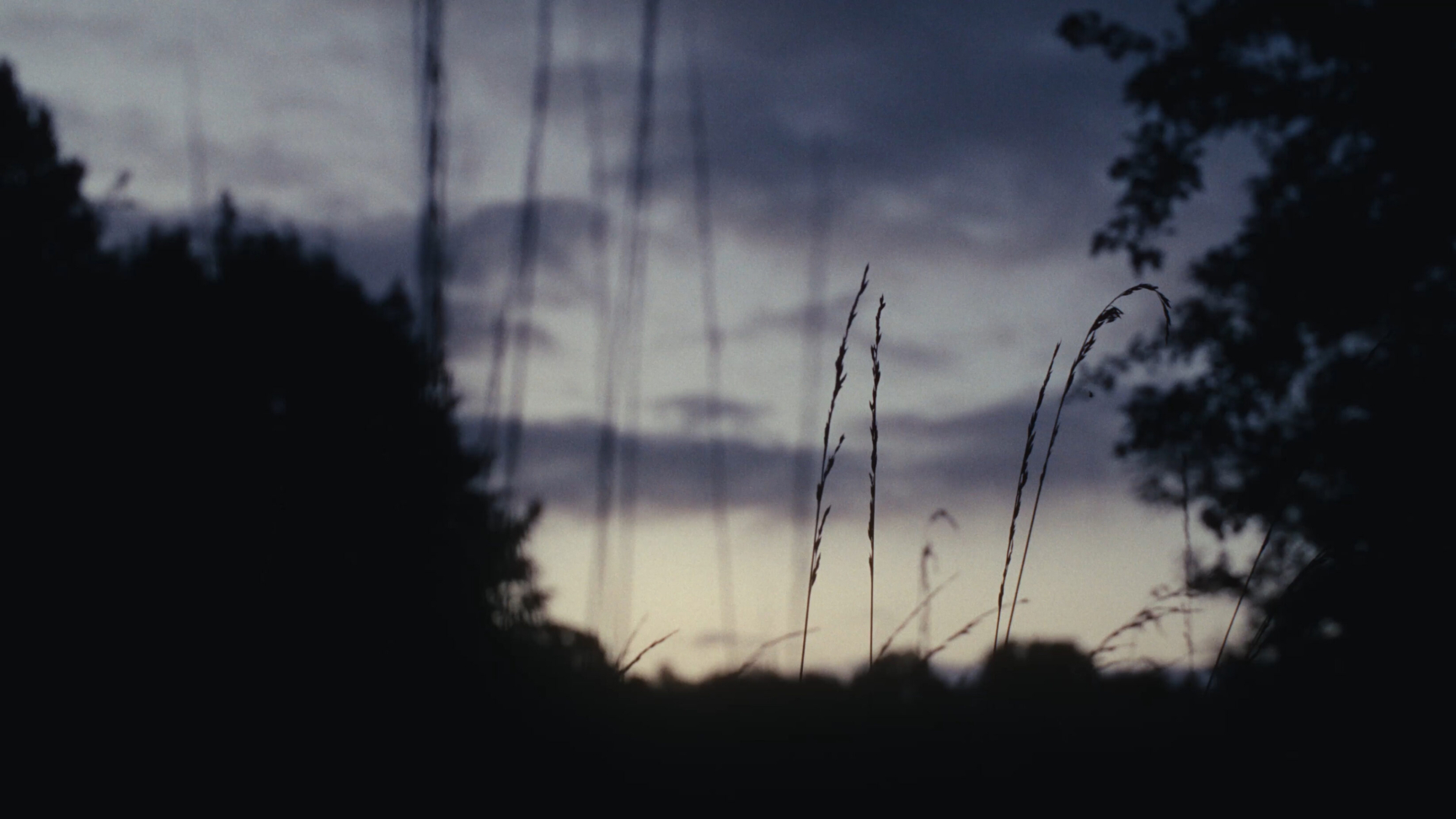
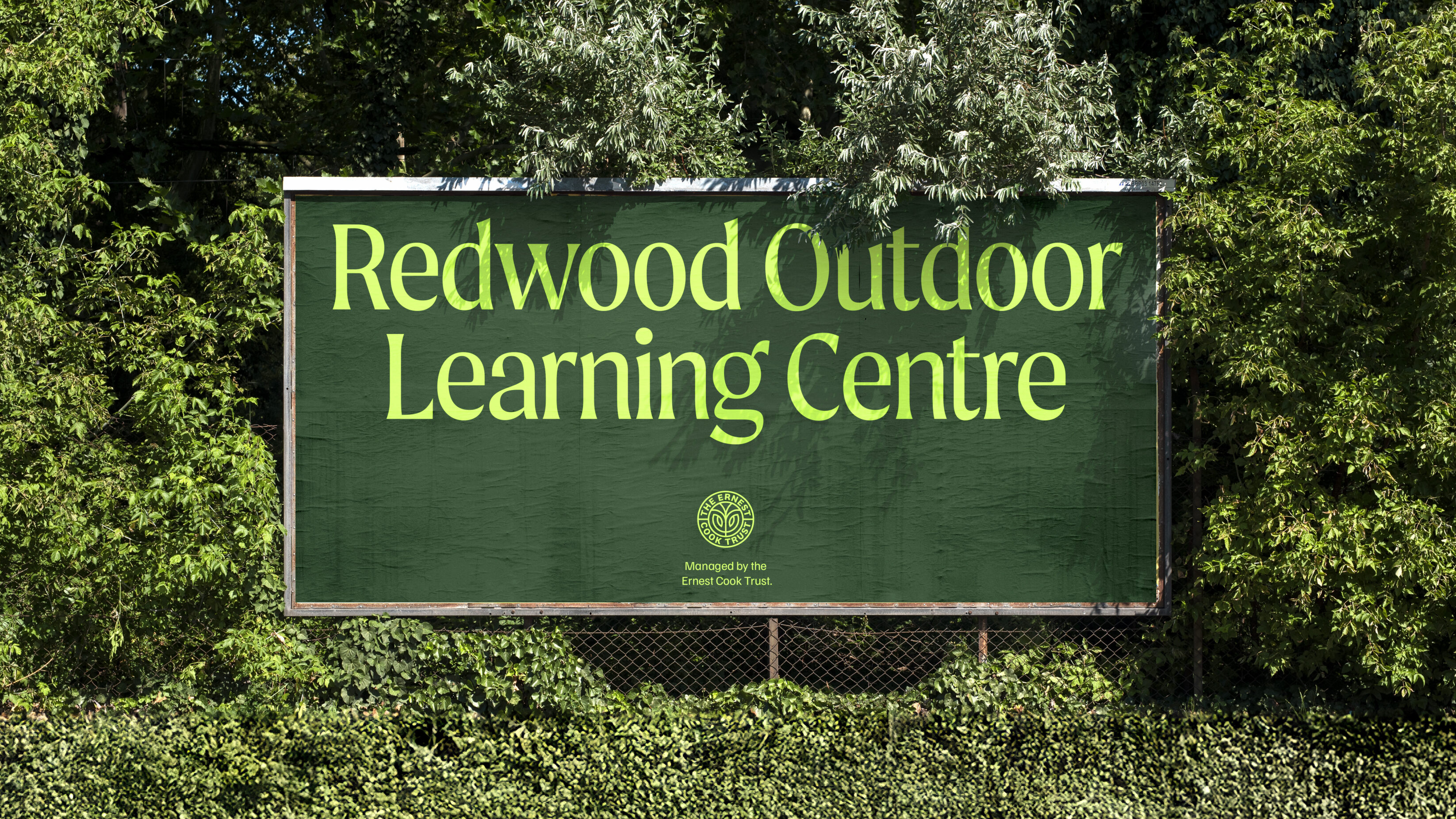
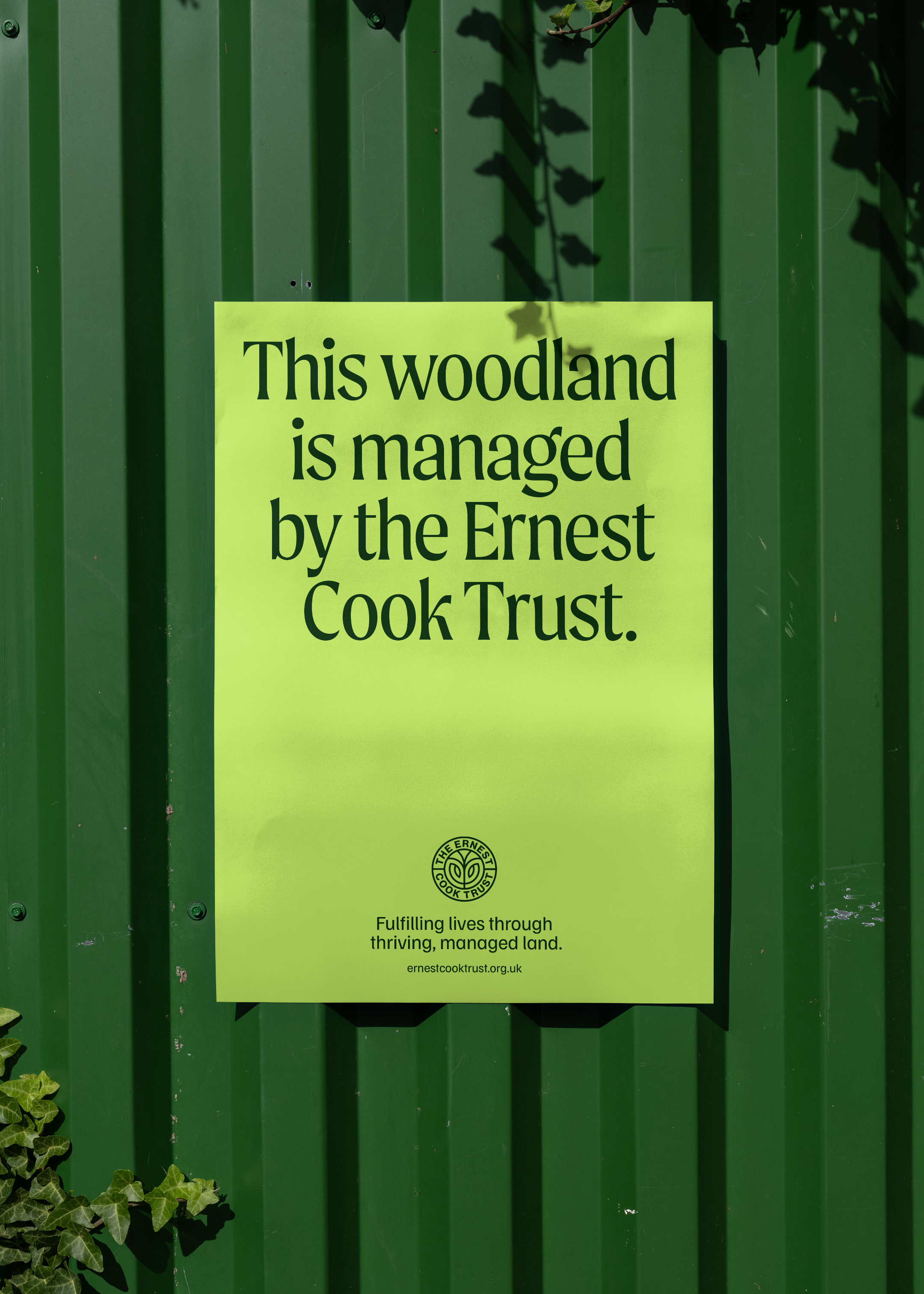
Before walking the path of a new strategic direction, the Trust needed to address fragmented perceptions and internal ambiguity regarding its vast landholdings. Beyond the initial brief, it was clear that we needed to bring together a diverse audience across the Trust’s 9,000 hectares and beyond — from tenant farmers to outdoor learners — under one cohesive, national story that justified landownership as their greatest vehicle for impact.

OUR ANSWER
Our discovery phase dug deep into the organisation’s heritage, purpose and mission, talking with over 140 participants, including trustees, youth boards, and tenants. Then came the ‘aha’ moment. We realised that managed land was deeply rooted in everything at the Trust. Without it, their unique brand of education and care simply didn’t exist. There’s an outdated picture of Englishness and its green and rolling hills that people think of as natural. But without the careful stewardship of human hands, it simply wouldn’t exist. A new story of visible, active stewardship began to grow.
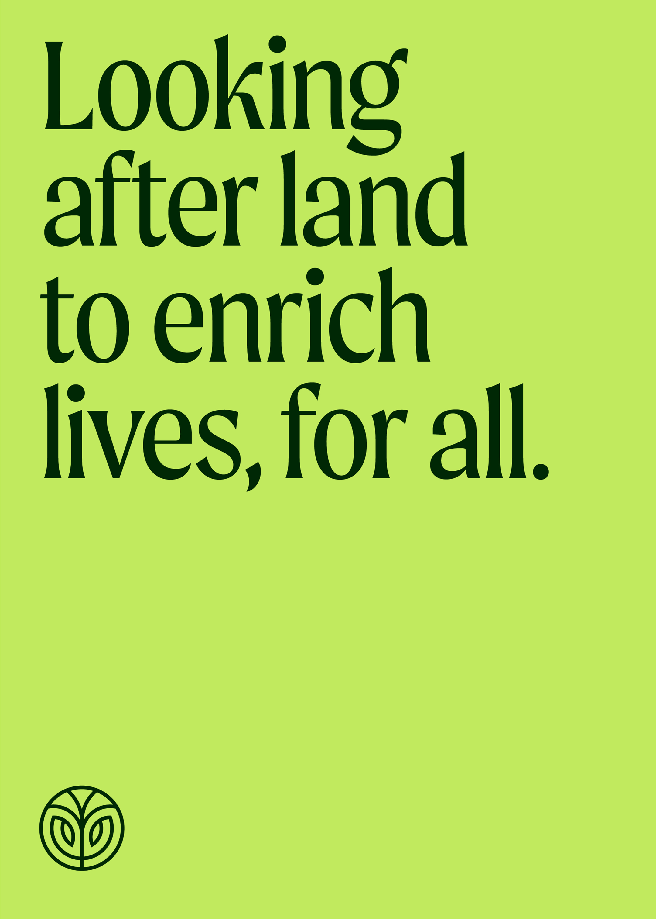
The brand story answered the ‘should we own land?’ question with an emphatic yes, with the intention of shifting the narrative from passive landownership to progressive stewardship. This is now central to the strategy of the Ernest Cook Trust – and can be evidenced across its structure, goals and actions.
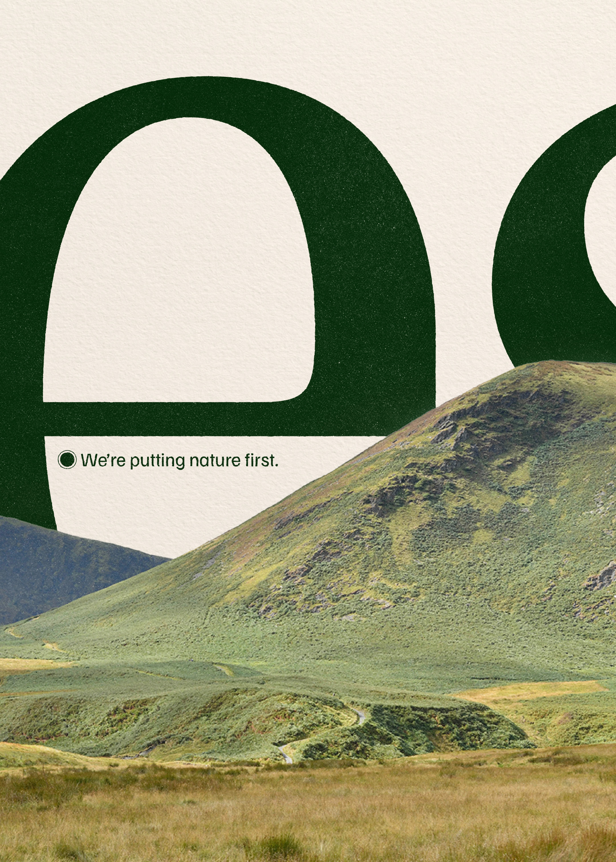
‘When land is well-managed, life is well-lived.’
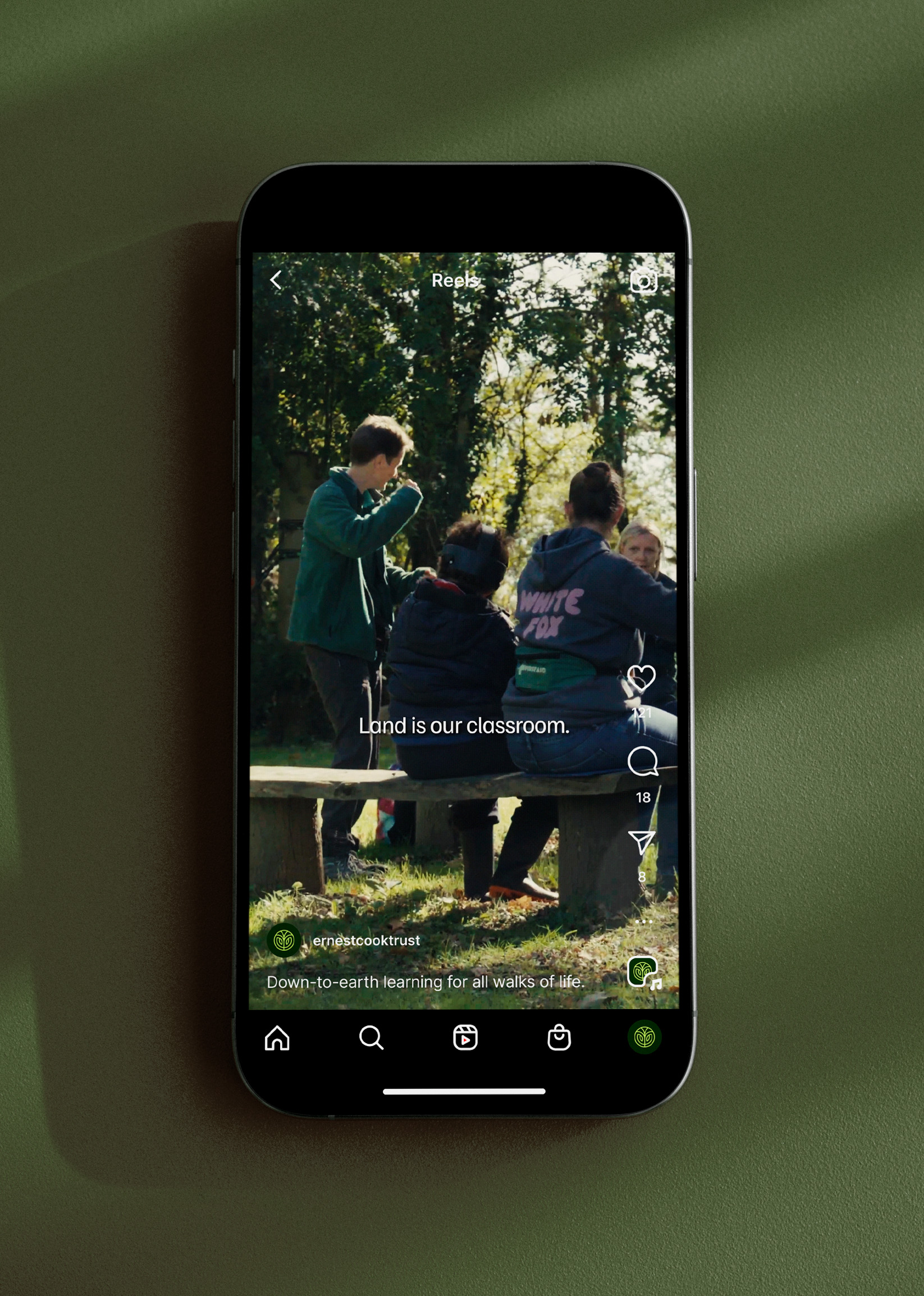
This positioning guided us to build a brand platform centred on the concept that ‘land is in our nature’ — not just for the Trust, but for everybody. This story wasn’t just for an annual report; it was a rallying cry for ‘Land Stewards’ — a new collective identity we created to encompass everyone from the outdoor caretakers to young land activists.


UnitedUs showed so much energy and commitment to really understand our organisation - they felt their way through our heritage, explored all of our present voices and identities, and helped us unearth a pathway that felt both new and natural to us.
Isobel Stewart, Director of Communications & Engagement


THE OUTCOMES
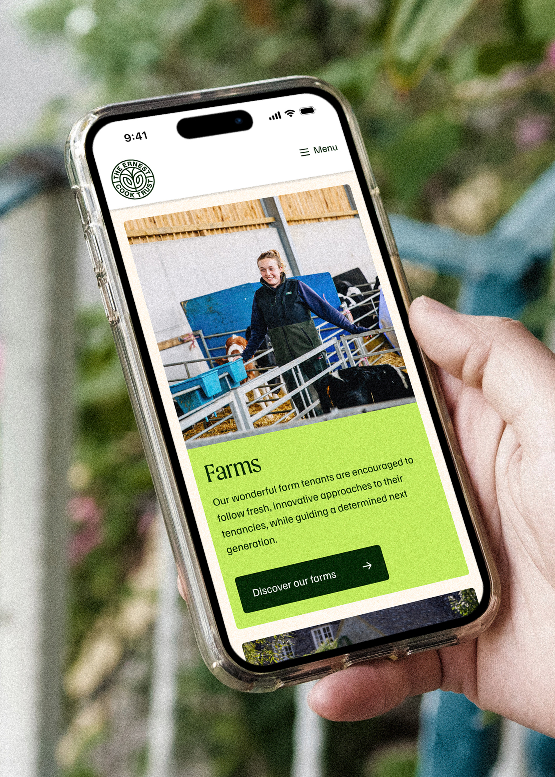
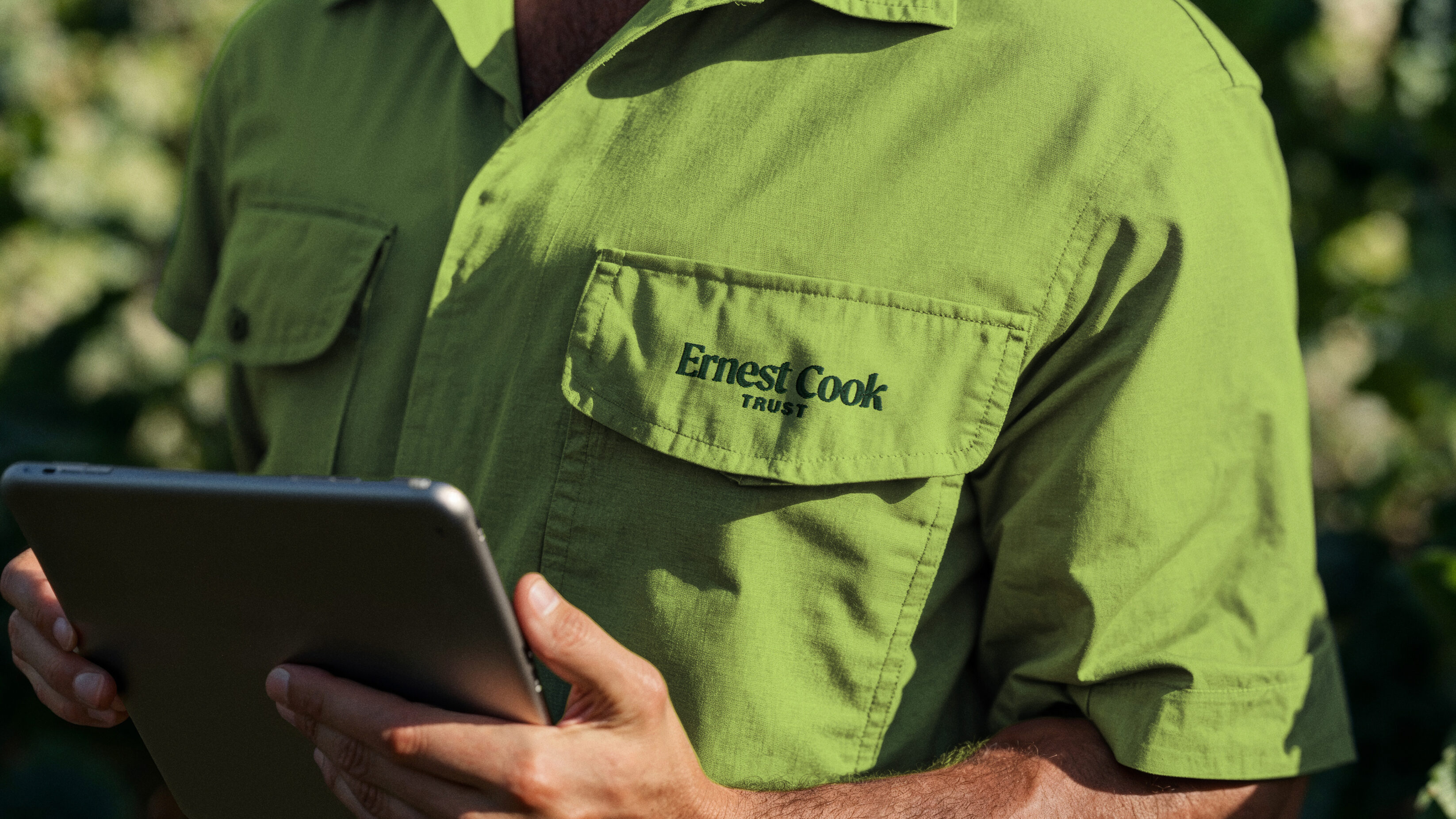
Today, the Trust boldly embraces its multitudes: a progressive land owner, a caring steward, educators, and conveners. By weaving together learning and land management, the new strategy better reflects landowners’ brilliant work, proving that self-sustaining, multi-use estates are the best way to deliver charitable missions today and for future generations. The brand now speaks with equal authority in high-level policy advice and trustee reports as it does in vibrant, sensory language for children experiencing their first Outdoor Week of Learning.
We implemented this vision through a vibrant visual and verbal identity that ties land management to a sense of the quality-of-life it can provide for us all. All of this comes together to ensure that the Trust remains a leader in the national conversation on the countryside. Today, tomorrow and far into a flourishing future.


My favourite thing about working with UnitedUs was the reciprocal nature of the work - they are able to balance their own conviction with our needs and desires, and I felt like we really got the best out of them and ourselves through the collaboration.
Isobel Stewart, Director of Communications & Engagement


Our work with UnitedUs led us places that were, in some ways, unexpected. Which is great, because the outcomes don't feel predictable or easy. But the real strength is that the place we've landed also feels authentic to our brand. It's a very overused word, but the authenticity of our final brand positioning is thanks to hours of thoughtful discovery and reflection from UnitedUs, not a generic cookie-cutter solution. And what's great is we also felt their own warmth for our brand and our organisation, and I think this comes through in the final offering.
Isobel Stewart, Director of Communications & Engagement
Related projects
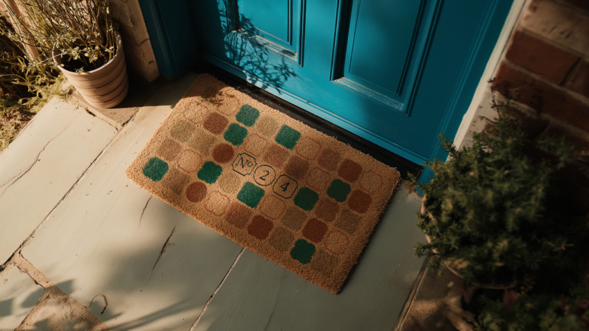
Number Twenty Four
Raising the status of a modern property agency to increase sales of luxury period property.
Bringing classic homes beautifully up to date, Brighton-based start up Number Twenty Four specialise in buying and selling homes with period features. We crafted an enticing brand and website that positions the start up as an efficient estate agency, composing service and character to exchange luxury homes across the UK’s seaside Regency city.

Mr and Mrs Clarke
Designing a discerningly different estate agency brand for acquisition by a leading UK Group.
Disillusioned with the traditional estate agency model and the way the property industry treats house buyers, husband and wife Paul and Alex Clarke, had a vision for a different way to connect with homeowners, because buying and selling a home is so much more than a chain transaction. Although they had the ambition and belief, they lacked the brand to change an industry. That’s where the UnitedUs investment arm, UnitedUs Heavy Industries, stepped in.
Want to build your brave brand with us?
