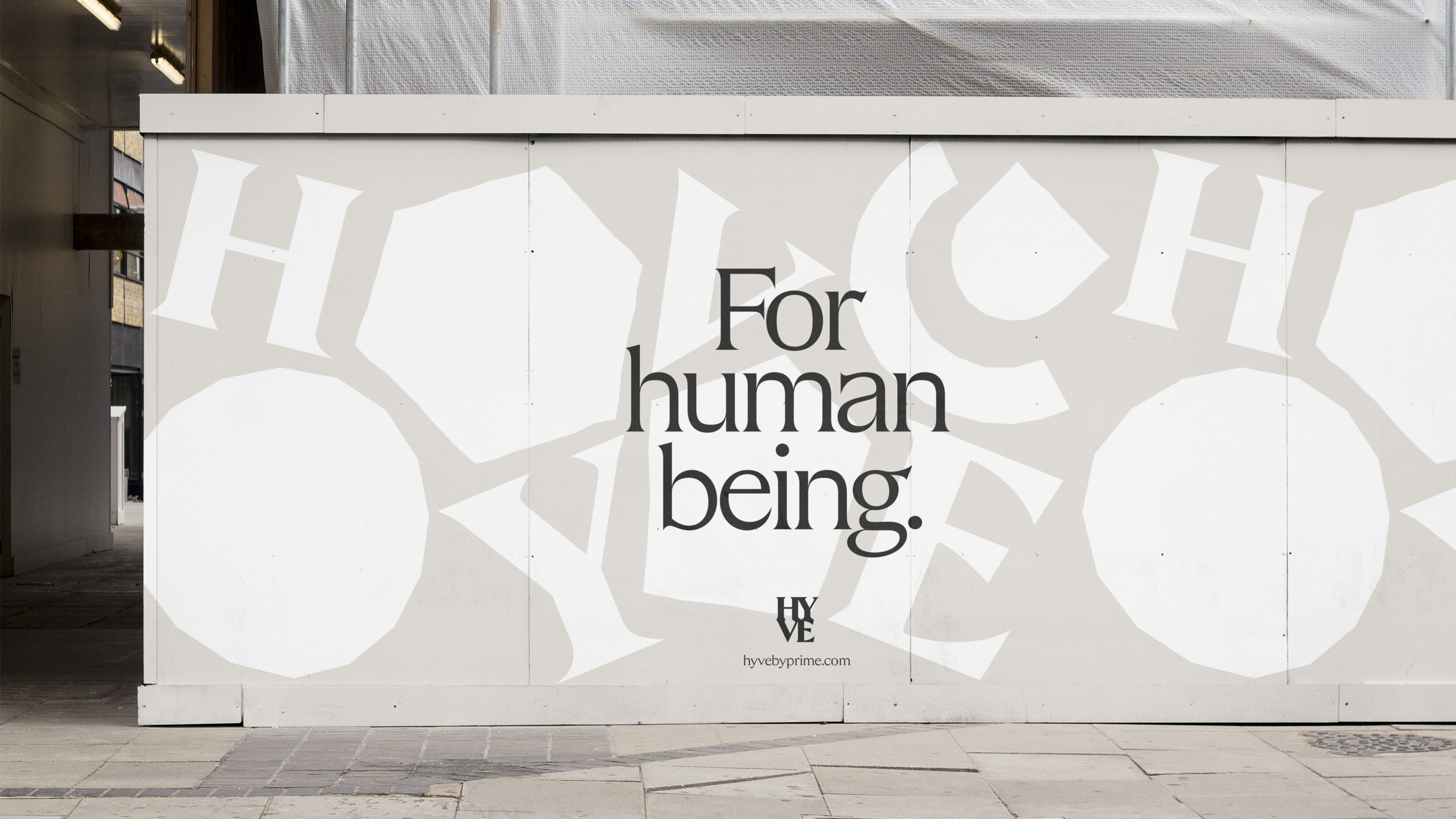
Hyve
Building a place brand for key workers and healthcare professionals to live well. We worked with leading UK health and care property developer, Prime, to imagine key worker housing that feels like home, waving goodbye to inadequate housing for healthcare professionals. Attracting the world’s best doctors, nurses and clinicians to work at your hospital while offering student-digs-style accommodation is the reality for most healthcare environments across the UK; but it doesn't have to be. With a new concept, brand and experiential identity that flows throughout each building, we're working with Prime to improve wellbeing. Welcome to Hyve, key worker accommodation that provides residents with a real sense of place and community.
Brand guidelines Brand strategy Copywriting UX Visual identity Web design Web development
Built environment Healthcare Professional services
UK
Having worked on the redevelopment of NHS estates across the country, Prime could see the challenges trusts are facing – struggling to attract and retain talent into our health service, and lacking the capital to affect much needed change to key worker accommodation. The team at Prime approached us with a clear solution: to build new housing that feels like home. They needed a creative thread to make this ambition a reality, someone to help give their buildings life and soul.
We knew the new place brand needed to attract people to living spaces that would become their home, for as long as they needed – whether that’s a six month placement or for a two year contract. We wanted to realise Prime’s value of creating enriching spaces with a focus on wellbeing, to deliver a high-level of credibility expected from anything associated with the leading property developers. So, we dived into the positioning work to communicate healthy living spaces in a place brand with a warm and welcoming personality.
With busy and challenging jobs working on the frontline of our health service, we wanted the brand to radiate wellbeing – restoring people’s reserves so they can keep doing what they do.
Through a virtual creative workshop, we worked closely with the Prime team to identify the motivations and pain points of the key audiences the brand needed to address. For residents, the accommodation needed to feel like it was part of a community, while still being enough of a blank-slate that it could really become their own version of home. Investors needed to better understand this niche market, while also getting a sense of social good that could place this product in their ESG investment portfolio. NHS trusts had to be assured that the housing would help to improve the wellbeing of staff – as a tool for attracting and retaining health and care workers.
Above all, these places needed to offer people the space to just be outside of work. Whatever home means for you, Hyve is the place where you can live it.

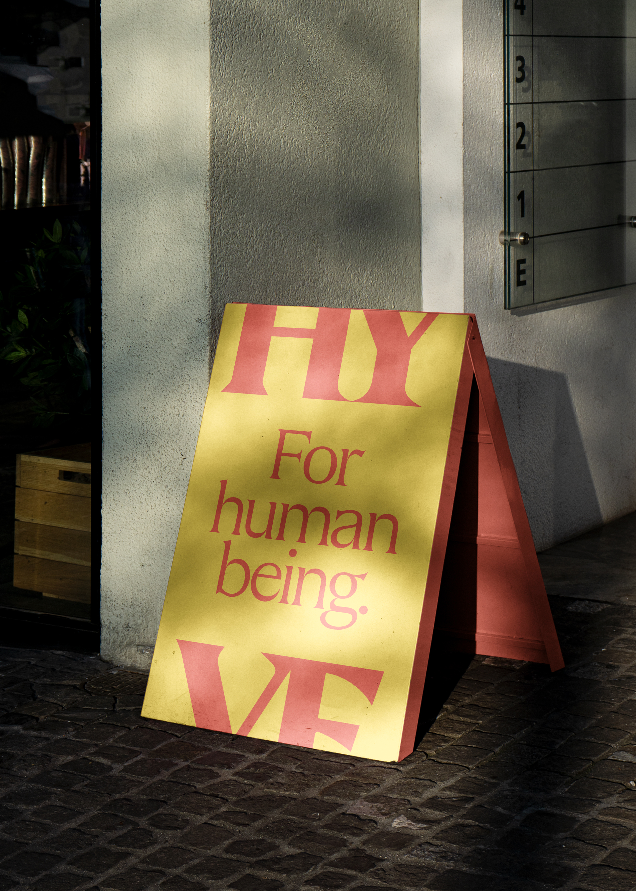
FOR HUMAN BEING.
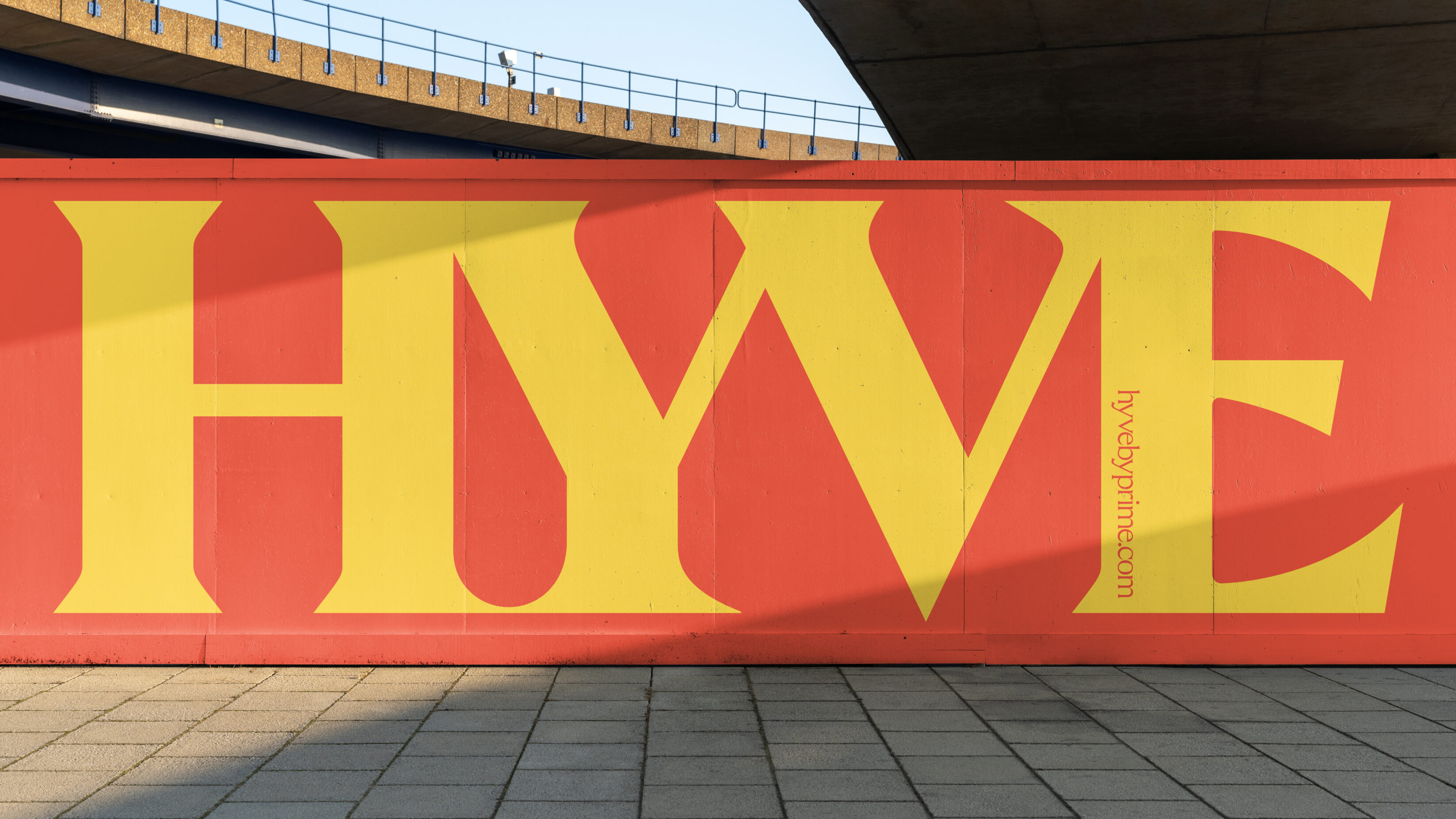
These spaces needed a name. One that would create a buzz and infer a sense of the space as home to a community. Using a portmanteau style, we combined three words to create the name. ‘Hive’ is the traditional home of bees, where the collective day-to-day efforts of valued individual workers leads to a supportive environment for all. ‘Haven’ is a place of shelter, safety and refuge. ‘Hyphen’, the mark of connection, brings these two places together.


We’ve had the pleasure of working with UnitedUs for five years on brand creation, thought leadership and marketing strategy. Our most recent project was on creating a brand for a new company, Hyve by Prime. The work involved coming up with the name, creating brand messaging and evolving the whole look and feel including the logo, colour scheme and typeface. I cannot speak highly enough about their professionalism, creativity and dedication to the project.
Leighton Chumbley

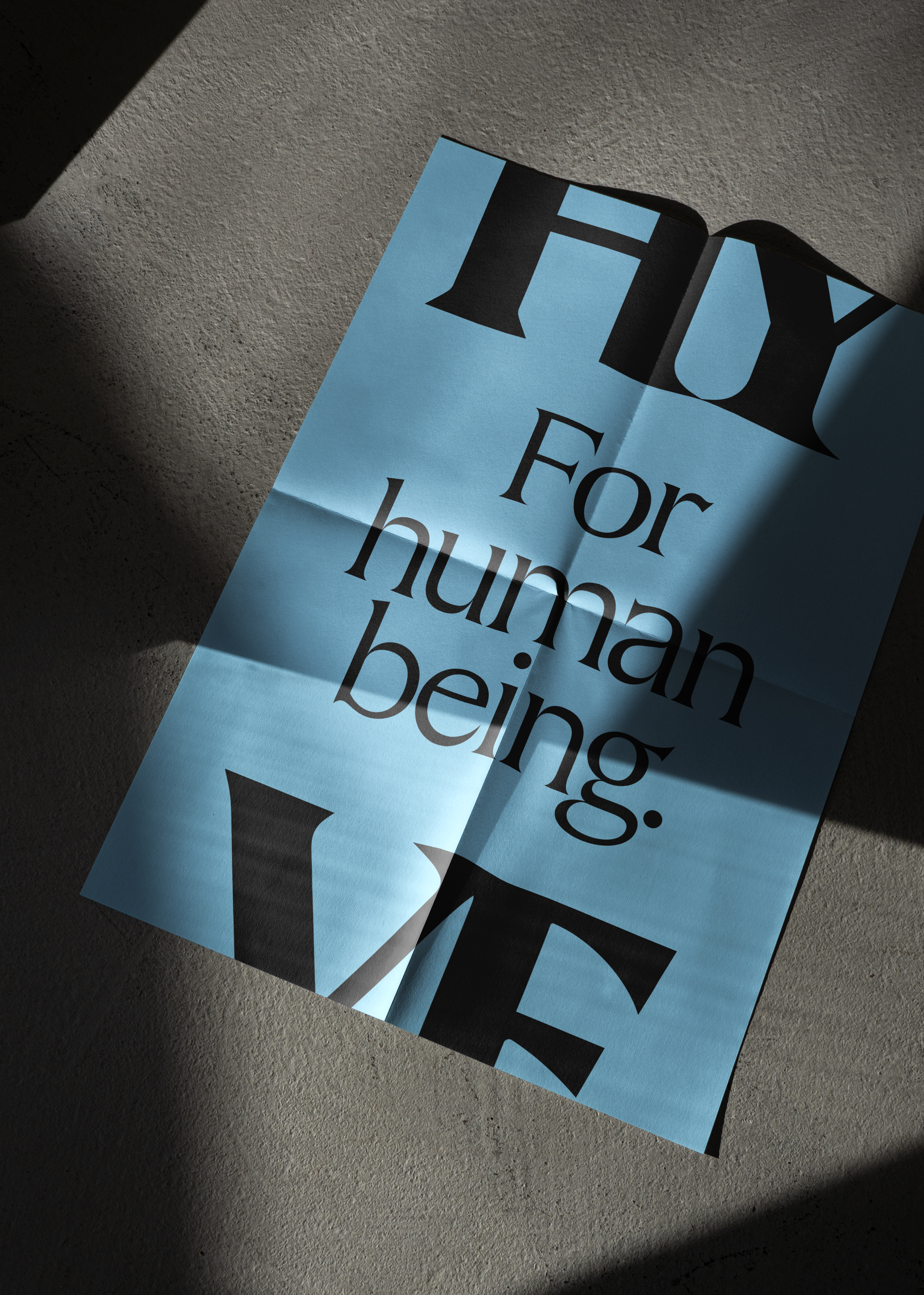
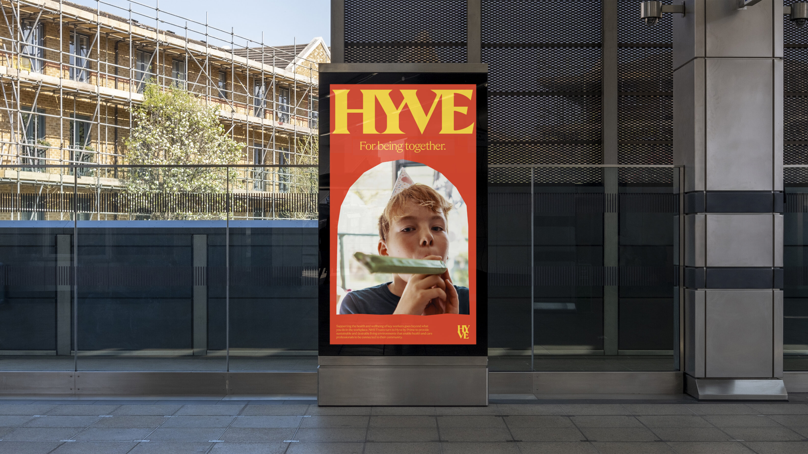
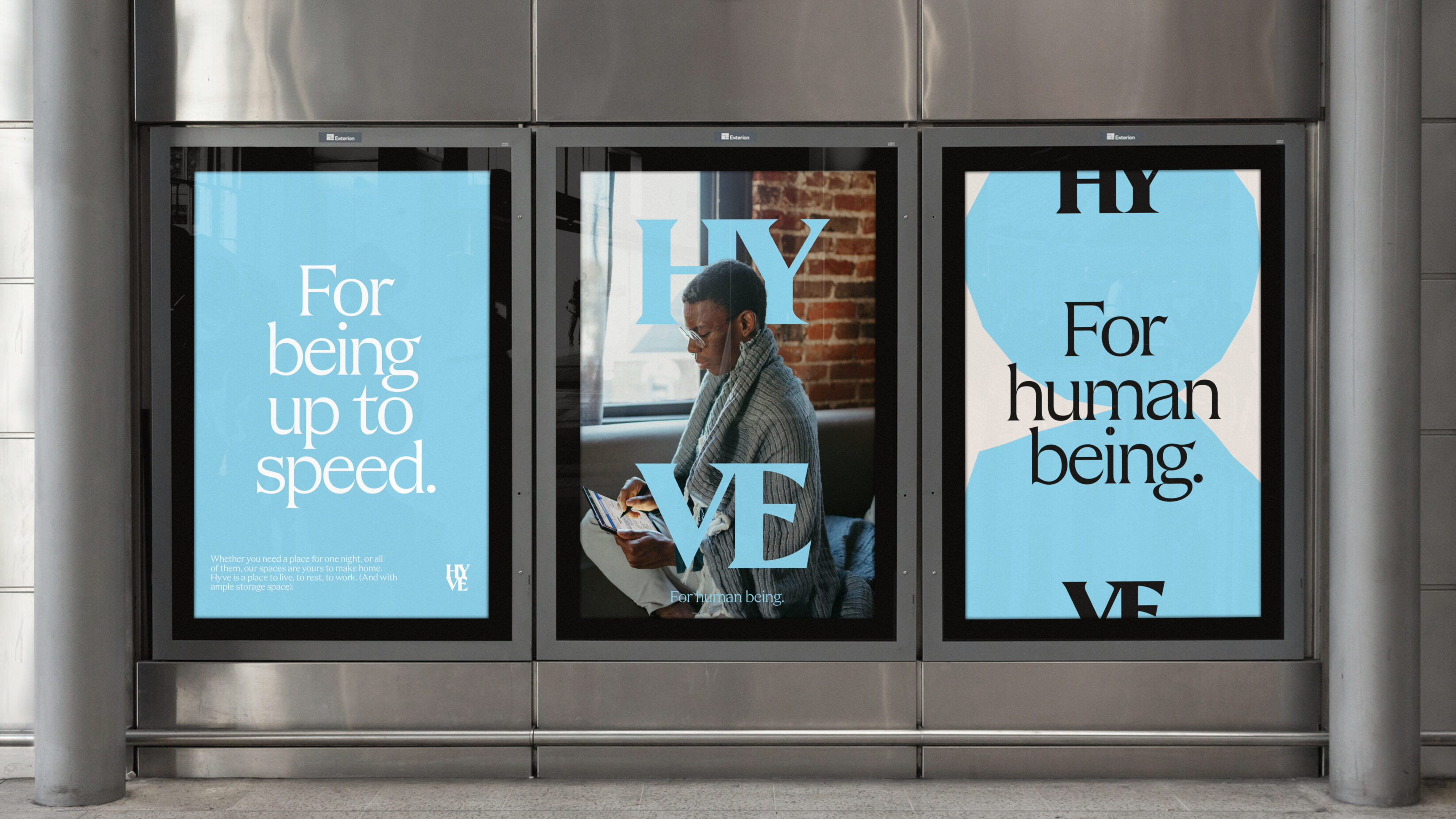
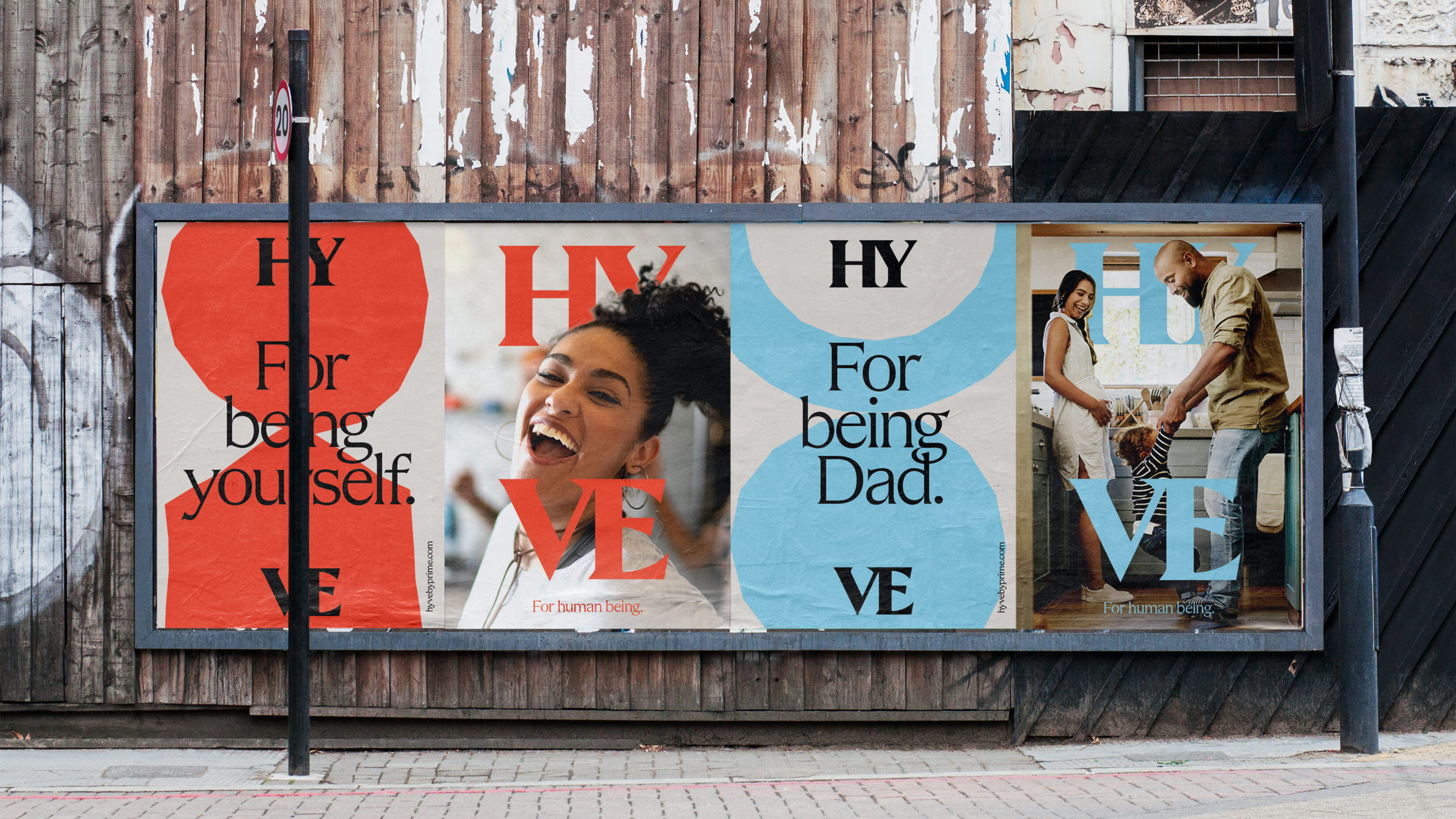
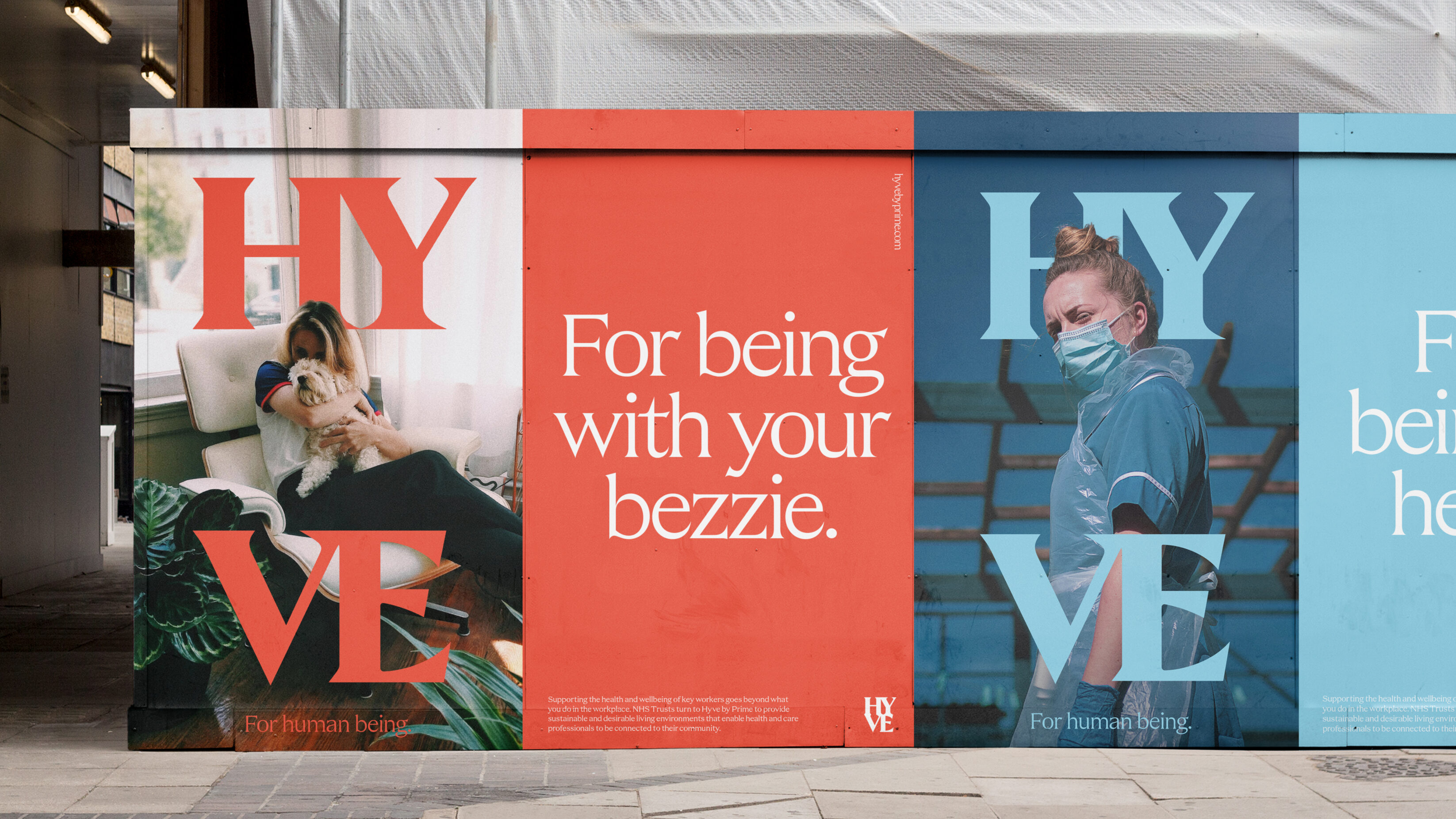
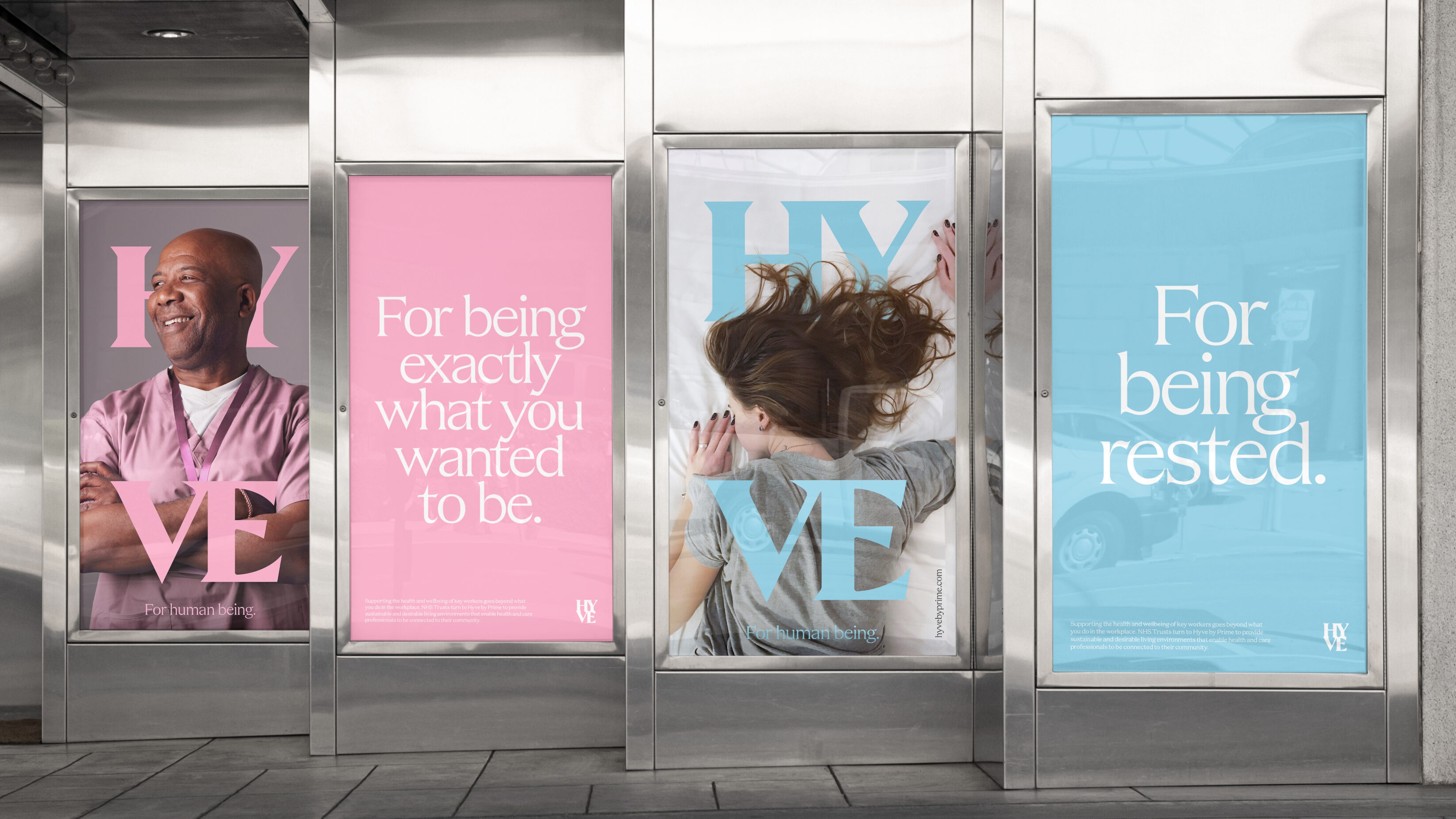
Utilising the Hyve logo as a graphic device that’s inclusive of the people that would dwell in the space, we split the wordmark as a framing device between featured images – literally putting people in the picture and making them feel like they can belong at Hyve.
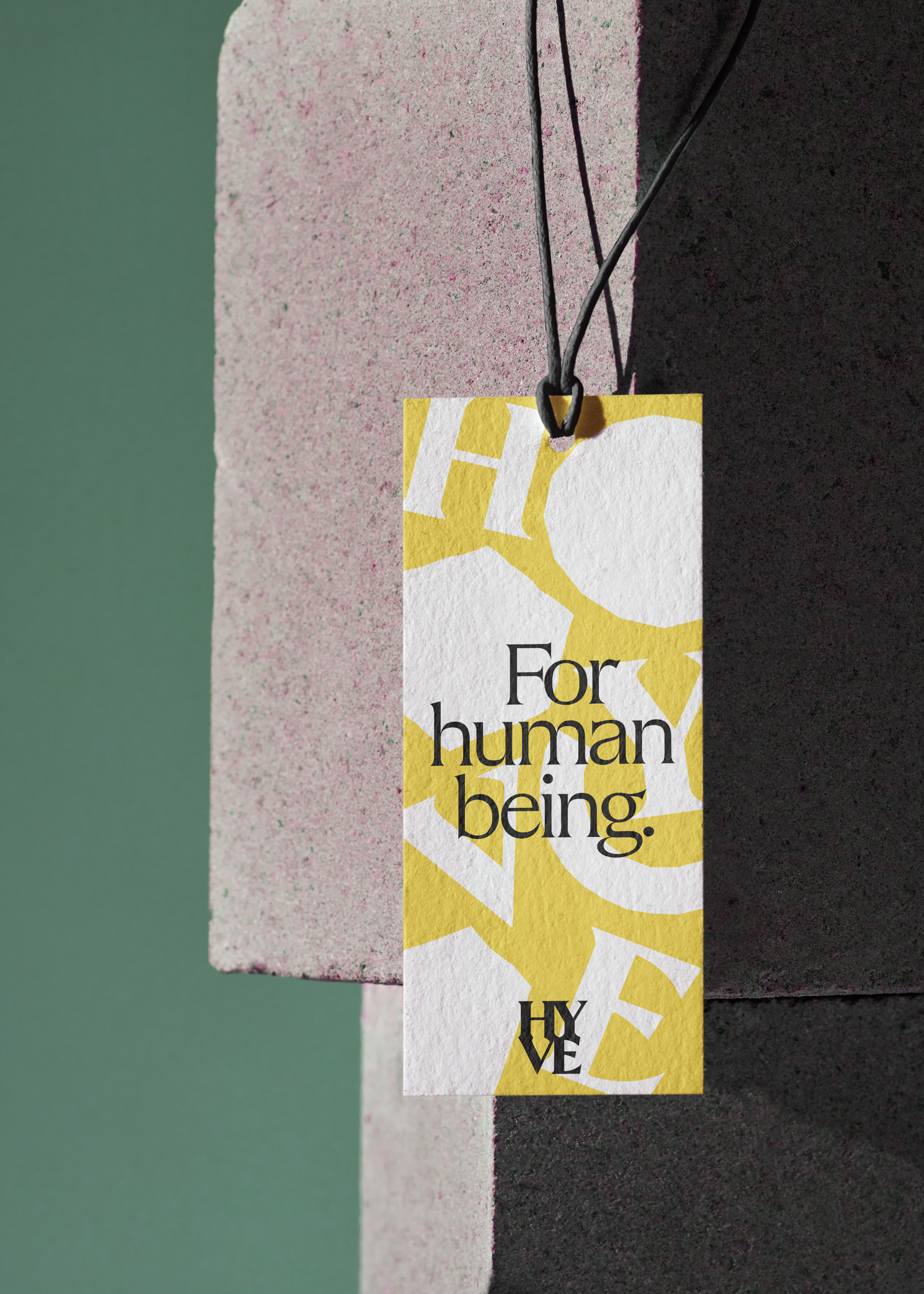
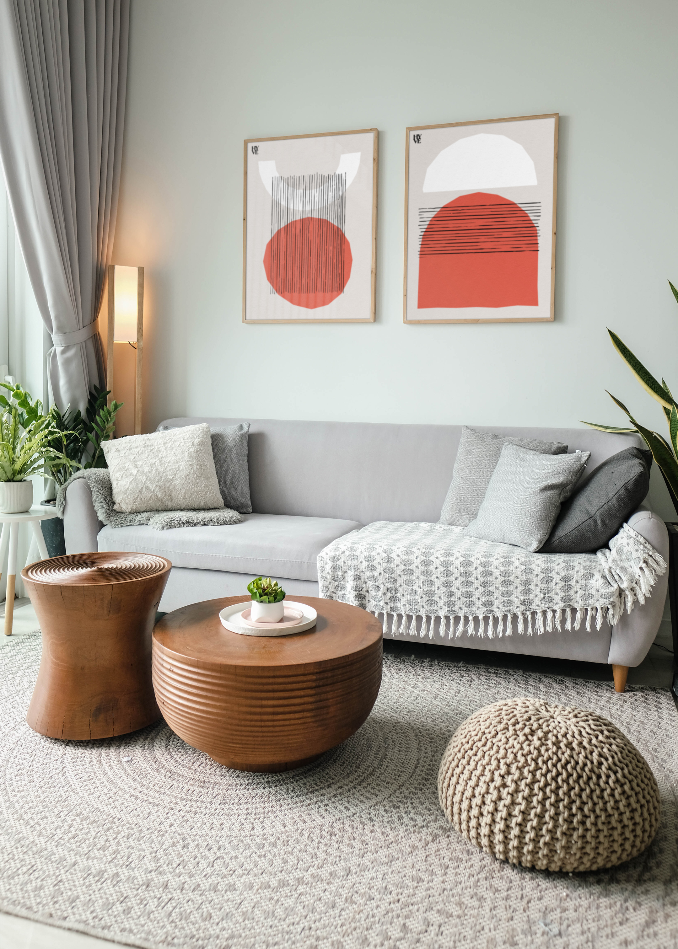
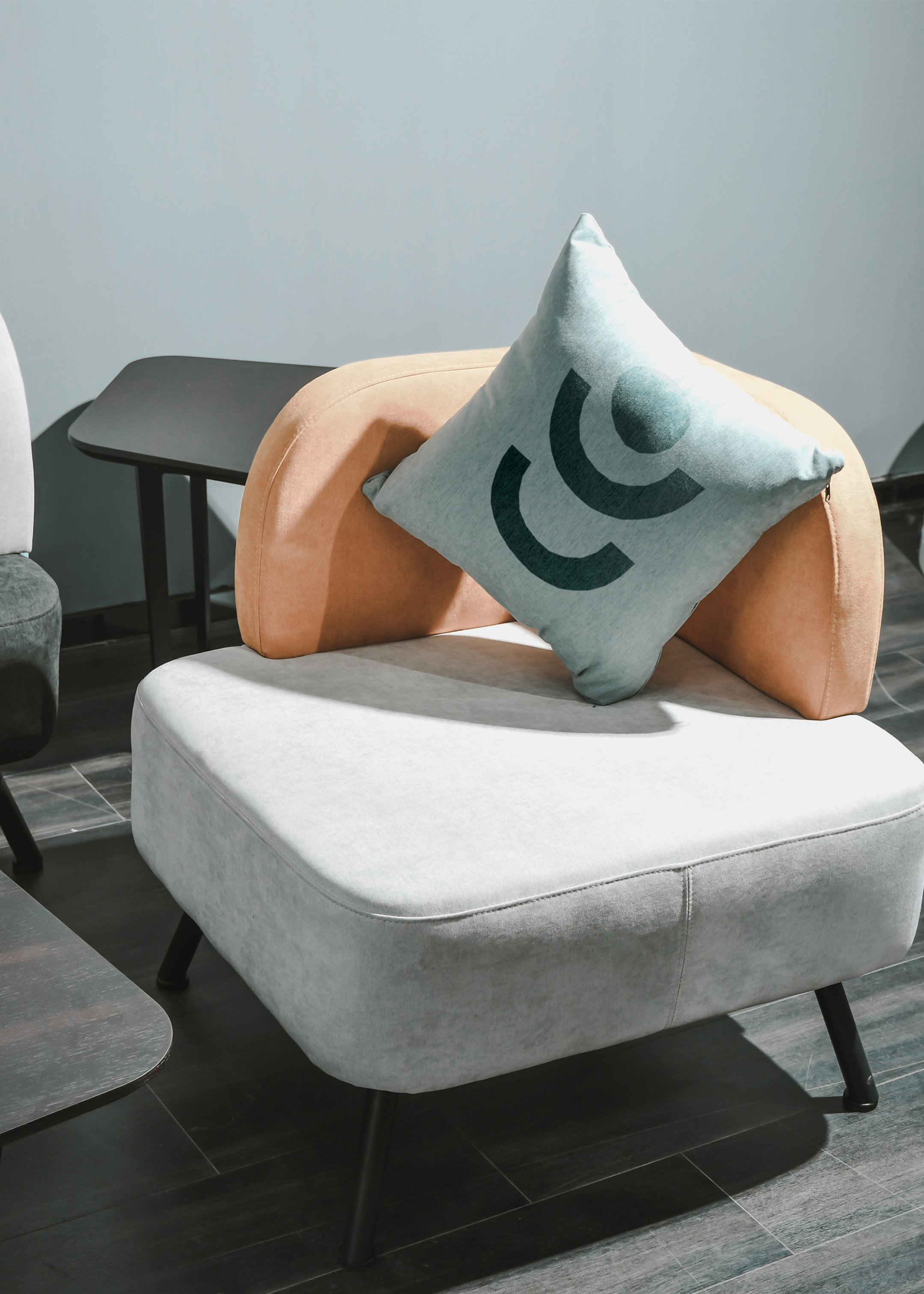
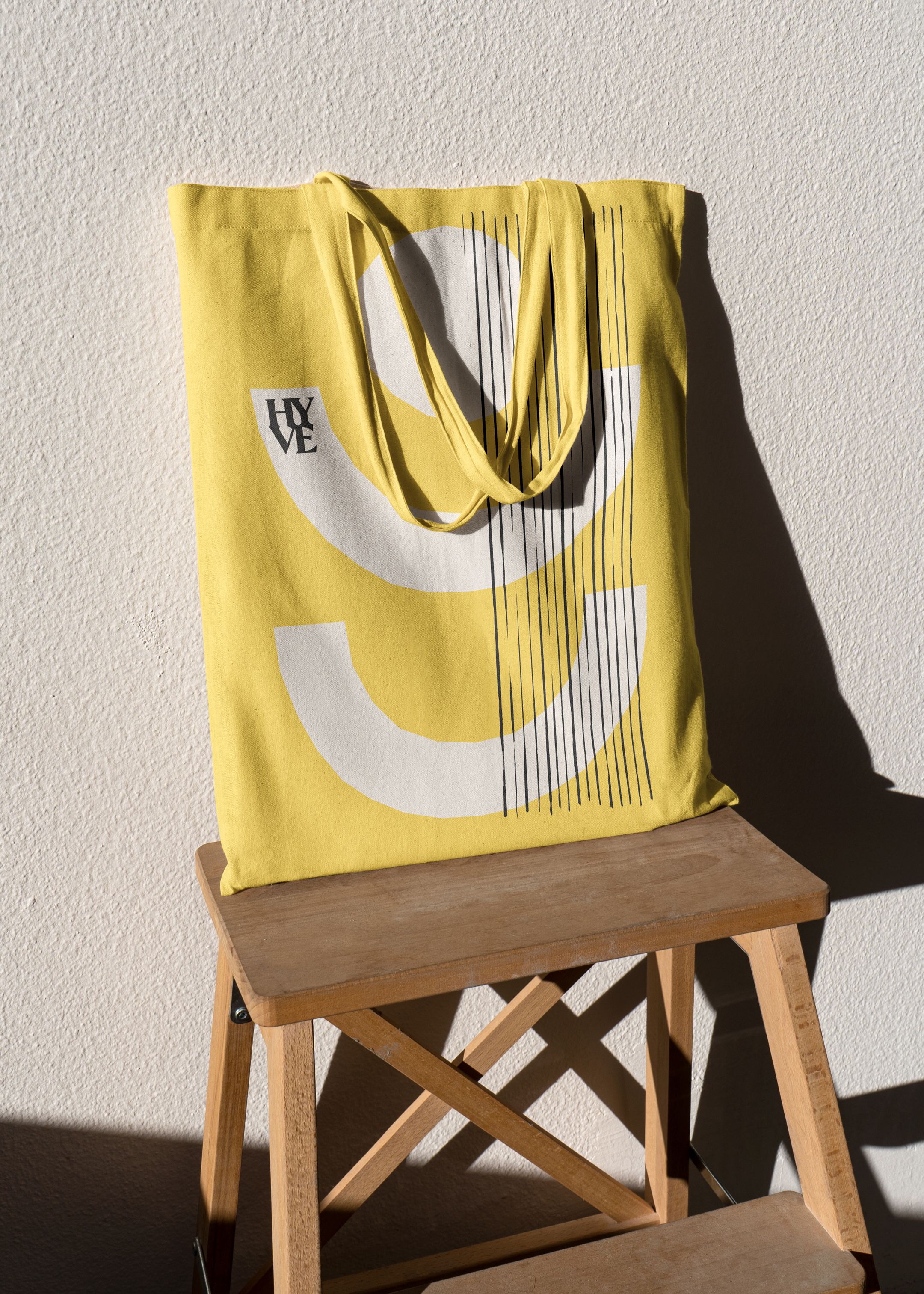
Building the place brand, designing not just for screen but for physical space, we developed a suite of shapes to punctuate brand communications and decorate physical spaces. To make the Hyve property developments feel like home we included domestic finishing touches, such as designing branded scatter cushions, framed Hyve imagery and the ever-welcoming ‘Step into Hyve’ doormat. We also developed concepts for reclaimed wooden wayfinding, sustainably-sourced key fobs and a bespoke eco-friendly beehive.
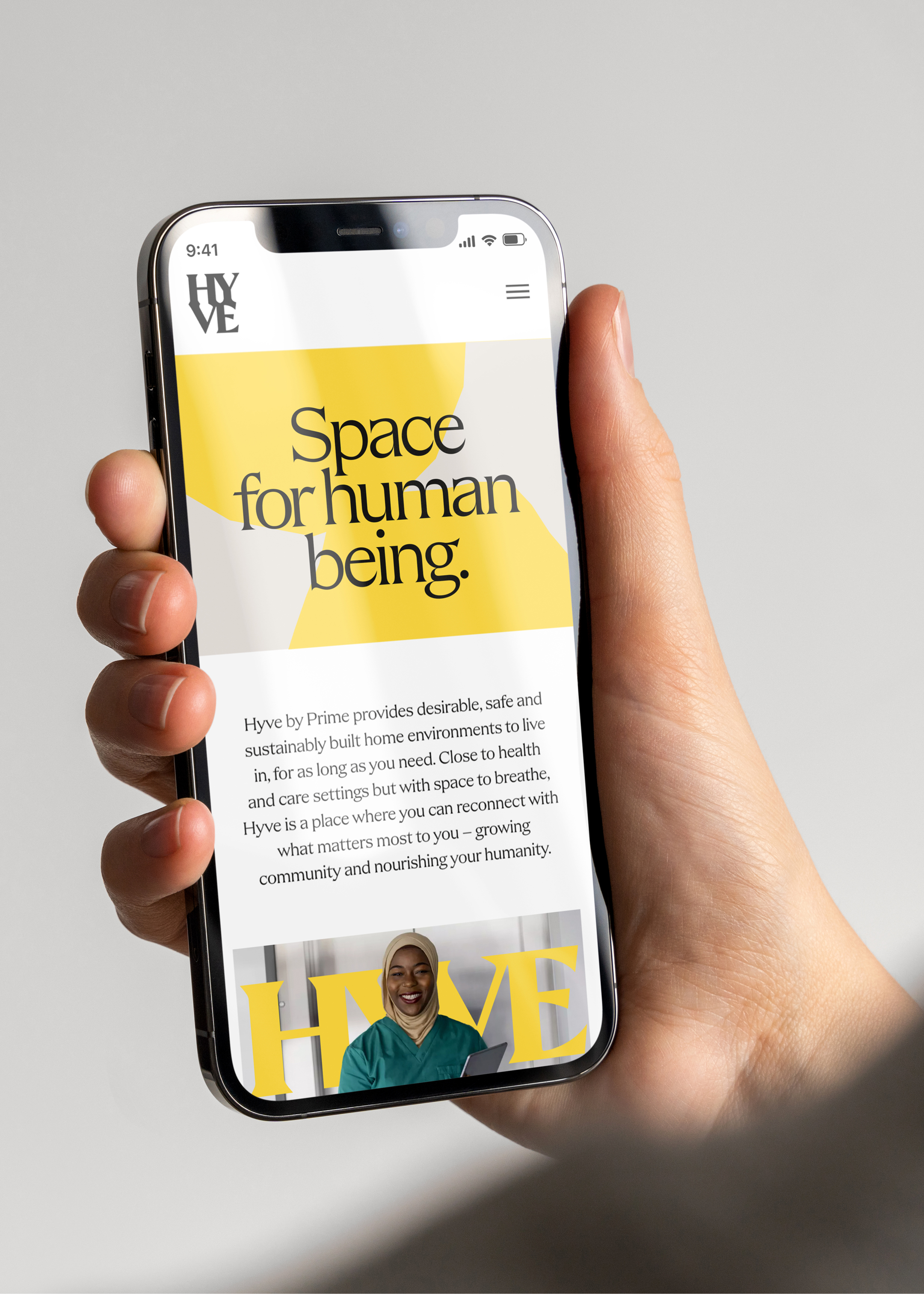
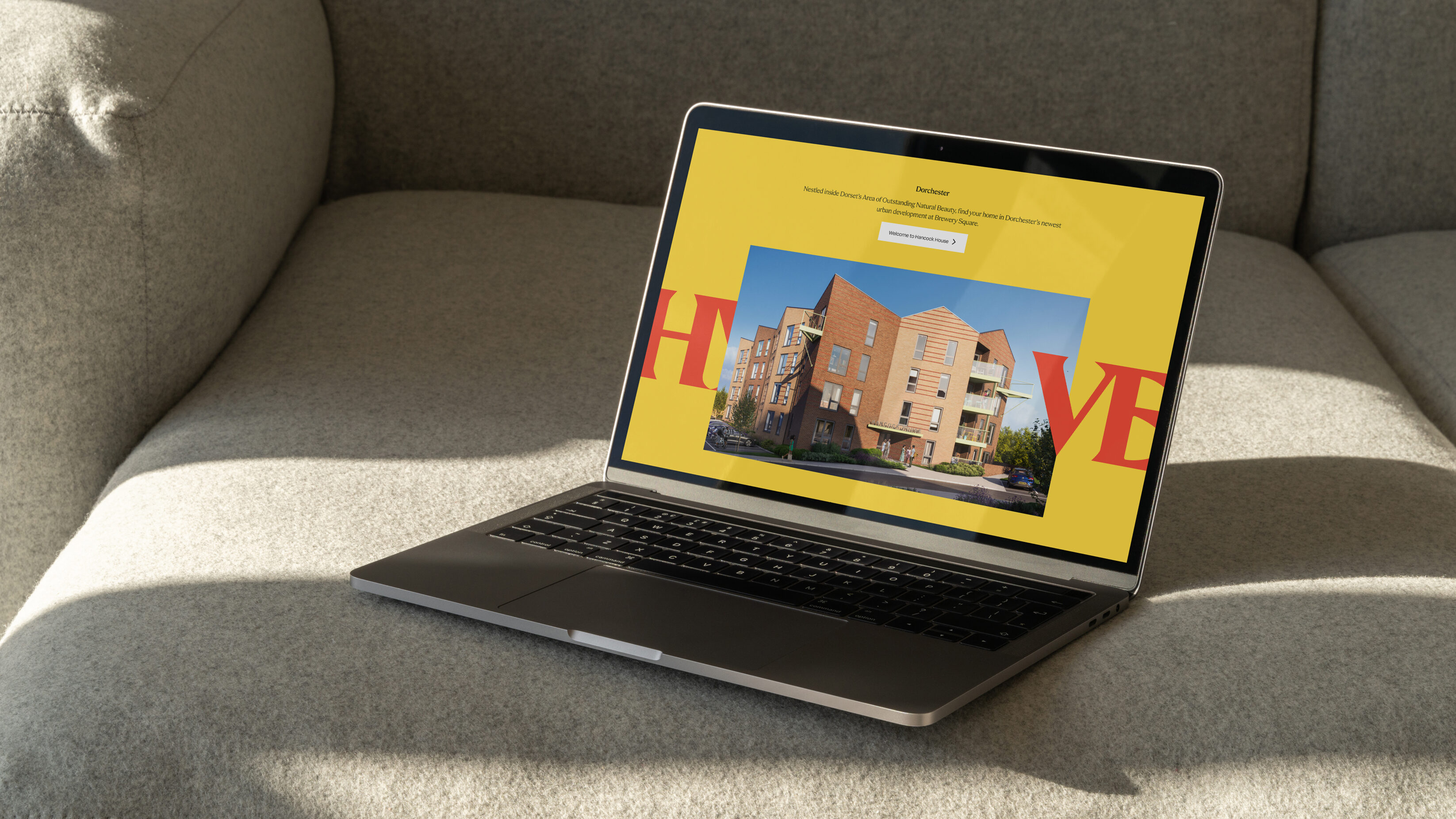
In the digital environment, we developed a website that enabled people to understand the initial look and feel of Hyve. Through a solid messaging framework, we were able to provide key information to residents, NHS trusts and investors. Under one unified brand message we enabled users to navigate to the value propositions and destinations they needed, with strategic UX/UI design and a colour differentiation to help steer journeys.


From the beginning, UnitedUs took the time to understand the new product offering and brand objectives. They worked hard to ensure that every aspect of the brand reflected our vision, mission and values. They were available to answer our questions, listen to our feedback and incorporate our suggestions into the final product.
Laura Pocknell

Throughout the process, UnitedUs demonstrated a deep understanding of branding and marketing, and they brought fresh, innovative ideas to the table that truly set our brand apart. Their design work was excellent, and they created a brand identity that we are truly proud of.
Nici Stride

Our work turned Prime’s business plan into an enticing idea their audience can begin to imagine. It gave them an identity they could pitch to investors with confidence; one that compels NHS trusts and their staff alike. We’re already seeing the first Hyve physical space come to life, and we can’t wait to continue our work with Prime as more emerge across the country.


Related projects
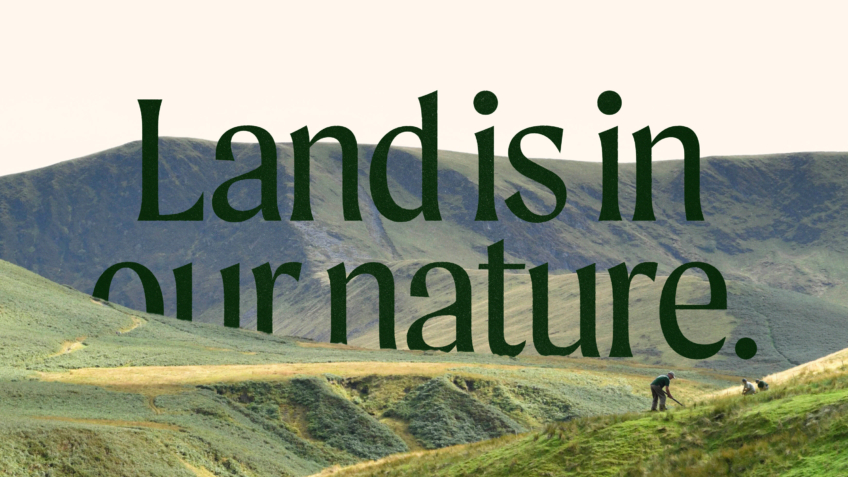
The Ernest Cook Trust
Telling the story of a brand new strategic direction, rooted in the land.
UnitedUs met the Ernest Cook Trust at a time when the organisation's brand and strategy were both in need of a fresh perspective. Working alongside the charity's strategy development, we cultivated a new brand positioning that was both rooted in the charity's enduring heritage and brought new life to its emerging strategy.
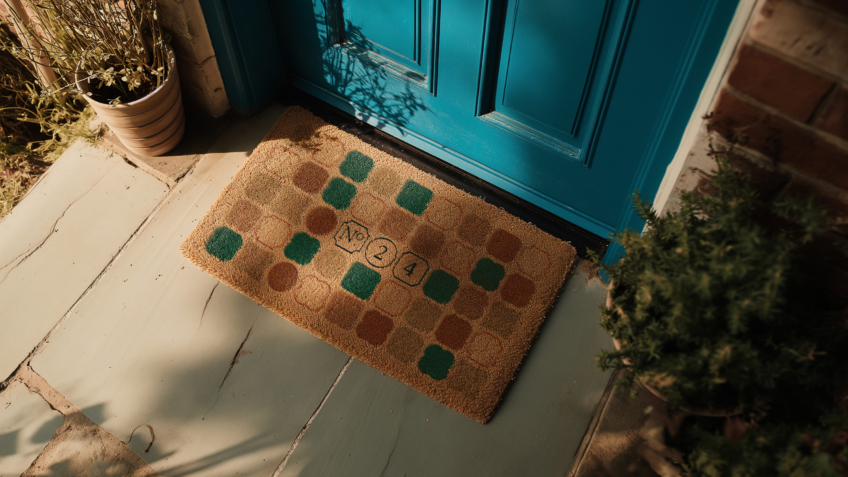
Number Twenty Four
Raising the status of a modern property agency to increase sales of luxury period property.
Bringing classic homes beautifully up to date, Brighton-based start up Number Twenty Four specialise in buying and selling homes with period features. We crafted an enticing brand and website that positions the start up as an efficient estate agency, composing service and character to exchange luxury homes across the UK’s seaside Regency city.
Want to build your brave brand with us?