
Loft
Uniting a new team and elevating next-level product design for an innovative American agency. A decade into their journey as a product design agency, Loft had gathered a wealth of experience under their wings, working with major players in consumer tech and developing forward-thinking product ideas for start-ups. But after a recent shift at the top of their shop, we helped them take their brand identity to new heights, uniting their American team around a brand that better represented their technical yet creative approach to next level design.
Brand guidelines Copywriting Digital design Illustration Tone of voice Visual identity
Technology
Accomplished at providing innovative product design solutions across industries, Loft were looking for the next step to get their image to the level they play at. We defined a visual identity that represented the energy, personality and creativity of their streamlined team, without a comprehensive verbal identity suite or strategic phase of work. In line with the challenging problems Loft solves through creativity, we set ourselves the task of understanding who Loft really is, solely through design.
With a brand name born from the team’s high-rise studio space, we metaphorically took an elevator to the highest floor, stepping into Loft and opening the hatch to a ‘sky’s the limit’ way of thinking. We took this mindset into a collaborative creative workshop held remotely with the team across the pond, enabling us to uncover what it feels like to work at Loft and the team’s motivations to show that by working with them, the only way is up for their clients.
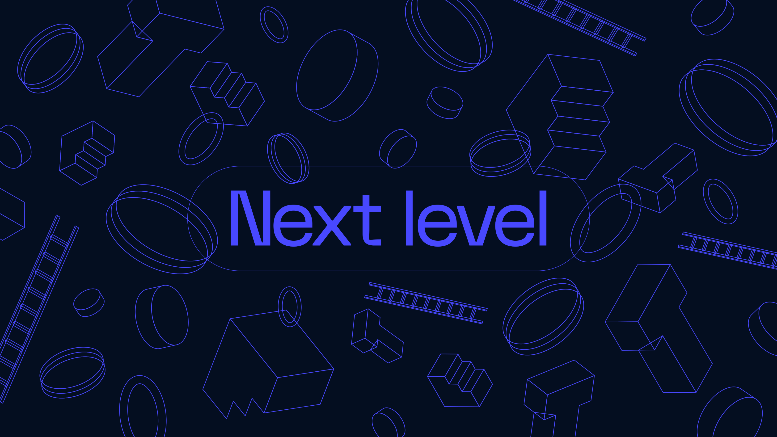
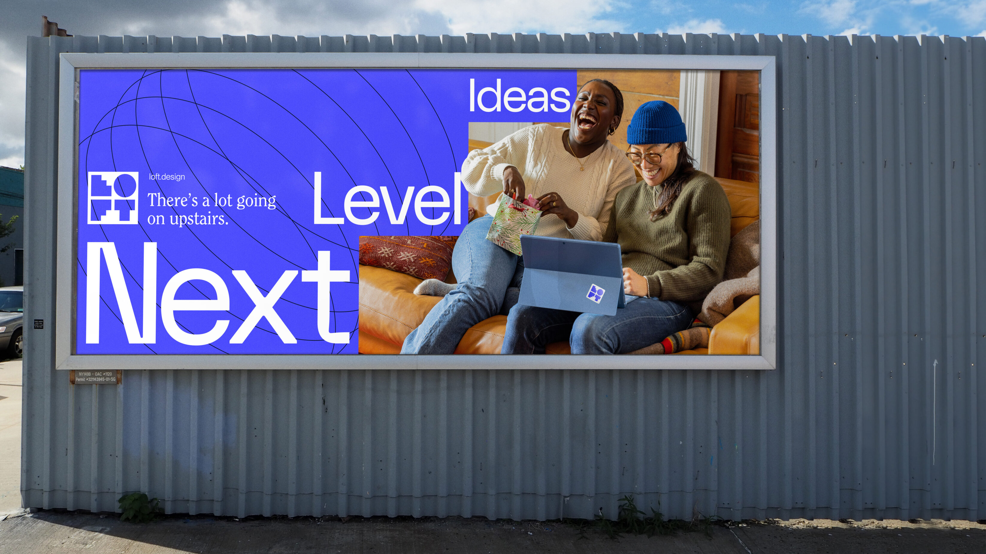
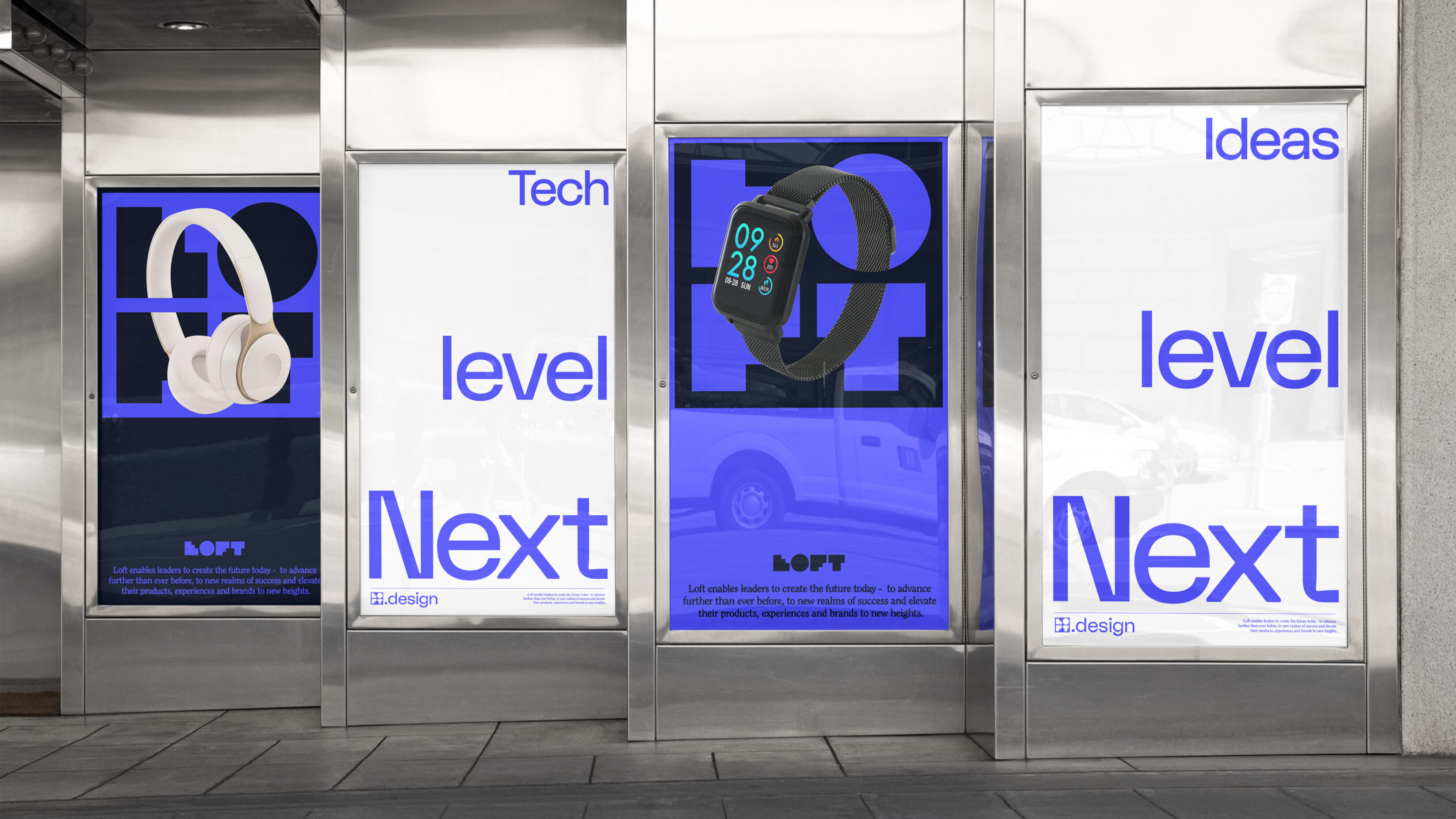
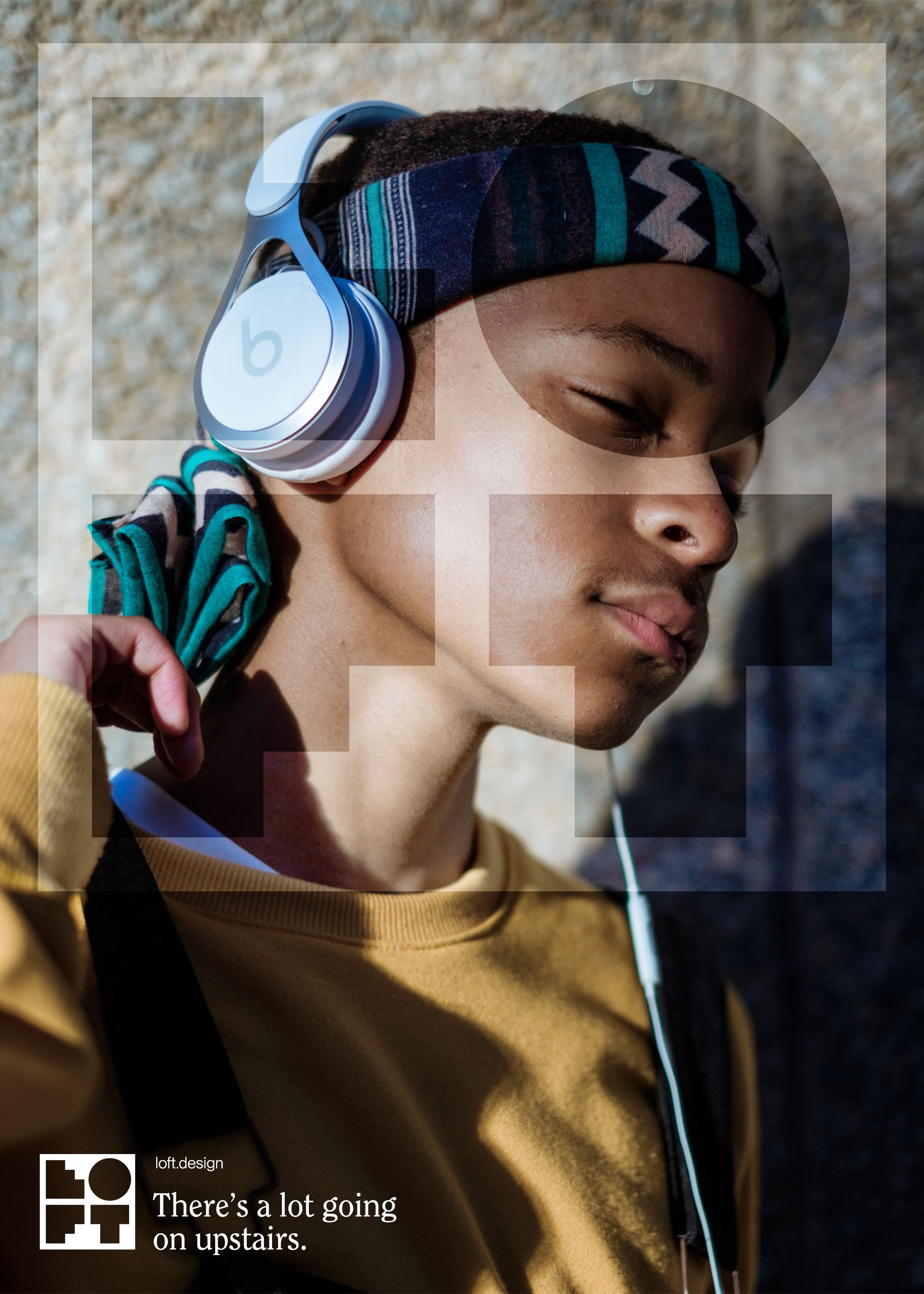
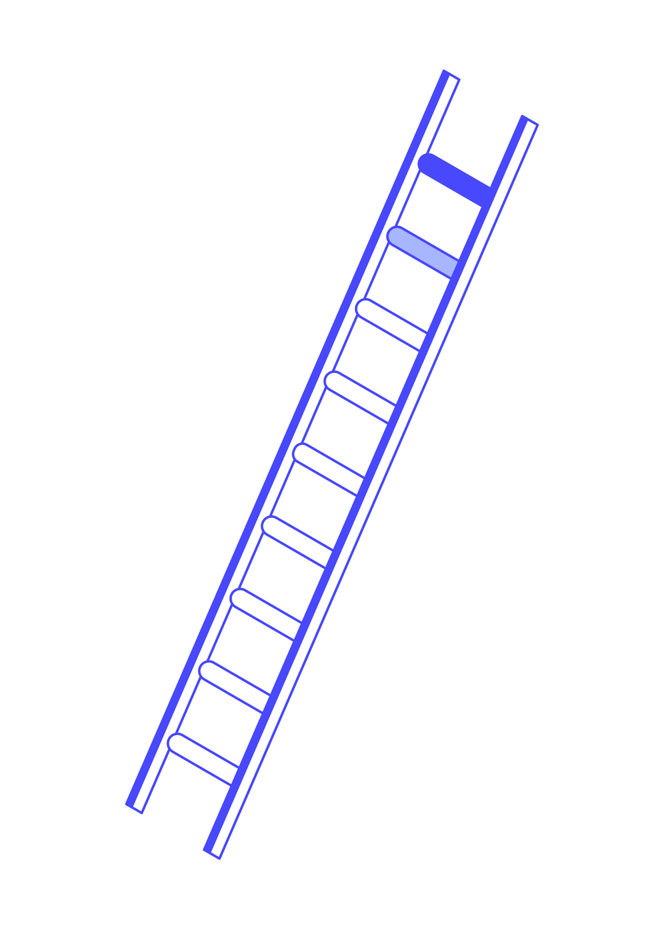
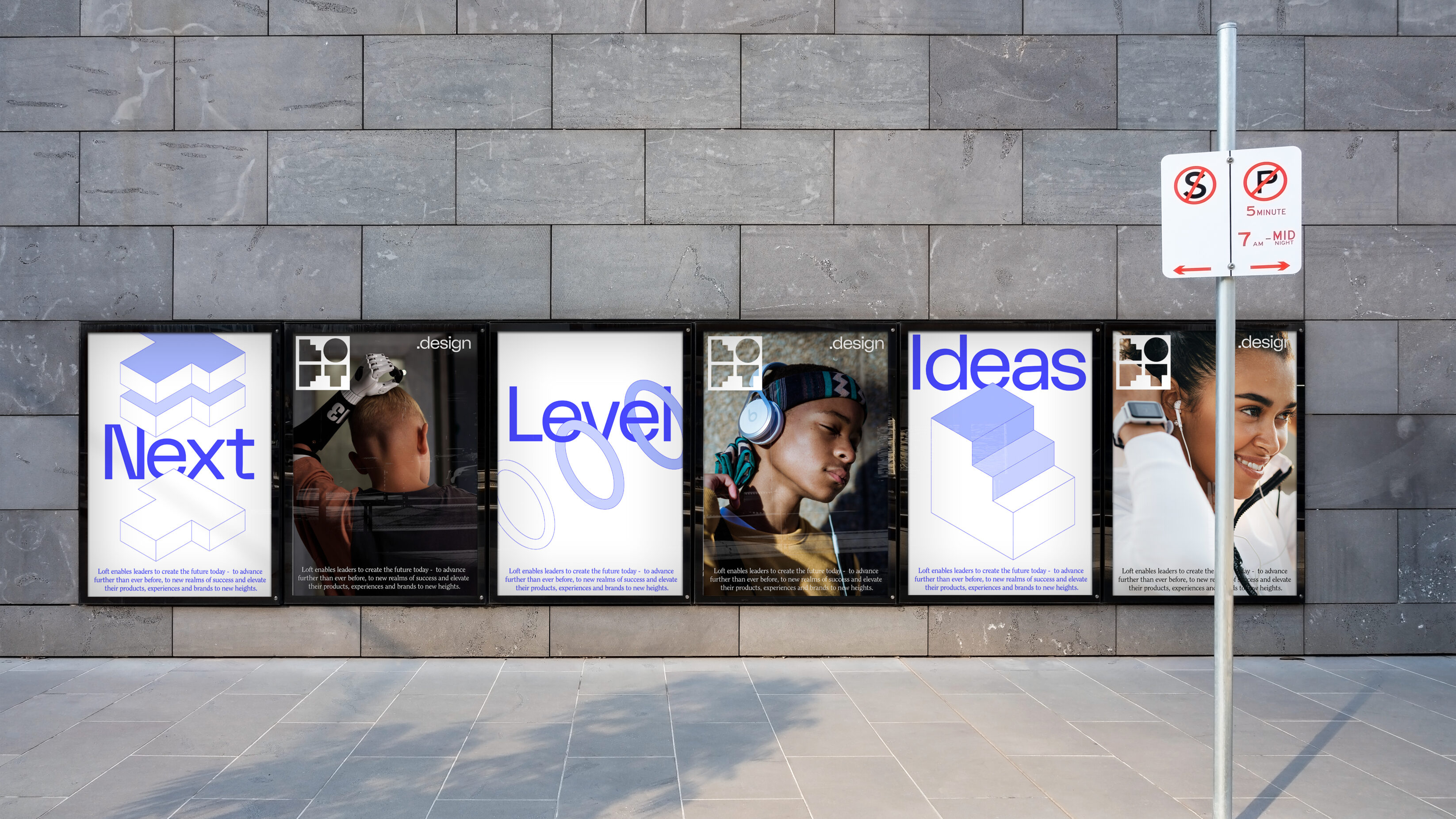
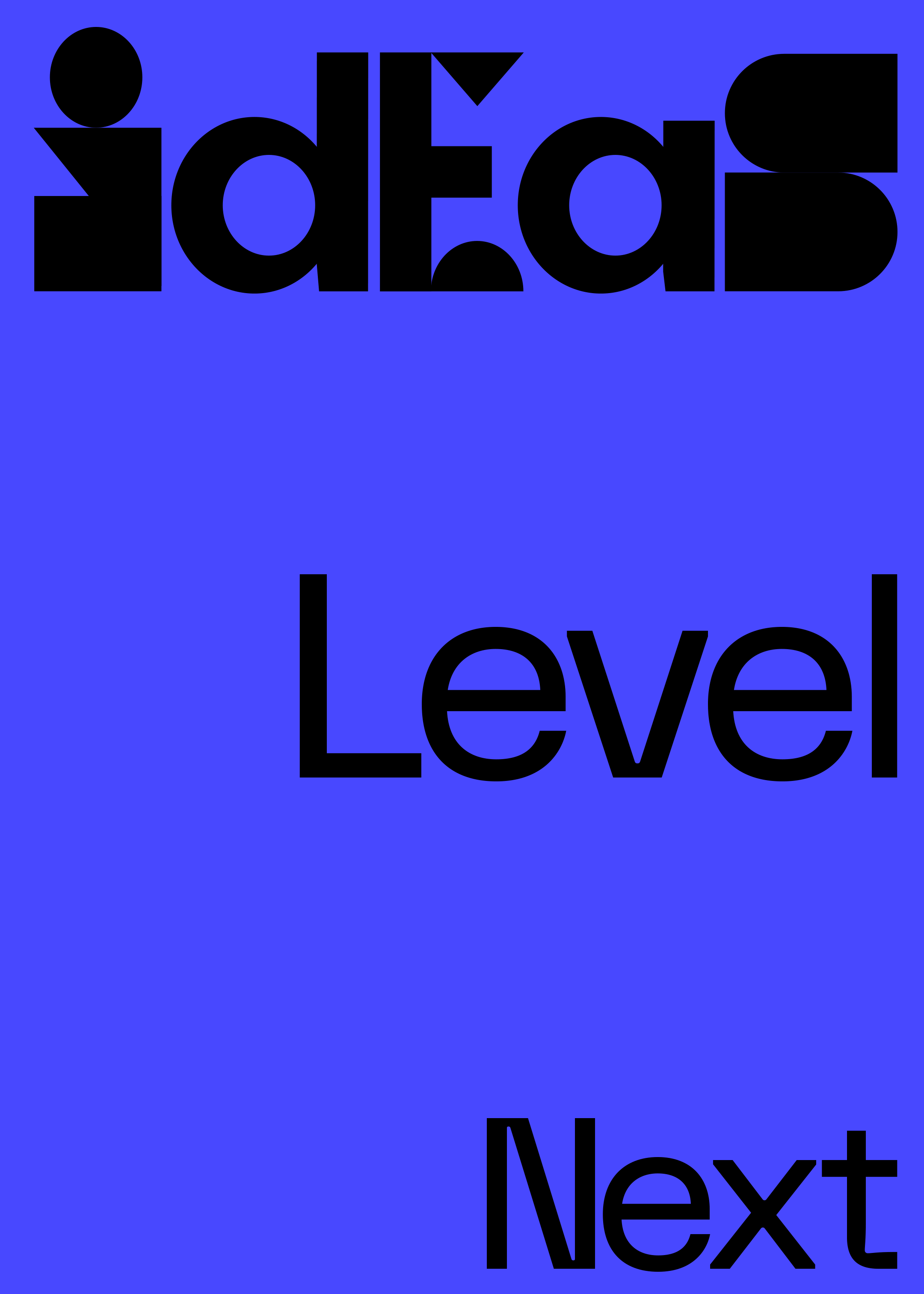
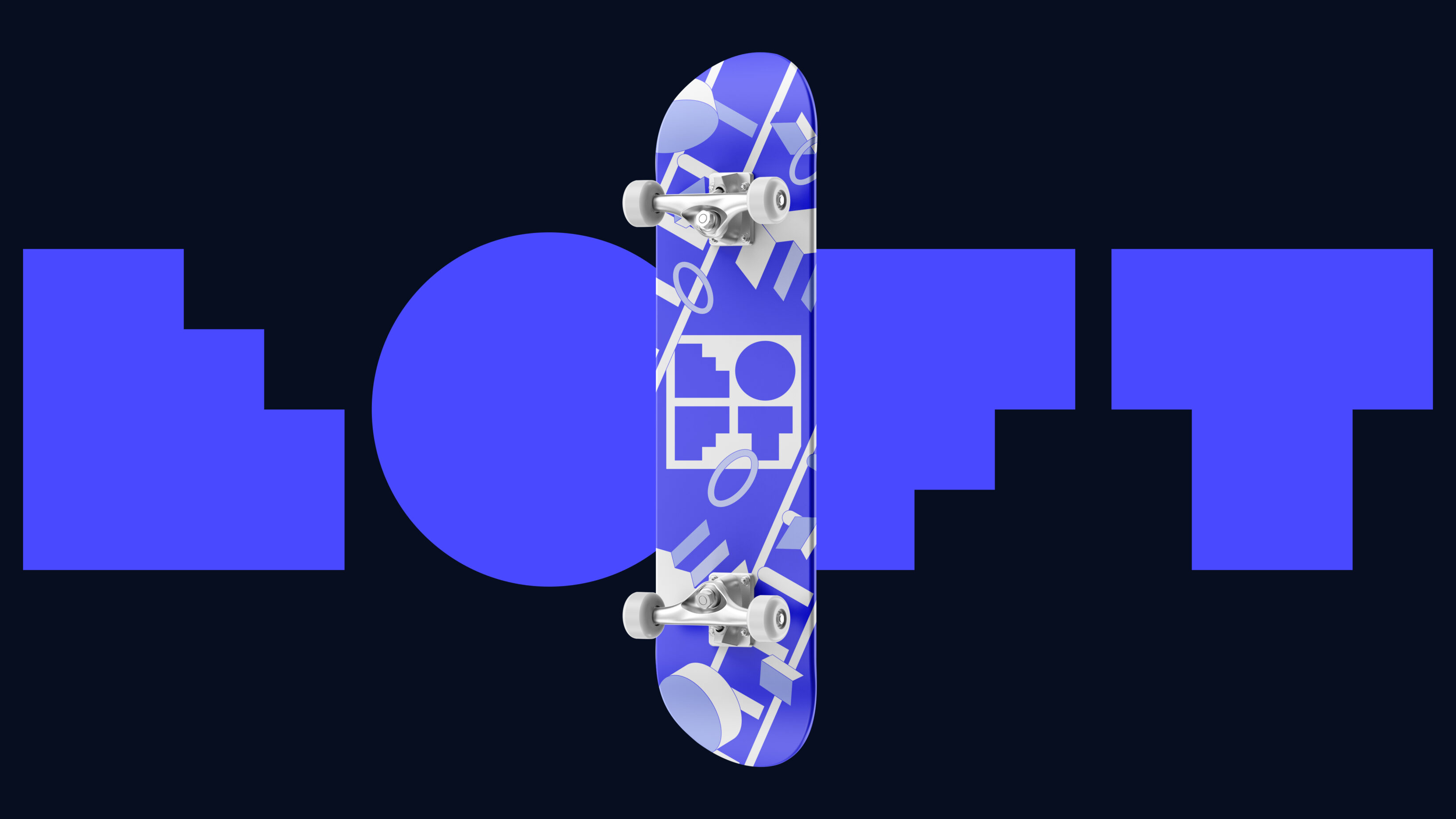
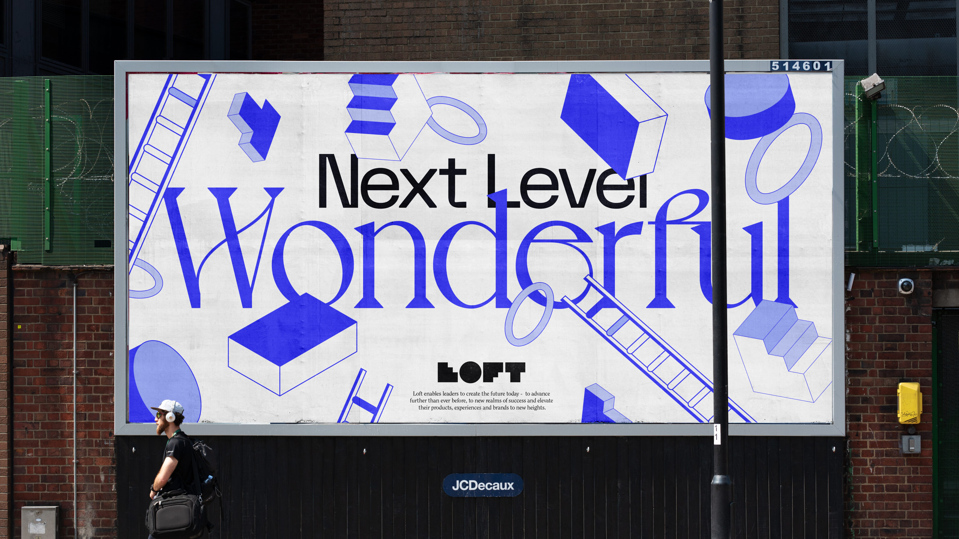
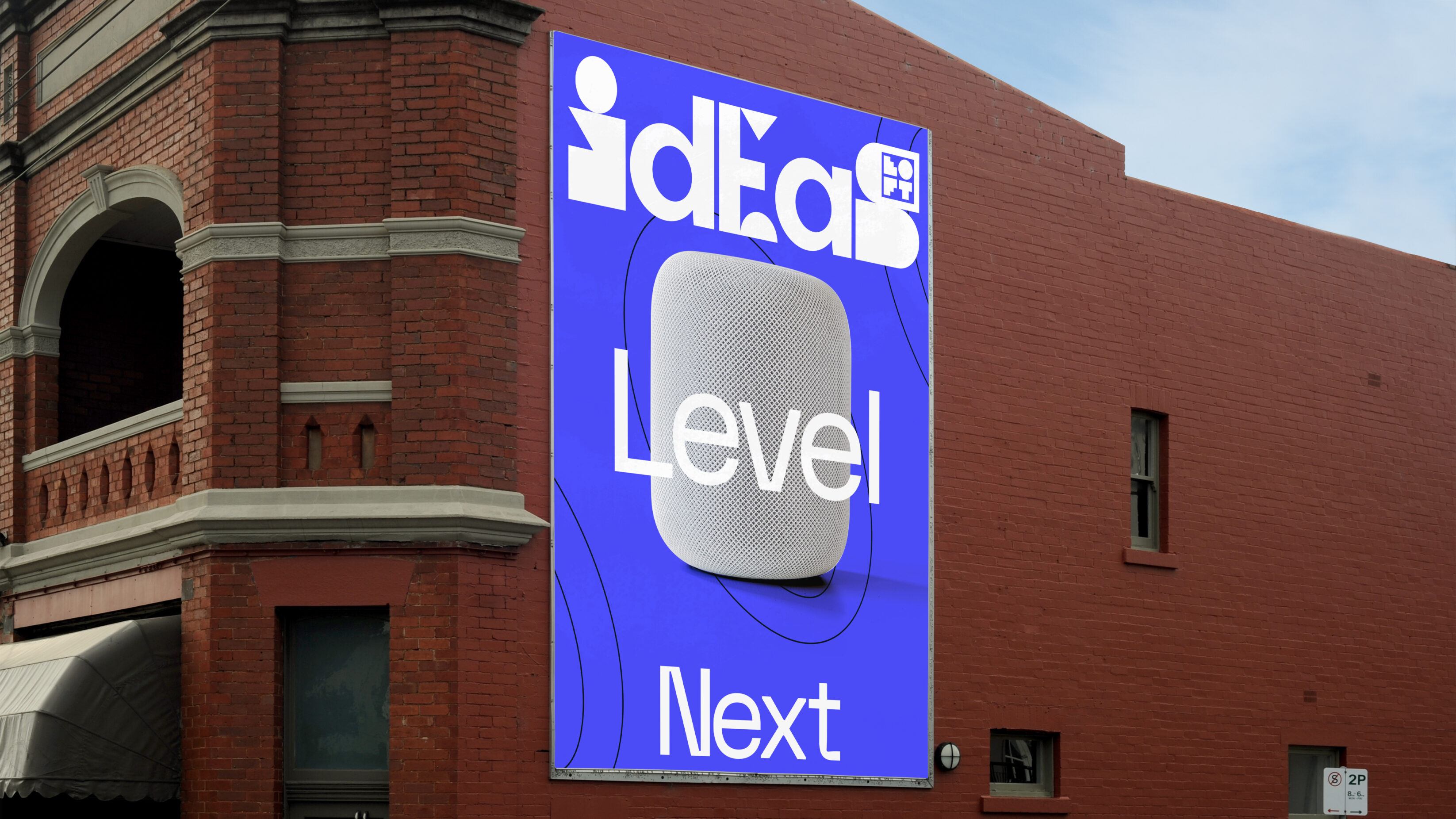
As a destination for next level products and ideas – ‘Next Level Design’ naturally became our creative hook to elevate the Loft brand identity. Imagining what this felt like in terms of visual identity and brand campaigns, we mapped out a logo that incorporated a simple way for people to reach new heights – we built the Loft logo using steps.
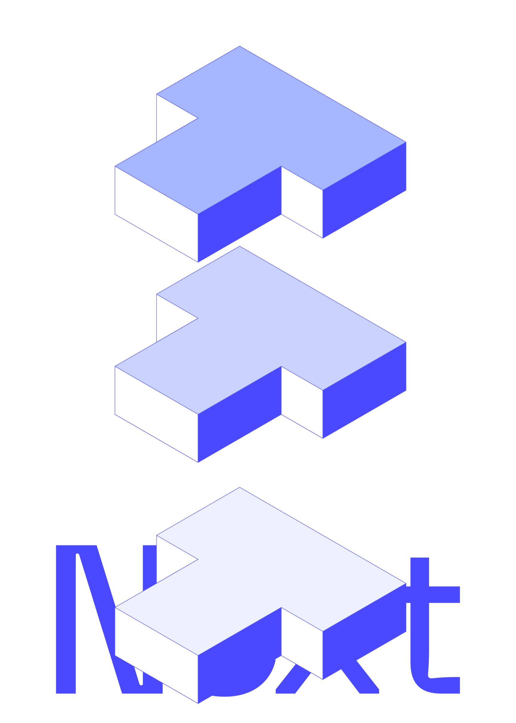
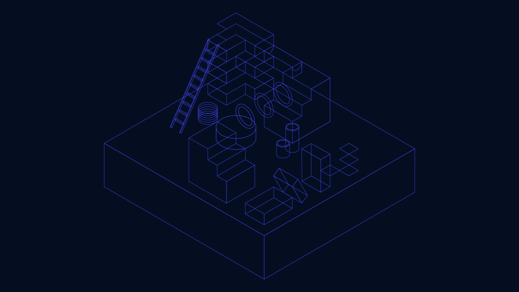
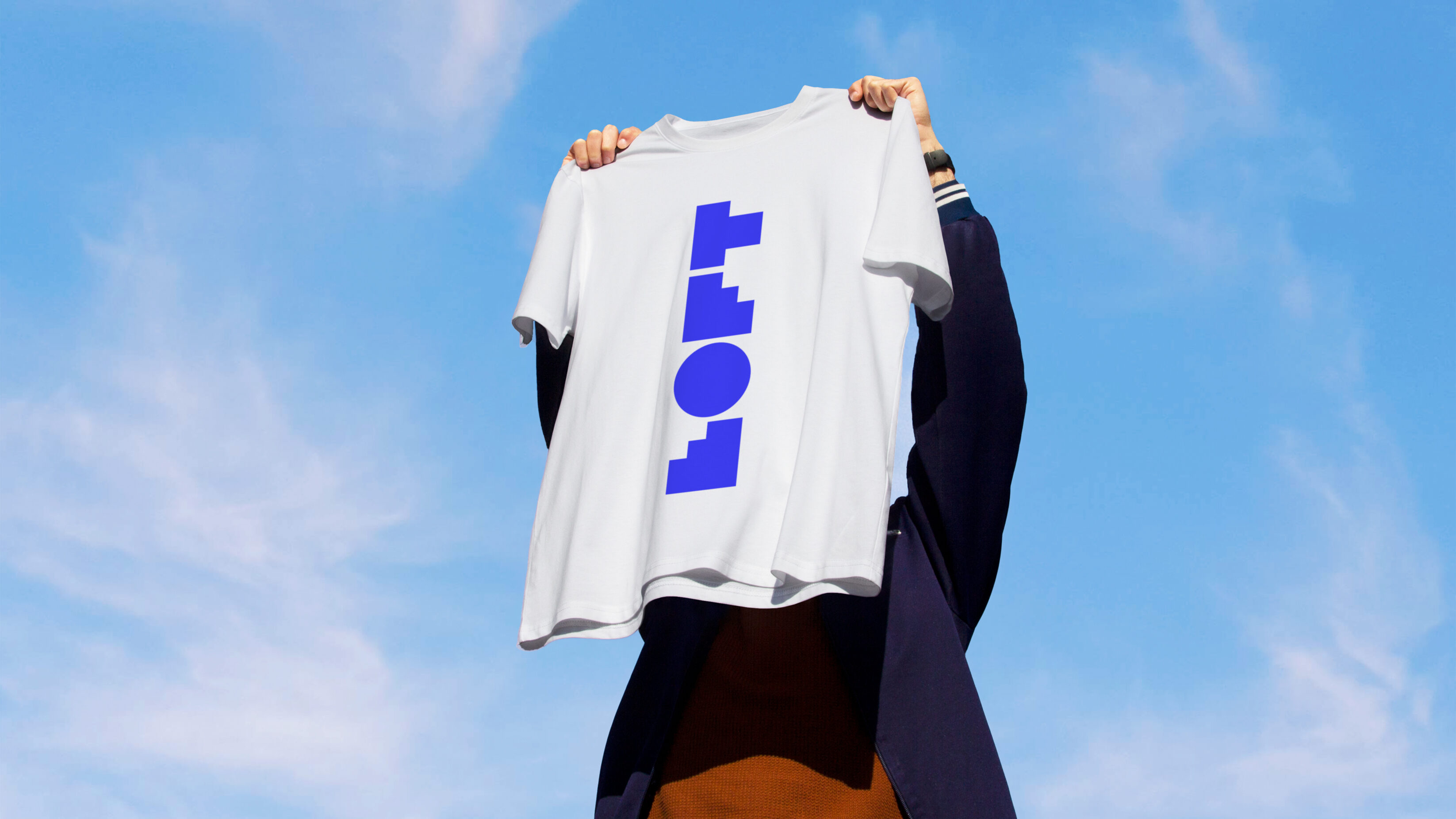
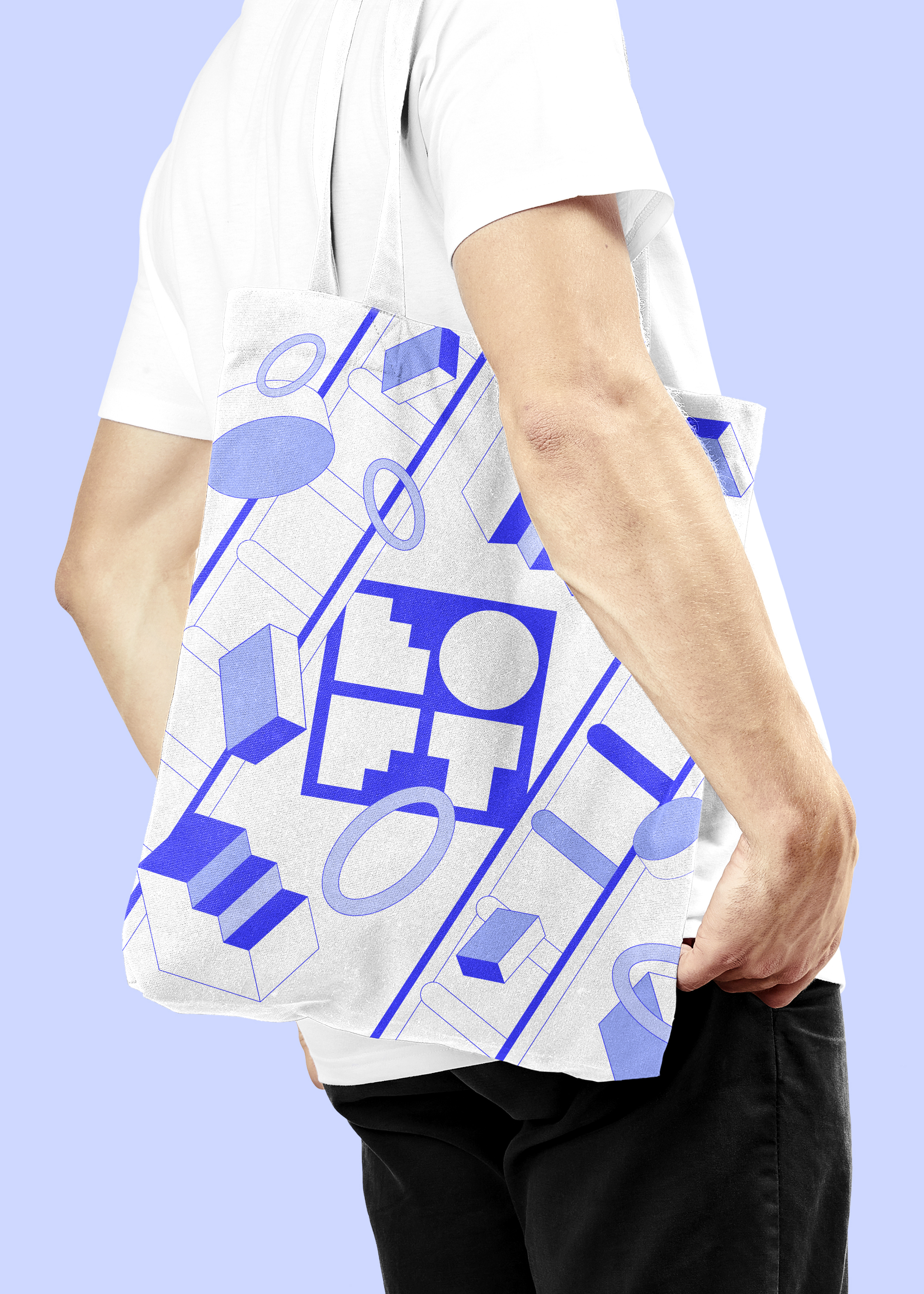
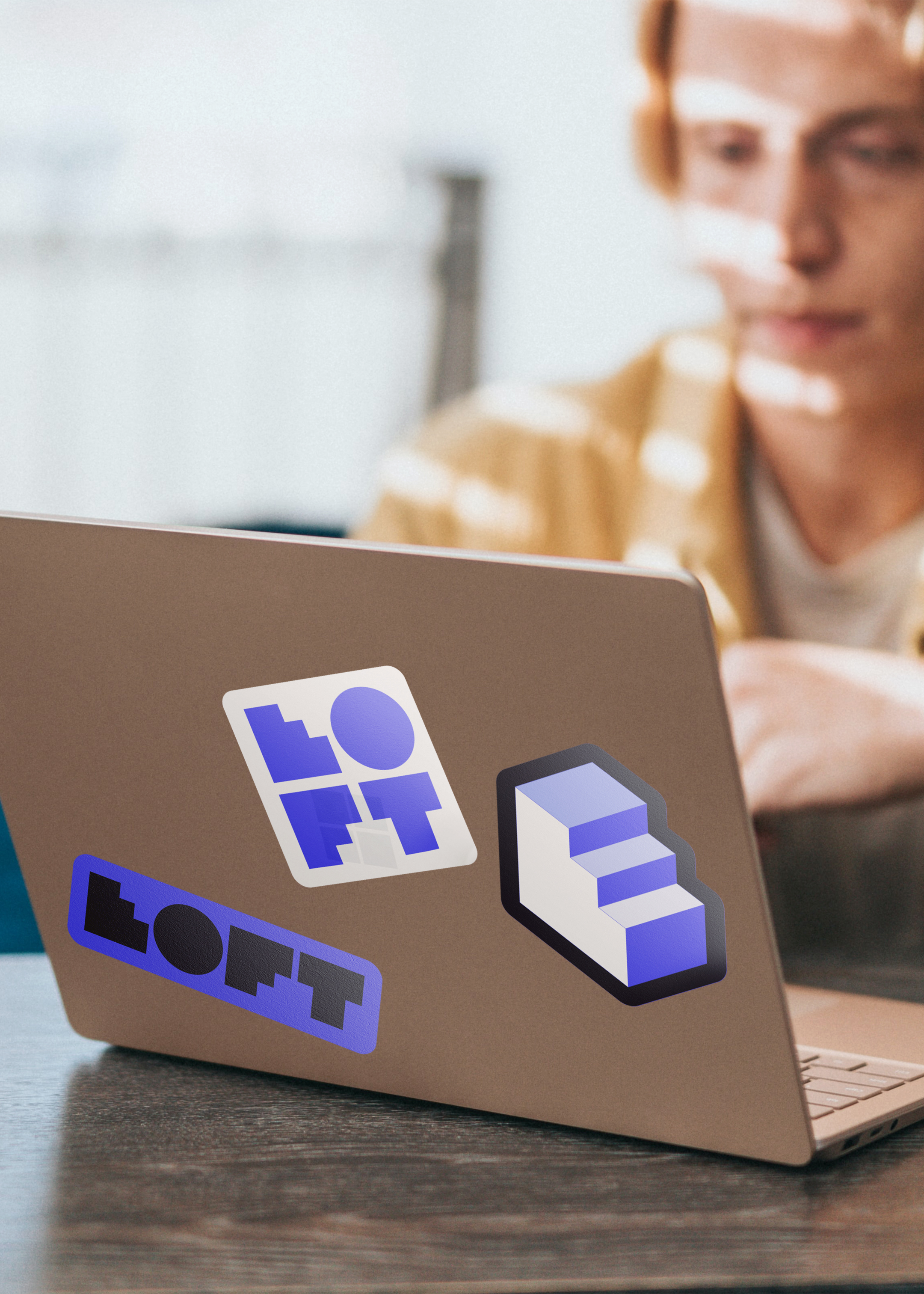
Next we laid the foundations through a playful aesthetic with a technical approach to design and craft, forming a blueprint playground. In this world of ladders, blocks and platforms that leads to the next level, individual letters from the logo formed components to create an on-brand environment – a geometric labyrinth of creative exploration. This versatile graphic suite enabled Loft’s unique visual identity to be as at home incorporated as a static print on studio wallpaper as it is in-motion on device screens.
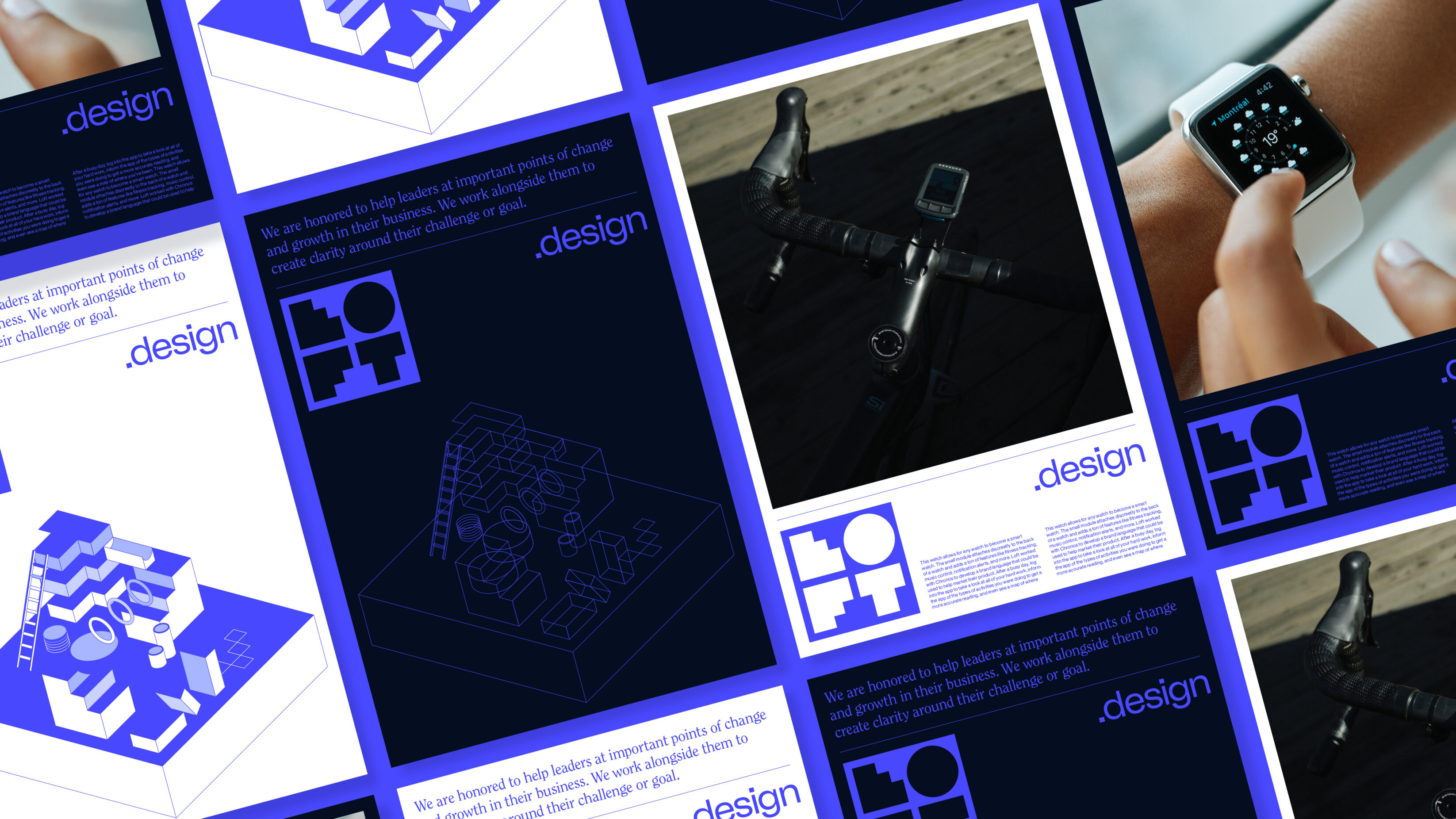
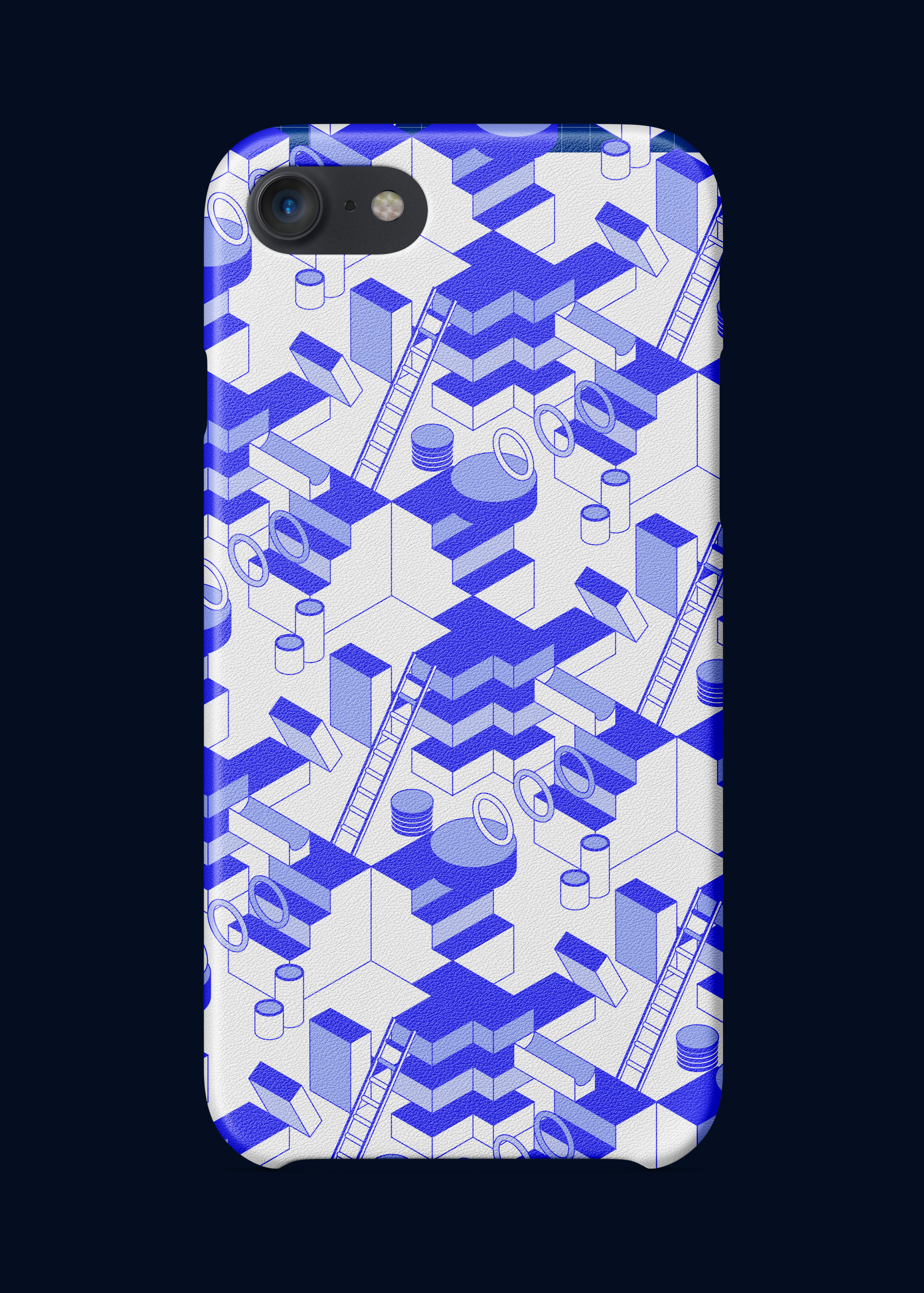
This visual wireframe directly links to the CAD technicalities of Loft while providing a sense of gamification for the brand, highlighting technical capabilities, the craft of bringing ideas together into tangible objects and a gamified image – marrying practical application with a playful approach to creativity. An intriguing modern-day Mousetrap to snare audiences and potential clients.
We selected a display type with negative spaces that complimented the geometric block shapes embodied by the Loft logo, where the brand type and hero visual mark effortlessly fit together. The secondary typeface, designed in the 20s and resurrected in the 70s through features on computer technology advertisements nodded to Loft’s innovative twist in on original design principles.
Dealing with masters of integrated tech, interactive dashboards and functional design, we installed a lights on/lights out device within the brand identity, allowing for a unique colour palette to be introduced and strengthen the notion of bright ideas.
Although our output is different, we were connected to some of the challenges Loft faced, both being agencies operating in the design world. Producing work that solves a specific challenge with the best outcome for our clients, not churning out a generic internal house style – we used our learnings in communicating this to remove any doubt that Loft could be considered a jack of all trades, master of none. Rather that their team – or the people they bring in from their network – have the creativity, expertise and vision to create next level ideas, whoever their clients are and whatever product they want to create. Getting the job done through the power of considered design.
As a team of print lovers, we are delighted to see our rebranding project picked up in PAGE — the German design, code and business magazine. This print feature looked at how the rebrand elevated Loft, literally, through its new identity.
Related projects

Spectrum.Life
A full spectrum brand for a global healthtech to engage new audiences, internally and externally.
We enabled innovative healthtech, Spectrum.Life, to engage, empower and transform across three main sectors — radiating the new energy needed to fuel international ambition. This identity, website and digital toolkit enhances their ability to communicate full spectrum support as a whole-of health partner.

Player Research
Positioning a brand to sell the science of gaming without losing the fun, from Canada to the UK.
Player Research’s acquisition by a global firm opened the door to a worldwide playtesting arena. Playing at the forefront of the game testing industry stage, they needed an identity that matched their instinct for play and expertise in gaming psychology. We positioned their brand to distil the essence of play, to inspire global audiences to get gaming.
Want to build your brave brand with us?
