
OKIN Process
Uniting an emerging portfolio of companies with a new multinational masterbrand. What began as a project to reinvigorate the brand of a global outsourcing firm as their organisation pivoted away from a legacy contract, quickly transitioned into defining a new organisational architecture and branded house for an emerging portfolio of companies.
Brand guidelines Brand strategy Business strategy Copywriting Print collateral Tone of voice UX Visual identity Web design Web development
Professional services Technology
Czech Republic U.S.A
Previously united only by their ambitious shared investor, Michal Jelinek’s portfolio boasted a 4,000 strong workforce spanning facilities management, process outsourcing, IT services and a raft of innovative emerging technology startups; distributed across the US, Czech Republic and South Africa. Yet while each business enjoyed its own successes, opportunities were being lost and hindered by the lack of an overarching sales process and clearly defined service offerings across the group. In fact, there was no ‘Group’ organisation to speak of.
Working with Jelinek, wider businesses stakeholders, and colleagues from across the organisation, we began carving out a new identity system and a supporting brand architecture that could both amplify the independent offerings of each business line and help identify areas for cross-selling and referrals. Early into our research, we identified that there was the opportunity to build a strong parent-company narrative and transition all the companies towards a flexible branded house model that would provide them with increased efficiency and clarity across their sales and marketing.
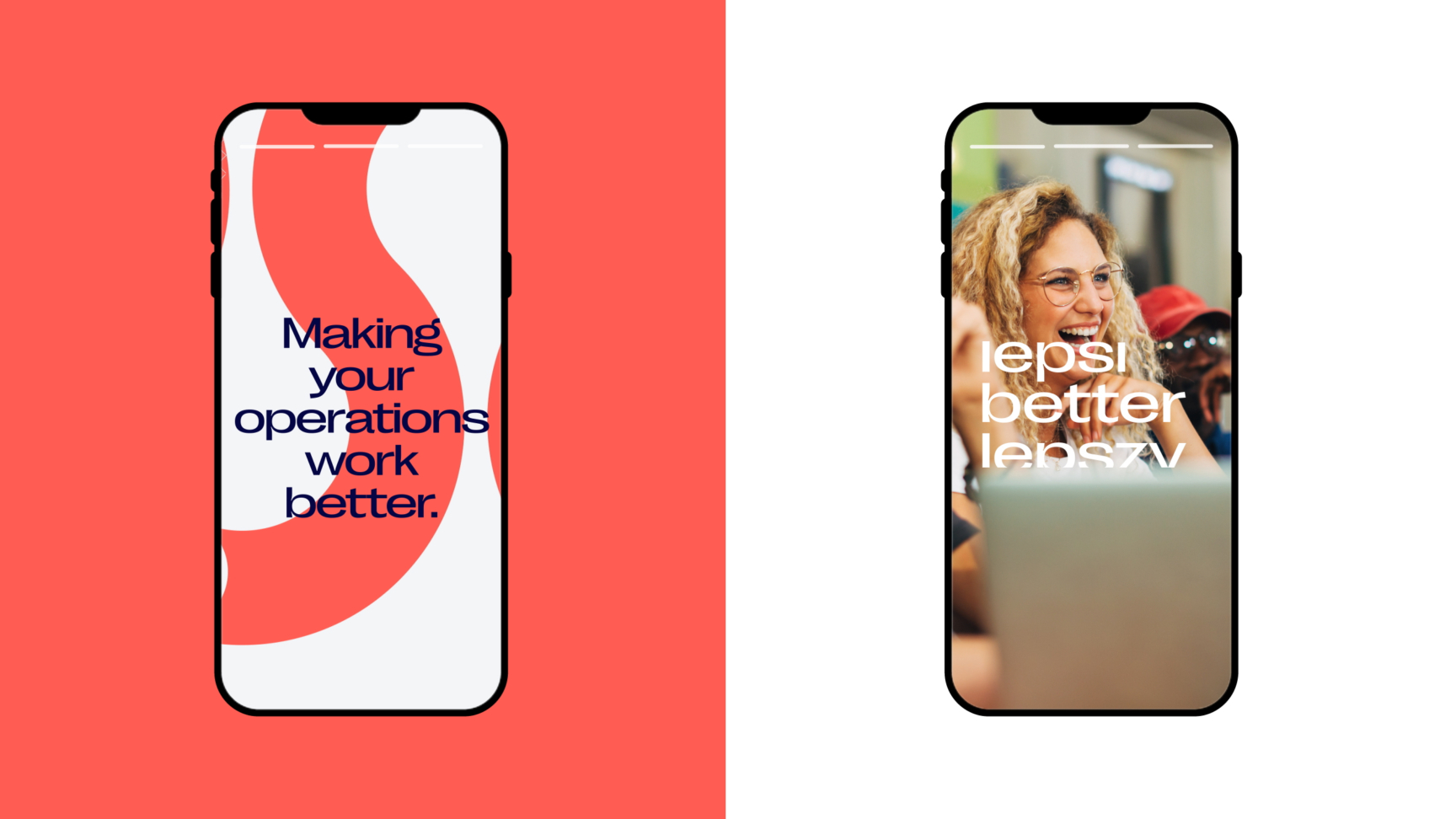
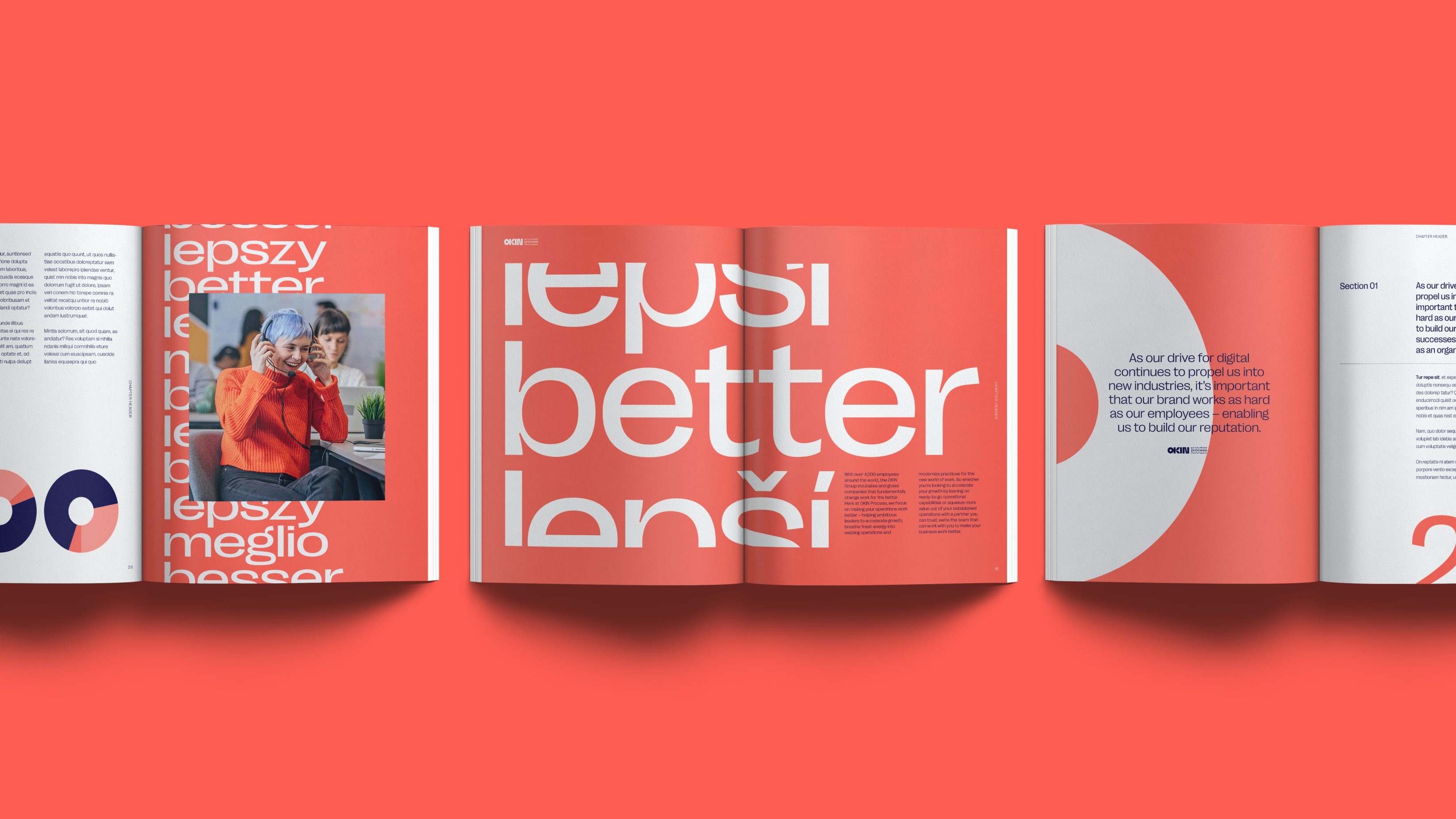
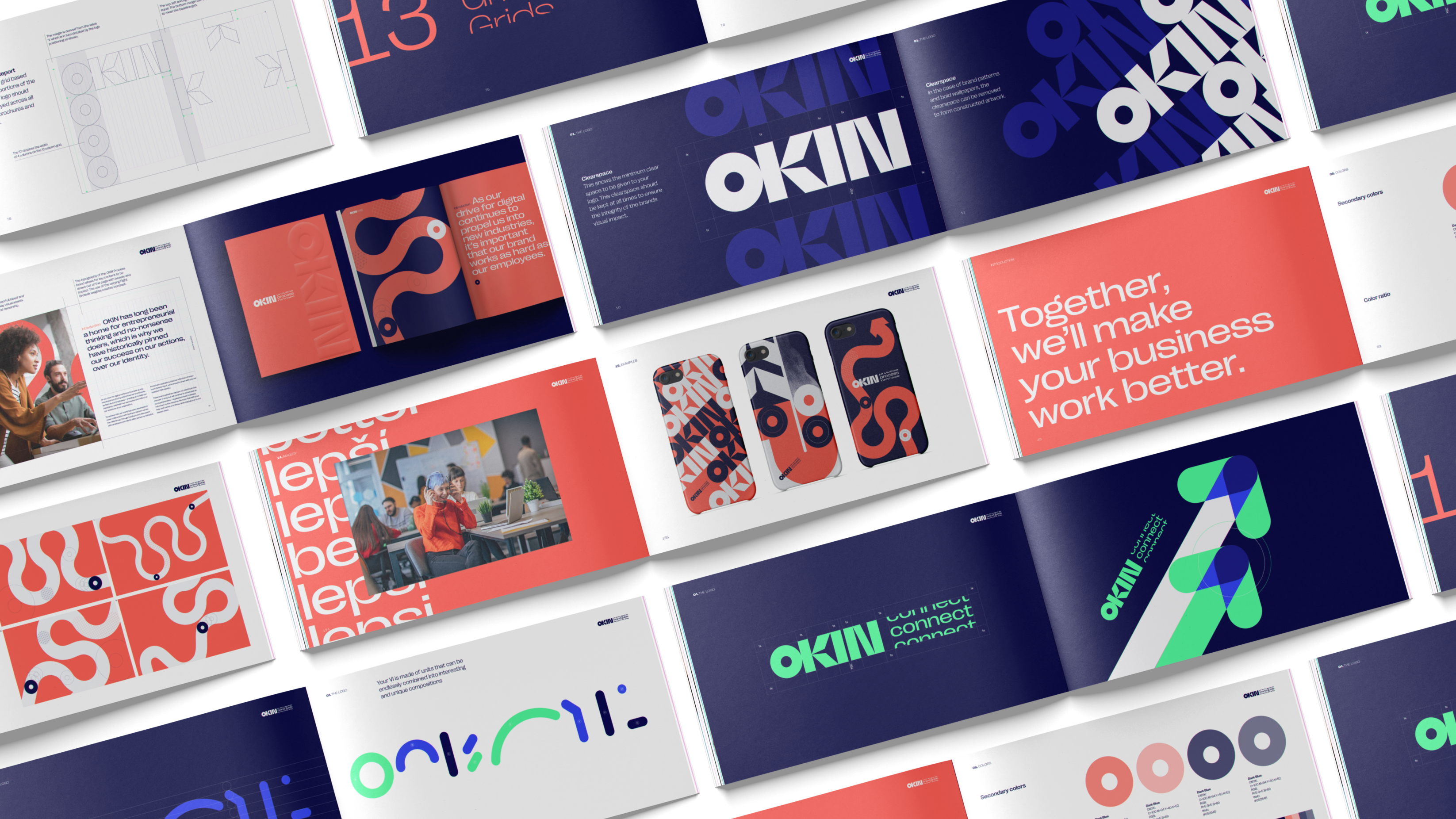
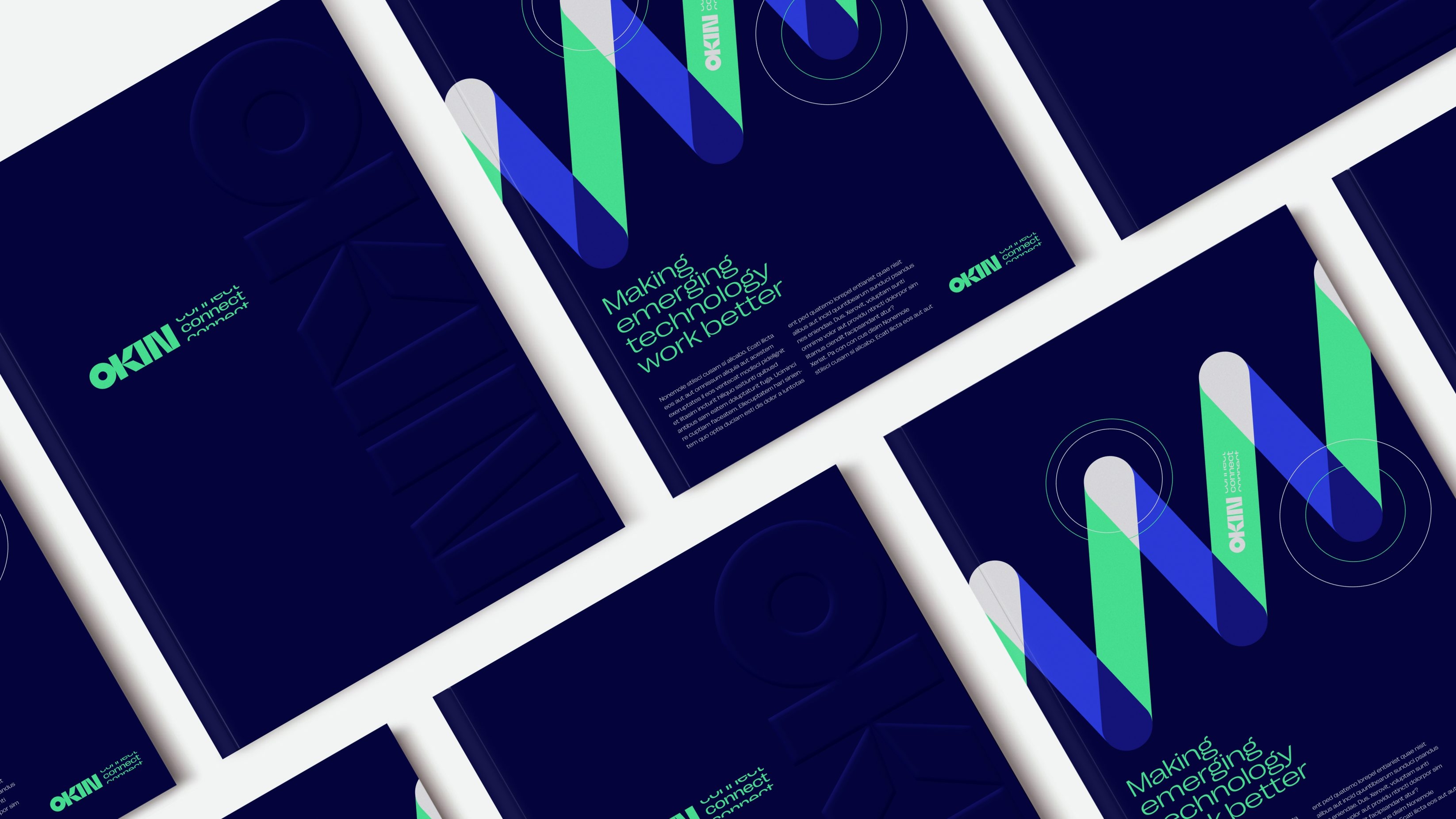
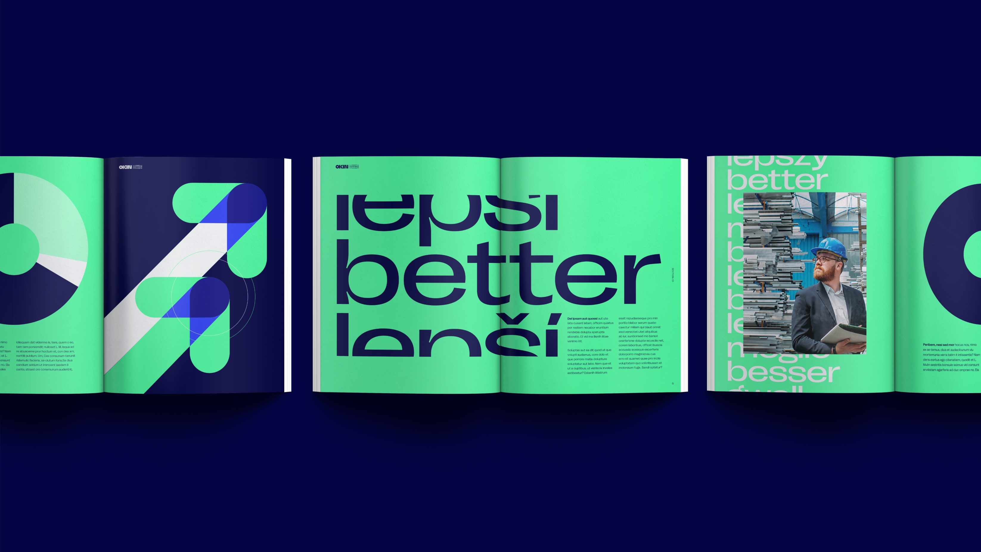
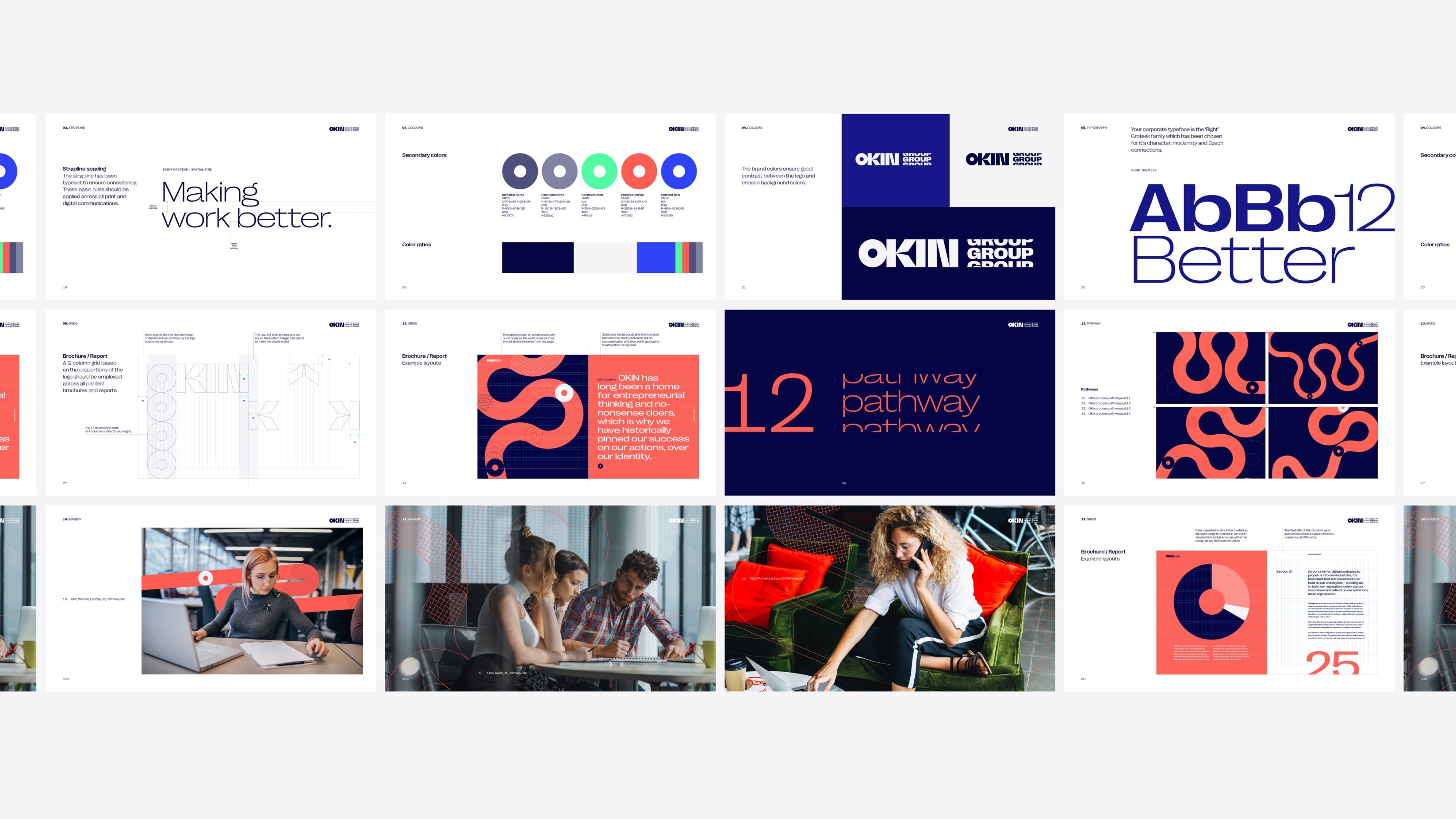
Grounding the OKIN companies with a new Group purpose and strapline – “Making work better” – we created a flexible brand architecture that would direct their entrepreneurial energy into clearly separated areas of expertise.

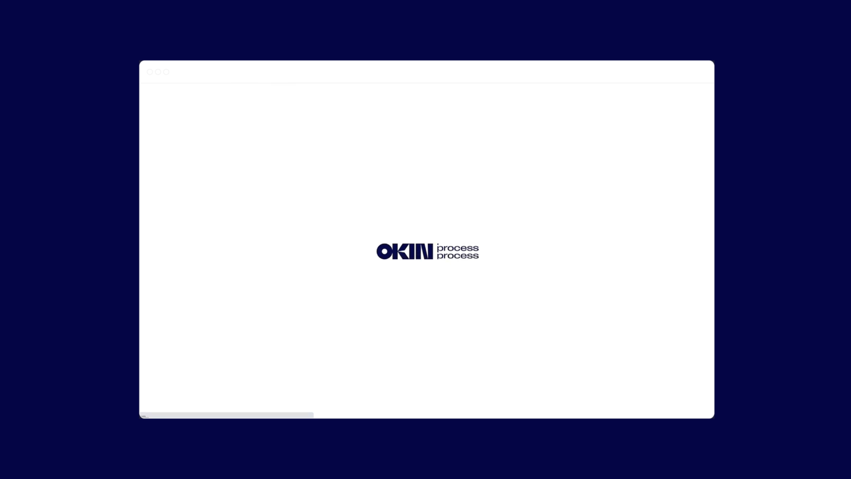
We set out guiding principles for each sub brand, so that the visual identity would not only work as a collective, but would bring their unique strengths to life. From the authoritative presence of OKIN Group, through to an animated process motif for the newly renamed OKIN Process (formerly OKIN BPS), and an electric green digital K’nex for OKIN Connect – each leveraged the Group brand for its firm foundations, mirroring the real-life operational setup of the businesses. This approach meant that the original brief for a re-invigorated process outsourcer could be met via a unique new OKIN Process brand that emphasises the fun, energy and practicality of the company, while also firmly grounding it within the purpose and values of the OKIN Group.







Make Work Better
As a result, the project didn’t just provide an emboldened, compelling sales narrative that both customers and colleagues across the business can understand and buy into for one business line. It has set a roadmap for collective success to be harnessed and cultivated as the Group continues to evolve. Leveraging each other’s strengths, assets and expertise and literally living their own purpose to…
Related projects

RM2
Supporting business owners to “own it” when it comes to shifting ownership of their business.
RM2 guides owners through one of the biggest decisions they can make about their business, handing it over to employees. The RM2 rebrand and website embody the clarity and confidence necessary to support people through shifts into employee ownership, restoring brand belief in the UK’s most experienced organisation dedicated to providing these services.

Spectrum.Life
A full spectrum brand for a global healthtech to engage new audiences, internally and externally.
We enabled innovative healthtech, Spectrum.Life, to engage, empower and transform across three main sectors — radiating the new energy needed to fuel international ambition. This identity, website and digital toolkit enhances their ability to communicate full spectrum support as a whole-of health partner.
Want to build your brave brand with us?