
Harlaxton
Positioning a US study abroad centre on a UK estate with a brand that pursues the extraordinary. Steeped in a history of activist owners, eccentric patrons and challengers of the status quo, Harlaxton Manor’s radical history has been continuously punctuated by transformations. Now home to the University of Evansville’s study abroad centre, Harlaxton College, we were invited to mark a new chapter in its fascinating history. Our aim: to develop a brand that prioritises personality, flexibility and inclusivity across the university campus, wedding events and wider Manor grounds. Eclectic yet unified, building Harlaxton’s identity meant communicating the changing demographic of US education systems, differentiating the Manor from other heritage sites and ensuring that extraordinary remains at its heart.
Brand guidelines Brand strategy Copywriting Tone of voice Visual identity
Education
U.S.A UK
If you’re lucky, you’ll get the chance to make your way down the driveway of one of the UK’s most eclectic country house estates. Standing tall in rural Lincolnshire, Harlaxton Manor is built differently – unapologetic – overlooking the Belvoir Estate.
Being there, we quickly found out there’s more to these stunning grounds than staggering architectural aesthetics. But the presentation of Harlaxton to the world – as a traditional, overbearing countryside mansion and passive study-abroad venue – was masking its truth: that this place is more than meets the eye.
The wonder of what might be inside grows as the grandiose space draws you in. Beyond the walled garden which was originally built in the 18th century with a first-of-its-kind heating system to grow exotic flowers and fruits, you’ll find University of Evansville’s trans-Atlantic campus. History has always been innovative here.
But it’s not until you step into the building that you realise this is unlike any other stuffy stately home you’ve ever visited. From the heraldry that adorns the Grand Hall, the 17th Century European mausoleum cherubs to the Atlas sculptures, Harlaxton is, and always has been, many things. The walls, ceilings, constructions and ornate flourishes share this place’s secrets, some whispered and some exclaimed – ever expressive, ever extraordinary.
Throughout Harlaxton’s trailblazing history, it had been a home for those who seek more for their futures. However, to counteract a declining admissions trend across American higher education and associated international study, the progressive vision of newly appointed leader, Dr Holly Carter, became the catalyst for the institution being more than a corridor to Europe. It was time for Harlaxton’s narrative to step up, enabling people to discover the literal and figurative secret doorways that Harlaxton has to offer.
In order to support the commercialisation of the Manor – and celebrate this unique opportunity for students to gain real-world learning – we set about building its brand for growth; elevating the price-point positioning as a commercial venue, both through continued professionalisation of its marketing and more clearly focussed differentiation.


Across Harlaxton’s intriguing and chequered history, taking on a new lease of life has been integral to its story. From Gregory Gregory’s construction of the Manor in 1831, combining audacious Jacobean, Elizabethan and Baroque styles, to the self-made millionaire businesswoman and activist Violet Van der Elst who took ownership of Harlaxton during WW2, innovation and change had been the heartbeat of the Manor. But as a brand, a pastiche of classic Britishness meant the Manor’s had become a diluted version of Harry Potter for its American alumni and wedding guests alike. But Harlaxton doesn’t need the magic of Hogwarts, it has its own – it was our job to spell it out.
Just as Violet brought electricity to Harlaxton in 1937, it was time to bring some energy back to the Manor. But unlike the eccentric female entrepreneur, we didn’t change the name of Harlaxton to ‘Grantham Castle’ – our priority was to bring personality, unifying the brand with one message that encompassed the intrigue, innovation and reinvention of this truly extraordinary place.
A deep strategy phase that included on-site visits enabled us to get insights from the people that work, live and experience Harlaxton. Interview days with stakeholders from marketing teams, grounds and operations team and also students, tutors and alumni of the University revealed that conservation, sustainability, learning, and internationalism are fundamentally important to the future of Harlaxton. Feeding into our immersive strategy phase, we landed on five key findings to develop the brand’s creative principles: a place to progress, change your stars and see the world anew, experience growth, one Harlaxton with many faces and enchanting enigma.

Pursue the extra-
ordinary
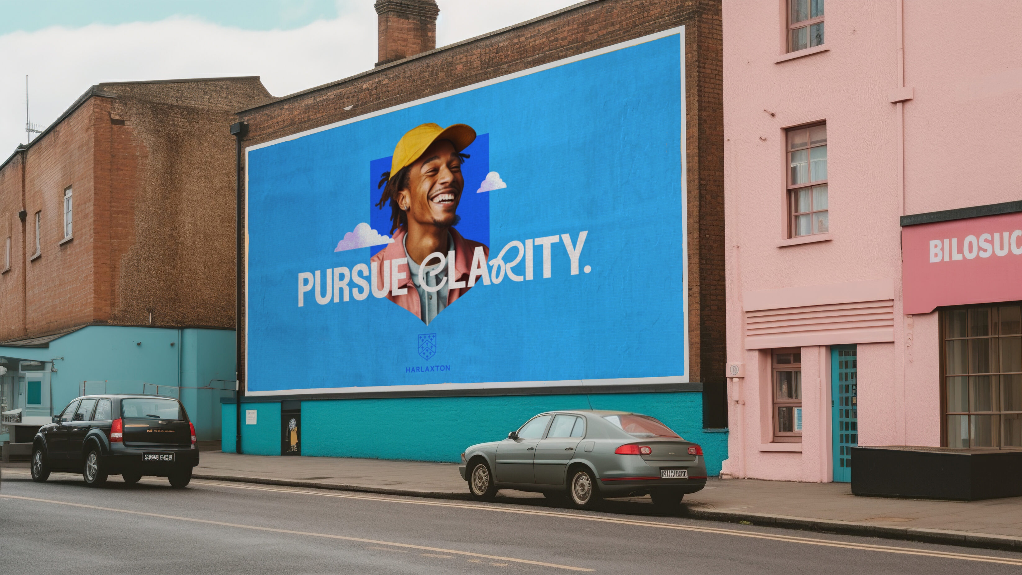
To guide the brand with a single lead message, we highlighted Harlaxton as a place where people can pursue the extraordinary. But with clearly differentiated strands of the business and audiences, each arm needed to have its own siren-like allure, just as each room does across the estate.


Introducing variable lead messages for the Manor and College meant people could pursue connection, whether getting married or sharing a bite to eat at an event open day, and pursue ambition where students, tutors and academics enter an experiential site for learning and intercultural exchange.

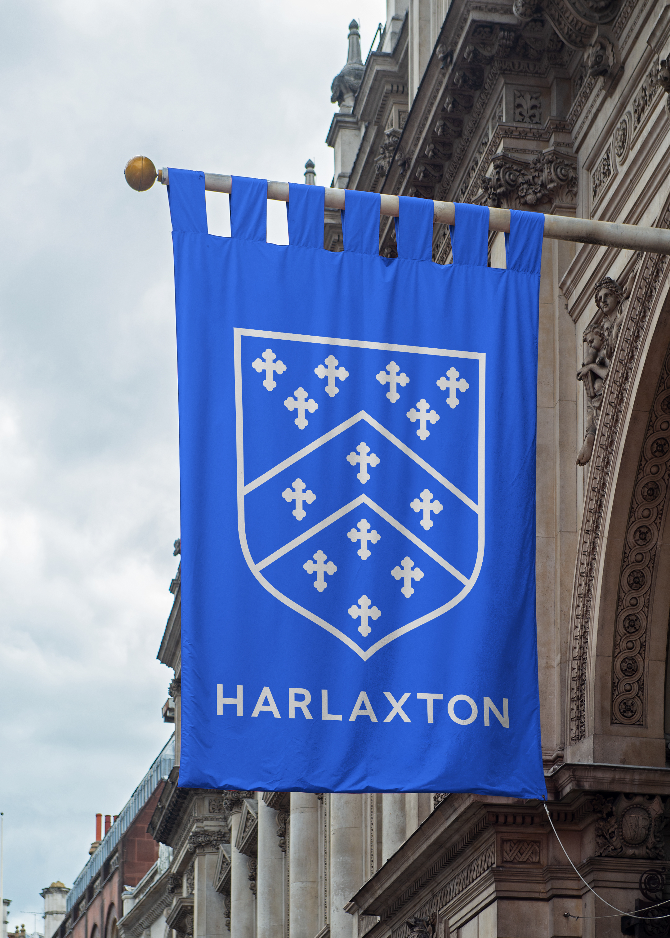
An emblem of change
Retracing emblematic roots, we stripped back the Manor’s classic shield, bringing focus to the idiosyncratic features of Harlaxton and what can be experienced there. This enabled us to bring heraldic heritage into the brand, a nod to the changemaking alumni, trailblazing owners and patrons of Harlaxton who have their ancestry documented across the building.
The shield became a mask that structured graphic layouts across the brand identity, from billboard posters that feature go-getting students, to wedding brochures that exude togetherness, while also working as a framing device for a compelling photographic style.
As eclectic traits make the Manor what it is, we used colour and type to juxtapose and signpost the academic and events strands of Harlaxton. Using the original burgundy, yellow and black of the Harlaxton as a base, we introduced an energised blue and a softer pink to bring a youthful presence to the college, mixed with a playful yet bold type. Not matching these colours to a specific gender enabled us to subvert preconceptions of traditional conventions, where students and tutors alike could challenge the status quo.
We elevated wedding communications with a refined gold colour that captures the elegance and beauty of precious moments, coupled with a delicately weighted classic type that perfectly complements an alluring photography style.


The interconnectedness of the Harlaxton brand reflects the Manor’s ability to bring eclecticism together for a new perspective. Providing a framework for teams at Harlaxton to realise the potential of this extraordinary place, we created a toolkit to connect with specific audiences for the university campus, weddings and events, under one unified brand.
This brand identity sets about positively changing the way people interact with higher education, weddings and events. This was achieved by designing inclusive experiences where people can pursue the extraordinary regardless of background.
Whether it’s through imagery that celebrates unique individuals, or language bursting with intriguing optimism, Harlaxton is now set up with a voice that can speak to the changing demographics of American higher education, people celebrating precious moments in life, or simply just to appreciate a different perspective.
We communicated the belief that educational opportunity should transcend wealth, emboldening first-generation students and those from minority backgrounds to bravely innovate in a changing world, joining Harlaxton’s rich legacy of changemakers. So whether studying at a foreign campus, teaching at an international institution, getting married or experiencing a myriad of cultural references, the extraordinary can be pursued at Harlaxton.


Related projects

The Ernest Cook Trust
Telling the story of a brand new strategic direction, rooted in the land.
UnitedUs met the Ernest Cook Trust at a time when the organisation's brand and strategy were both in need of a fresh perspective. Working alongside the charity's strategy development, we cultivated a new brand positioning that was both rooted in the charity's enduring heritage and brought new life to its emerging strategy.

Prept
Naming and branding for an educational charity to impact food culture across the UK.
By equipping a Sussex educational charity with an impactful name and identity, we crafted a high-quality brand to help the organisation scale, secure new partners, and serve food culture in the UK. Built on foundations of food and engaging cooking experiences, Prept now inspires a new generation to live happier and healthier lives.
Want to build your brave brand with us?
