Solici
Forming a new strategic competitive intelligence arm to live within a healthcare house of brands. Having determined what the future of Cambridge Healthcare Research brand architecture should look like, we formed a strategic competitive intelligence division to sit with the house of brands. Backed by an ambitious board, bringing Solici to life meant bringing opportunity to light for Cambridge Healthcare Research and their new brand’s clients.
Brand guidelines Brand strategy Campaign strategy Copywriting Digital design Marketing Tone of voice UX Visual identity Web design Web development
Healthcare Professional services
UK
Communicating ‘The Power of Knowing’ guiding ethos which unifies the Cambridge Healthcare Research brand house, the strategic competitive intelligence sub-brand had to launch to market with an individual brand tone that differentiated from others in the family, including CHR’s reinvigorated research division, Vox.Bio. As an entity that was still yet to be named, we needed to showcase their ability to give clients the power of knowing that they’re armed with the hard to reach insights that give them the upper hand.
Inspired by the latin name for sun, ‘solis’, we added a commonly used competitive intelligence acronym CI as a suffix to bring the Solici name to light – illuminating a name that becomes a guiding light in the industry category. There is a lot that healthcare decision makers already know, but Solici is set up to find the insights they don’t – illuminating blindspots to allow decision makers see the road ahead and compete with confidence. This gave rise to the brand concept of ‘bringing opportunity to light’.

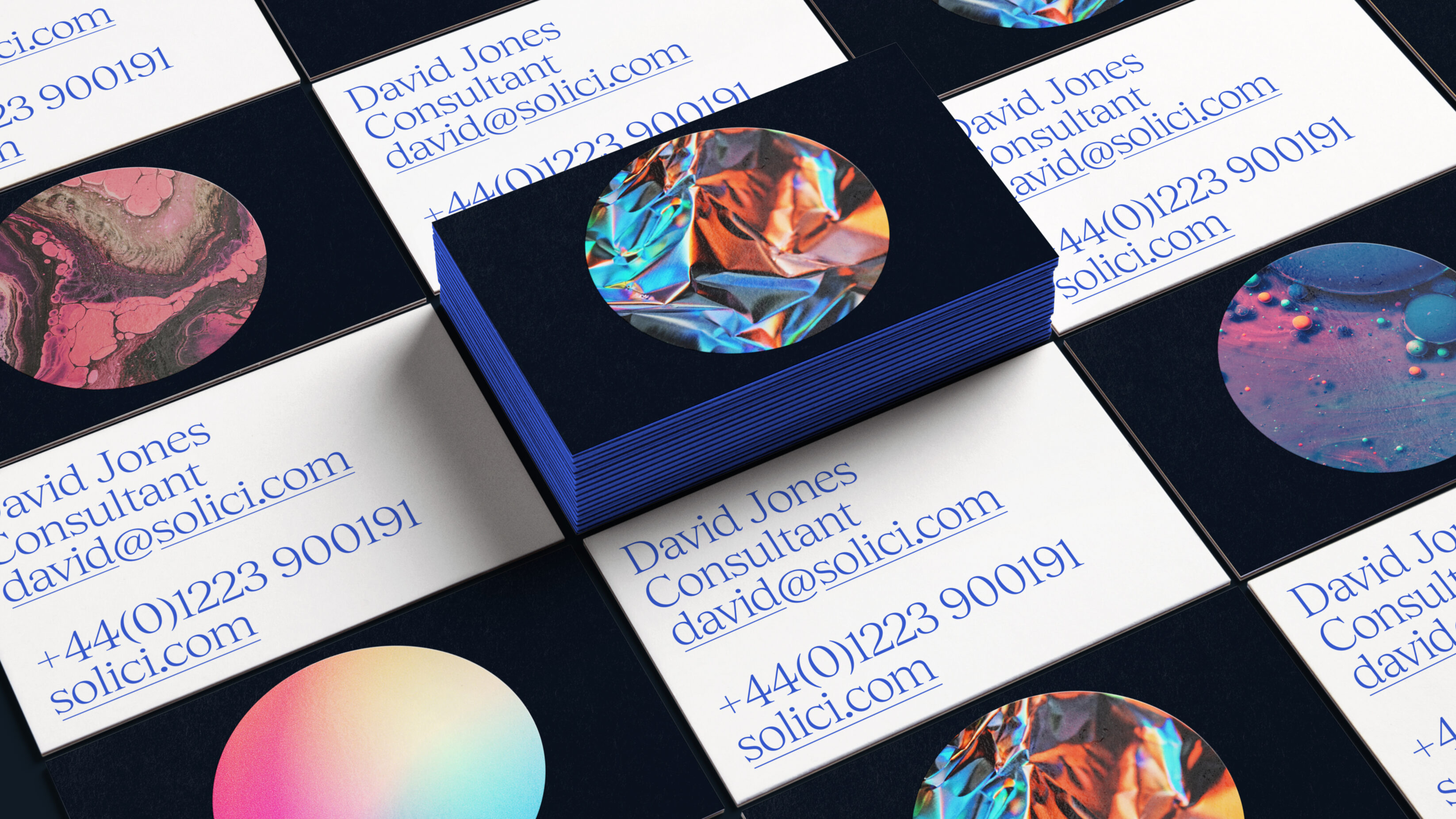
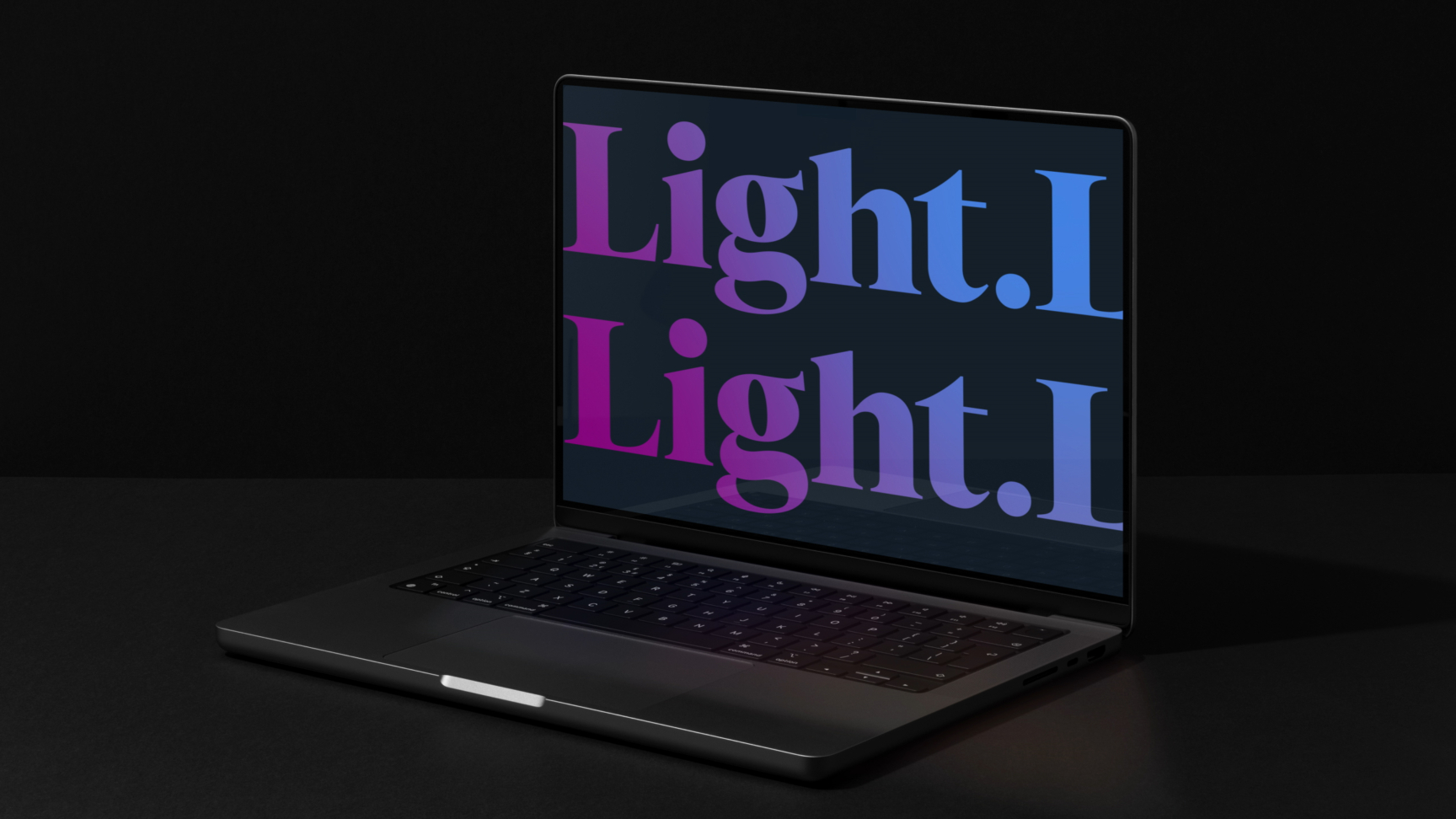
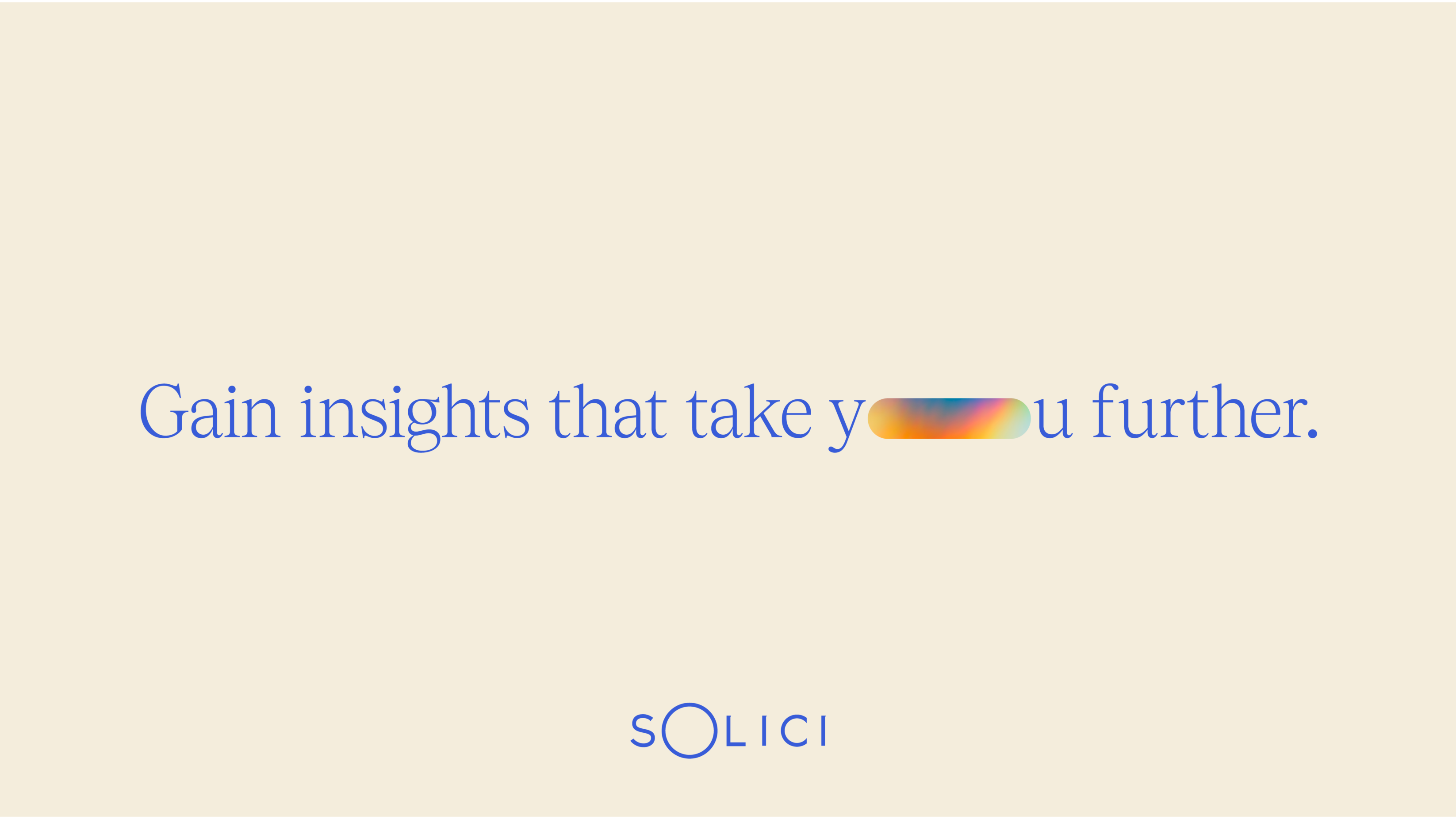
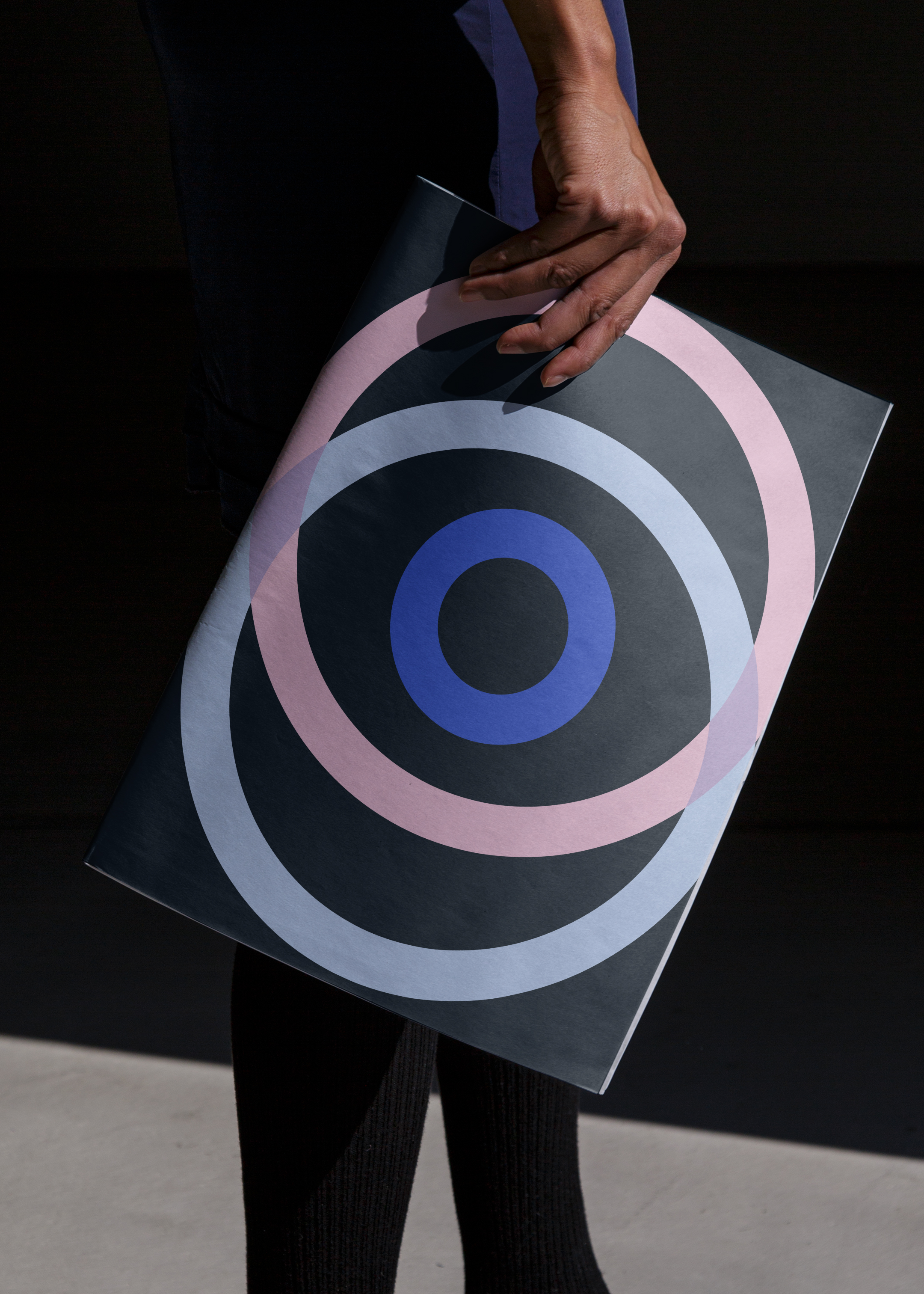
To bring Solici to life visually, we took inspiration from the idea of illuminating blindspots, using the ‘O’ of Solici as a window into opportunity with scientific references. Reminiscent of the sun, a spotlight, or a Petri dish under the microscope, the flexible ‘O’ device shows that Solici reveals opportunity that was before unseen, or outside a clients periphery. The visual identity leans on the brand strapline ‘Bringing opportunity to light.’, strengthened by the use of colour to prompt this metaphor. Gradients on key words in hero messaging and a design framework that plays with the illusion of illumination, from dark to light, reiterate the brand’s leading message.


As scientific research is constantly evolving and iterating, Solici needed a brand identity that focused not only on the here and now, but looked to what’s next. Compounding the ‘Bringing opportunity to light.’ message with an ability to go above and beyond for their clients, Solici needed to show its services could develop and help their clients to compete with confidence.
Strengthening the close relationship between Solici and its clients, we developed the ‘O’ device and elongated the shape into a lozenge, physically representing the distance that decision makers can go with strategic competitive intelligence, stretching their understanding and gaining insights that take them further.


The new brands, as well as the evolution of our vision and mission, illustrate our growing ambition in the market. The brands allow us to showcase both our strategic thinking and our creative approaches to helping our clients. United by a common thread, the power of knowing, our brands are strong enough to stand independently and to support each other.
Matteo Perucchini


We produced digital brand guidelines with a full suite of brand assets to enable their people and partners to communicate a consistent brand, producing a variety of print concepts and creating a highly-intuitive digital environment to attract talent and new clients to the brand.
Prompted by brand-led micro-interactions in line with the considered visual identity, we built a website that utilised scientific imagery as the user explored the Solici brand. Personifying the ‘Bringing opportunity to light.’ metaphor, we incorporated features such as a code pen with a cursor circle that illuminated and expanded when hovering over key navigation buttons. Despite complex stakeholder agreements in a tight timeframe, building this engaging digital environment became the North Star for the brand, galvanising a newly formed team.


Our strategic creative work for Solici has been featured in The Brand Identity – a publication that showcases the best graphic design projects and thinking from across the globe. Read the article that talks through the project, with our Creative Director and Co-Founder, Luke Taylor.
Related projects
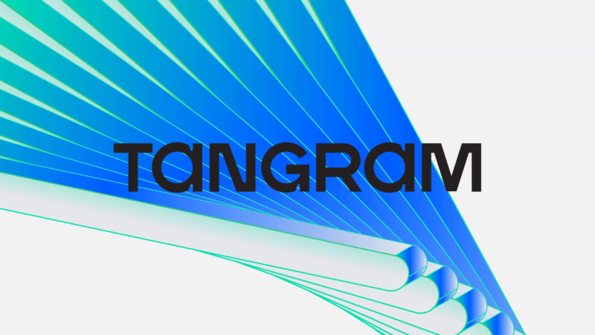
Tangram Therapeutics
Generating investor and patient interest in RNAi medicine discovery through a relentlessly creative identity.
Tangram Therapeutics is driven by a persistent pact: to realise life-transforming drugs faster. The company, which realises the collaborative code for relentless medicine discovery, required a new name, positioning and brand identity to form a platform for the organisation’s expedited exploration in RNAi drugs.

Spectrum.Life
A full spectrum brand for a global healthtech to engage new audiences, internally and externally.
We enabled innovative healthtech, Spectrum.Life, to engage, empower and transform across three main sectors — radiating the new energy needed to fuel international ambition. This identity, website and digital toolkit enhances their ability to communicate full spectrum support as a whole-of health partner.
Want to build your brave brand with us?
