Brompton House
Baking joy into a sweet treat brand to engage and diversify business and consumer audiences. Warmly welcoming people to the home of sweet treats, we brought the Brompton House brand to the forefront of minds and shelves. Baking moments of joy into the brand, Brompton House now has a clear, fun and consistent identity capable of increasing brand awareness and capitalising on market share.
Brand guidelines
Consumer goods Food & drink
Spain UK
Buyers for and in supermarkets desire food products that taste great. But with fierce competition on the shelves, and tightening purse strings, customers are increasingly reaching for products that better communicate the value they’ll get from their purchase.
Over the past two decades, Brompton House has produced great-tasting, low-cost baked goods. While their products continue to be a snacking favourite in many households — a staple feature in cupboards and lunchboxes across the UK — their brand and website communications were pushed to the back of the shelf.
Their team approached us to bake the Brompton House values and joy that customers experience through their tasty snackable products into the brand. Through a refreshed, simplified brand identity and website that clearly communicates personality in their offering — both to customers in the aisles and those in buying teams — we served up moments of joy online and in-store.

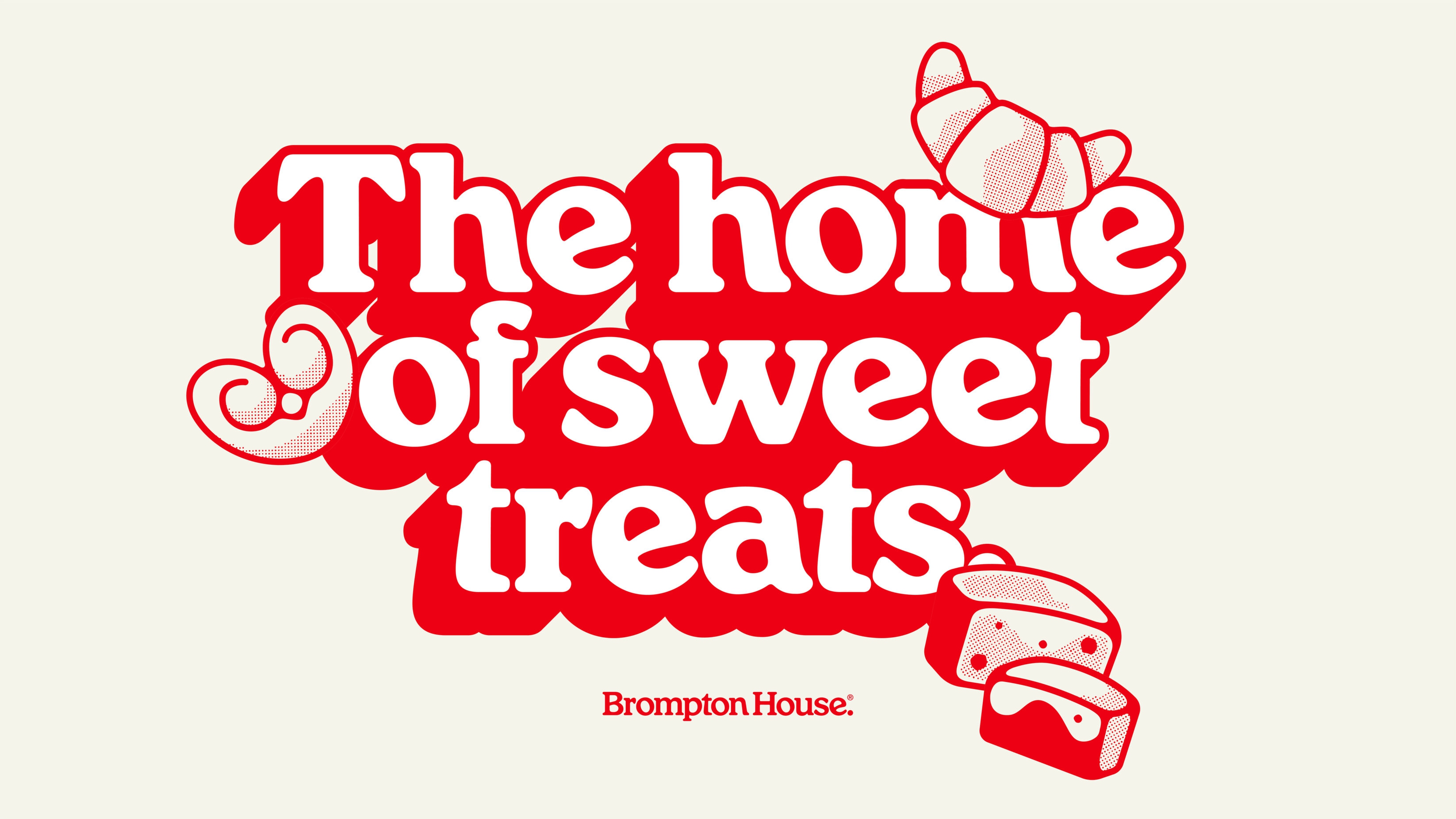
The lead message evolved from simply being the home of baked goods, into ‘the home of sweet treats’. This new hero statement enables the business to confidently branch out into other product categories and ranges, such as chocolates and breakfast goods while setting customers up for equally sweet visual and verbal messaging.
It was clear from our creative workshop with the family-run business, that quality, reliability and, well… family, are at the heart of the business and brand. Their pride in bringing moments of joy through sweet treats has been mixed into the brand with a warm and playful tone. It was time to ‘pump up the volume’ so their brand could be authentically heard.
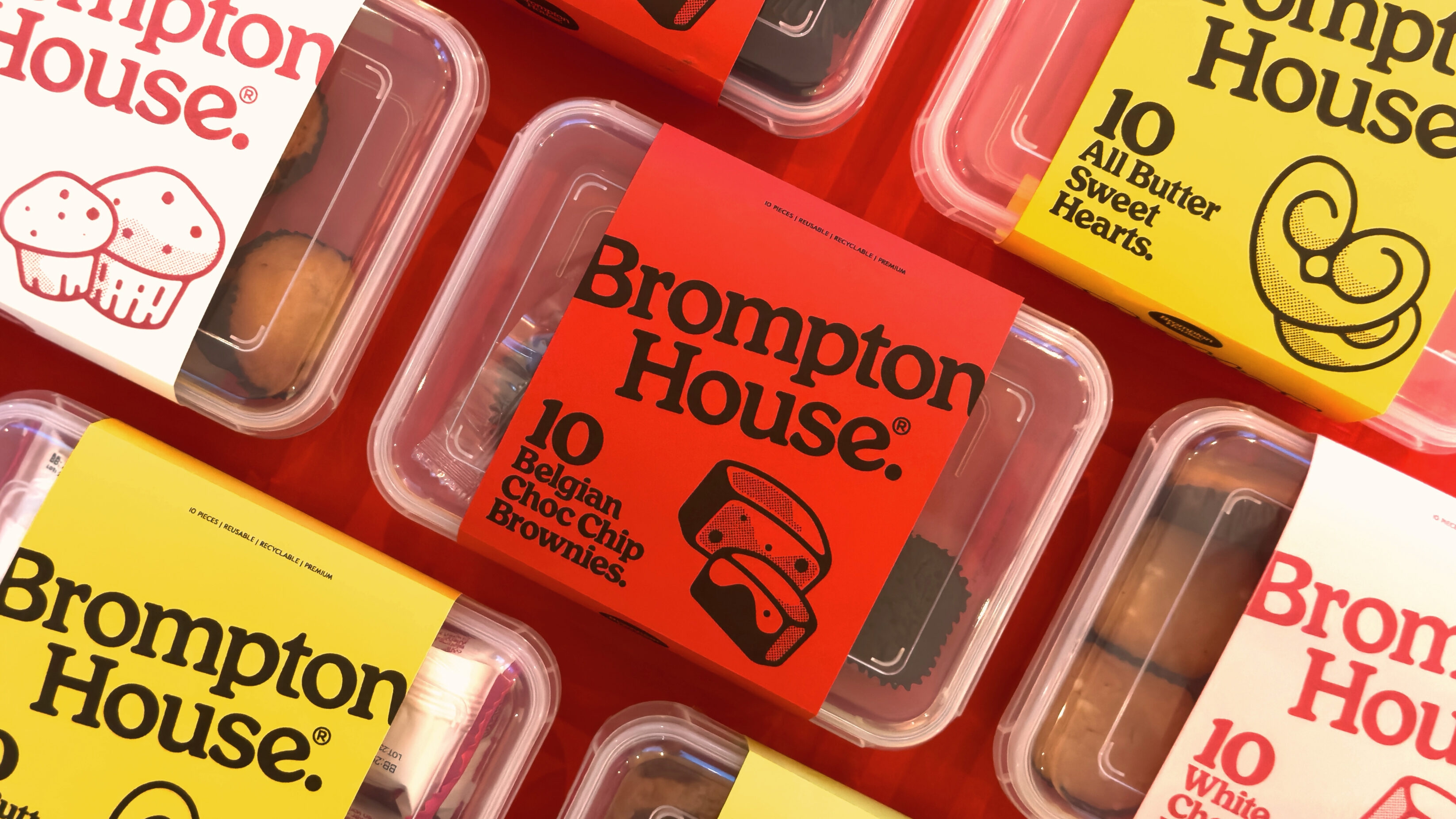
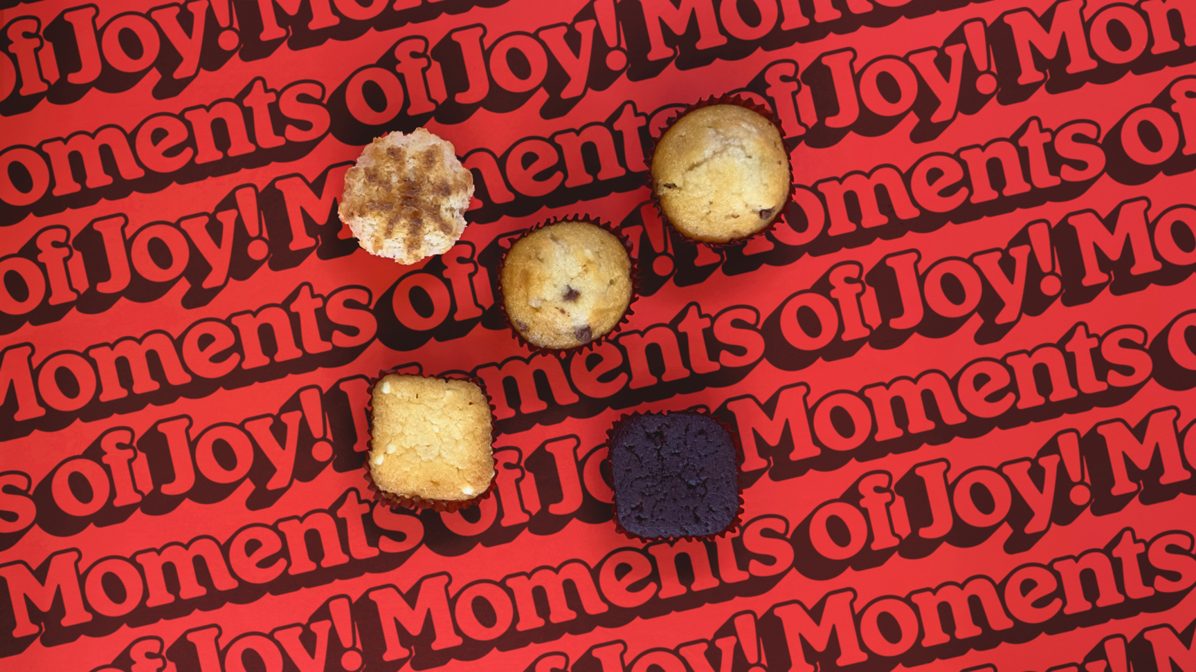
A series of tongue-in-cheek descriptions for each product and unique illustrations also act as little moments of joy and enable the toolkit to be as rich as Brompton House brownies. Introducing ellipsis to emulate a short moment of pause for the reader, similar to the moment when people bite Brompton House sweet treats, this device also suggests a little trail of crumbs…
Detail is everything for us, and UnitedUs really pay attention to detail — their team has consistently impressed us. From the very beginning, they made the effort to understand the values at the heart of our organisation, joining us at our headquarters in Madrid for creative workshops and deeply listening to perspectives from our team.
Paz Ripollés, Design & Marketing Manager

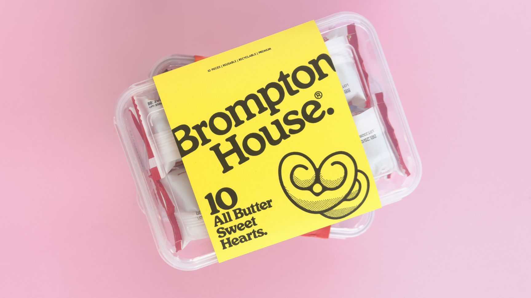
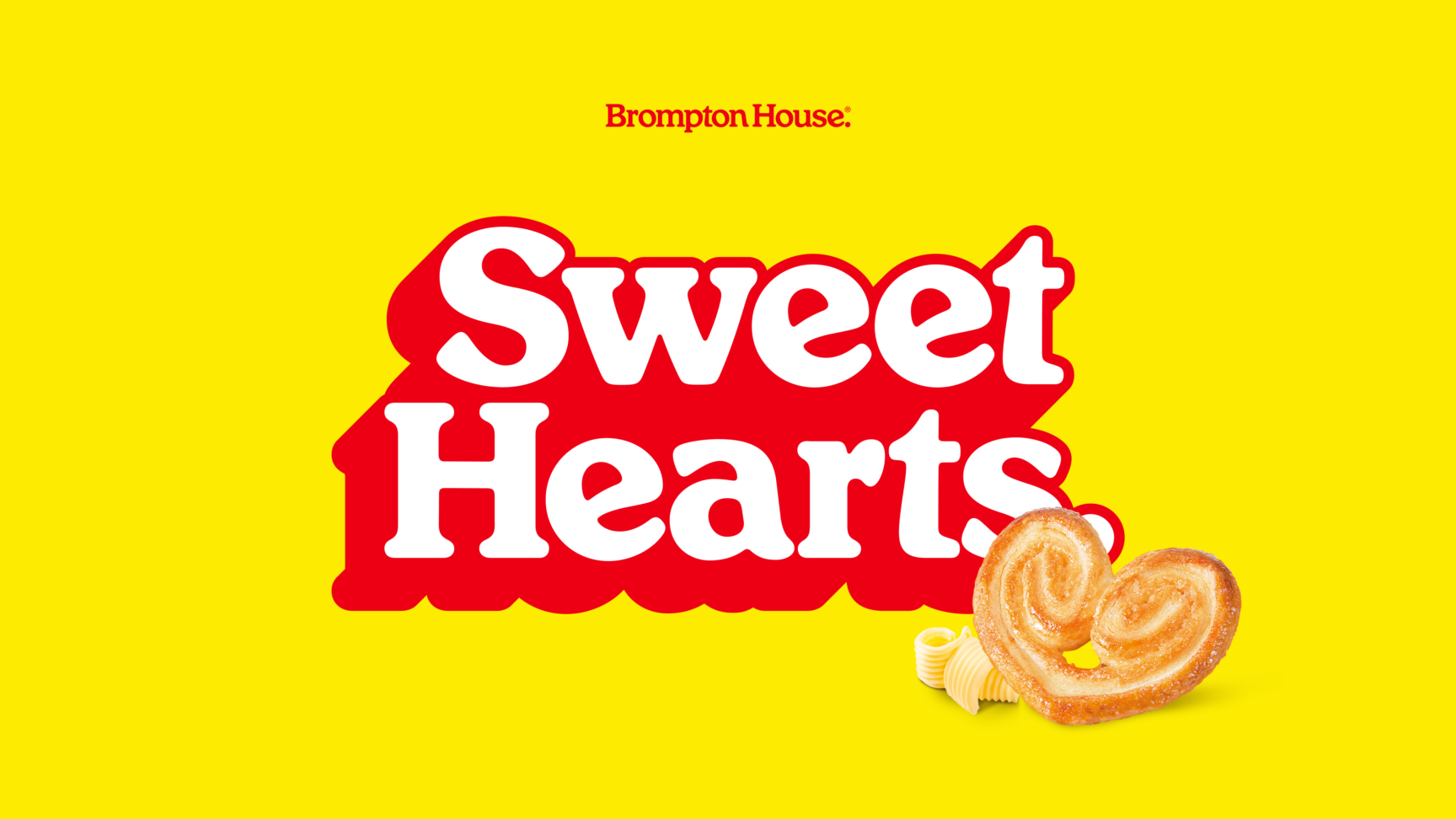
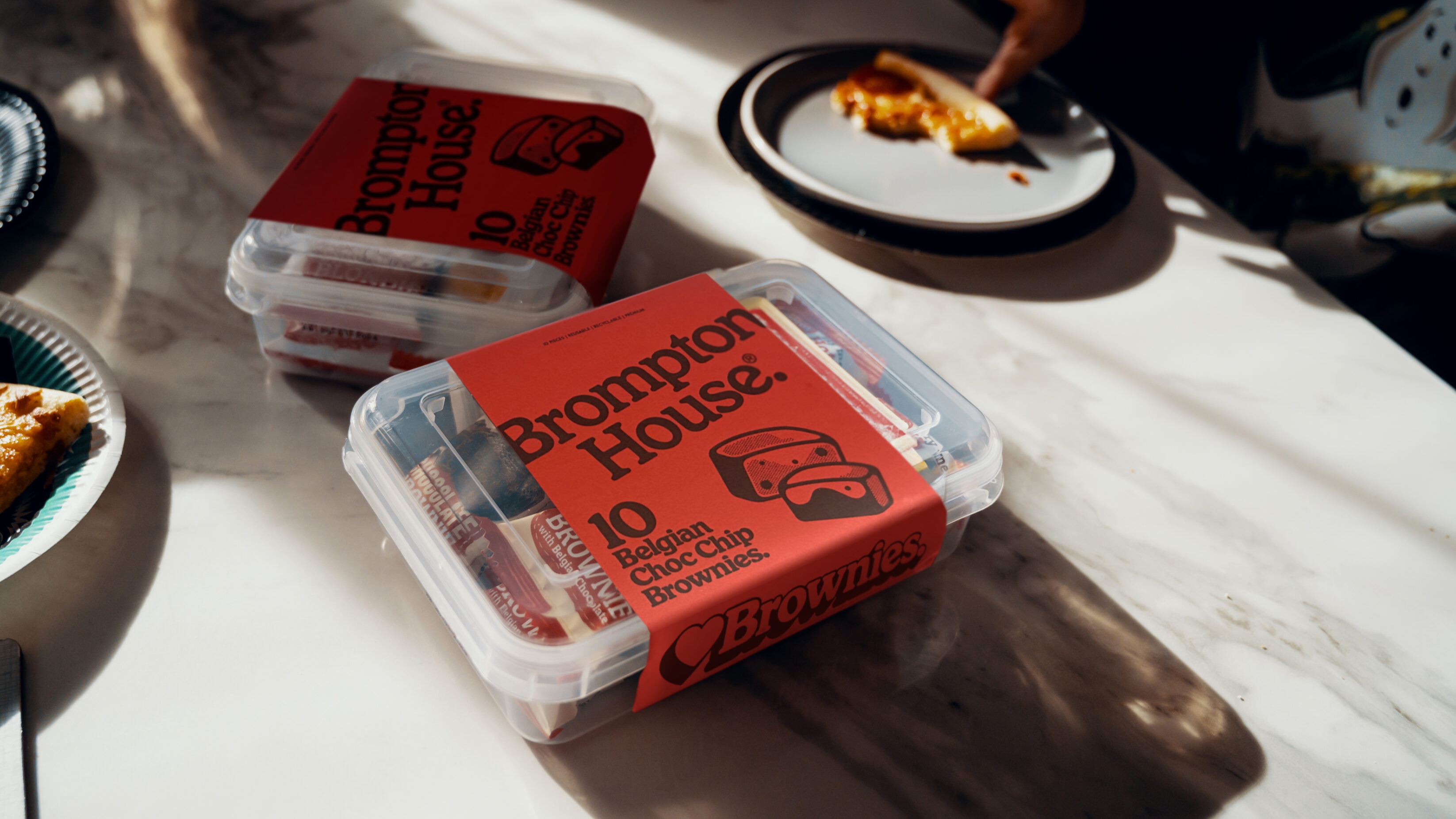
Removing the antiquated country estate illustration and rough texture from the original logo, we created a new simplified brand mark to feature the Brompton House brand name. Dropping unnecessary text, this fresh, clean logo uses two colours and removes superfluous decoration to create a brand mark optimised for digital and works across all scales. As clear in large in-store POS displays as it is on individual product packaging.
With major players in the sweet snacks category heavily relying on colour for brand presence (just think of a particular chocolate brand’s purple), owning a singular colour was fundamental to the visibility of Brompton House. Leveraging the heritage of their signature red, we planted a prominent flag amongst the competition to welcome customers to the home of sweet treats.


Initially tasked with updating our website, UnitedUs opened our eyes to the value of evolving our wider brand. Although the prospect of transforming our brand initially felt overwhelming, we put our trust in UnitedUs to creatively deliver the work. The imagery, messaging and assets they created better communicates our brand and enables us to stand out for all the right reasons.
Ignacio Lopez Salazar



A type of joy
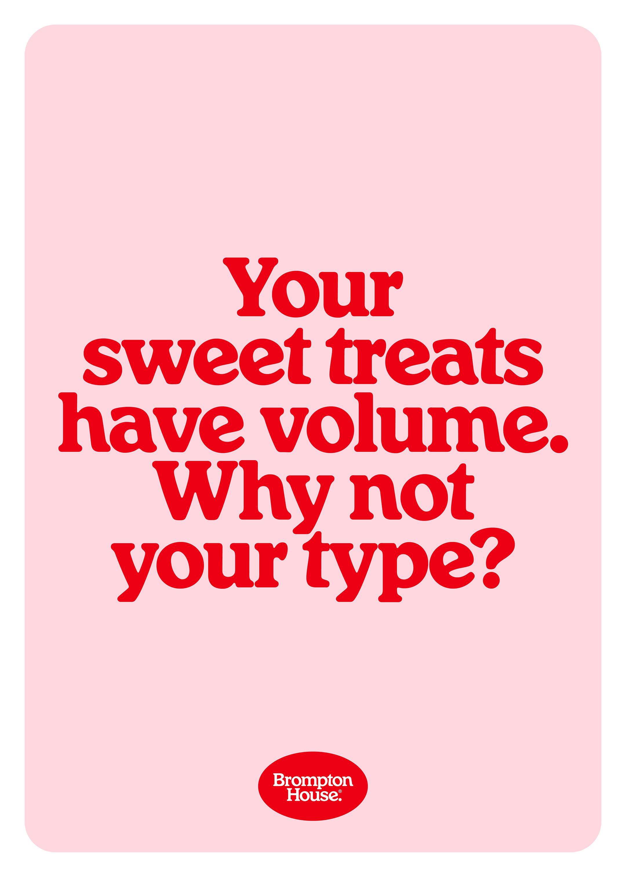
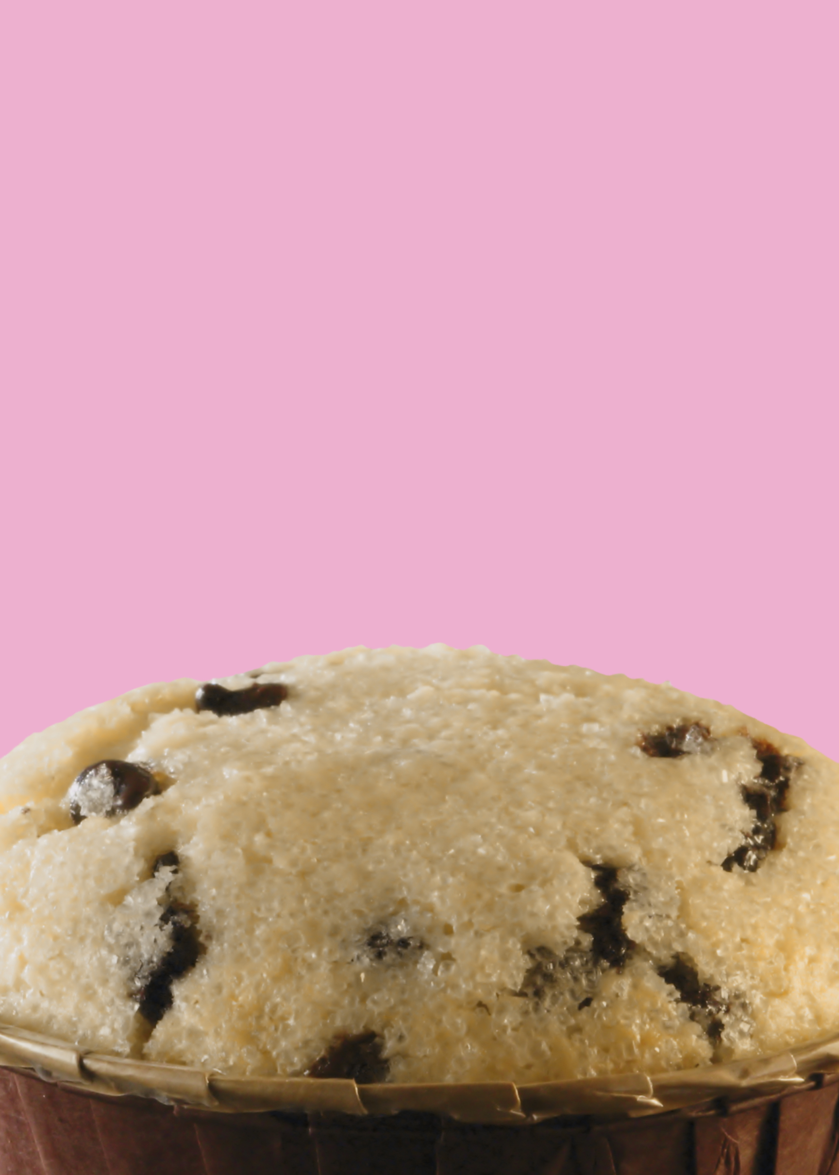
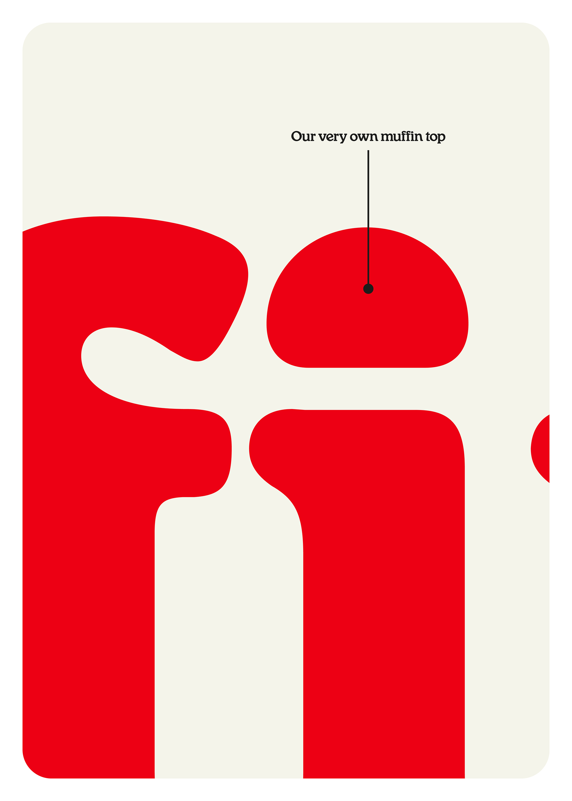
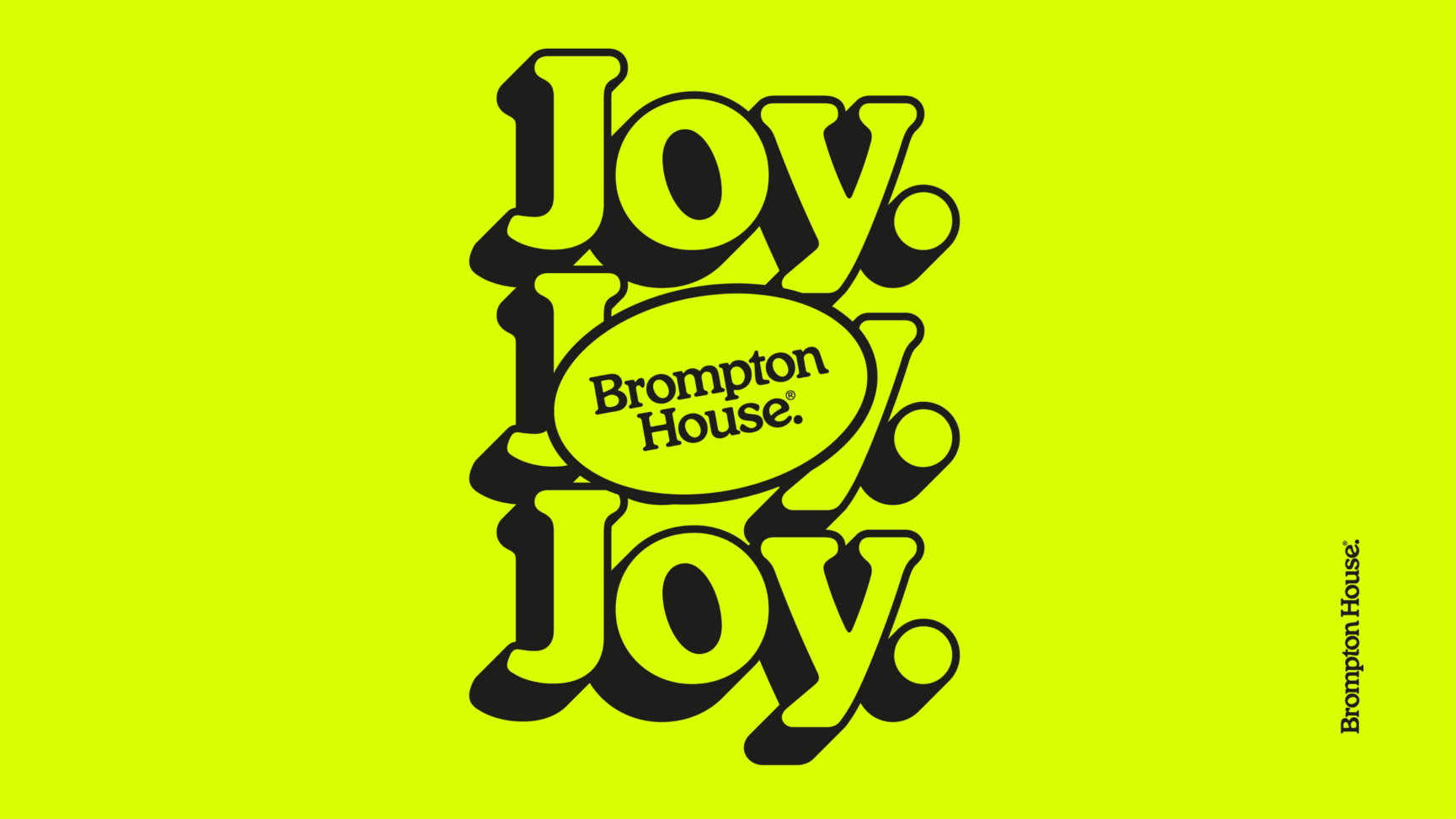
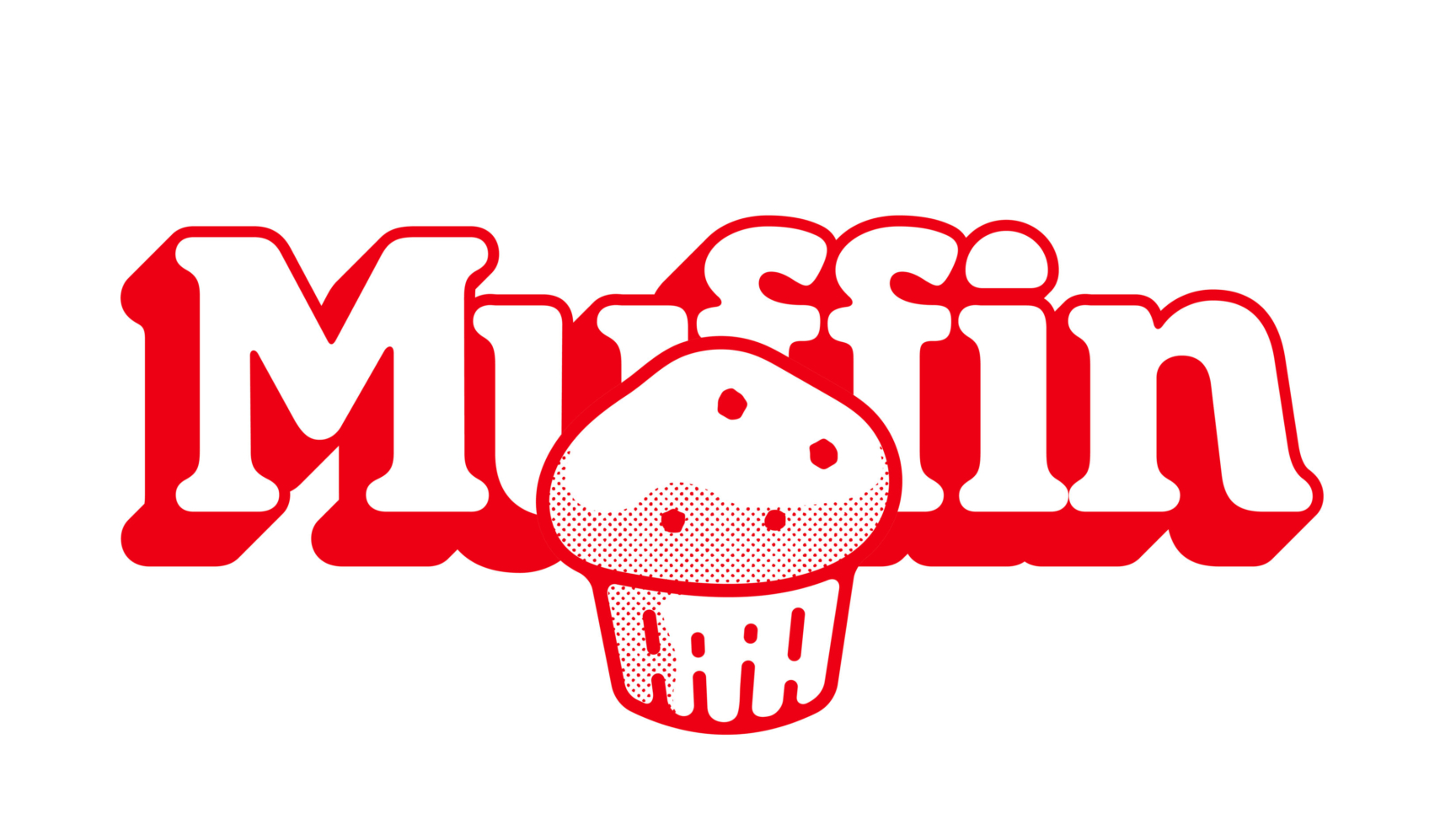
VC Henrietta as display type provides fun and boldness with the ability to pump up the volume through an extruded form. This type embodies moments of joy, such as the tittle on the ‘i’ rising like the dome of a freshly baked moist muffin.
Euclid Circular provides a versatile yet precise type with character, so whether communicating key ingredients onscreen or a supporting message on OOH posters, the brand can showcase its simple dedication to quality that customers love.
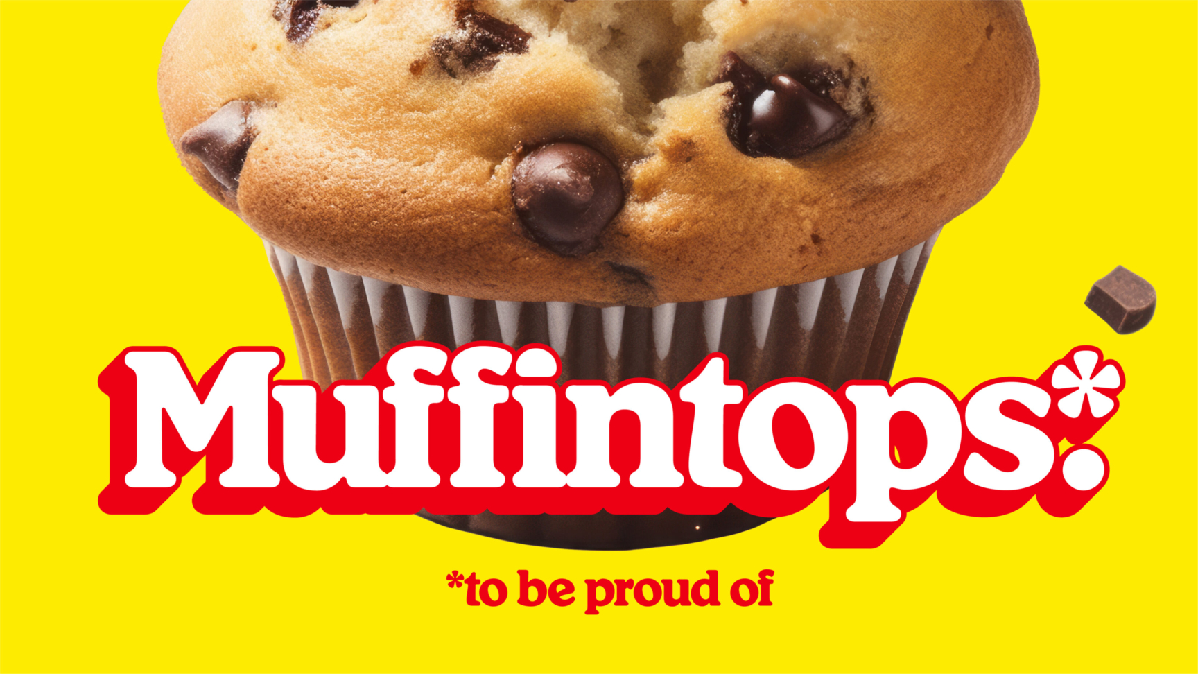
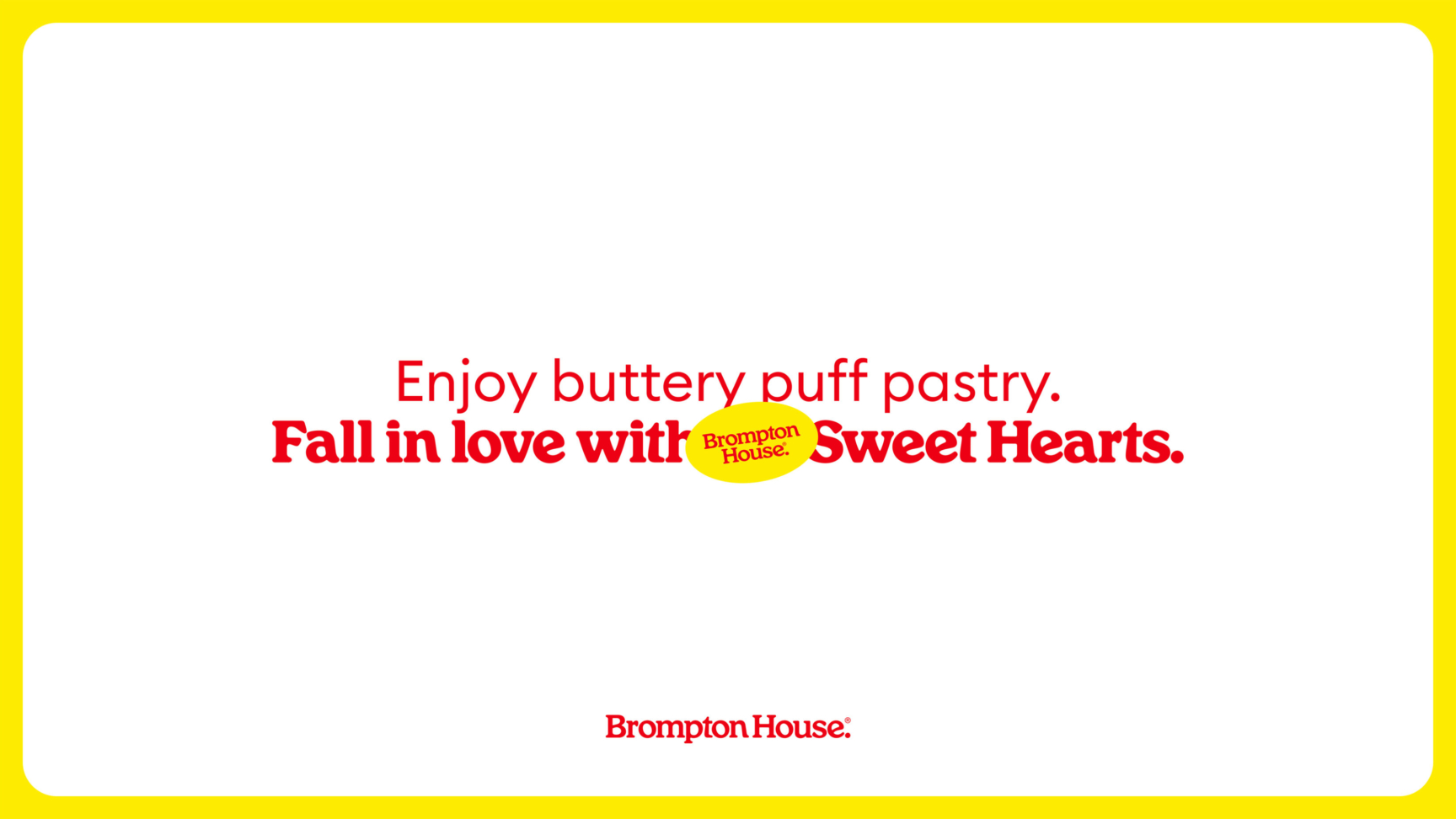
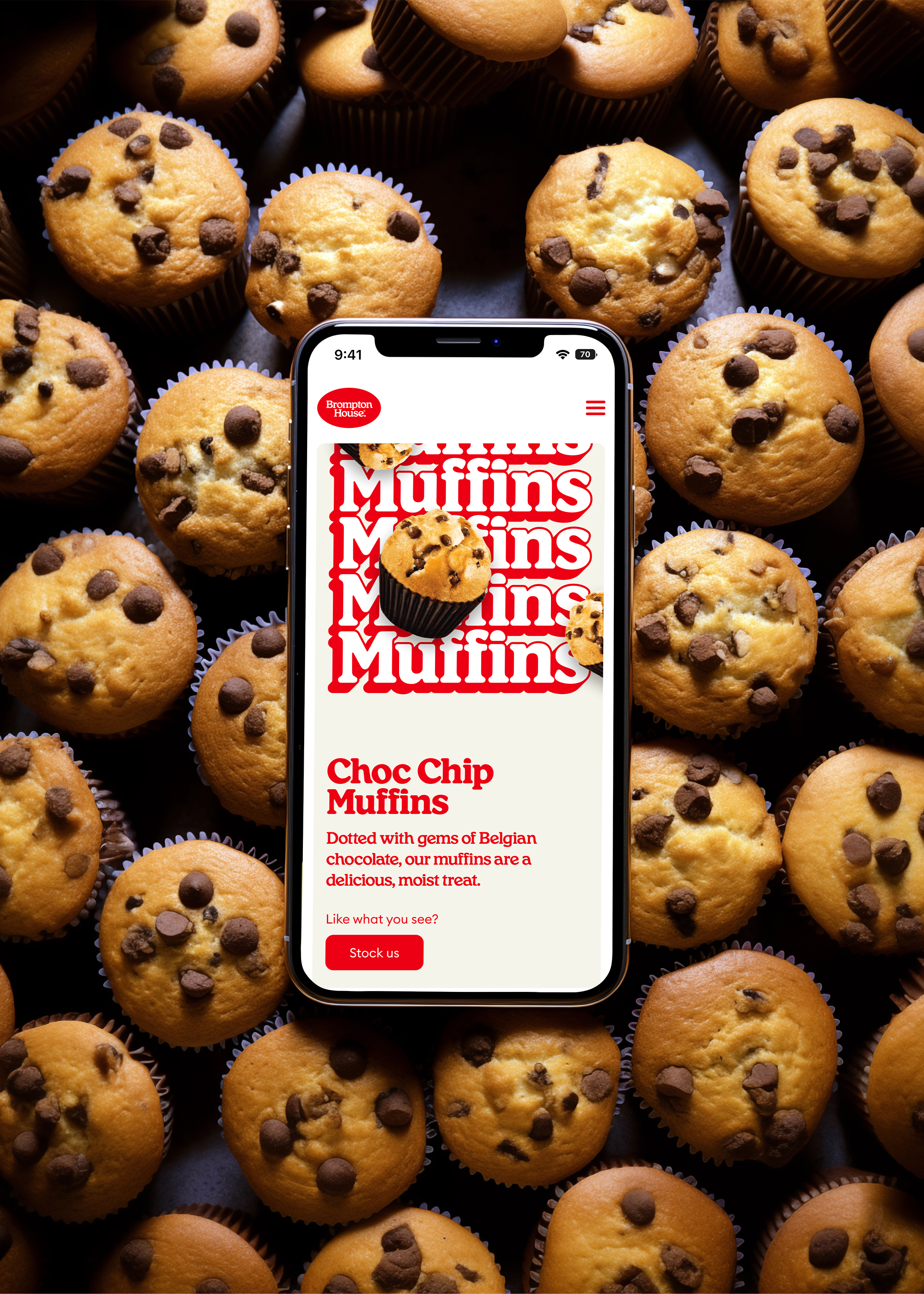
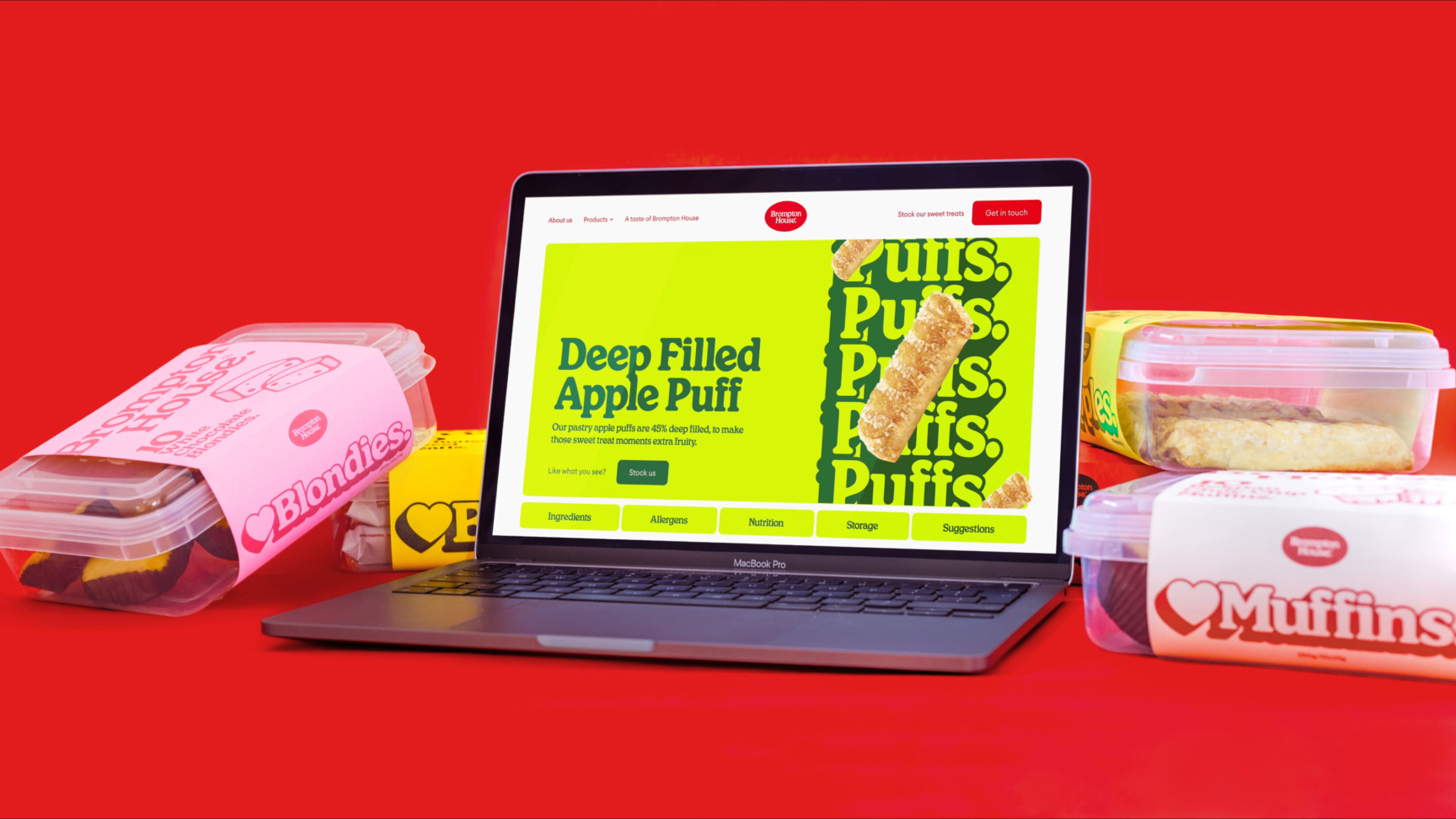
Bringing the brand to life online, we developed a website communicating to consumer and business audiences. Lifestyle photography shots of cheerful children having fun provide familial personality, showcasing the enjoyment of Brompton House products on screen. But the brand’s playfulness didn’t stop there, we tapped into Midjourney to create 60s, 70s and 80s stylised imagery, producing tongue-in-cheek campaigns that appeal to the minds of parents and grandparents alike.
With a website that baked in Brompton House’s goodness, we also streamlined the process for inbound requests and queries — creating a more professional experience for potential buyers and an easier process for customers to give feedback.

Related projects
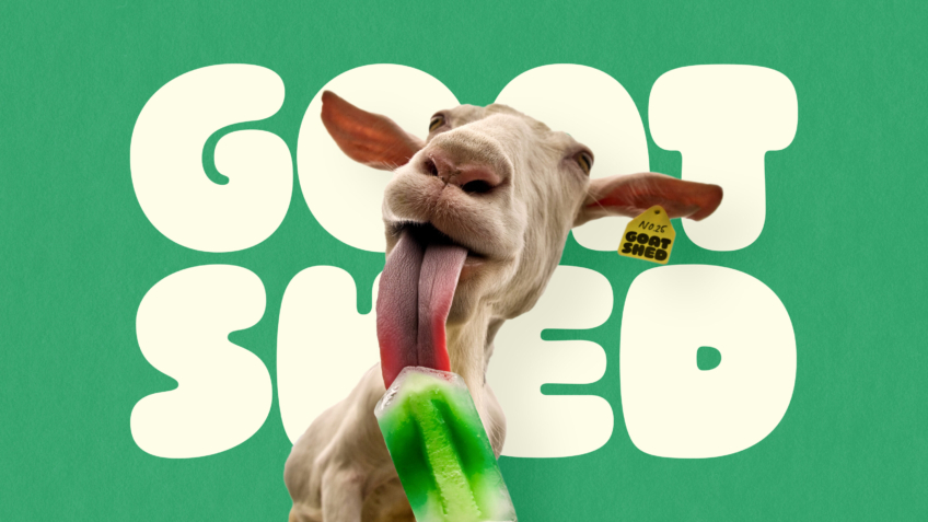
Goat Shed
Doubling basket spend for a G.O.A.T destination brand dedicated to food, family and farming.
Bucking the trend of traditional farm shops to create the goat-est Norfolk destination of all time. Heroing the animals that started Goat Shed's journey, their brand and website now embodies all the fun of the farm.

Cocoa Runners
Optimised e-comm site with a 56% increase in users for the world's best craft chocolate brand.
Blending fascination and facts around chocolate, we unwrapped a high-quality brand and eCommerce site for Cocoa Runners. Offering optimised consumer experiences through the communication of sensational experiences, we enabled people to embark on their own craft chocolate adventures and connect with the world’s best makers.
Want to build your brave brand with us?
