
The Circle
Supporting a movement of global feminism through a brand that amplifies female voices. A new Chief Executive, armed with a new strategy, and inheriting a huge legacy of impact, community and prestige. The brief to rebrand The Circle was not only to unite its audiences of community members, celebrity supporters, partners and donors around the new focus - to end violence against women and girls and support the economic empowerment of women - but to amplify its impact and the voices behind the name. The Circle needed a brand that called people to action around the globe, in solidarity for women and a new movement of feminism.
Brand guidelines Brand strategy Brand visualisation Copywriting Print collateral Tone of voice UX Visual identity Web design Web development
Charity
Global UK
2022
Design Week Awards (Shortlisted) Best brand strategy for The Circle
Since the dawning of time, women have come together to convene, commune, and collectively shape a shared future. And in 2008, one such gathering of women with Annie Lennox at the helm, led to the creation of The Circle. From that moment, the organisation has provided the space for women to come together and engage in the subtle yet mighty process of change making – from demanding a living wage for garment workers, to providing resources for women fleeing persecution. But the world has changed since 2008, and so has feminism.
‘Feminism’ is a loaded word, and the new trajectory of The Circle needed to confront the discomfort. It needed to embrace intersectionality, understand its own biases and redress the levers of power. So we created a brand mantra capable of uniting feminists around the world, influenced by the timeless female social activist, bell hooks.
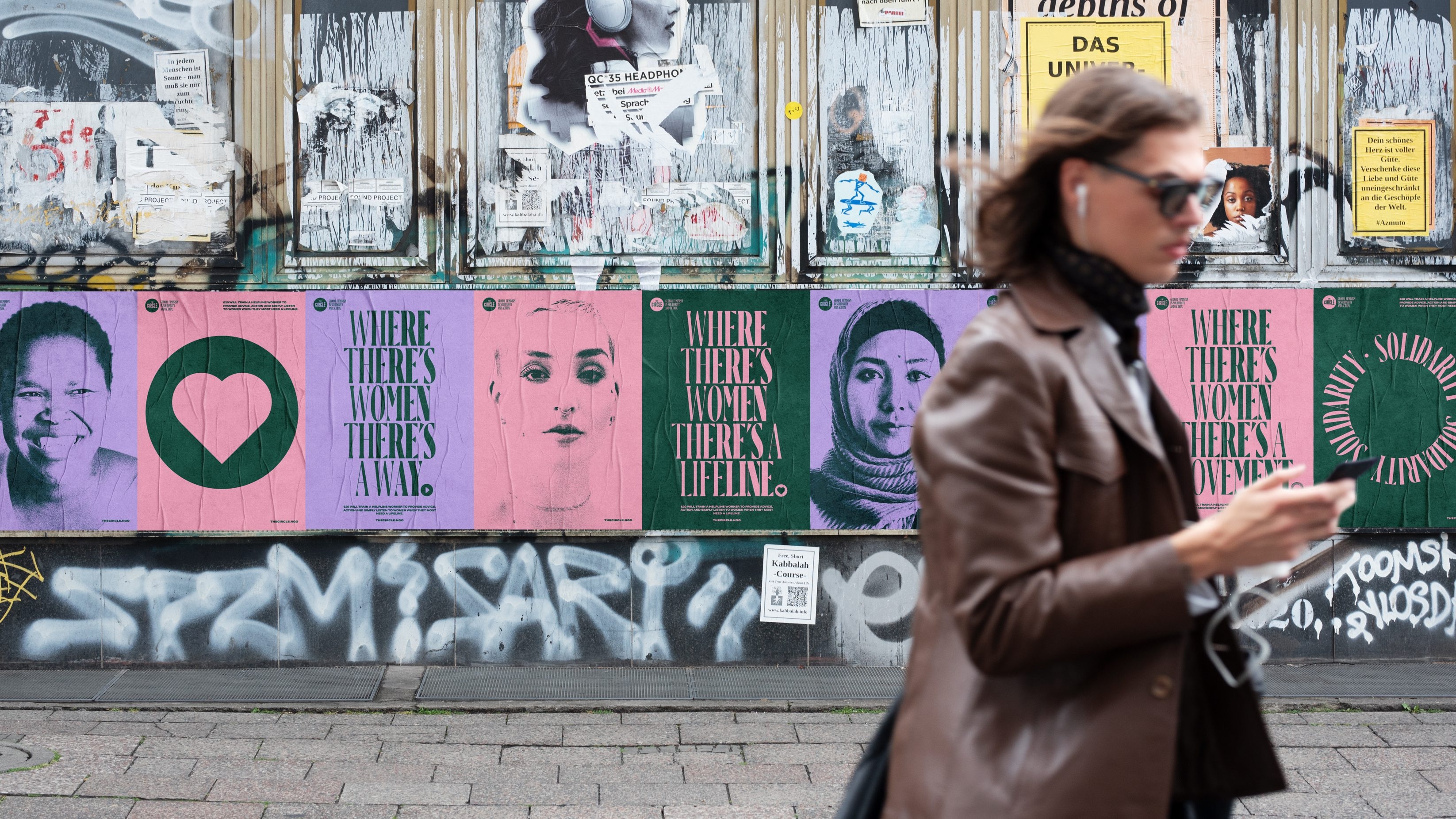
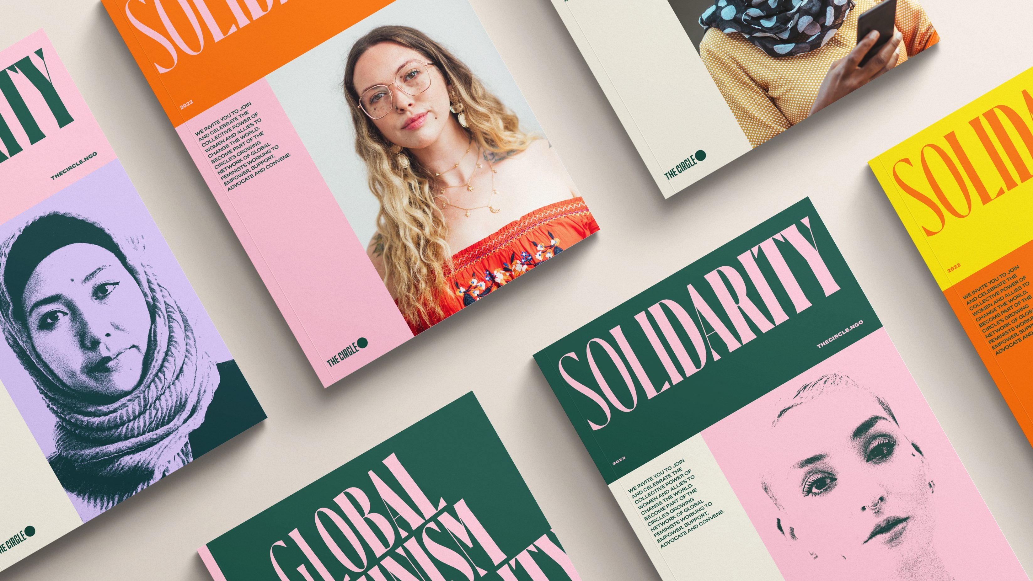

We crafted the brand language to centre the core motivation of The Circle and the belief of everyone in their community – that we should aspire to be Global Feminists, in solidarity and action. As Global Feminists we fight for gender equality for women and girls in every corner of the world. Global Feminism is our guiding light through which we empower, support, advocate and convene women from across the world. Together we address the root causes of gender inequality and fight for a fairer world.
I’m really excited by the vision and potential of The Circle going forwards towards its next phase. At a time fraught by so much polarity and division, our perspective of global feminism offers everyone from all backgrounds and walks of life an opportunity to become actively engaged in the development and evolution of feminism everywhere across the globe.
Annie Lennox
In becoming the brand incarnate of Global Feminism, The Circle’s visual and verbal identity needed to be reflective of the principles it holds: a celebration of diversity, the amplification of underrepresented voices, acknowledgement of where power lies, an expansive understanding of the implications and roles of sex and gender – and an inclusion of all those who identify as women in our mission.
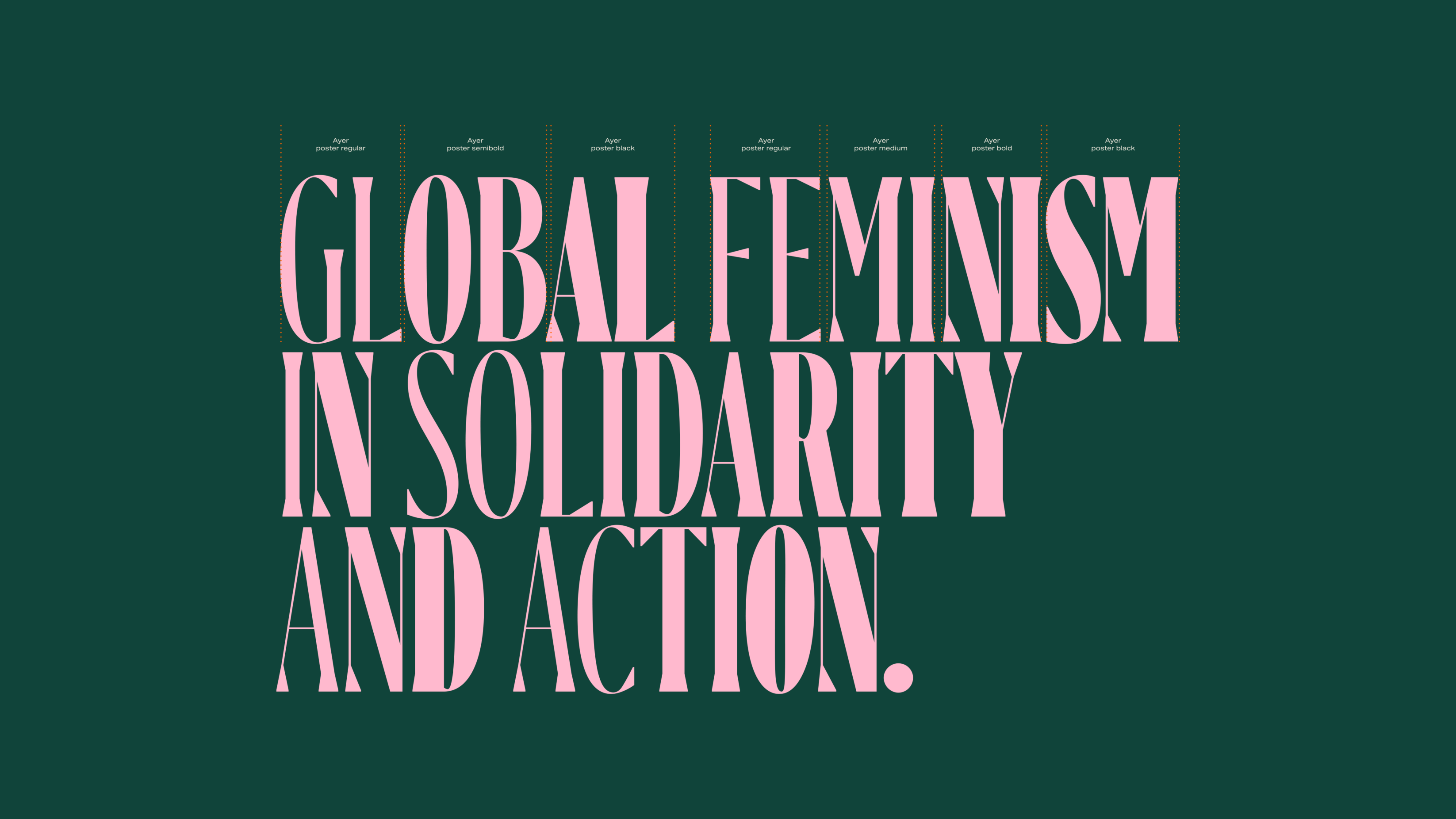
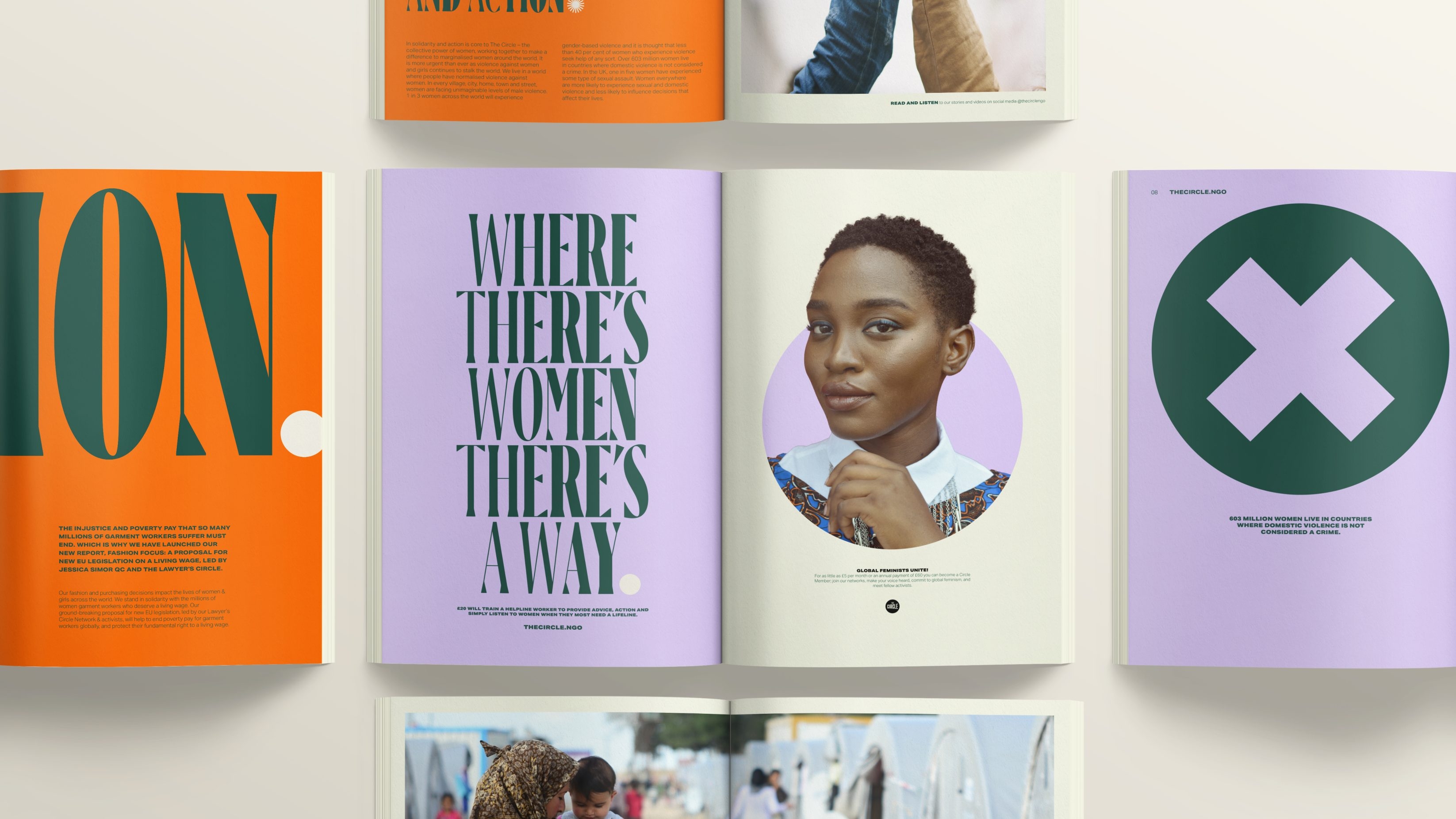
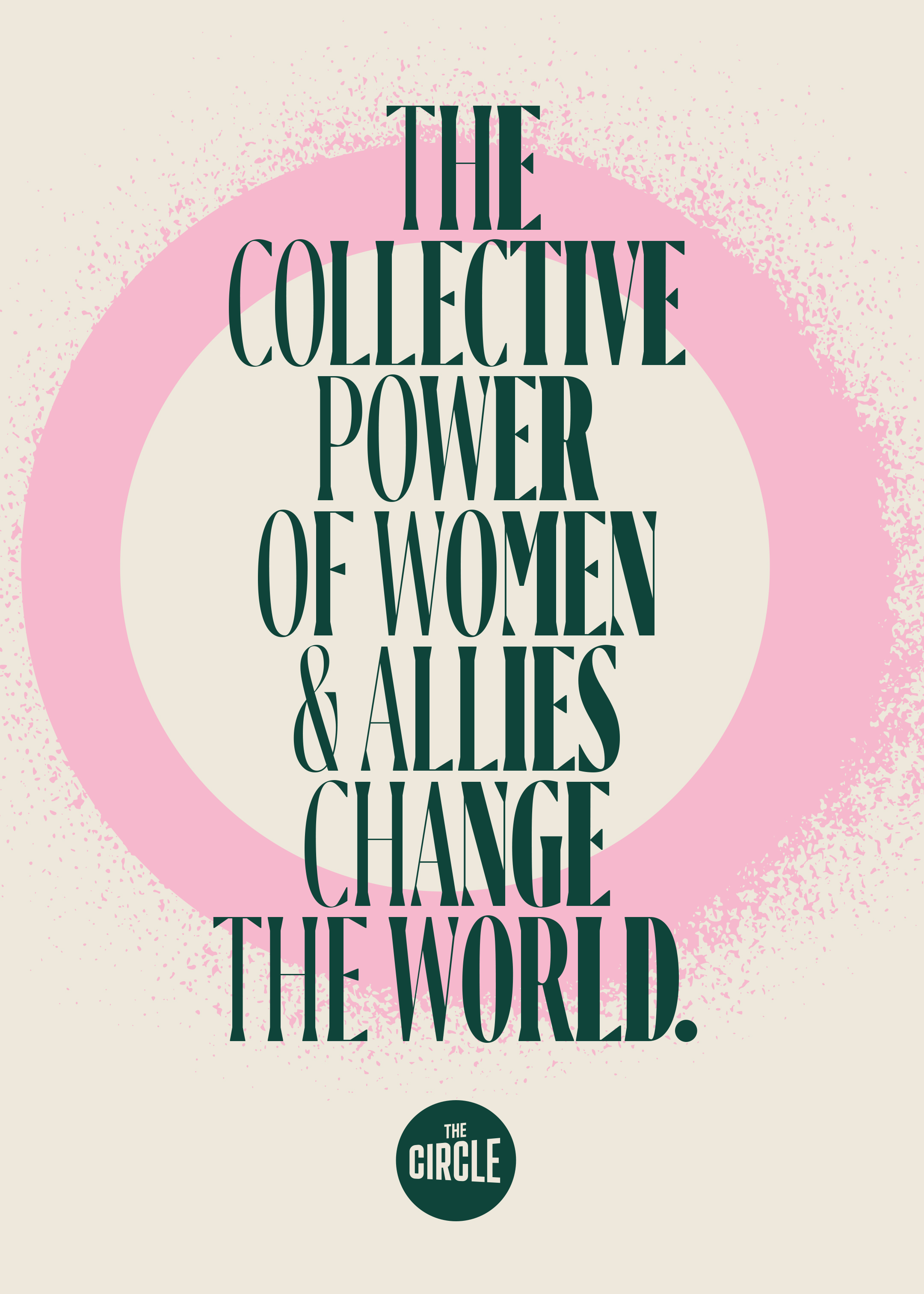
Leading the visual identity is bold typographic statements – reflecting both the courage and the rallying cry of The Circle, as well as a custom type setting intended to represent the amplification of women’s voices. A combination of Ayer Poster and Aktiv Grotesk gave The Circle a bold, but accessible visual voice that can be used across both campaign materials and international policy documents alike.
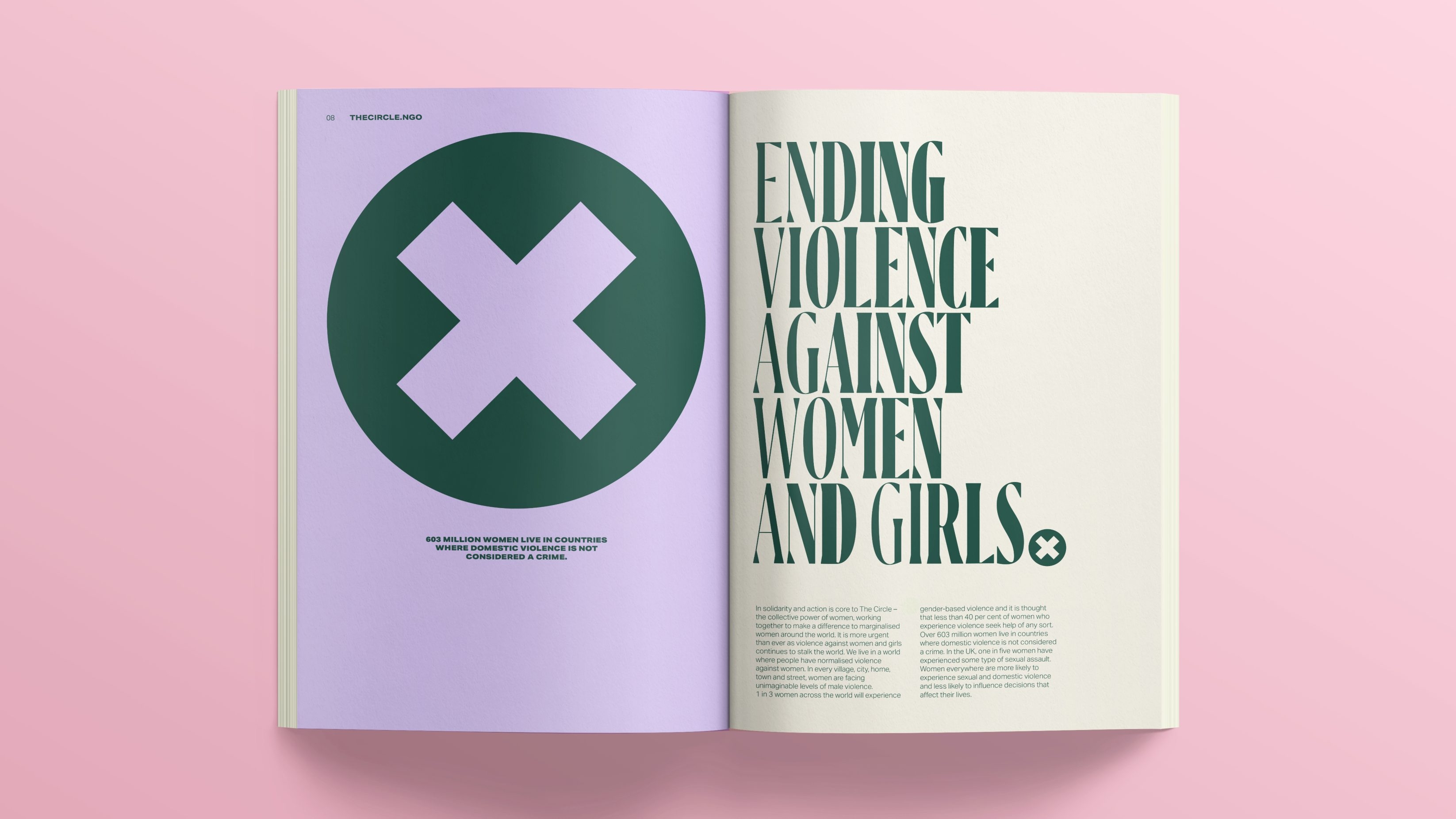
While many NGOs and charitable organisations have faced backlash and controversy around their use of exploitative imagery or presentations of white saviorism, the image and graphic choices behind The Circle’s brand celebrate women. Because, quite frankly, you shouldn’t need to see an image of a beaten woman in order to know that it’s not right. Instead, we worked closely with the team at The Circle to identify imagery from their archives and project partners that reflected the aims and values of the organisation. Imagery is intentionally representative of intersectionality, presents the subjects of the imagery with dignity and respect, and where original imagery (non-stock) is being used, credits are applied.
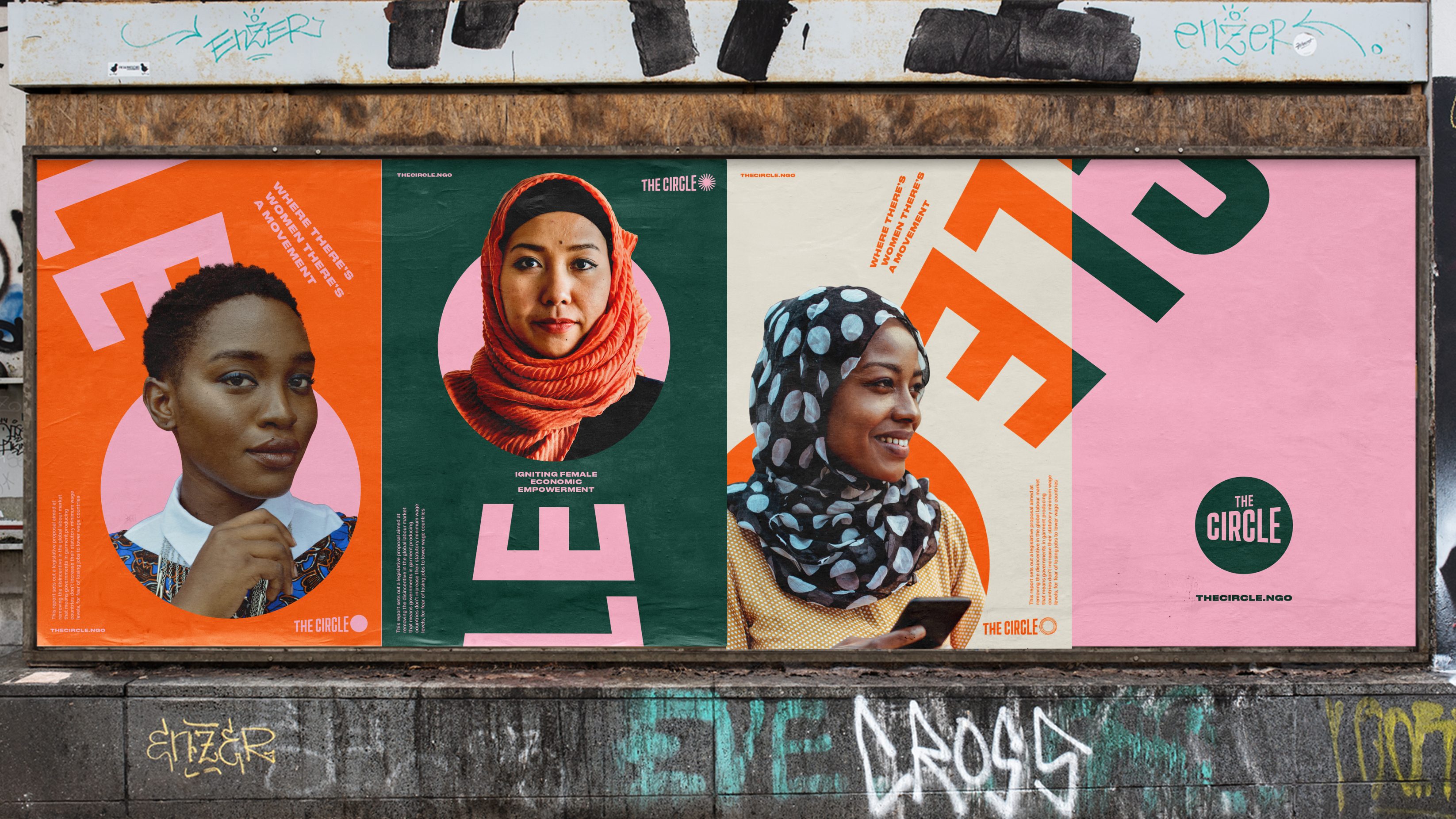
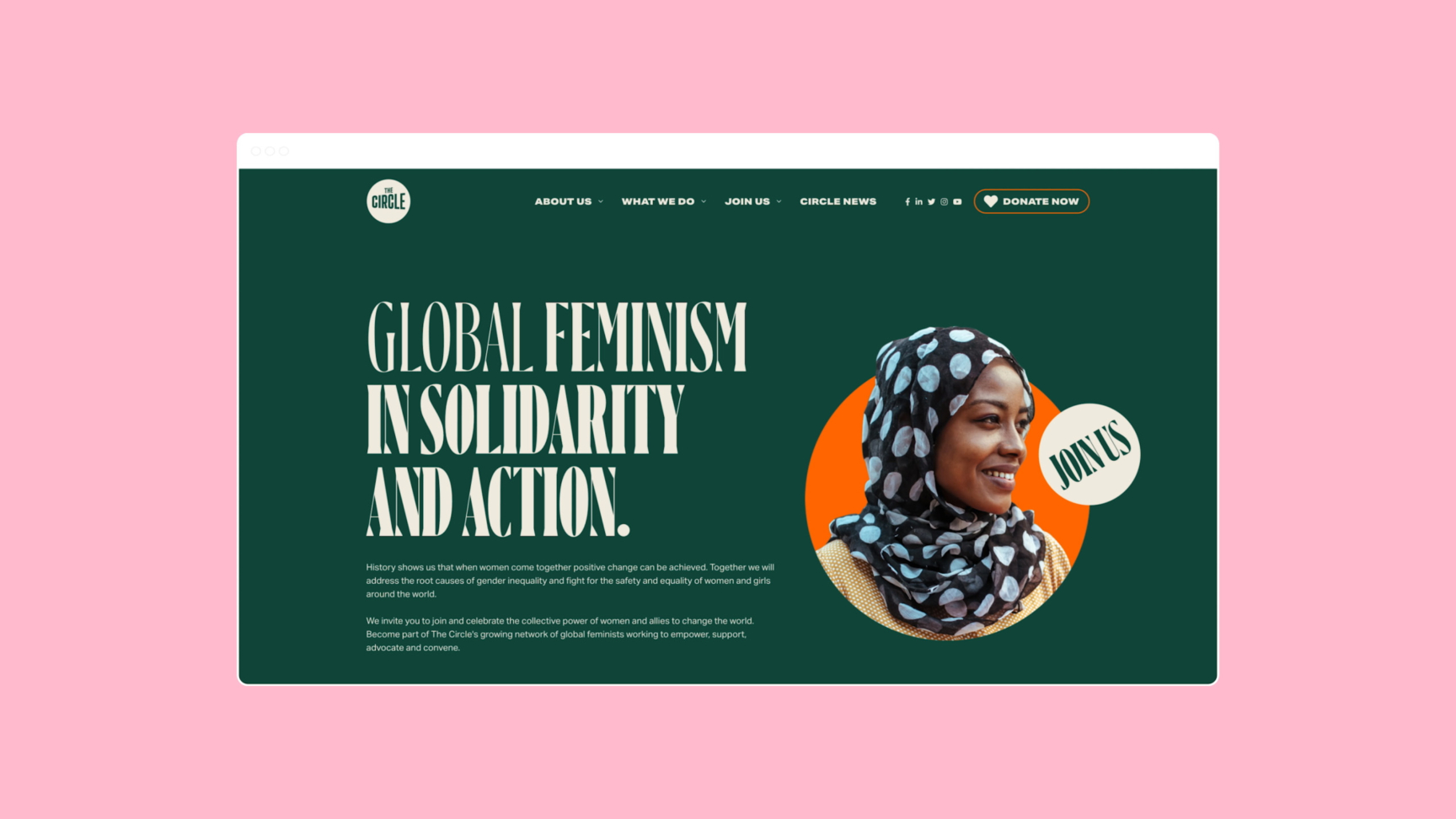
We stand in solidarity with women and girls in terms of access to human rights, justice, and equality. This is reflected in our positive and powerful new brand. As allies in partnership with our global sisterhood we aim to connect, inspire, and support everyone to become proactive in helping to create the positive changes we passionately want to see.
Annie Lennox
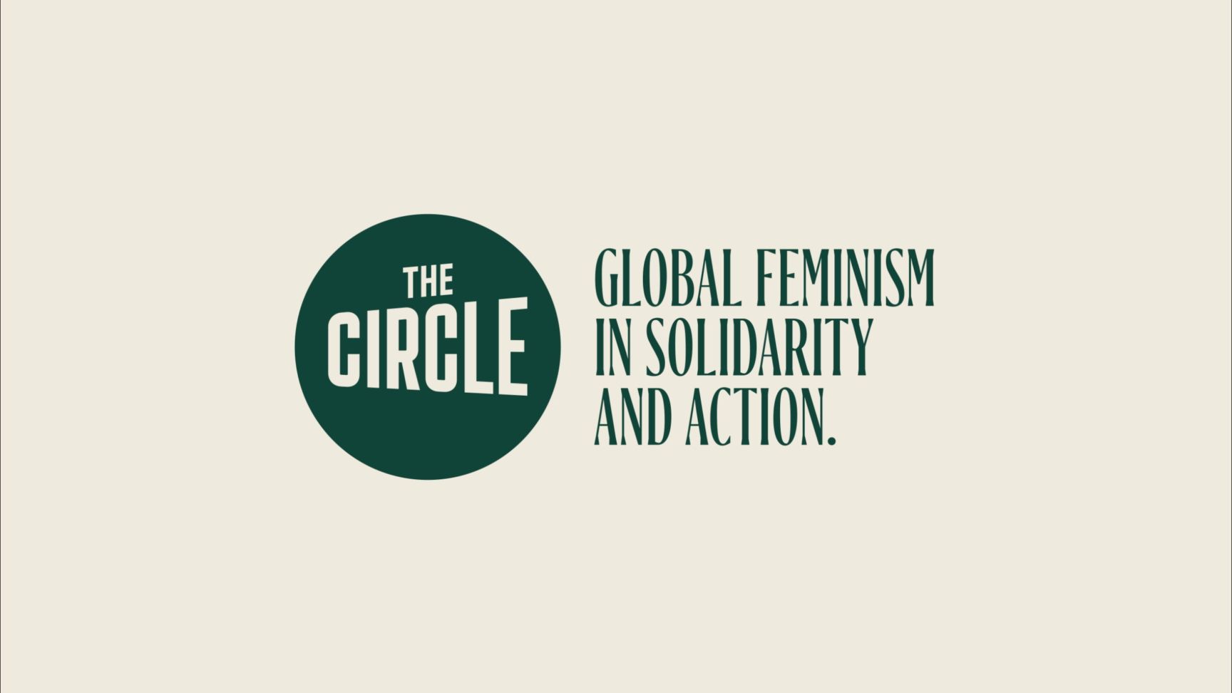
Prior to the rebrand, The Circle was the space that women held together. In the new identity, the circle shape becomes a prevalent graphic device – to be used to punctuate Global Feminist action, draw attention, and convey progress. It is the divine feminine in all its facets – a Global Feminist evolution of the three faces of the moon goddess, and a device that can be applied as a stamp-like marker of Global Feminism.
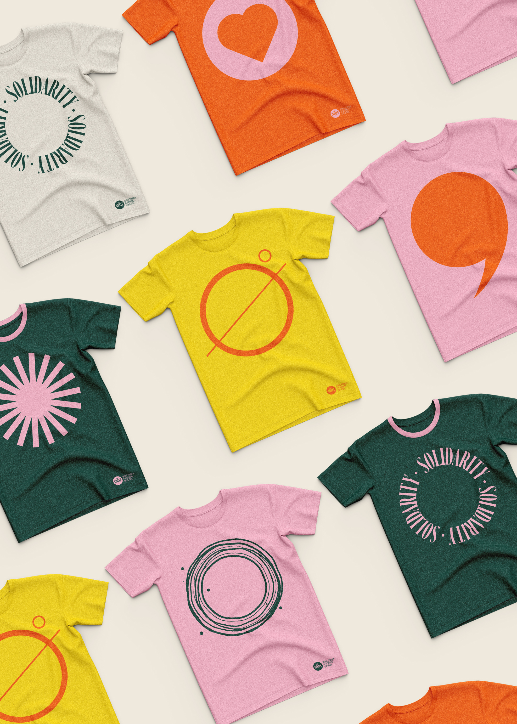
It was a privilege to work with the hugely talented team at UnitedUs who share our mission to create a fairer world for women & girls globally. They were true partners and understood our ambitions to bring Global Feminism alive. They've done an incredible job developing and delivering our bold new brand strategy with activism, global feminism, and solidarity at the heart of it. Our Founders, Board, and team can't thank them enough for their time, dedication, and commitment to our work.
Raakhi Shah, Chief Executive
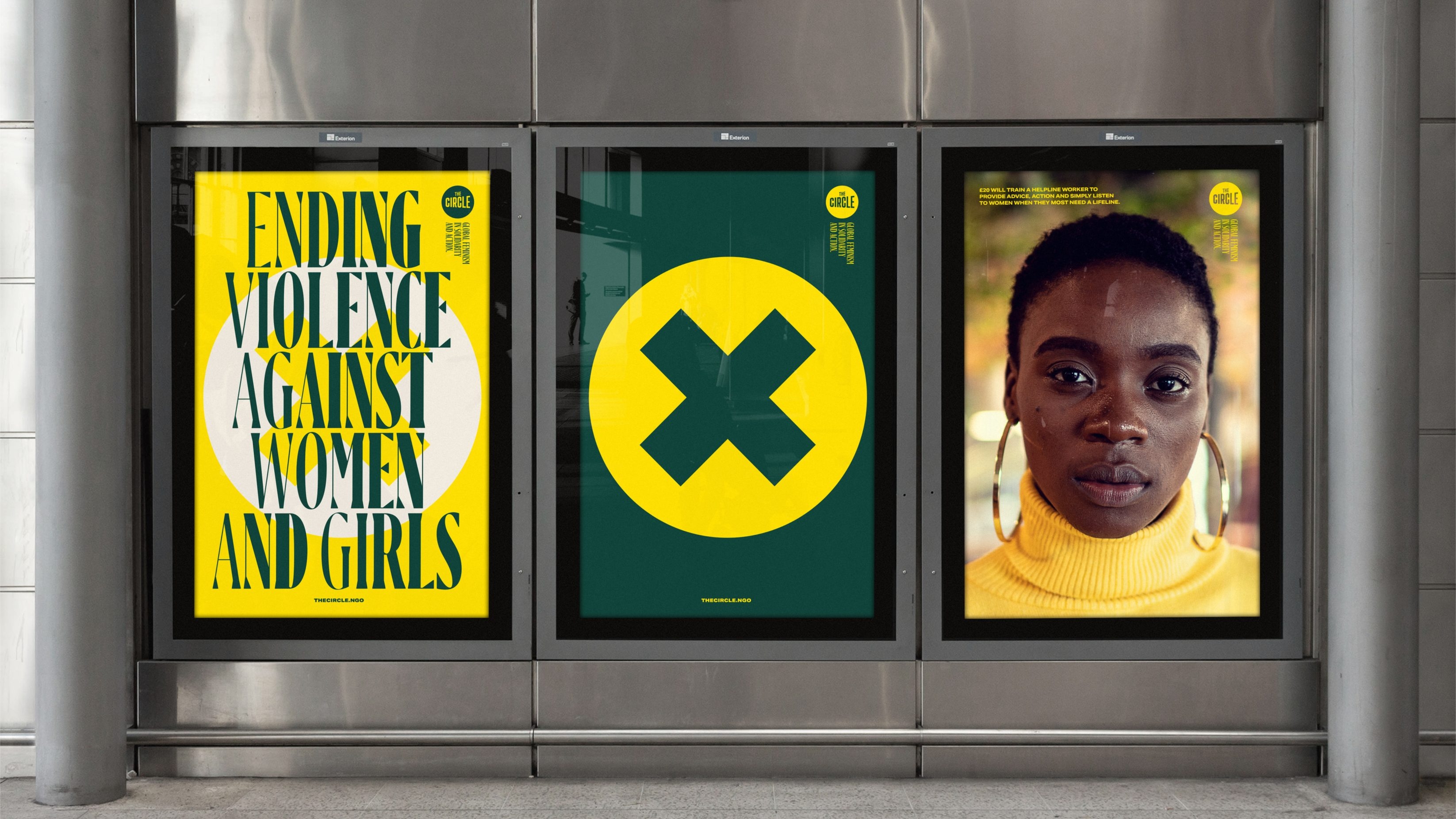
Though the brief was to create a brand for The Circle, this brand is intended to be an identity for all Global Feminism. It joins the pussy hat, the power salute, #MeToo, bare nipples and so many more as symbols of our time – icons for us all to own and adopt. To embrace and push forward much needed change and enter a new era of equality.
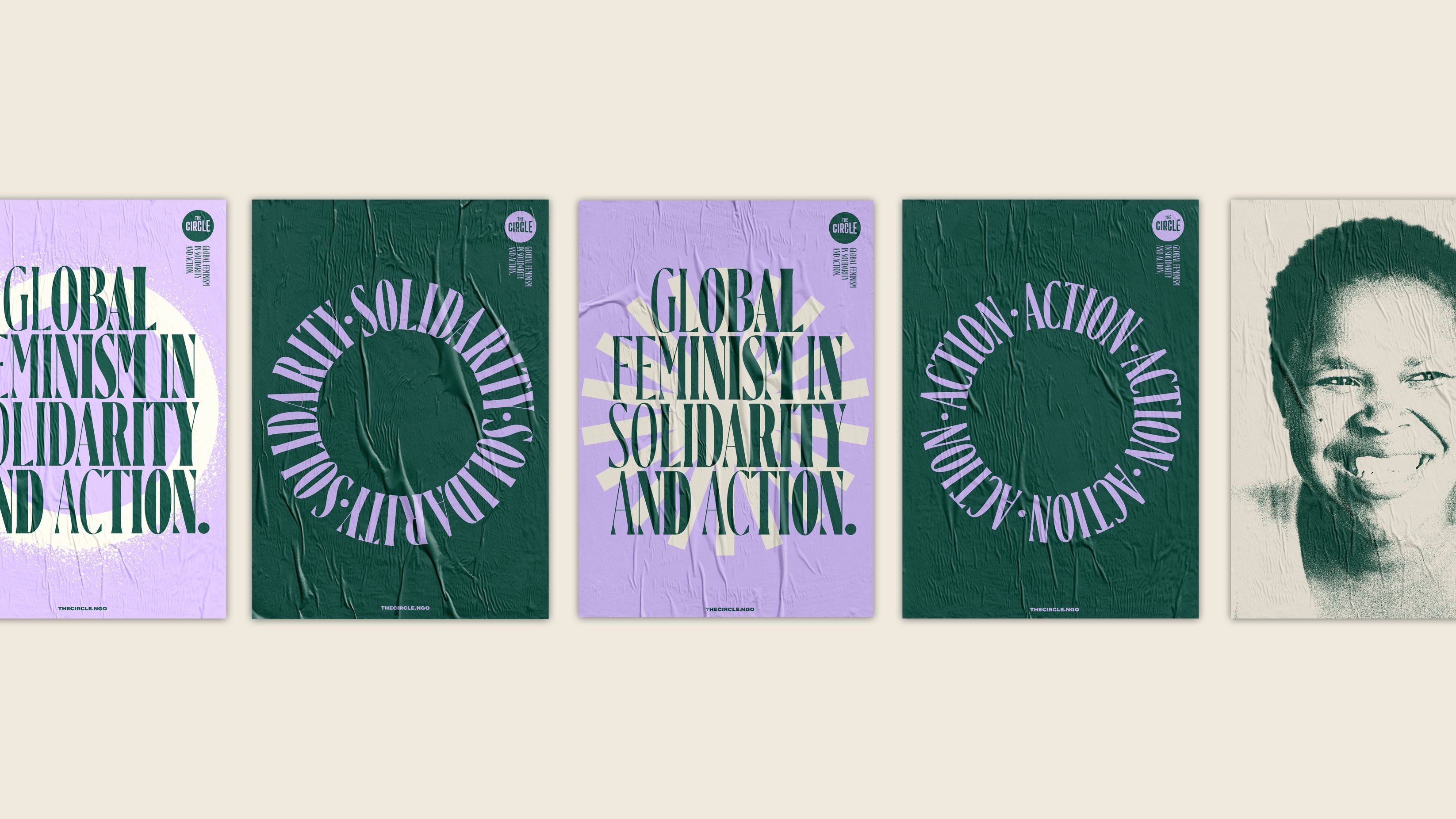
Related projects
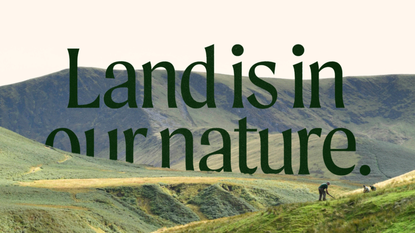
The Ernest Cook Trust
Telling the story of a brand new strategic direction, rooted in the land.
UnitedUs met the Ernest Cook Trust at a time when the organisation's brand and strategy were both in need of a fresh perspective. Working alongside the charity's strategy development, we cultivated a new brand positioning that was both rooted in the charity's enduring heritage and brought new life to its emerging strategy.

Buttle
A fundraising-ready brand for a frontline children’s charity
For over 70 years, Buttle UK has been the quiet force behind the scenes, providing the essential items that keep a childhood on track. But in a world where the gap between the ‘haves’ and ‘have-nots’ is widening, being quiet was no longer an option. Buttle needed to stand up and have a voice about the support needed to deliver what’s truly important to protecting childhoods.
Want to build your brave brand with us?