Buttle
A fundraising-ready brand for a frontline children’s charity For over 70 years, Buttle UK has been the quiet force behind the scenes, providing the essential items that keep a childhood on track. But in a world where the gap between the ‘haves’ and ‘have-nots’ is widening, being quiet was no longer an option. Buttle needed to stand up and have a voice about the support needed to deliver what’s truly important to protecting childhoods.
Brand strategy Copywriting Digital design Illustration Photography Print collateral Verbal identity Visual identity Web design
Charity
UK
THE CHALLENGE
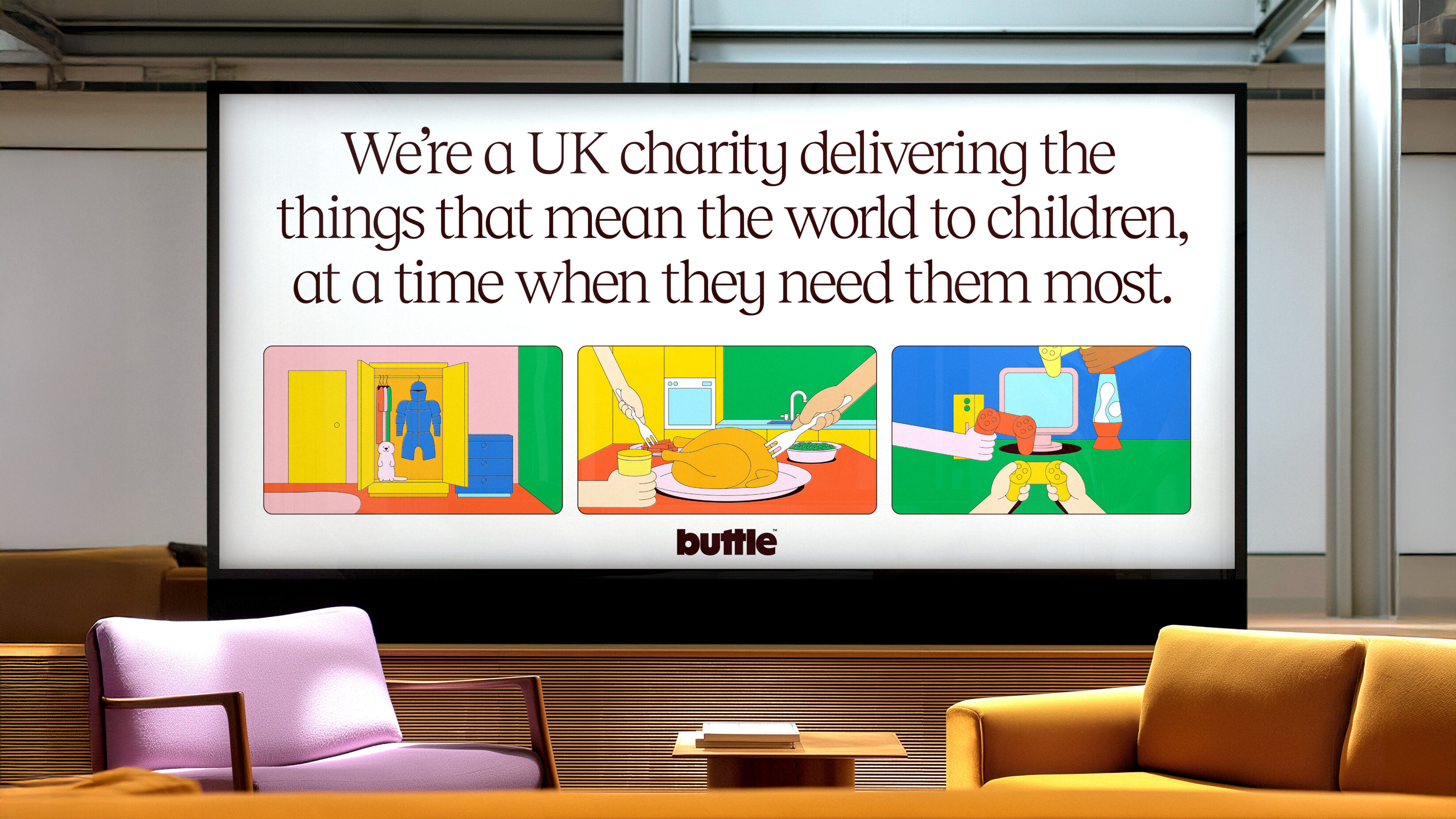
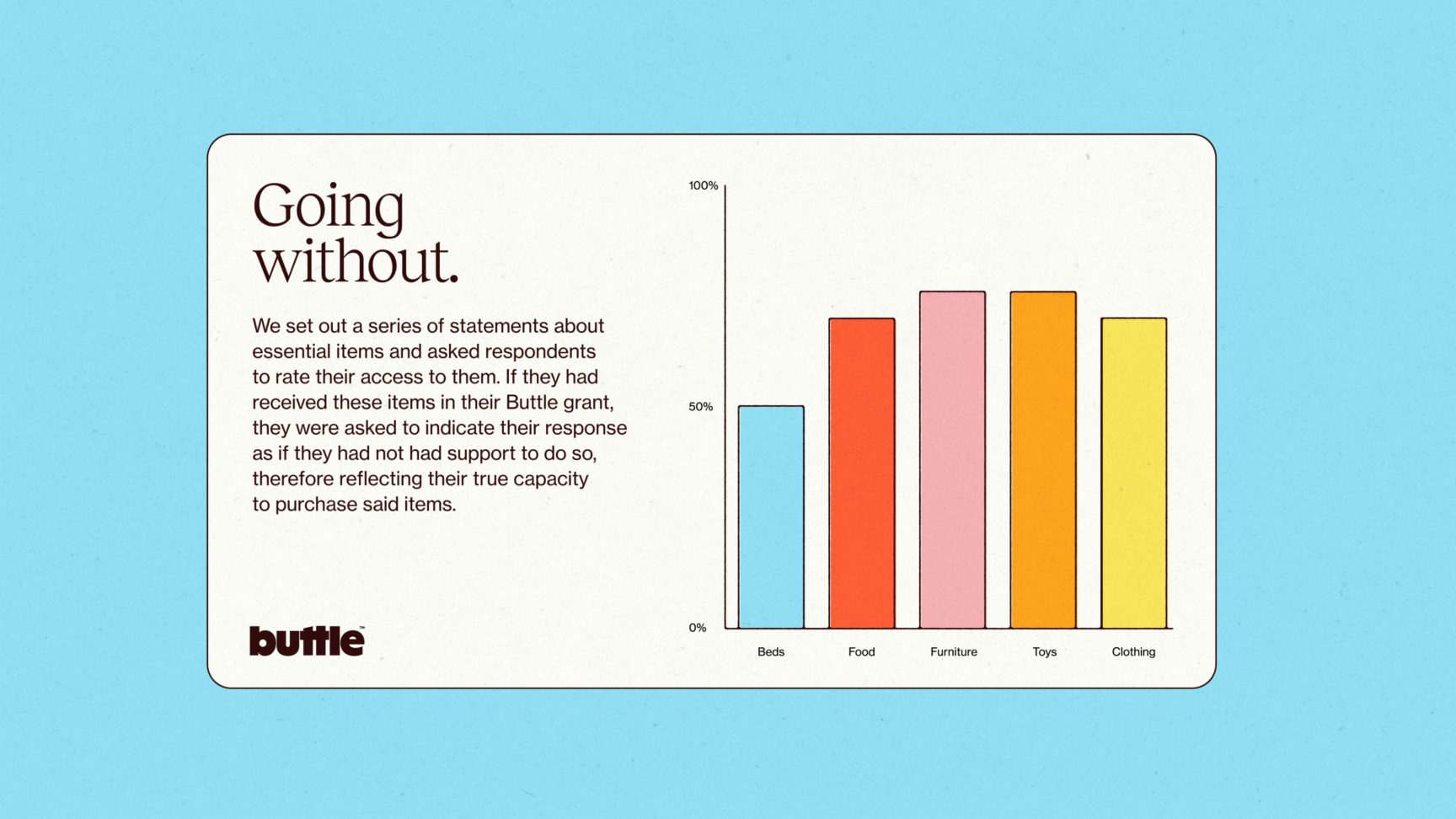
Buttle doesn’t just give grants; they give children their dignity back. Whether it’s a bed to sleep in, or a laptop for homework, these aren’t just ‘items’, they are the building blocks of a ‘normal’ childhood.
The organisation’s previous brand was too modest to meet the scale of the current crisis. They needed a brave new identity that could bridge the gap between their historic legacy and a modern, advocacy-led future. They needed a platform that didn’t just ask for your support, but demanded a better standard for every child.
The Creative Thrust:
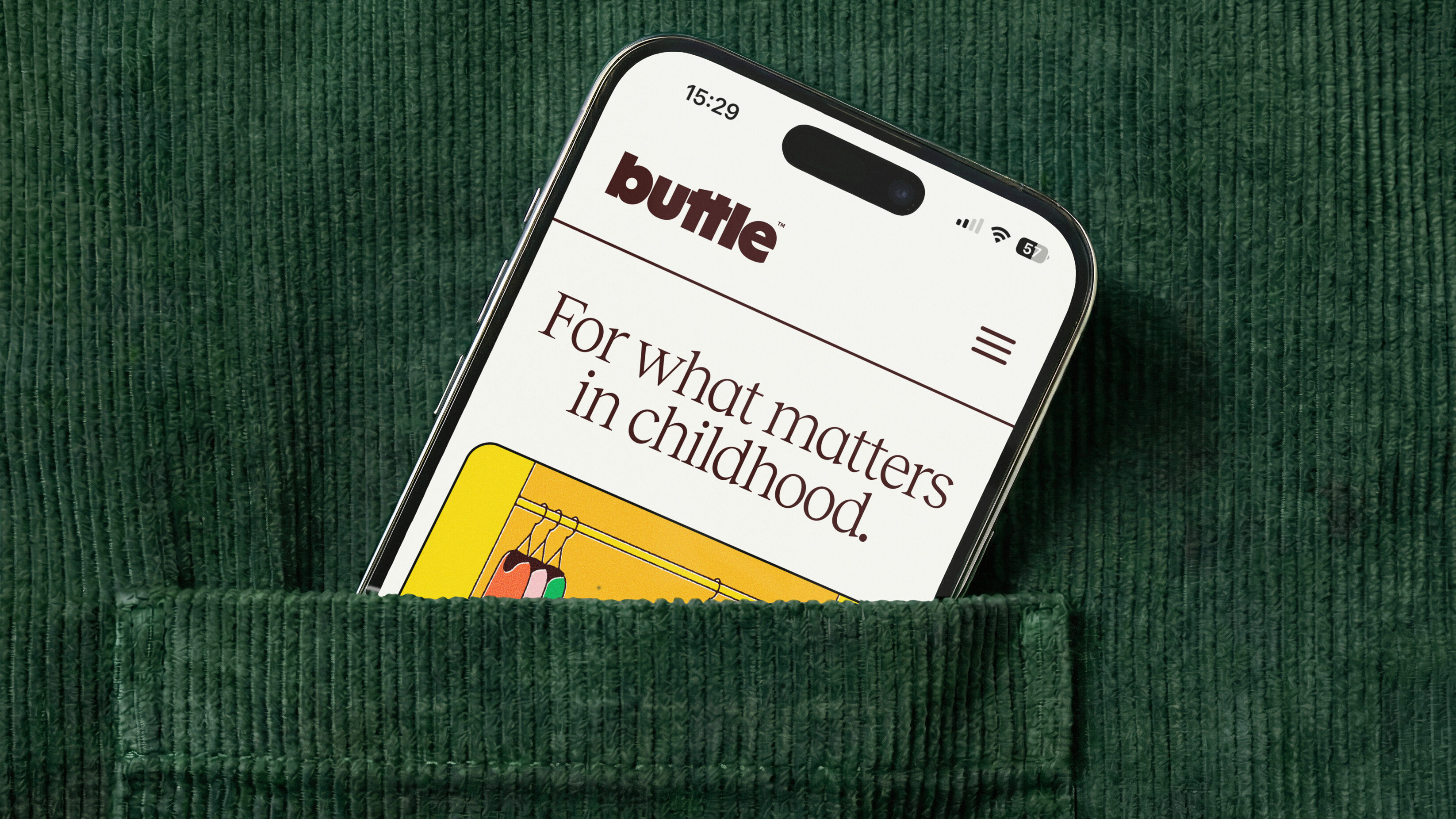
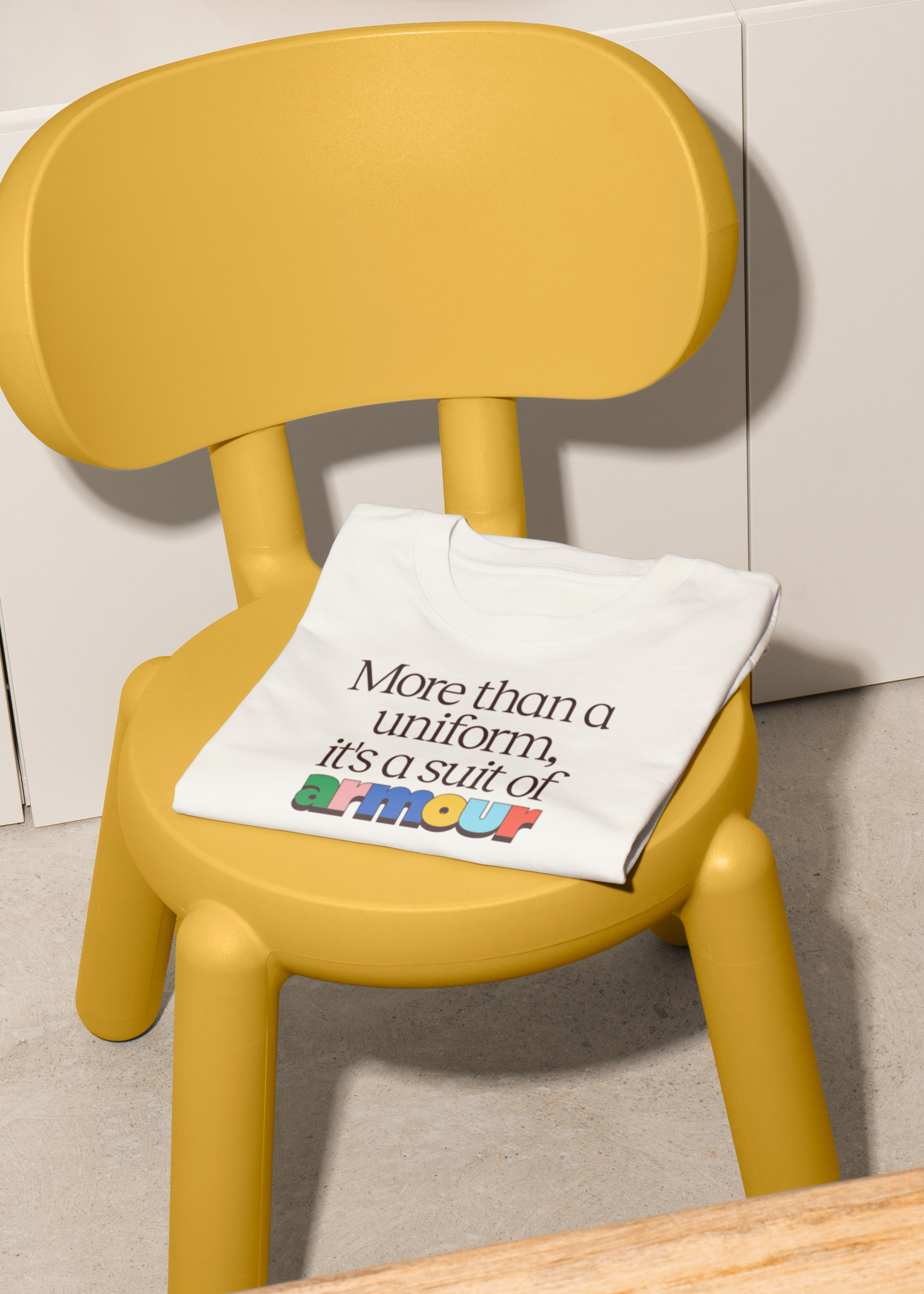
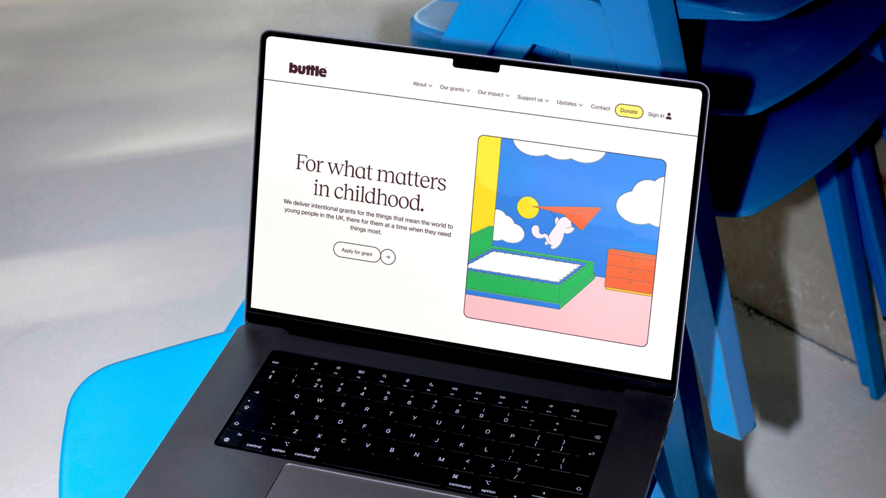
“For what matters in childhood”
At the heart of our strategy was a shift in perspective. We moved away from the clinical language of “crisis intervention” and “grant delivery” to focus on the emotional truth of the work.
1
organisational survey
10
Trustees engaged
8
external interviews
7
leadership interviews
23
staff collaborators
“For what matters in childhood” became our North Star. It’s an uncompromising statement of intent. It shifts the focus from the charity’s internal processes to the child’s lived experience. By recognising that the ‘small things’ – the school trips, the toys, the warm coats – aren’t frivolous to a child, they’re the manifestation of safety, security, access to friends, normalisation of life no matter the circumstances that surround you. Embracing this reality gave Buttle the permission to be bold.
UnitedUs have spent a huge amount of time really understanding Buttle as an organisation. They’ve engaged with a wide range of stakeholders, from the youth advisory panel all the way through to our trustees and campaign board.
Analiese Doctrove, Director of Fundraising and Marketing
The Creative Execution
To bring this direction to life, we built a brand world that feels as vibrant and resilient as a child’s imagination.
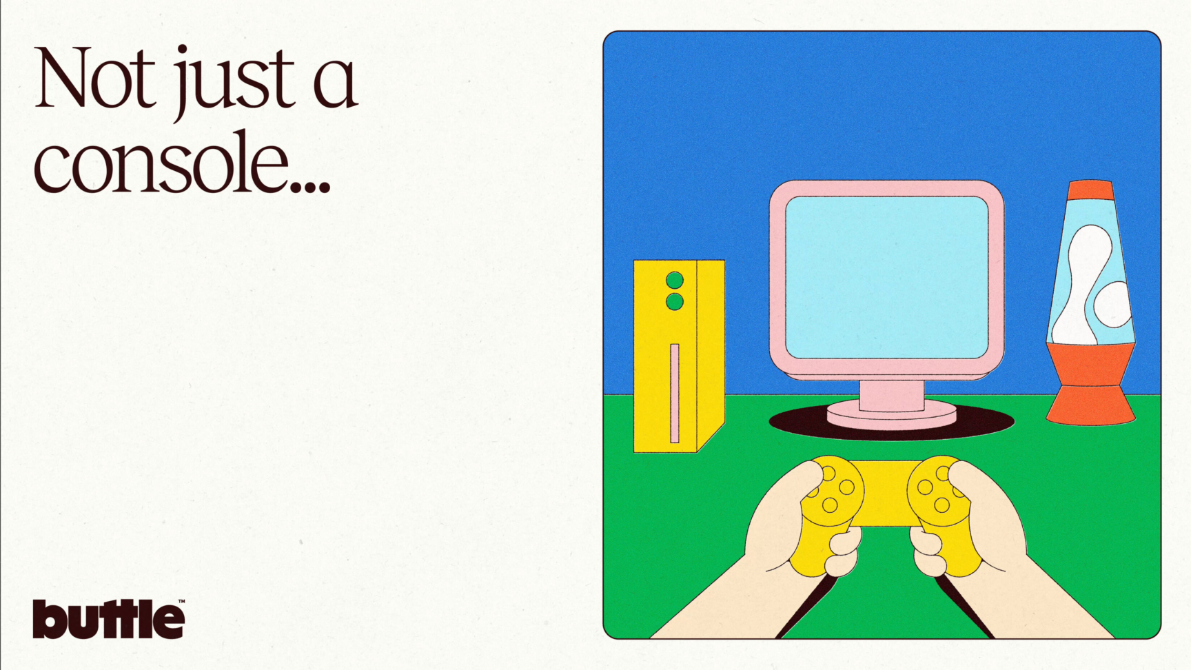
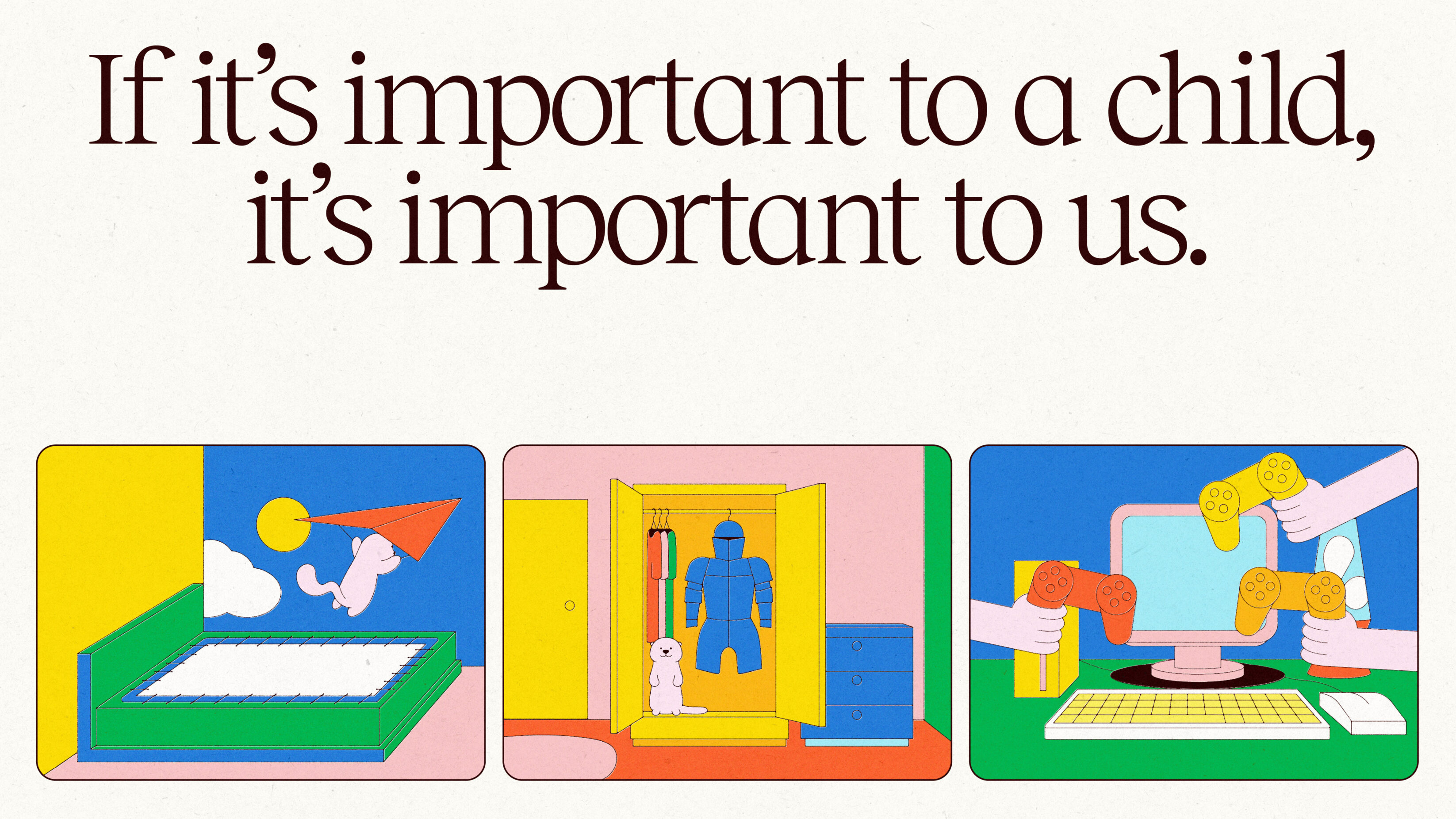
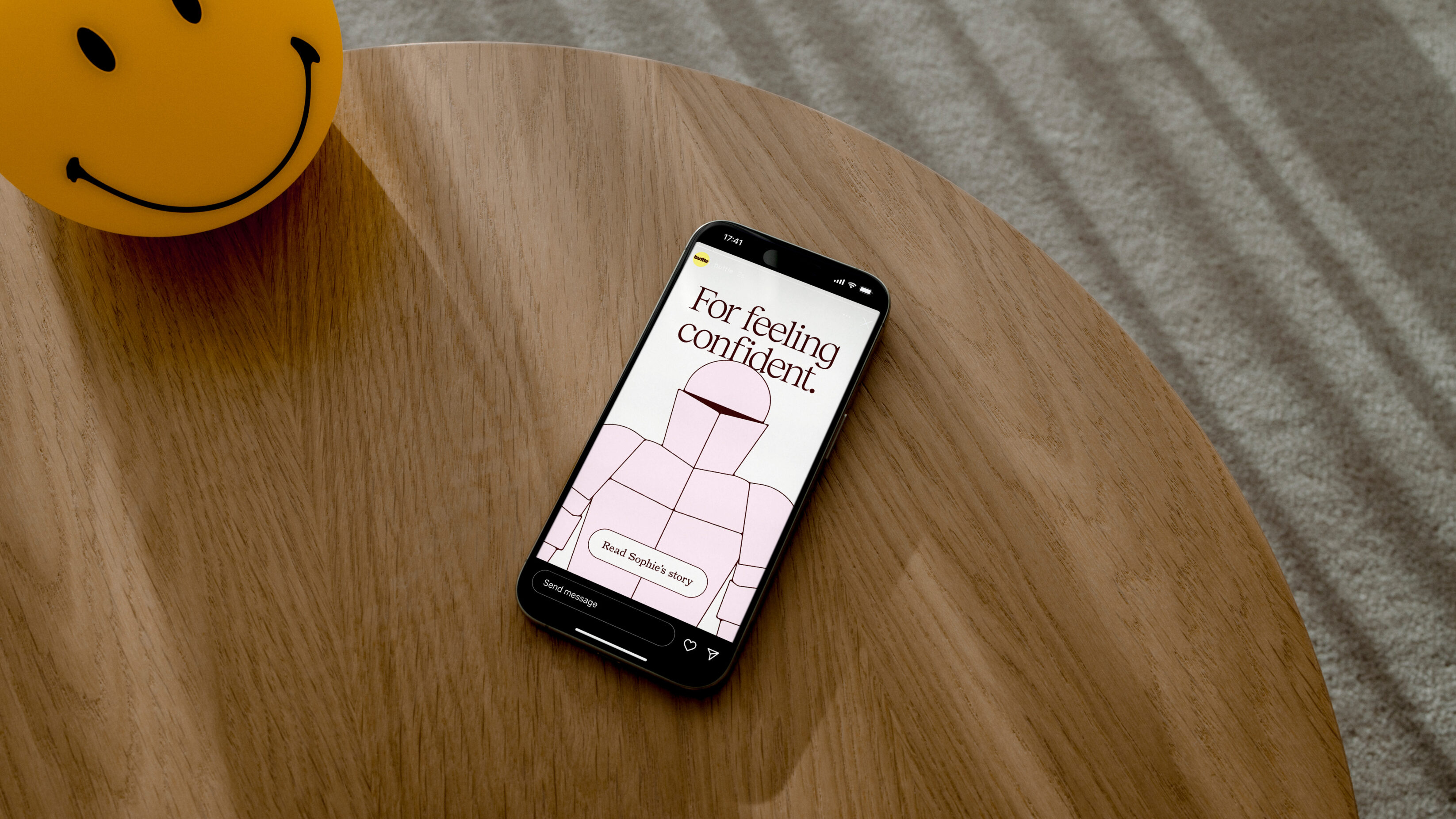
We elevated the everyday: Through a bespoke illustrative system, we transformed everyday objects into symbols of empowerment. A simple bed isn’t just furniture; it’s a sanctuary. This visual metaphor helps donors see the profound psychological impact of a Buttle grant.
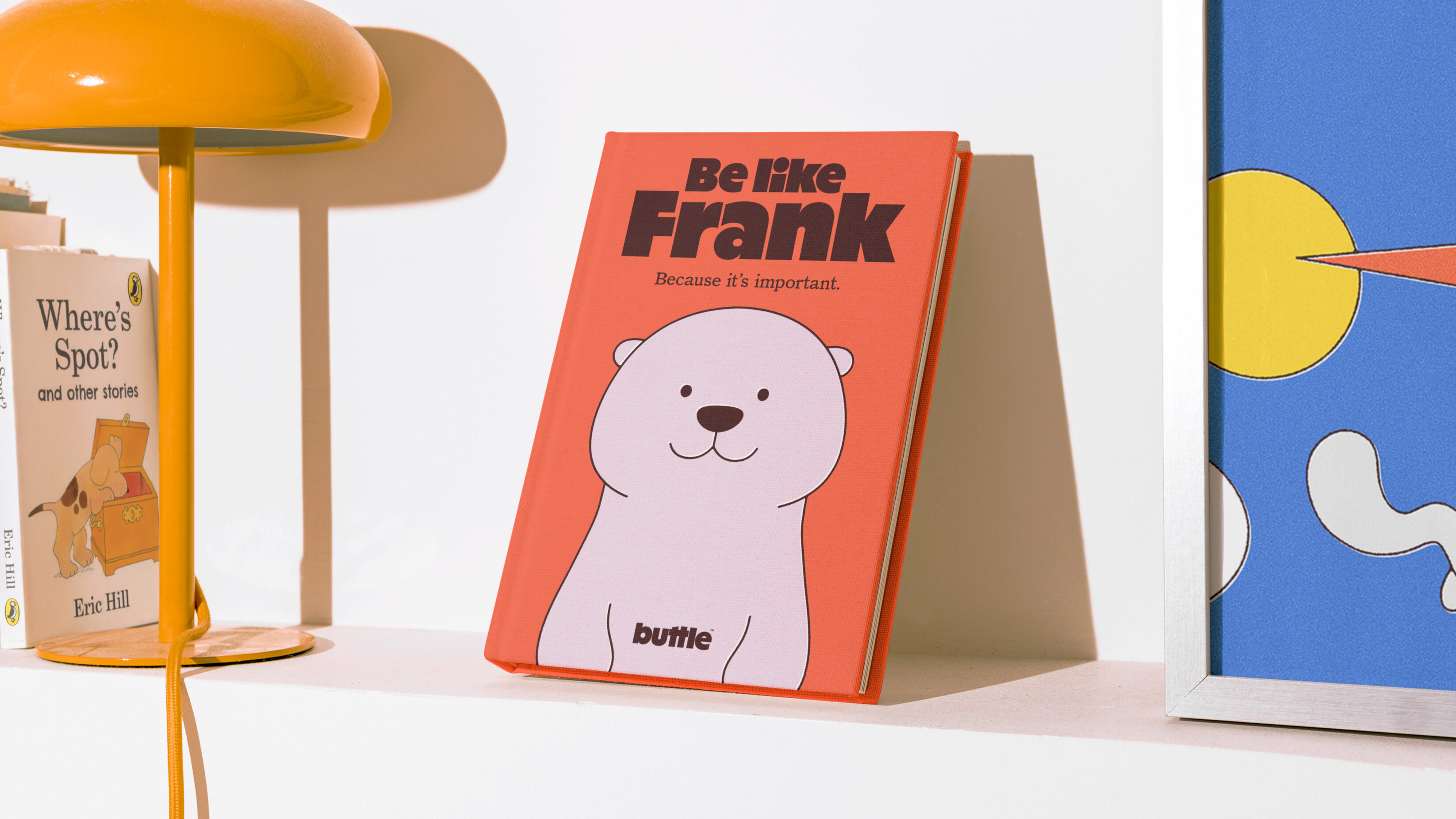
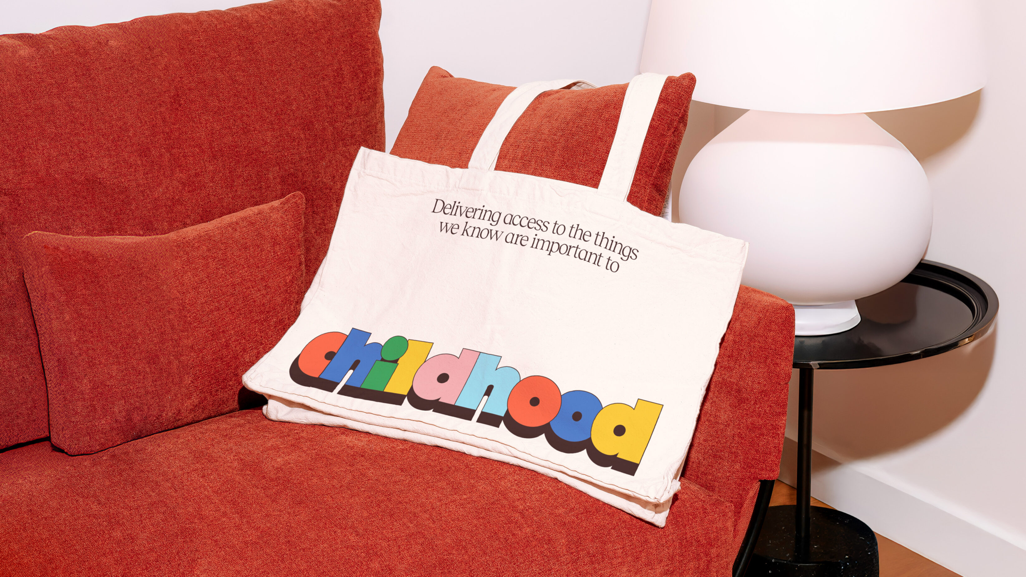
We championed the power of a nostalgic spark: The visual identity is rooted in the nostalgia of children’s books. Not the contemporary hilltop houses of Bluey or Peppa, but the clean focus of Miffy, Spot the Dog, Mr Benn. These were bursting with warmth but retained a simple style that also resonated with adults, speaking to Buttle’s potential donors and funders. By tapping into the visual DNA of classic storytelling, we bypass the ‘pity fatigue’ of the charity sector and instead trigger a deep, empathetic connection to the universal joys of childhood.
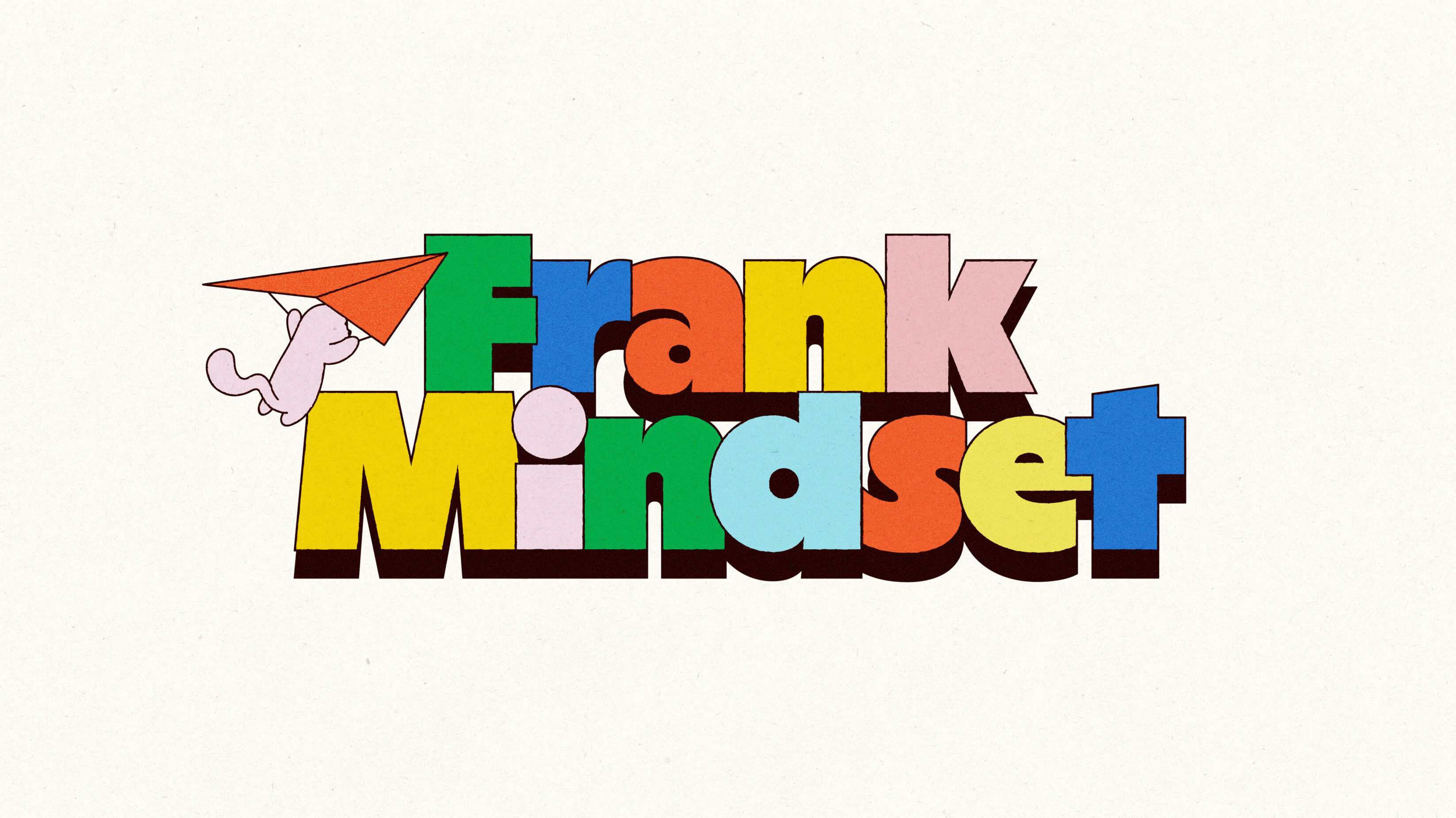
We embodied the spirit of Frank: We personified the charity’s heritage through Frank the Otter. Named after their founder, Frank Buttle, this character acts as a supportive companion within the brand, bridging the gap between the organisation’s rigorous professional standards and its deeply human heart. The otter came from direct conversations with the Buttle Youth Advisory board who felt the traits of an otter represented them and the organisation beautifully.
We didn’t just want to simply change the colours on the website or the strapline of a logo. We wanted this to be genuinely meaningful, have a big impact in the long term and help to upskill our team.
Analiese Doctrove, Director of Fundraising and Marketing
The Impact
By anchoring everything, from the tone of voice to the typography, to the idea of protecting what matters, we have given Buttle a brand that is both supportive and defiant.
The Buttle 5 year strategy needed more than a refreshed visual identity; it requires a voice that can’t be ignored. The result is a fundraising-ready brand that empowers the Buttle team to lead the conversation on child poverty with confidence, clarity, and a renewed sense of purpose.
Our new brand is all about putting children and young people front and centre at Buttle. We’ve spent a long time working with them, so we truly know what matters to childhood—from having a bed of their own to the chance to just fit in and have fun. By being that ‘invisible friend’ who provides the things they need most, we’re helping every child stand taller and look forward to a brighter future.
Joseph Howes, CEO
Related projects
The Ernest Cook Trust
Telling the story of a brand new strategic direction, rooted in the land.
UnitedUs met the Ernest Cook Trust at a time when the organisation's brand and strategy were both in need of a fresh perspective. Working alongside the charity's strategy development, we cultivated a new brand positioning that was both rooted in the charity's enduring heritage and brought new life to its emerging strategy.

Prept
Naming and branding for an educational charity to impact food culture across the UK.
By equipping a Sussex educational charity with an impactful name and identity, we crafted a high-quality brand to help the organisation scale, secure new partners, and serve food culture in the UK. Built on foundations of food and engaging cooking experiences, Prept now inspires a new generation to live happier and healthier lives.
Want to build your brave brand with us?
