
Rockinghorse
Bringing energy and clarity to a Sussex children's charity brand that rocks. Over the last 50 years, Rockinghorse Children’s Charity has raised money to provide life-saving services for sick babies, children and teenagers throughout Sussex. To put it simply, they rock! Leaning into the motion of its name, we gave the brand the energy it deserved – making people aware of the work Rockinghorse does to protect the health and happiness of young people.
Brand visualisation eCommerce Logo design Visual identity Web design Web development
Charity
UK
If you know about Rockinghorse, it’s usually one of two reasons. They’ve looked after someone you know, perhaps a young family member, through a trip to A&E or an episode of illness, or you’ve donated to their cause. Either way, you’ll be aware of the vital work that Rockinghorse does to support sick young people in need.
Without any government funding, the charity relies on generous support from individuals, community groups, schools, companies and trusts. And now, more than ever, it needed to ensure its brand could encourage donations at a time when financial security is a challenge for charities, business and donors alike.
To raise awareness of the charity and who it supports, we provided much needed maturity, clarity and uplifted energy – increasing the opportunity for donations through a new brand identity and digital environment. But importantly this rebrand had to show up with character, moving away from an infantile aesthetic and better communicating with, and for, young and older adults.


To ensure Rockinghorse’s logo showed up with the energy it needed for current-day interaction, we tapped into the motion of ‘rocking’ from the charity’s name – bringing momentum and movement to the modernised logo. Stylised with multiple line weights, the logo’s form balances an evolution from the original with a hand-drawn edge that’s equally ready to jump across printed communication and digital screens.
Using the primary logo as a base, we crafted a suite of logo variations to connect across generations. From supporter logos to stripped back emblems, each logo had a function across Rockinghorse’s many streams of communication.
Optimism has been injected into the brand through the use of a playful type that’s often presented in an arch – a reflection of a rockinghorse’s familiar motion. An energised blue and yellow provide a modern vibrancy to the brand’s original colour palette, with a secondary palette including ‘Brighton green’ to show the intrinsic connection to the Sussex seaside city.
Upbeat language gives life to the verbal identity, with call-to-action prompts that embody a together-we-can-support-those-in-need attitude. Instead of simply saying ‘Make a donation’, using ‘Let’s rock’ enabled us to communicate youthfulness that all ages could connect to and exaggerate the ‘feel-good’ emotion of donating.


It was really important for us to feel like our brand continued to reflect our heritage and the range of work that we do, whilst still having an eye on the future, making sure we continue to have a positive impact on children and families across Sussex. UnitedUs took us on a journey to help us discover and develop our brand and we couldn’t be happier.
Alexandra Marshall, Head of Marketing and Communications


Collaboration
That Rocks
Holding web workshop sessions with key stakeholders including the charity’s CEO and Head of Marketing & Communications, we set about improving the flow, experience and functionality of their website. By better understanding the people who would be using the website, including young people, community groups, local businesses, donators, charity supporters and NHS champions, we mapped out persona profiles and clear user journeys. This enabled us to ensure vital information, stats and hero messaging could be prominently positioned and identified.
Building the new website also required social media integration and a hub for case studies and resources, highlighting the rich array of work that the charity does. An interactive map that shows the exact healthcare and medical settings that Rockinghorse support was introduced to make it clearer their coverage spans East and West Sussex.


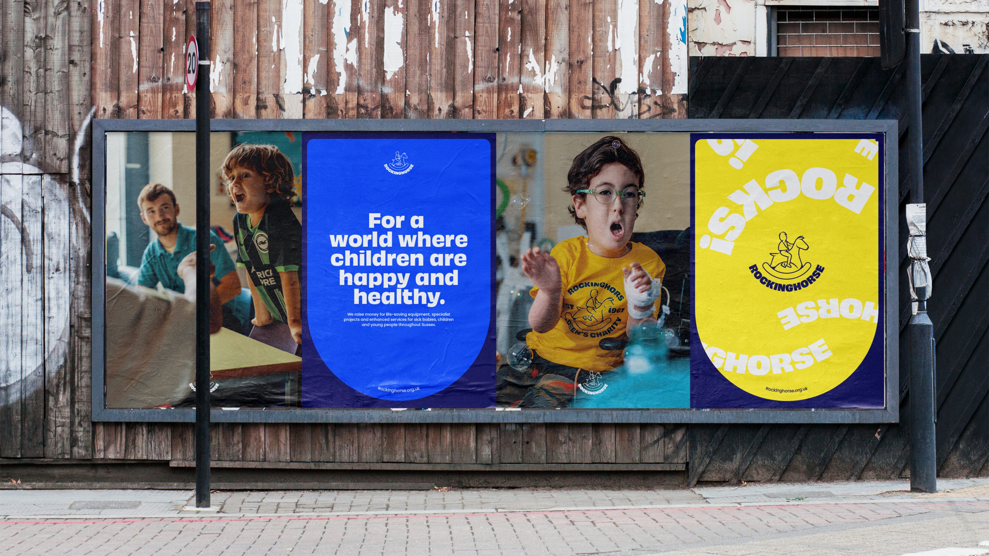


This rebrand has provided a more professional identity for the children’s charity, a brand designed to empower the people it supports with the bravery, energy and optimism they approach in their daily lives. With one in-house designer, this identity had to consider consistent replication across a variety of digital and print communications. Using the arch shape as a key graphic device across the brand, whether as a mask for images or to feature hero messages, we produced templates that allow Rockinghorse to always show up with personality and clarity.
The idea of bouncing back with the arch motion represents the situation of coming in and out of hospital in a playful yet realistic way, priming the brand for future campaigns that sensitively approach the sometimes back-and-forth nature of illness.
Just as healthcare professionals at the Royal Alex and Trevor Mann Unit* wear the Rockinghorse badge with pride, this project is also close to our hearts at UnitedUs. As many of the team have young families in Sussex, we are aware of the vital work that this charity does to support sick babies, children and young adults suffering from serious illness.
This rebrand had a core focus to rejuvenate Rockinghorse’s identity, provide a clearer understanding of the charity and improve the experience for donors. In the process, we believe we’ve given all those associated with Rockinghorse something to be proud of, a testament to how far the charity has come since its inception. And with the help of generous donations**, long may it continue.

Our evolved brand truly reflects who we are, what we do and the people we work with. It takes us into our next era whilst recognising and celebrating our history. Thanks so much to Luke, Jan, Natalie, and the whole team for taking us through this process and creating such a beautiful new visual identity for Rockinghorse Children’s Charity.
Alexandra Marshall, Head of Marketing and Communications


*Rockinghorse Children’s Charity was initially set up as the official fundraising arm of the Royal Alexandra Children’s Hospital in Brighton by Dr Trevor Mann in 1967. Along with the Royal Alex and the charity founders eponymous Baby Unit, the charity now also supports the Special Care Baby Unit in the Princess Royal Hospital in Haywards Heath along with paediatric wards, specialist neonatal units, respite centres and children’s services spanning across the county of Sussex.
**We donated £35,000 of the fee for this work to the Rockinghorse Charity. It was an honour to join patrons at the Fundraising Gala, which aimed to raise vital funds for programs, including psychological support for children and their families during and post-treatment – helping them integrate back into a healthy and happy life.
Related projects
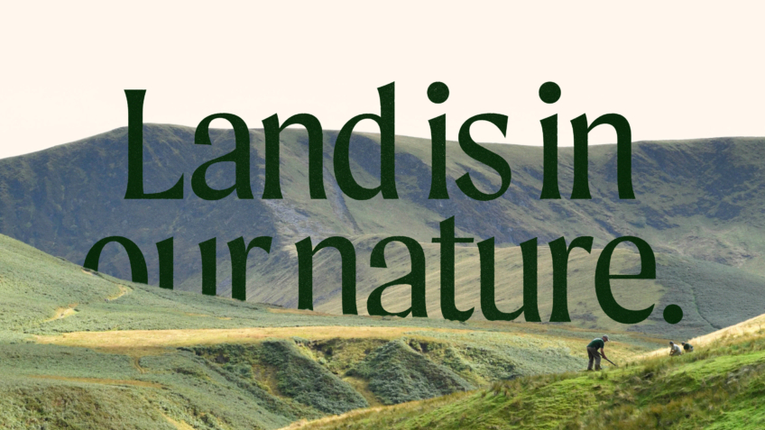
The Ernest Cook Trust
Telling the story of a brand new strategic direction, rooted in the land.
UnitedUs met the Ernest Cook Trust at a time when the organisation's brand and strategy were both in need of a fresh perspective. Working alongside the charity's strategy development, we cultivated a new brand positioning that was both rooted in the charity's enduring heritage and brought new life to its emerging strategy.

Buttle
A fundraising-ready brand for a frontline children’s charity
For over 70 years, Buttle UK has been the quiet force behind the scenes, providing the essential items that keep a childhood on track. But in a world where the gap between the ‘haves’ and ‘have-nots’ is widening, being quiet was no longer an option. Buttle needed to stand up and have a voice about the support needed to deliver what’s truly important to protecting childhoods.
Want to build your brave brand with us?
