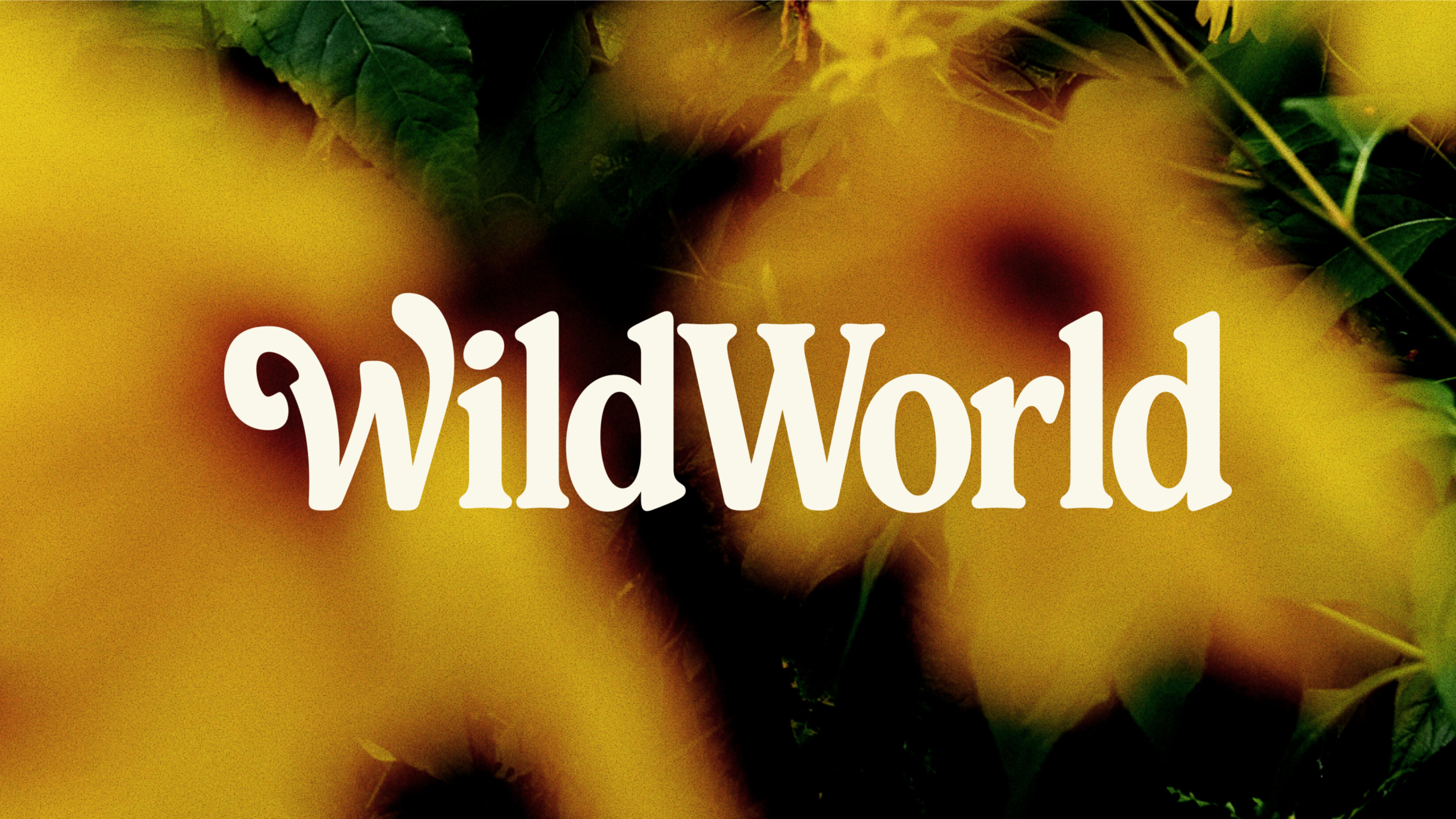
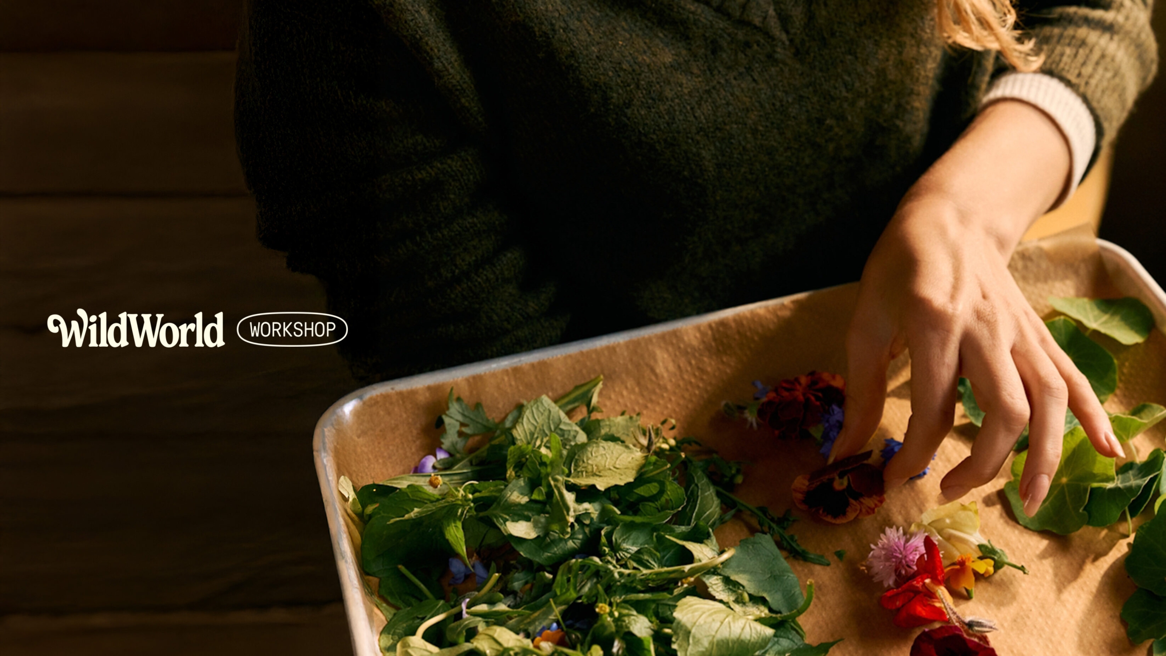
WildWorld
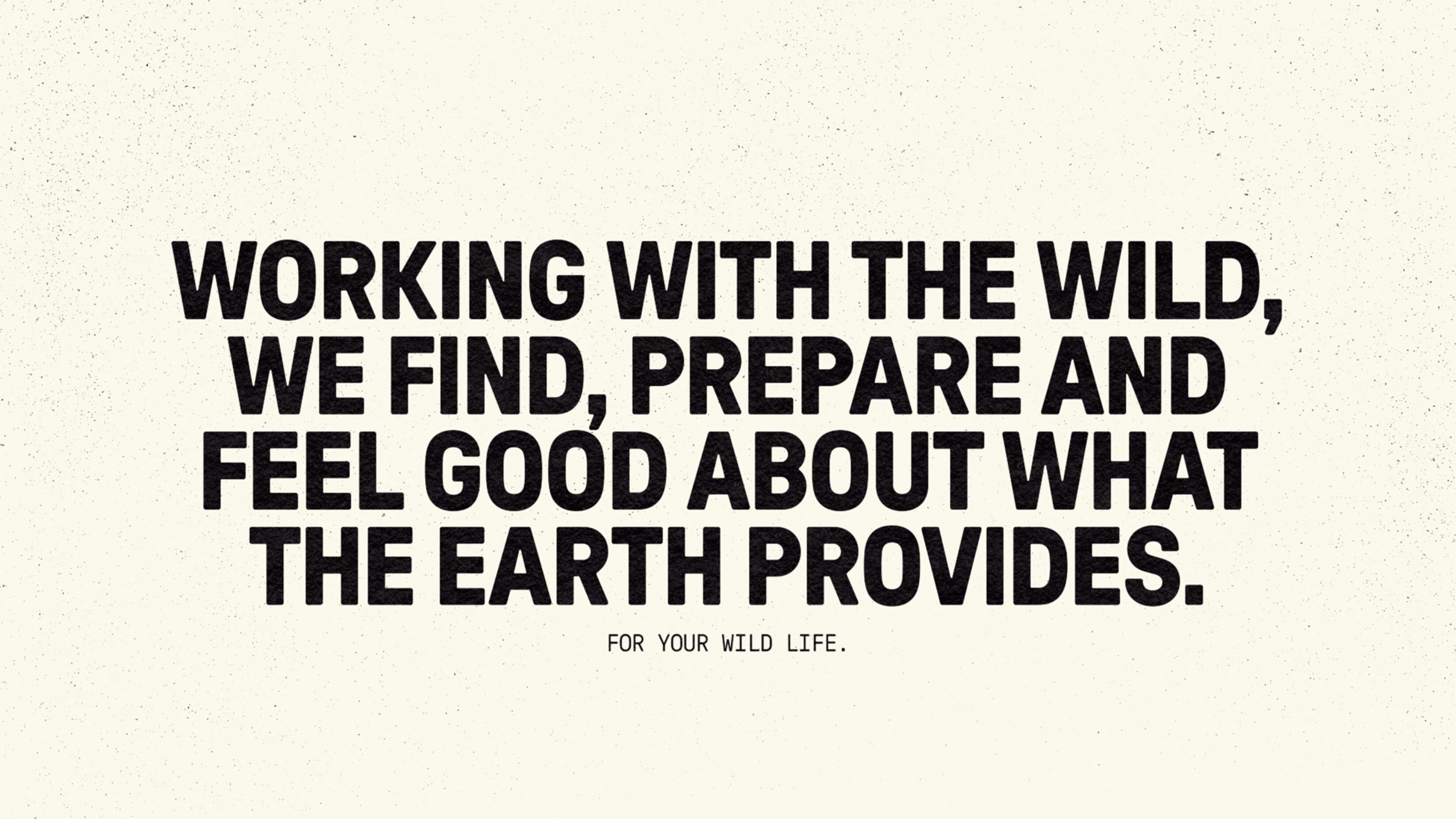
Wild foraging and UnitedUs: a match made in nature.
Our love of working with experience-led, nature-focused brands and founder, Mike’s, long-held desire to work with us led us down the path of crafting WildWorld: a brand that feels as human and grounded as the experiences Mike leads. We unpicked what makes Mike and his wild food and foraging education service tick, helping us cultivate a blooming brilliant brand that does exactly what Mike does: craft lasting human connections with nature.
Case study
Have you ever gone about your day — in the woods, on the way to the office, out with the kids — and been struck by something you usually overlook? Maybe it’s a leaf falling in autumn or a flower blooming in spring. For Sussex-based forager, Mike, who works every day opening eyes to the natural world through his (you guessed it) foraging business, life is all about these smaller things that we may have otherwise passed by.
Well, once you have the trained eye of a forager, a world of possibilities opens up. That’s what we discovered when Mike stepped seemingly out of the woods and into our office, laden with jars of pickled mushrooms.
PICKING MIKE’S BRAIN
Mike had wanted to work with UnitedUs for some time, and we were keen to continue our involvement with brands working knee-deep in nature. The collaborative energy was immediately evident. The team picked his brains on his motivations, why he loves what he does and how we could better reflect this in his verbal and visual branding. Conducting a workshop over nettle soup and wild garlic pesto parcels, we asked what makes Mike different from the rest, what future success looks like, and what the brand stands for today. Mike takes people on a journey of discovery. His experiences are hands-on, making learning feel natural, exciting and endlessly accessible. He doesn’t overcomplicate things; he just reveals what’s already there in a way that feels effortless and eye-opening. He’s knowledgeable, but humble. When talking about the ingredients he forages to create food, we’ll put it in his words: “It’s not magic. It’s the ingredients.” Mike’s only trying to make you see a grounded, natural world that he’s fallen in love with, so you can too.
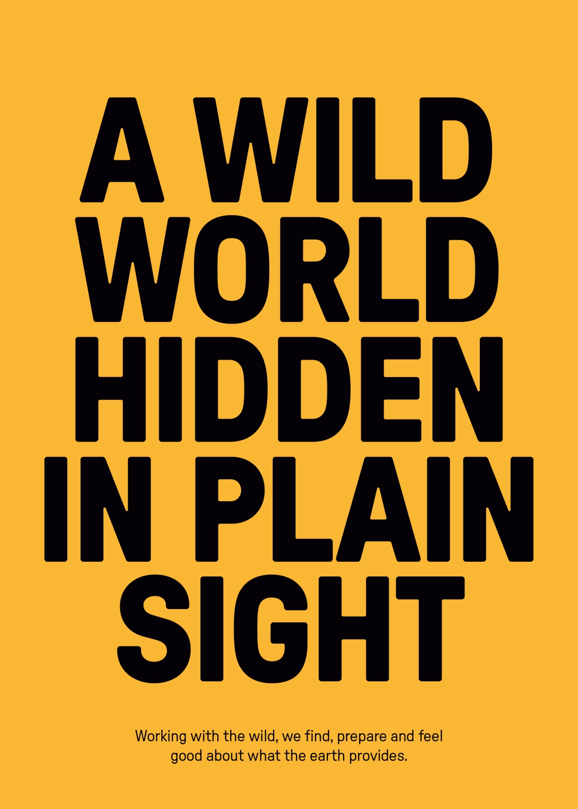
A WILD WORLD HIDDEN IN PLAIN SIGHT
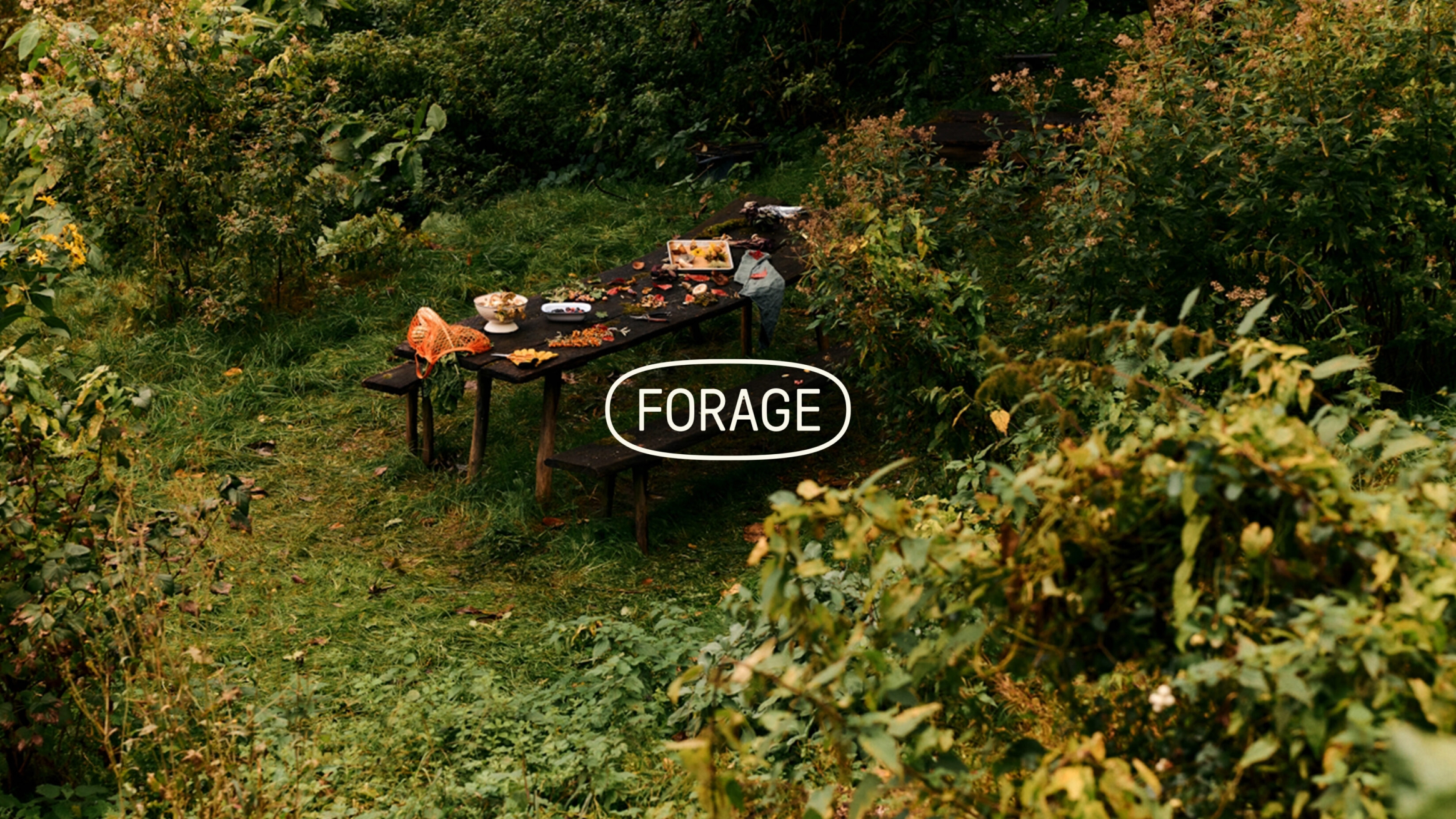
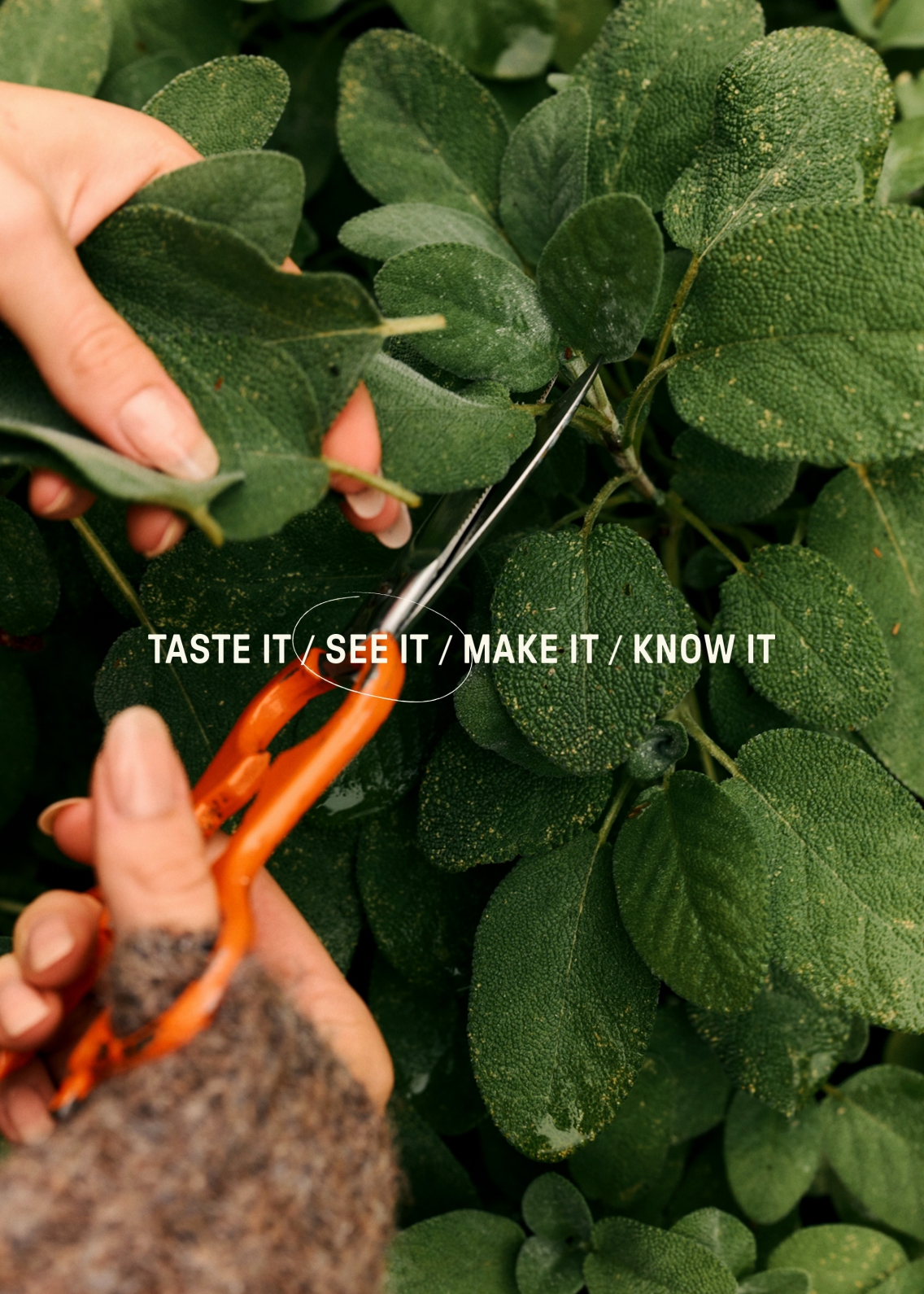
Throughout the visual identity, we immersed ourselves in the idea of ‘forager vision’ — finding bits of nature that you might miss, and the practical culinary benefits that come out of it. The identity reflects this tactile nature and utilitarian spirit, keeping things simple and focusing on what counts. The act of spotlighting hidden foraged goods around us is straightforward yet effective — just like Mike’s approach.
The end result? WildWorld — a name that reflects the world Mike helps illuminate, teeming with possibility. Let’s get into the details.
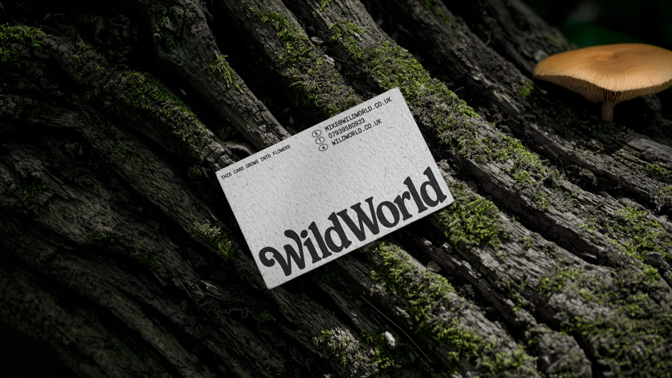
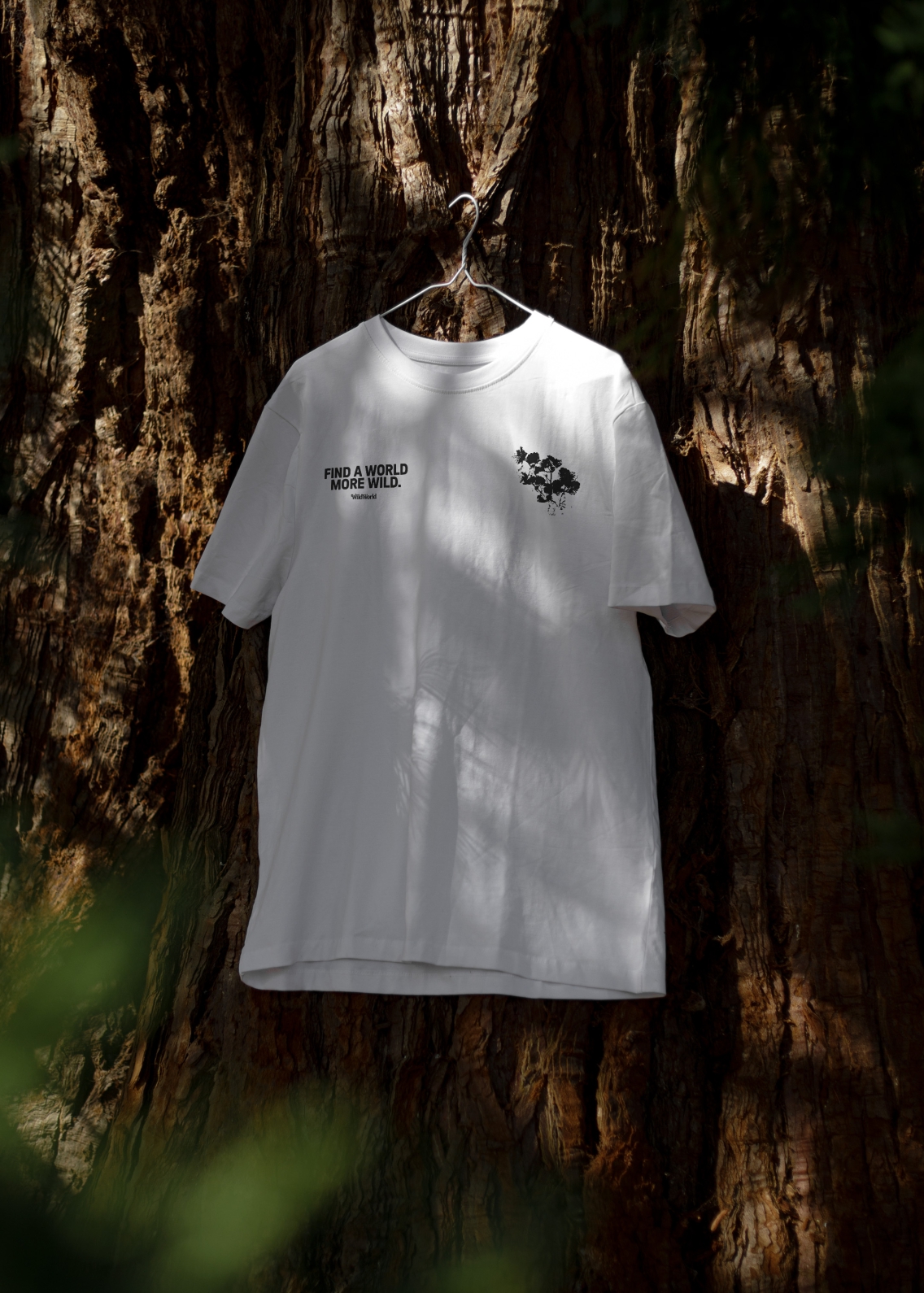
For the logo’s font, we found a new version of Windsor called New Spirit, an arcadian typeface relating to stability, abundance and harmony with nature. Windsor itself was chosen as it is strongly associated with the visual vernacular of guidebooks from the golden age of exploration, along with old nature and gardening books. Squint, and you’ll also see the outline of a mushroom sprouting under the first ‘W’, hidden in plain sight. In other type, we used GT Pressura, inspired by metal type printing, which leverages the tactile, utilitarian nature of the brand.
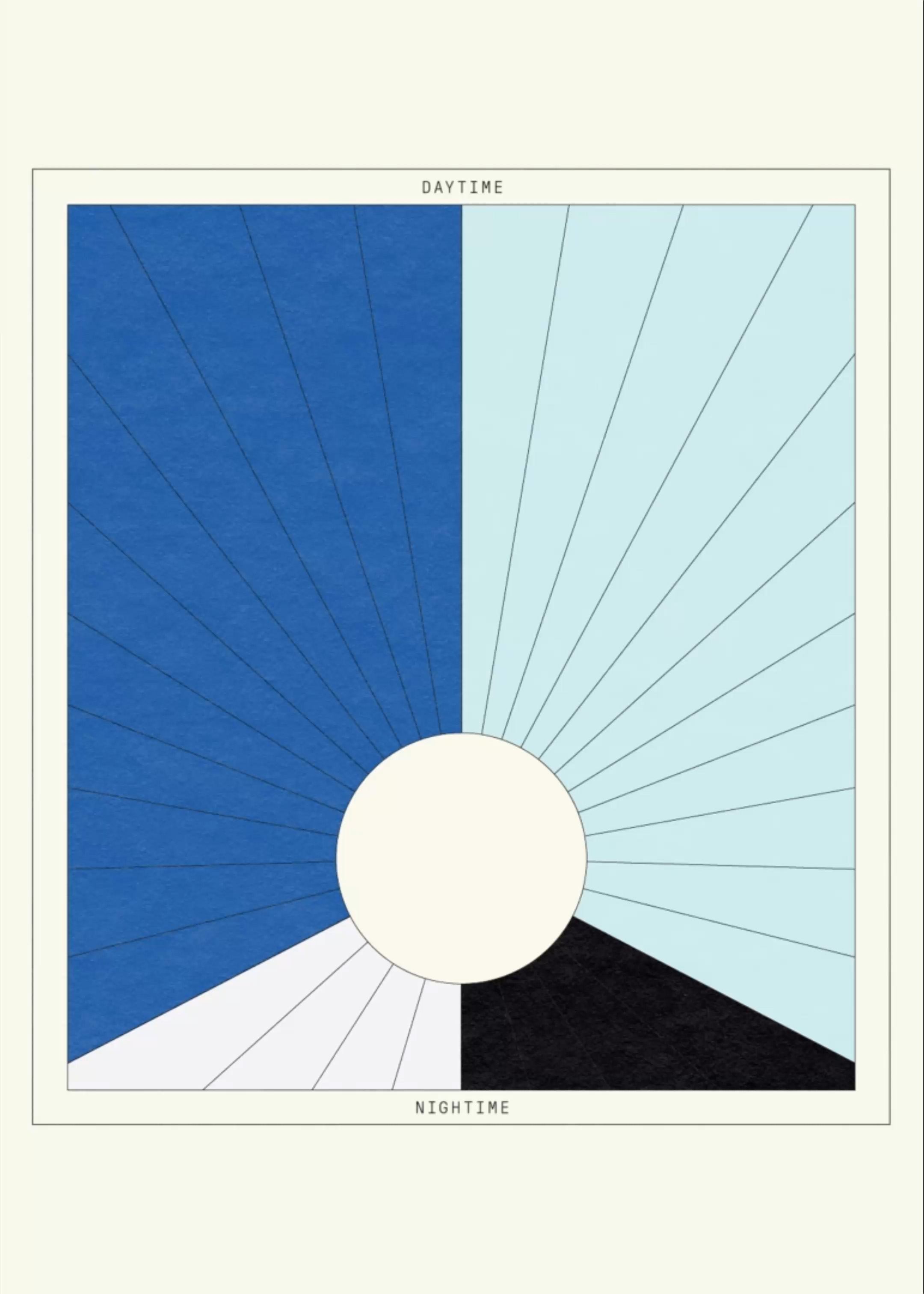
The colour palette was inspired by a cyanometer (an instrument that identifies and documents the colour of the sky) stumbled upon by our designer, Josh, who was rummaging through an antique shop at the time with the project in mind. The colours we chose can be mixed and used across nighttime and daytime events, while working particularly well with the printed-style designs.
AS HUMAN AS MIKE’S NATURAL WORLD
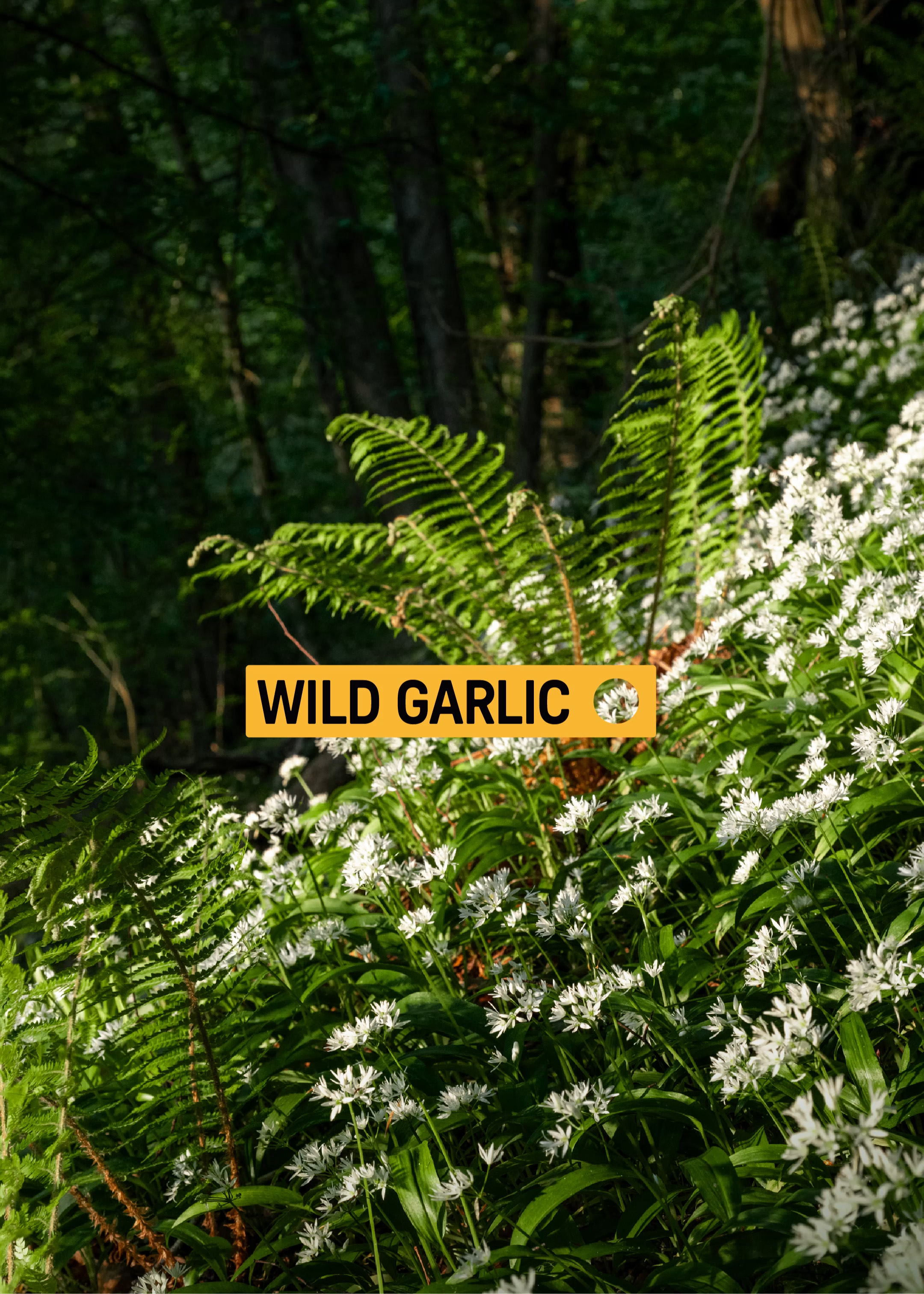
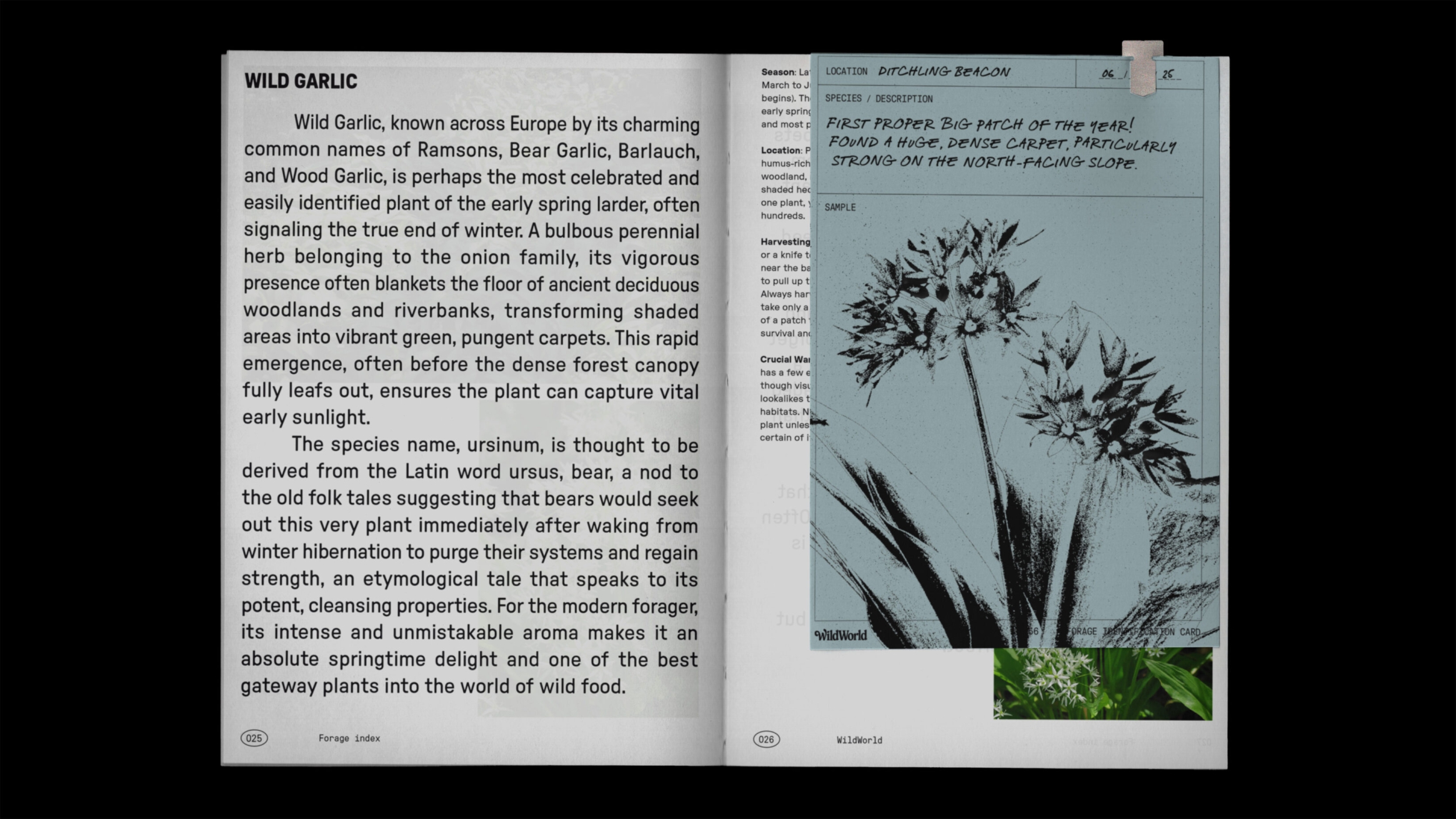
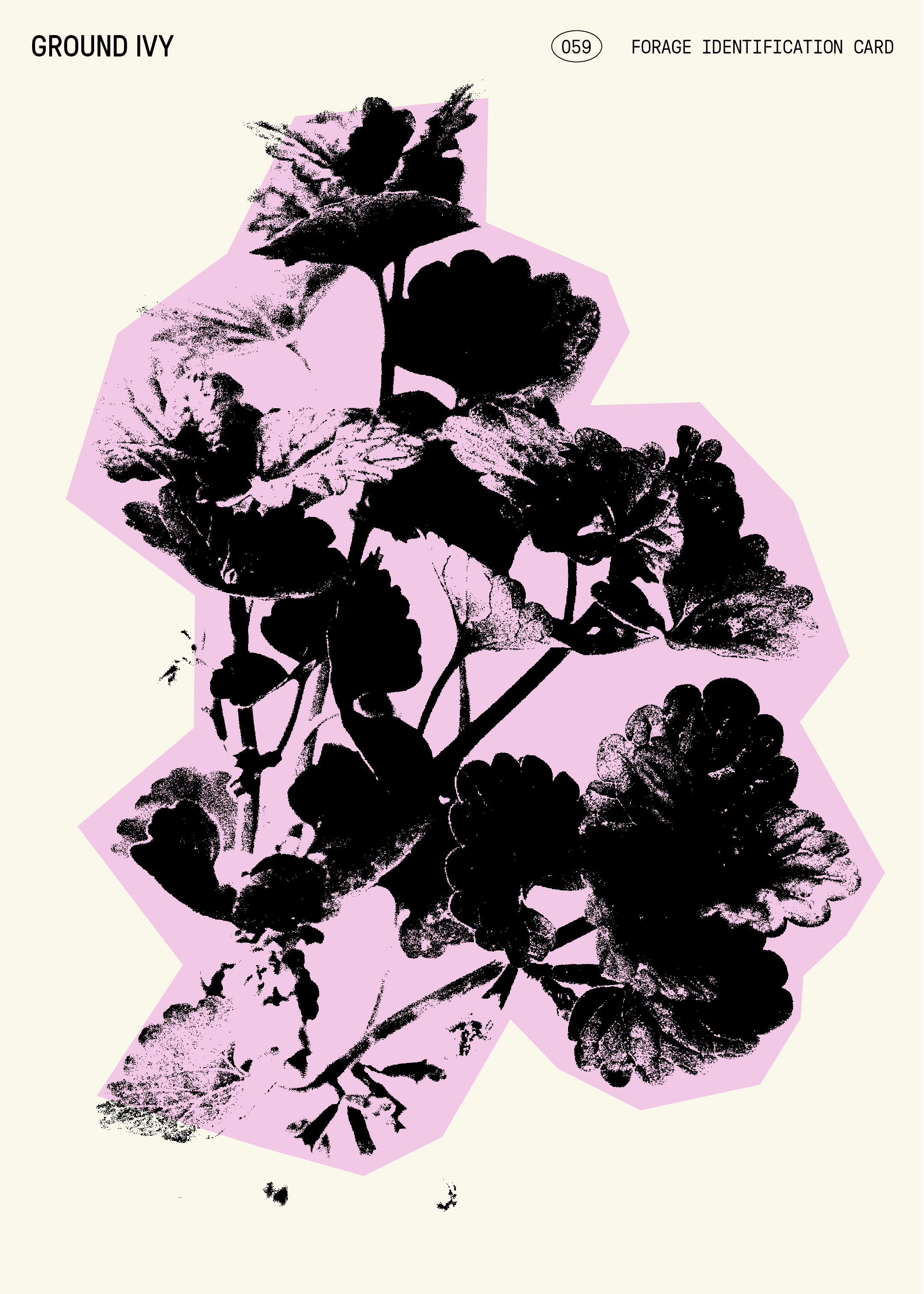
Throughout the rest of the visual design, we reference material like a forager’s notebook, filled with curiosity. It highlights ink-stamped impressions of leaves, mushrooms and other foraged finds, which mirrors how Mike and his people directly interact with nature.
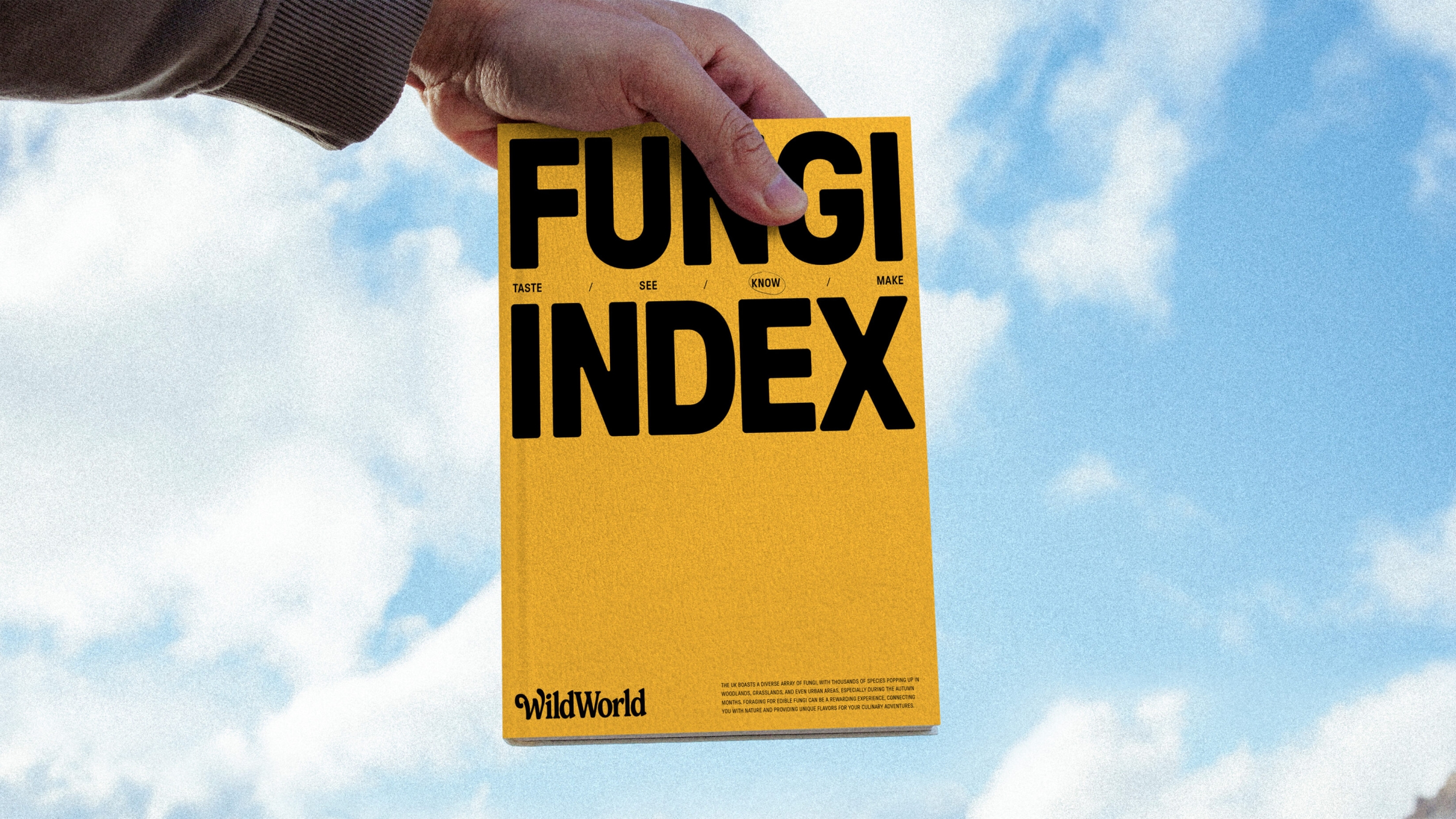
The visual language is tactile, layered and inspired by the textures of nature itself, reinforcing the sense of uncovering something that has always been there, waiting to be seen. This notebook style also resonates with the blending of nature and people, connected through collection. We also conceptualised a branded notebook or index that can be used to document ingredients people find with Mike and print them in there for reference. In our vision, even Mike’s business cards are embedded with seeds.
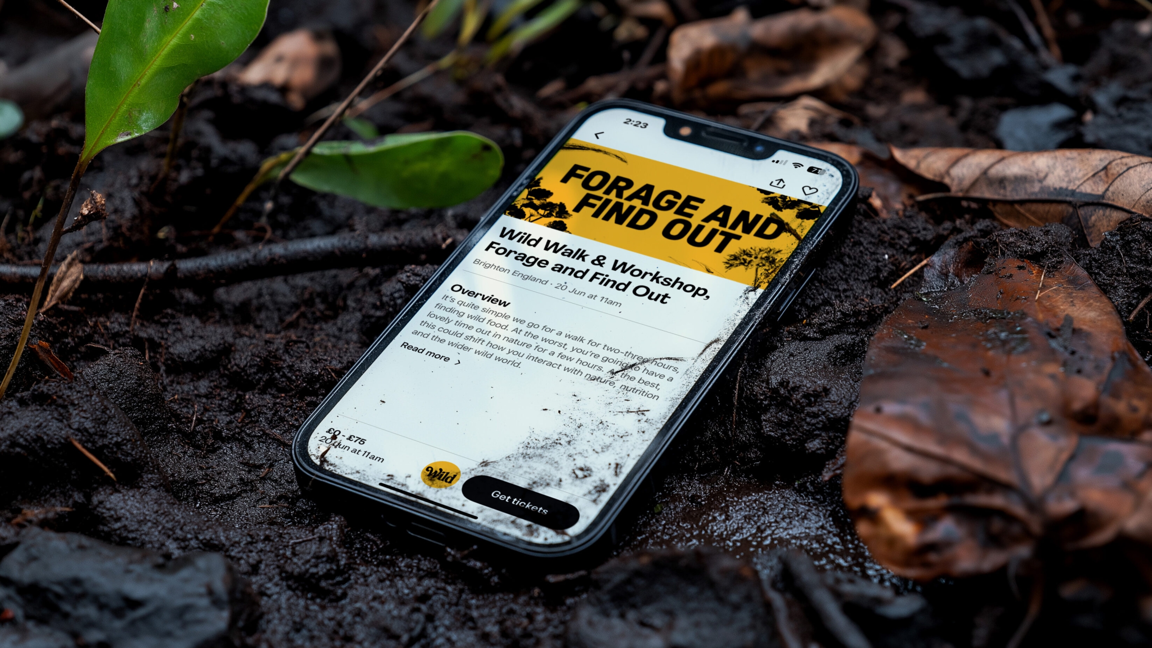
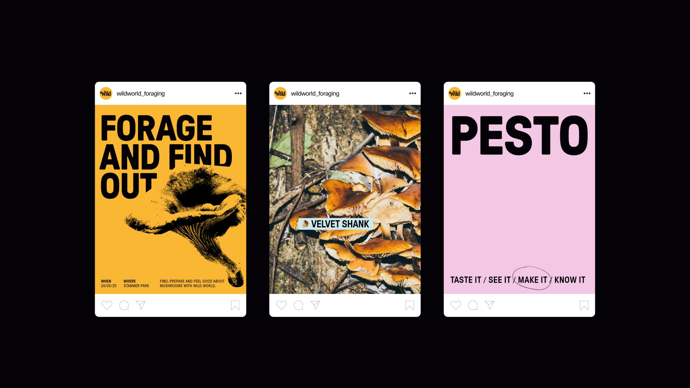
In terms of the verbal language, the strapline ‘For your wild life’ and the hero line ‘Find a world more wild’ resonate with the idea of Mike bringing the wild world he sees directly to individuals, making it their own. Of course, laying some seeds of fun with the line ‘forage and find out’ never goes amiss. While it’s Mike’s wild world, it’s ‘your wild life’.
All of this encourages human interaction, not just with nature, but with the brand itself.
A BLOOMING BRILLIANT BRAND
Spotting, knowing and engaging lies at the heart of Mike’s view of the world, and his intentions for his business. Now, his brand mirrors the world he’s inviting people to connect with.
Growth is the priority: for nature and business alike. For Mike, WildWorld will branch out to new people, connecting more minds with nature and the joys of foraging and cookery. For us, we got to continue our love of working with experience-led brands and working in nature. Oh, and we also got to sample some of those delicious pickled mushrooms. That’s a win-win in our books.