The Drop
Signalling new levels for the Drop’s visual and verbal voice. We’ve created a refreshed visual and verbal language to amplify the Drop’s next stage of growth, giving them a clear, ownable identity that didn't have to rely on — and wasn't dictated by — imagery from their clients. In other words, pitch-perfect branding.
Brand strategy Copywriting Digital design Logo design Tone of voice UX Visual identity Web design Web development
Music & entertainment
Brighton Montreal
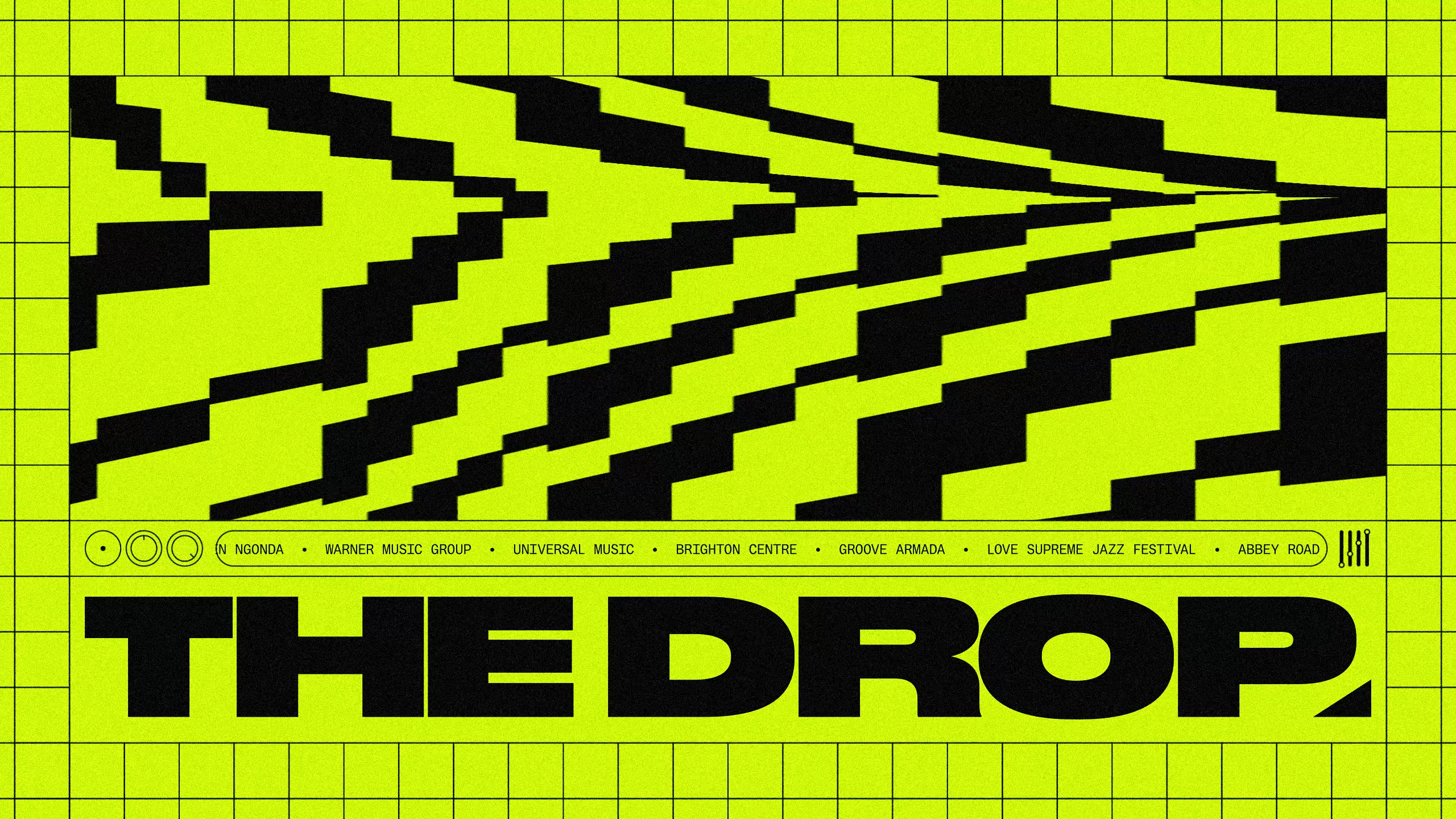
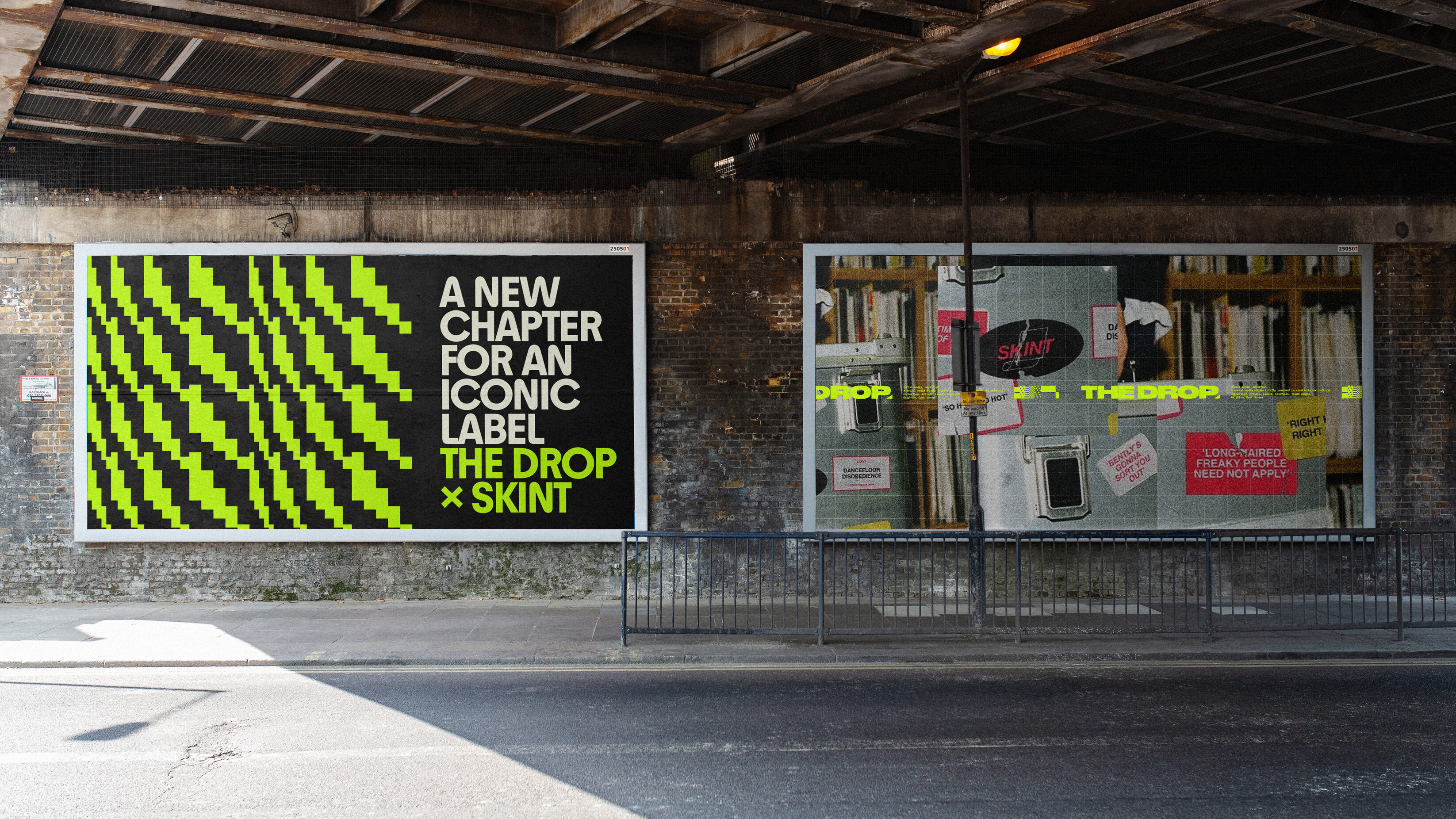
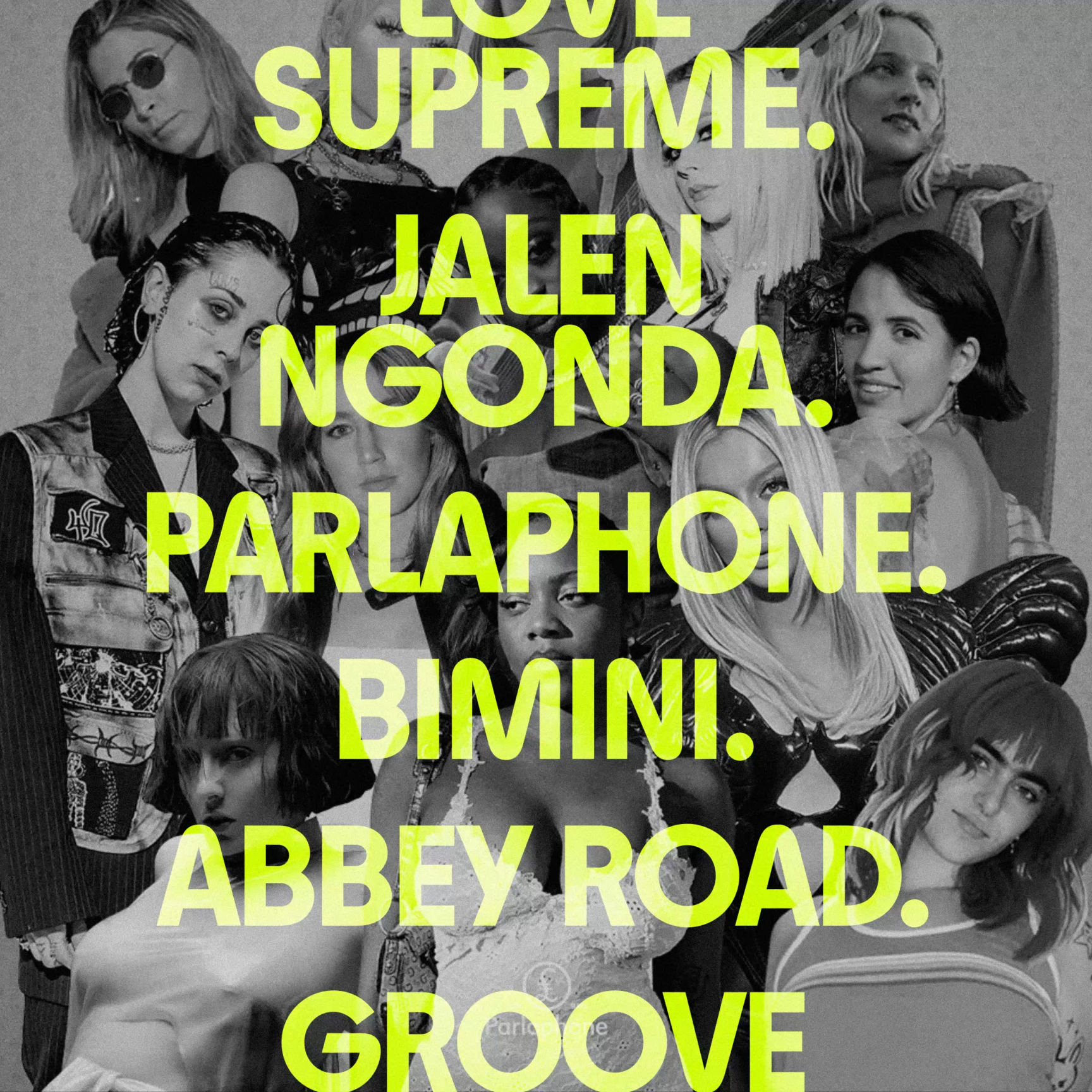
FINDING A GROOVE
Many service businesses trip into the same trap. One in which the identity is led by the service, and not the other way round. The business mirrors the artist’s work. The brand identity is diluted. The distinctive voice is lost. That’s where the Drop — a music social media agency based in Brighton that works with musicians, events, labels and more — found themselves. The Drop needed a visual and verbal language that was their own. One that still championed the artist. One that gave them their own voice in the conversation.
Digital minds, analogue hearts
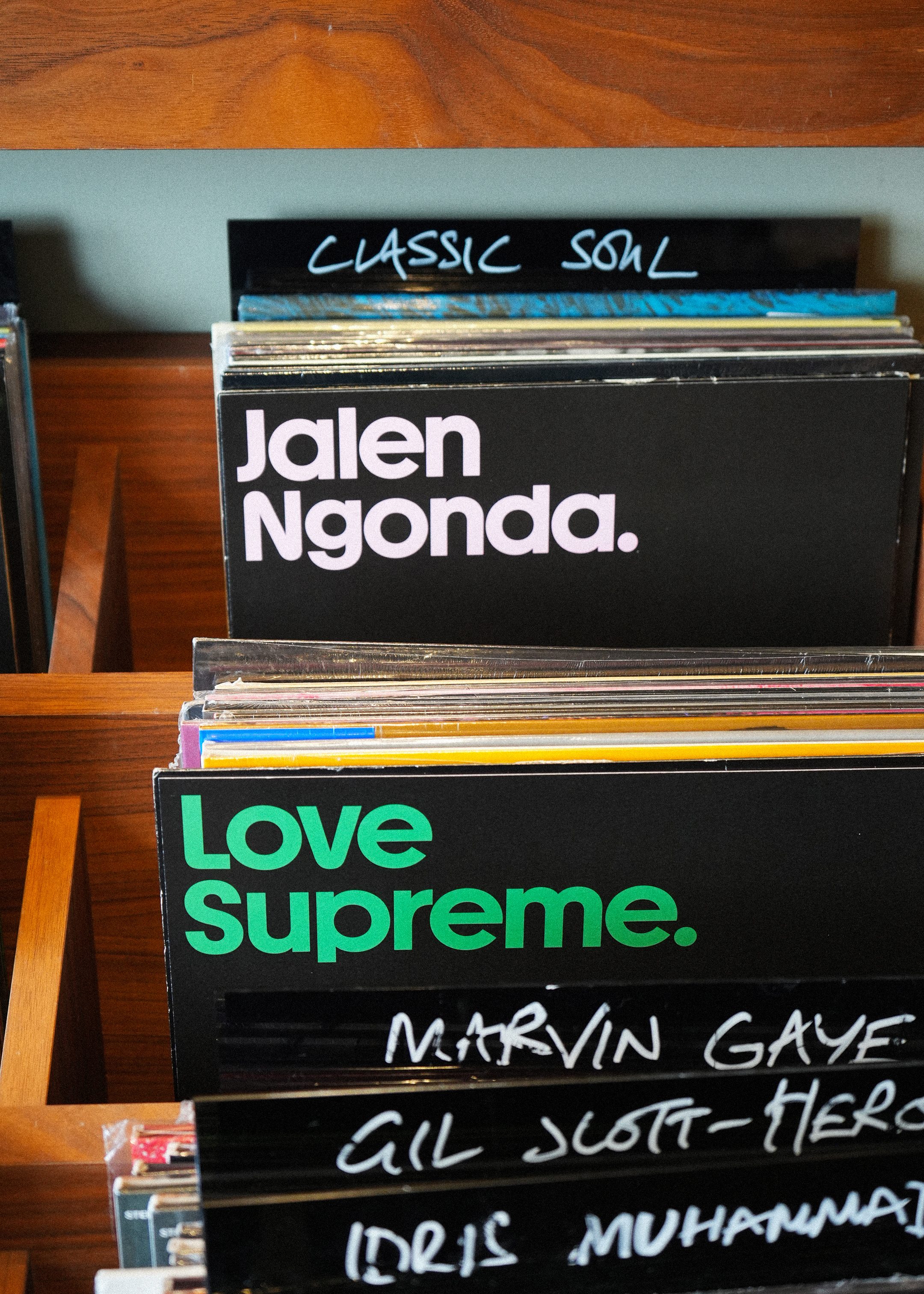
We invited the Drop crew down to UnitedUs towers to connect and share ideas in an in-person, face-to-face workshop. We discussed what was working with the current site and what could be left behind. We even waxed lyrical about some of our favourite record covers. Clearly, the Drop team were digitally-minded music obsessives with analogue hearts. The question was, how could we translate this digital and physical balance into a thriving brand identity?
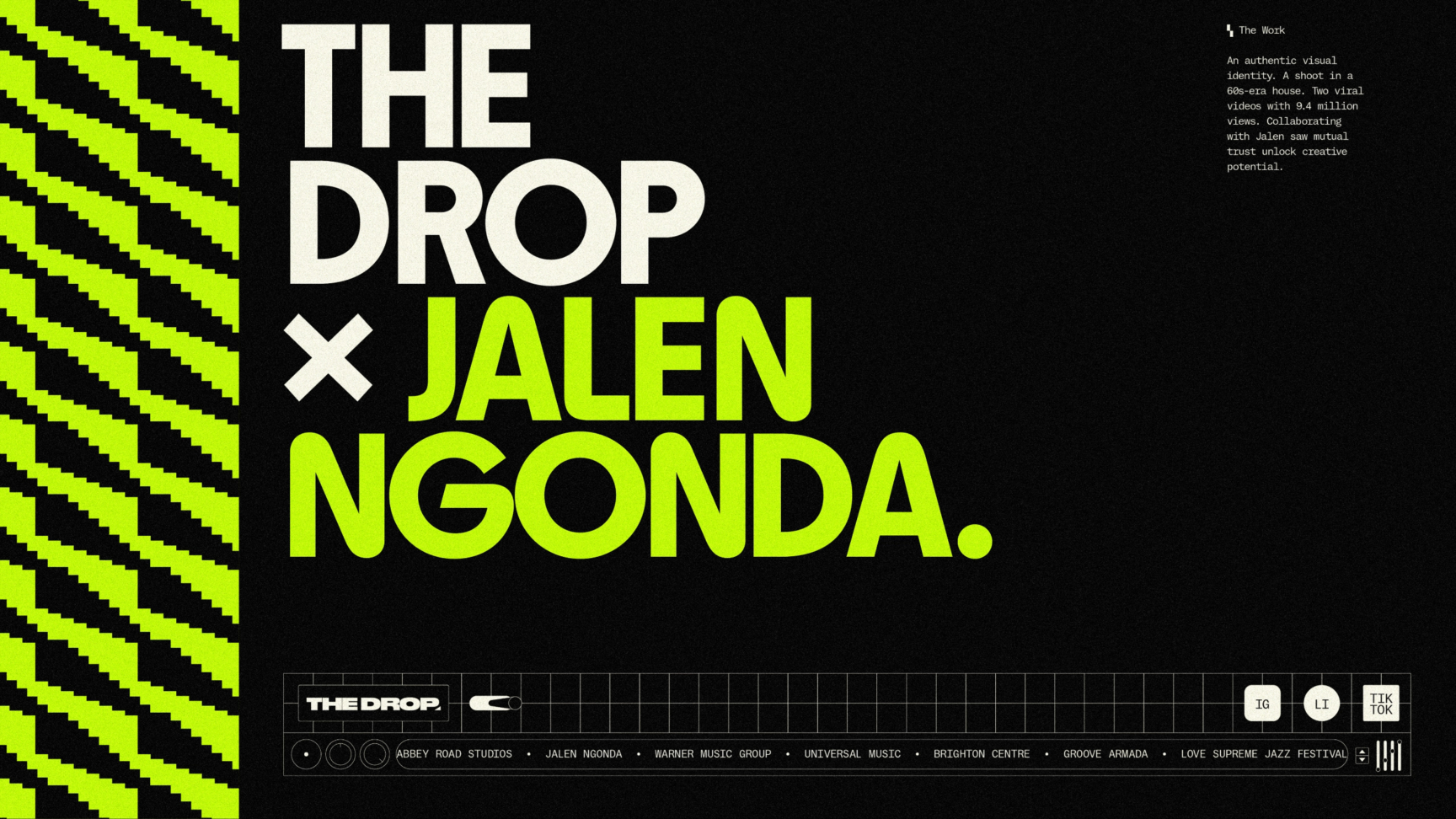
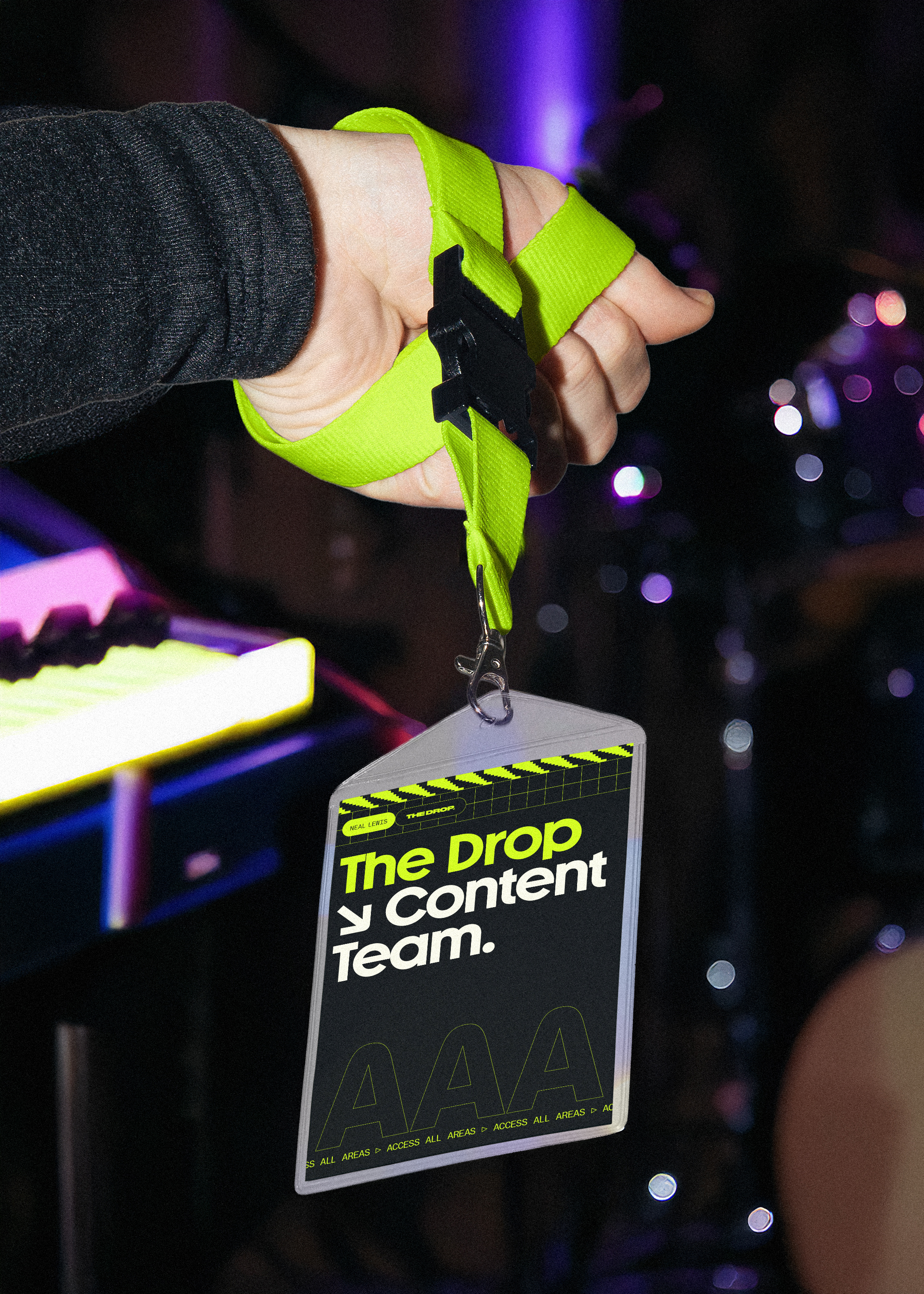
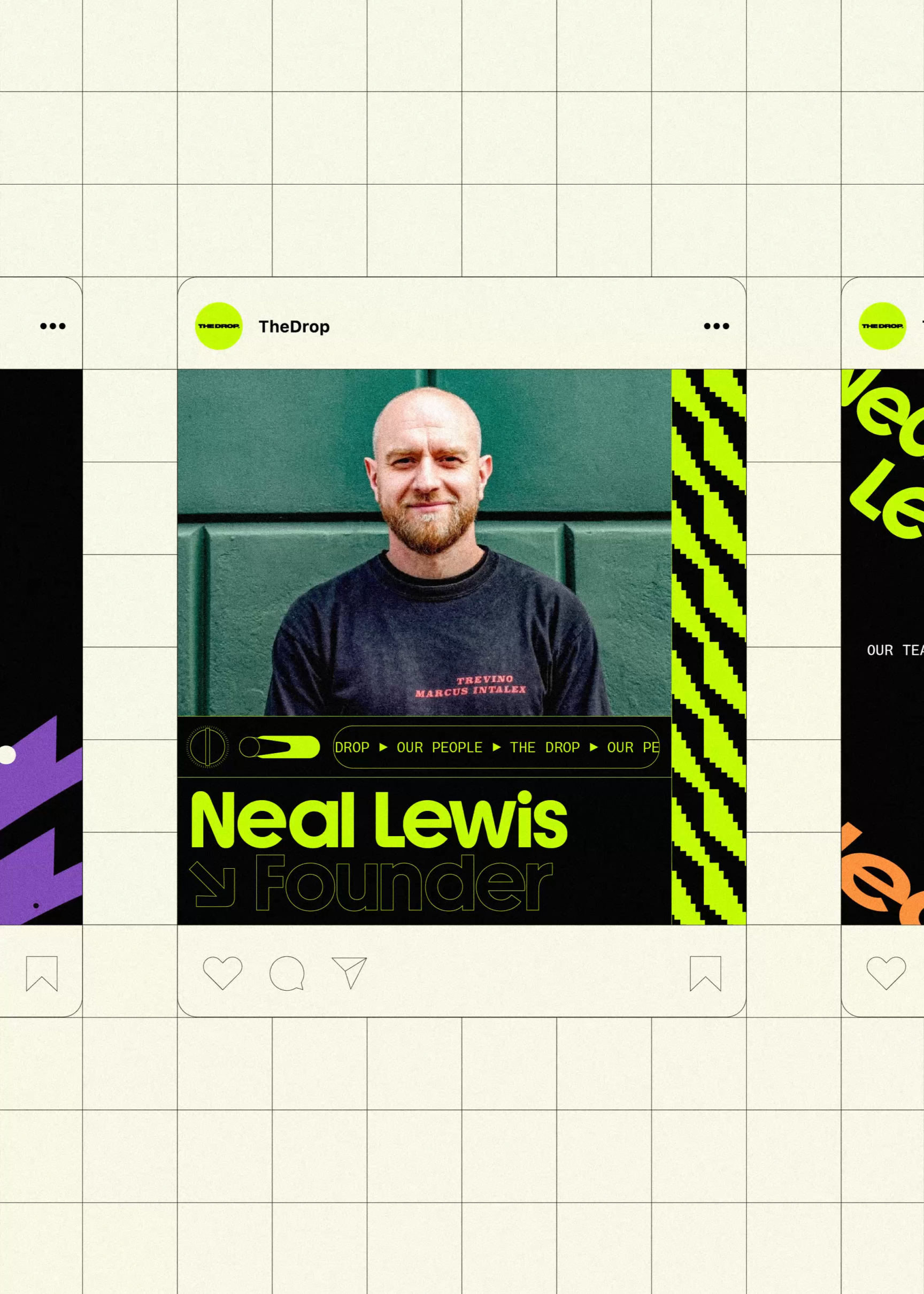
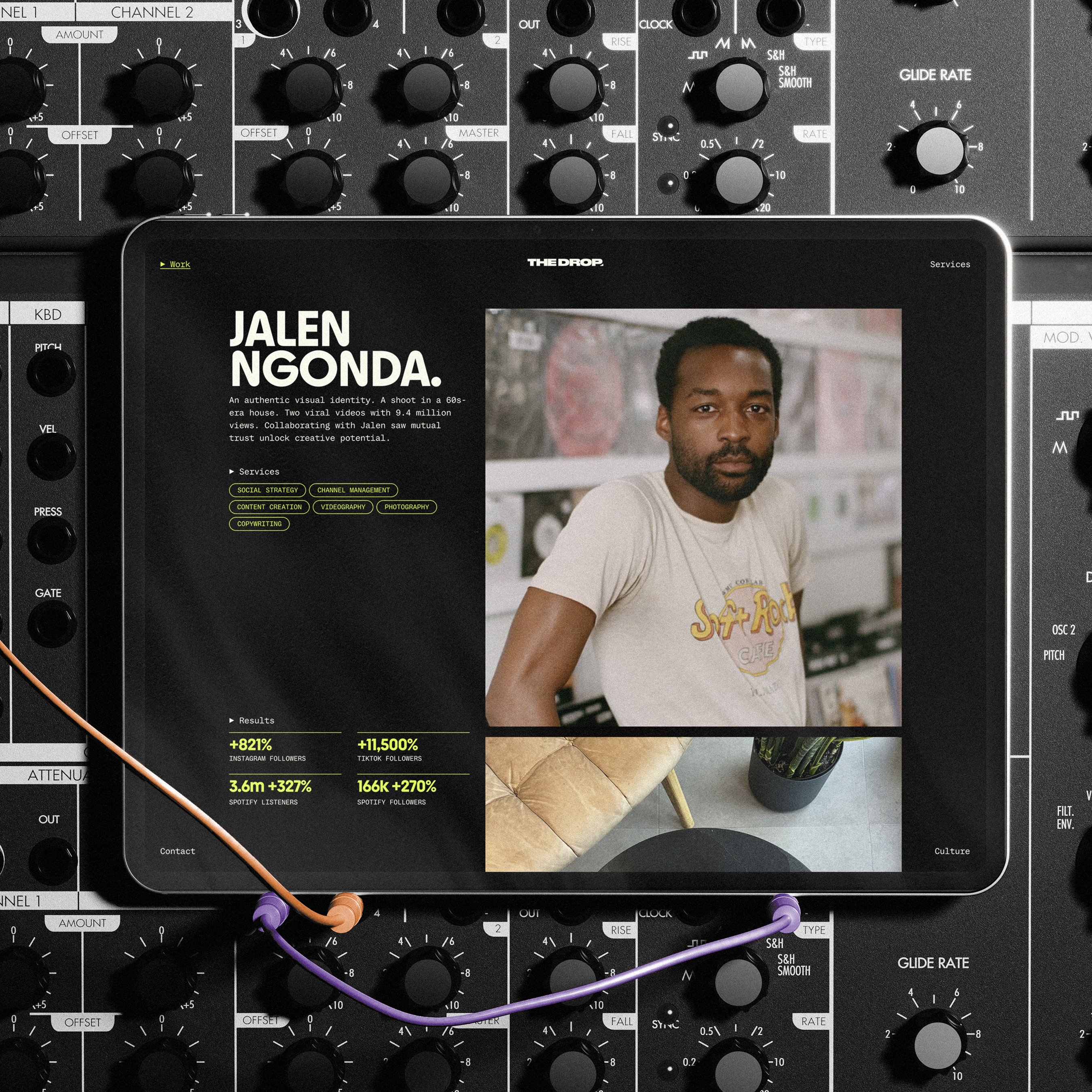
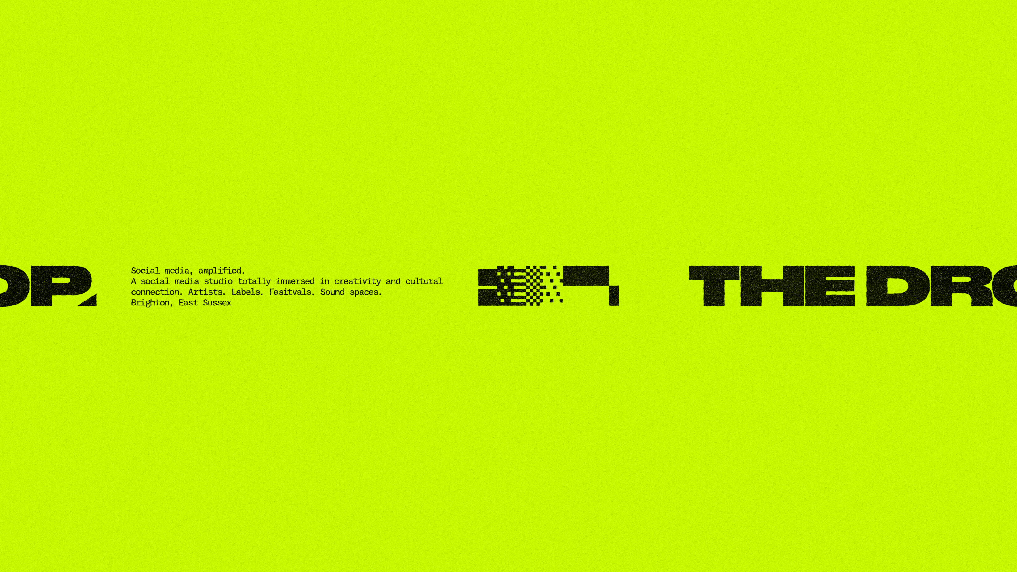
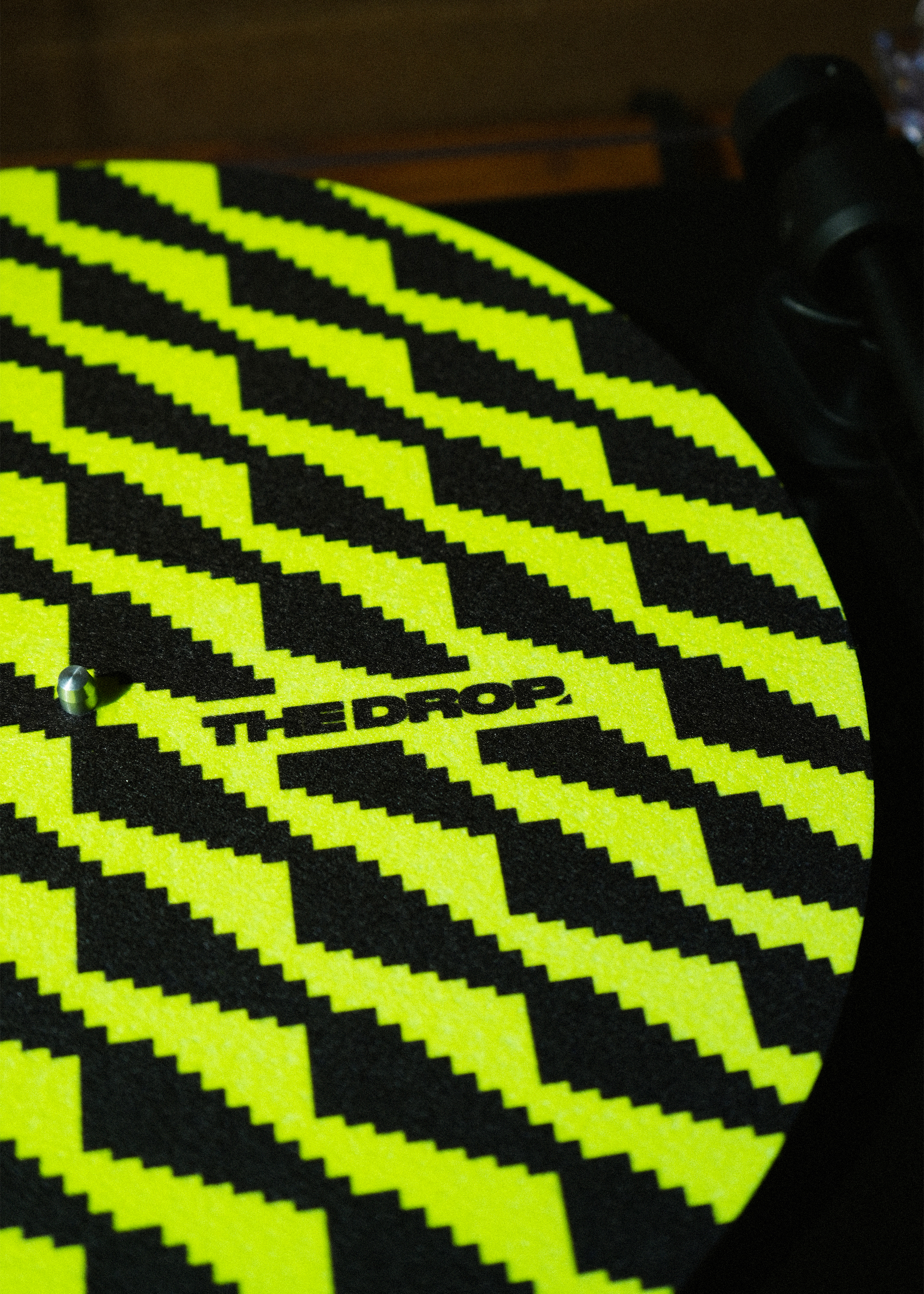
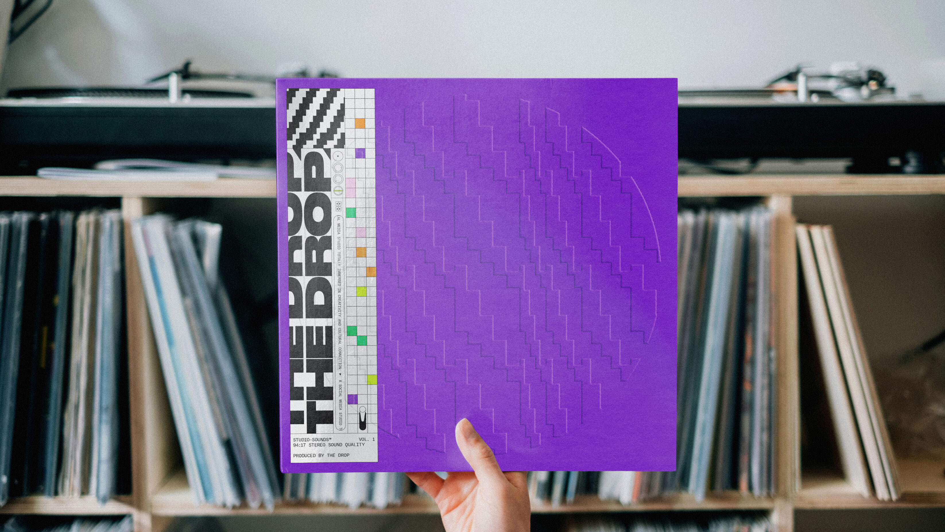
We took cues from some of the visual language of modular synthesis — volume dials, noise patterns, sine waves — and combined it with a character and attitude that feels both contemporary and ripped out of other music eras.
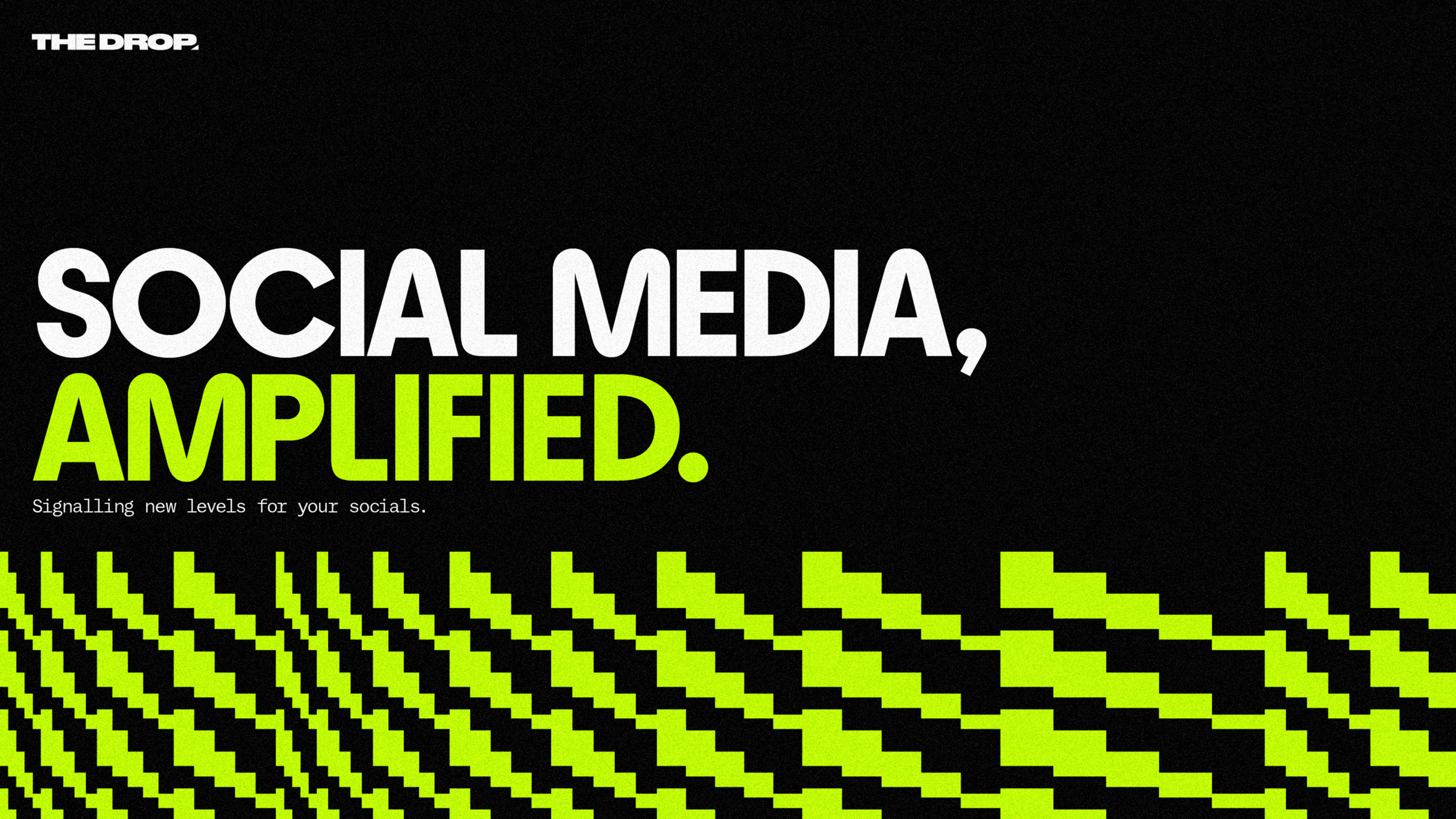
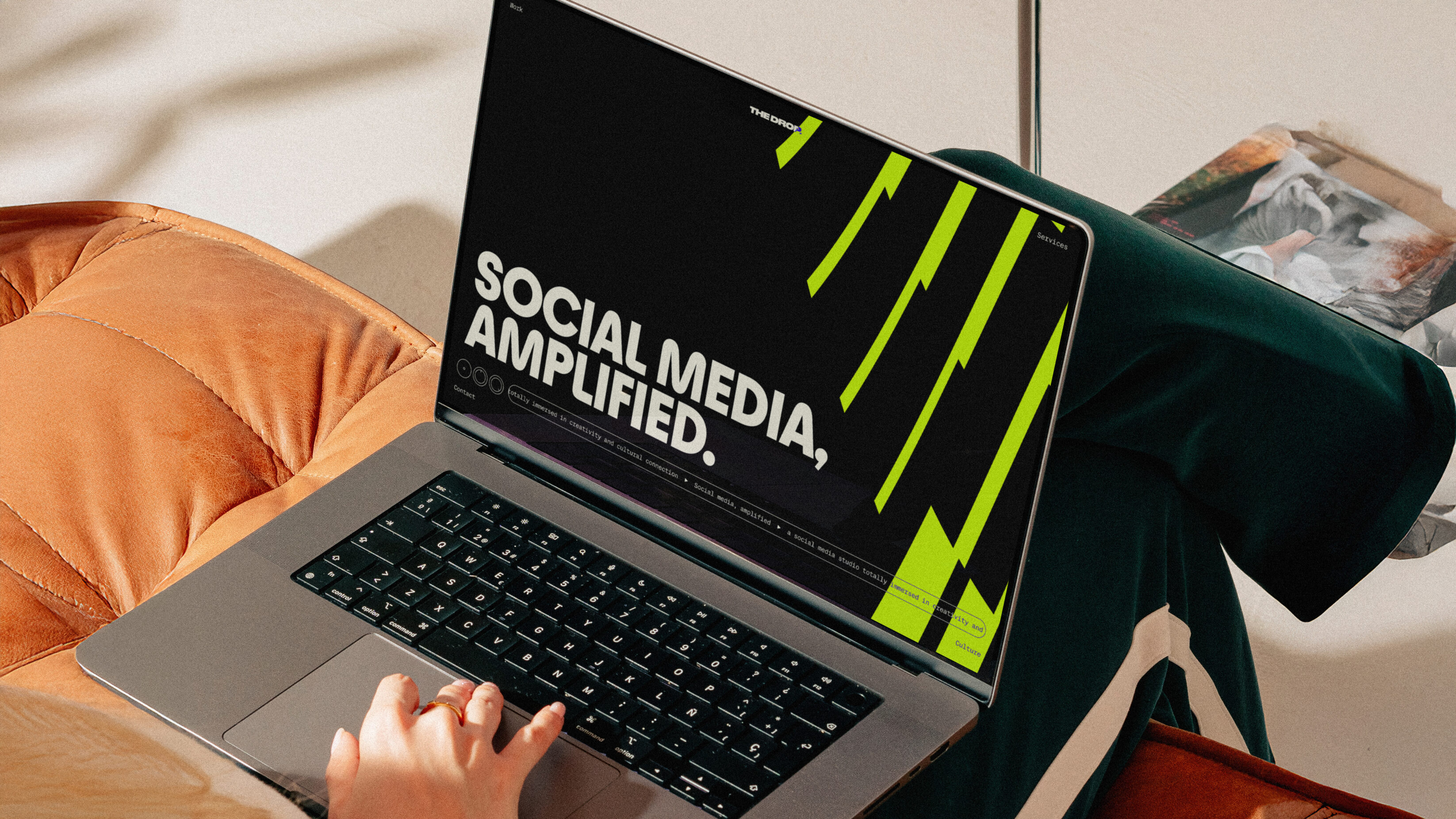
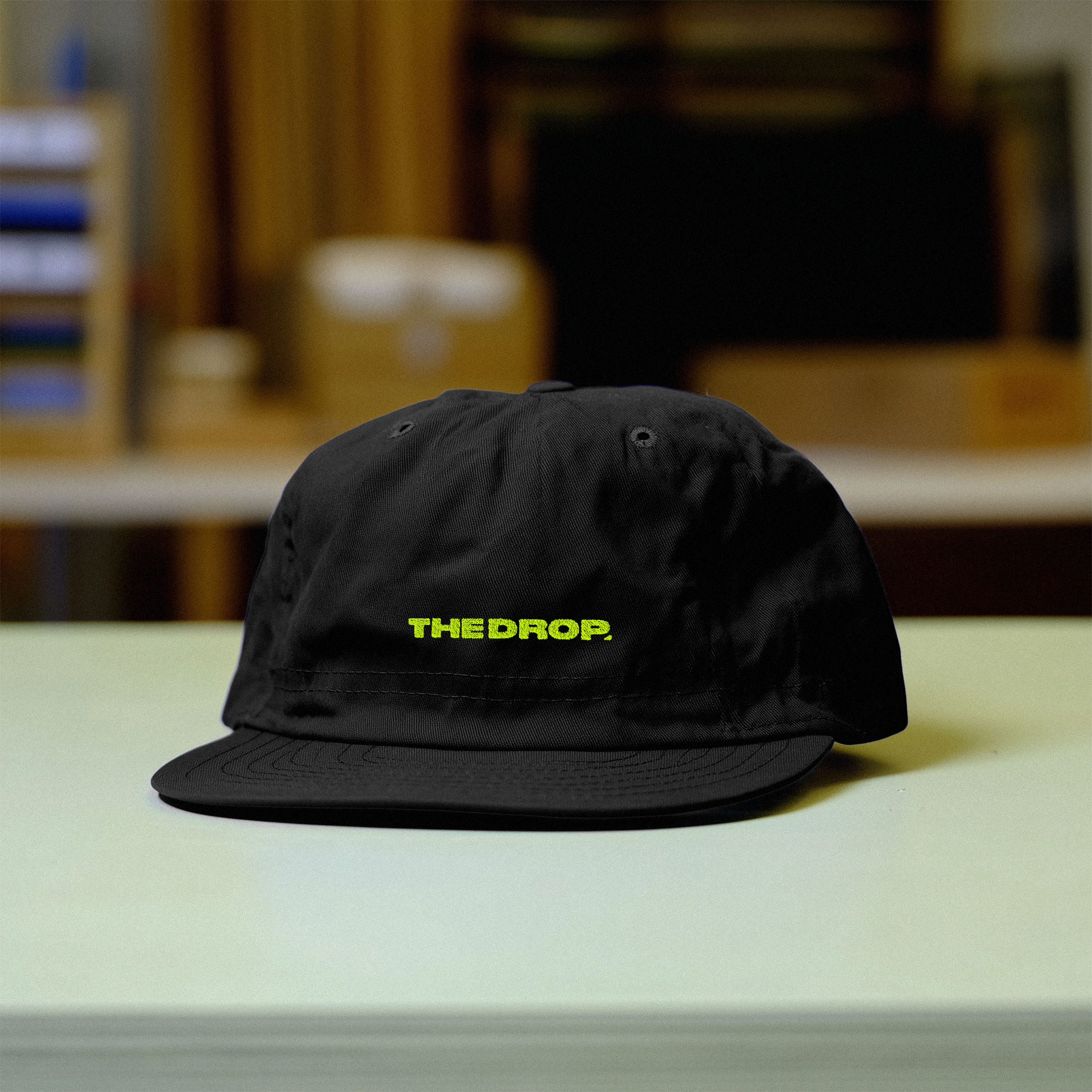
The Drop wanted a loud identity, and we landed on the word ‘amplify’. It perfectly encapsulated everything the Drop does, and everything the Drop wants to do, with a knowing nod to the music they love. The new identity *amplifies* everything it touches, and is fit for a social media studio totally immersed in creativity and cultural connection.
Turning up the volume
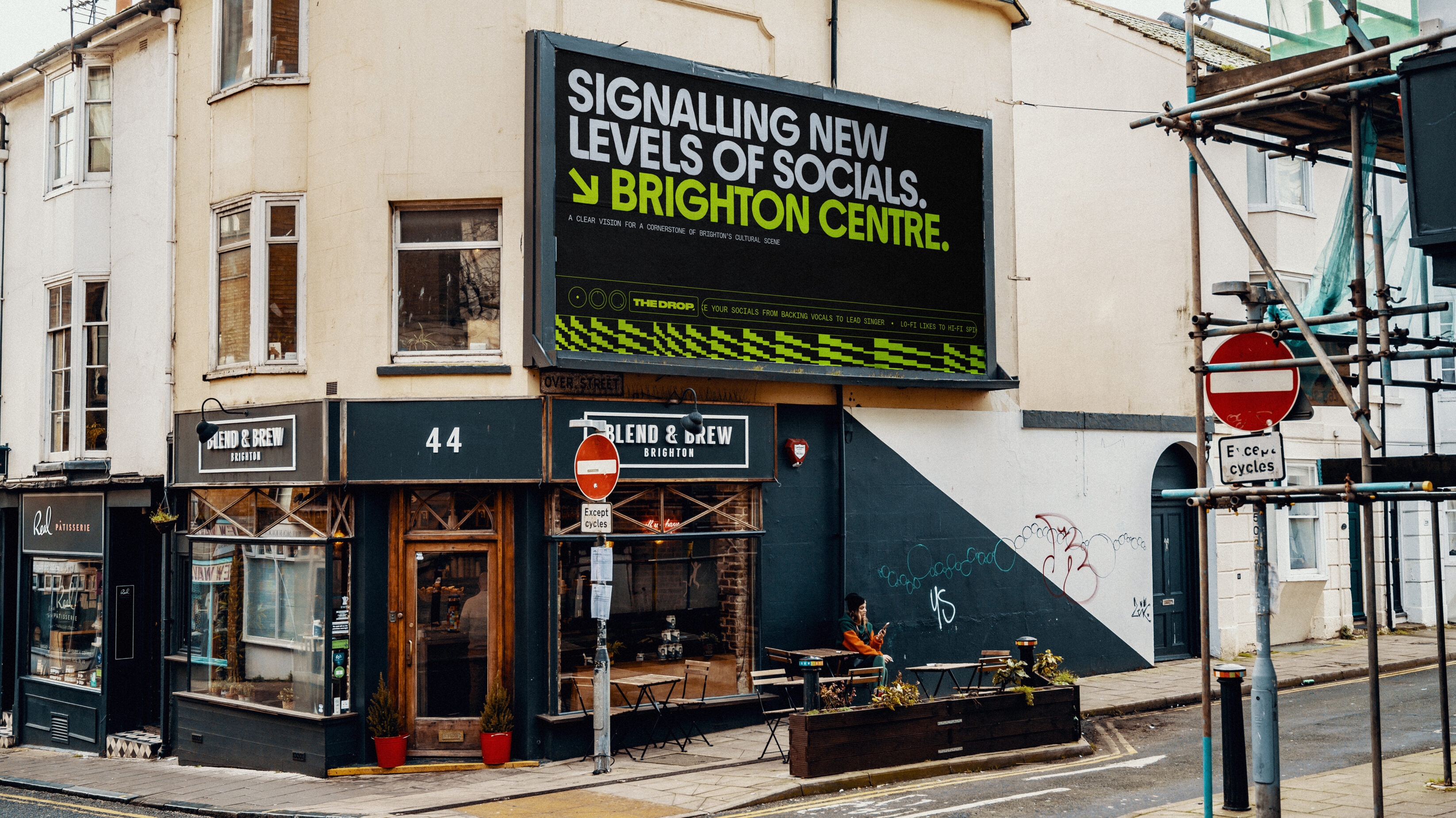
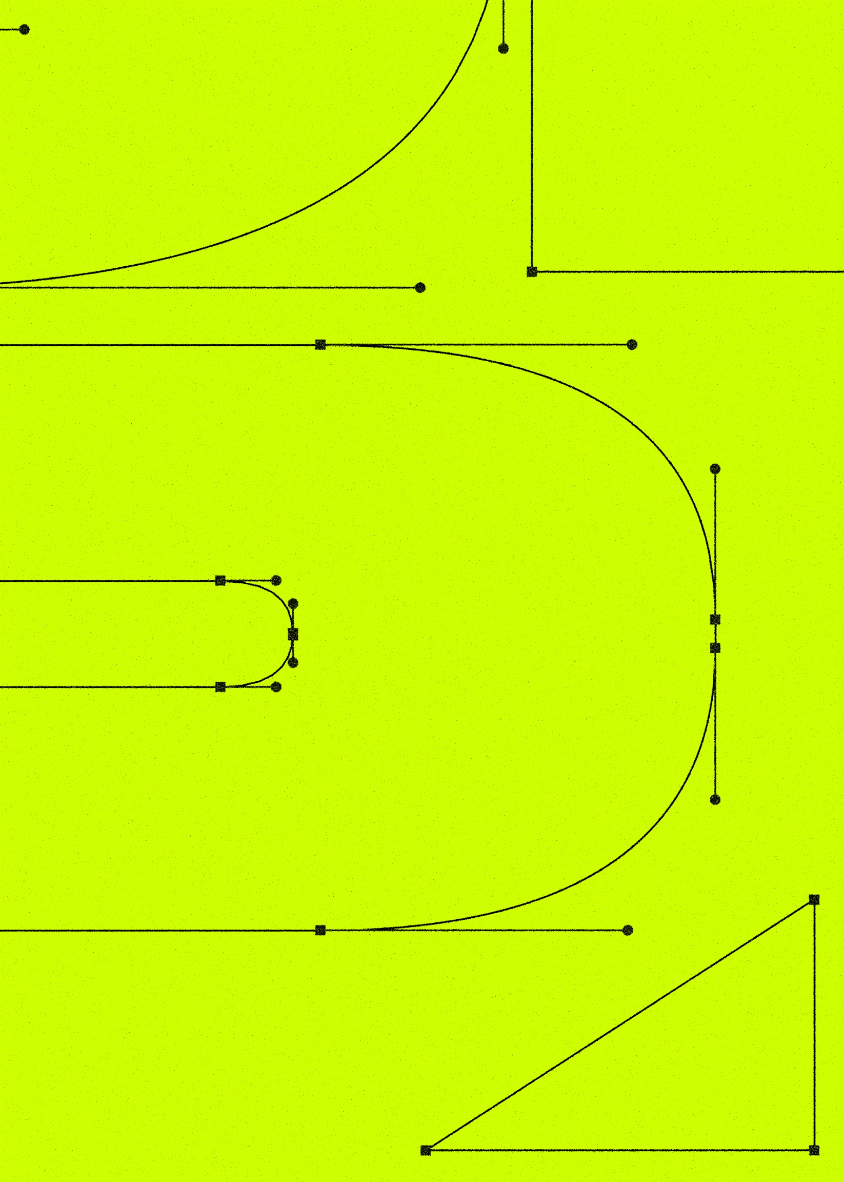
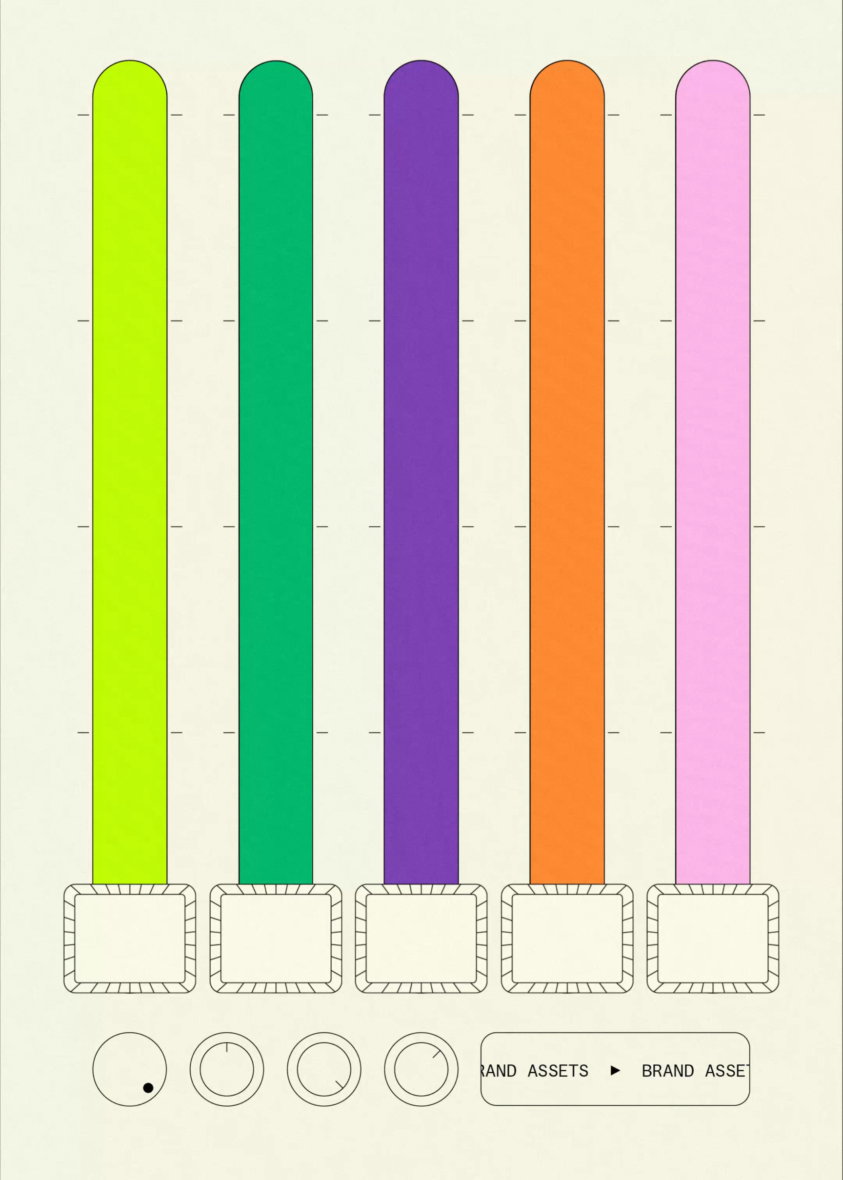
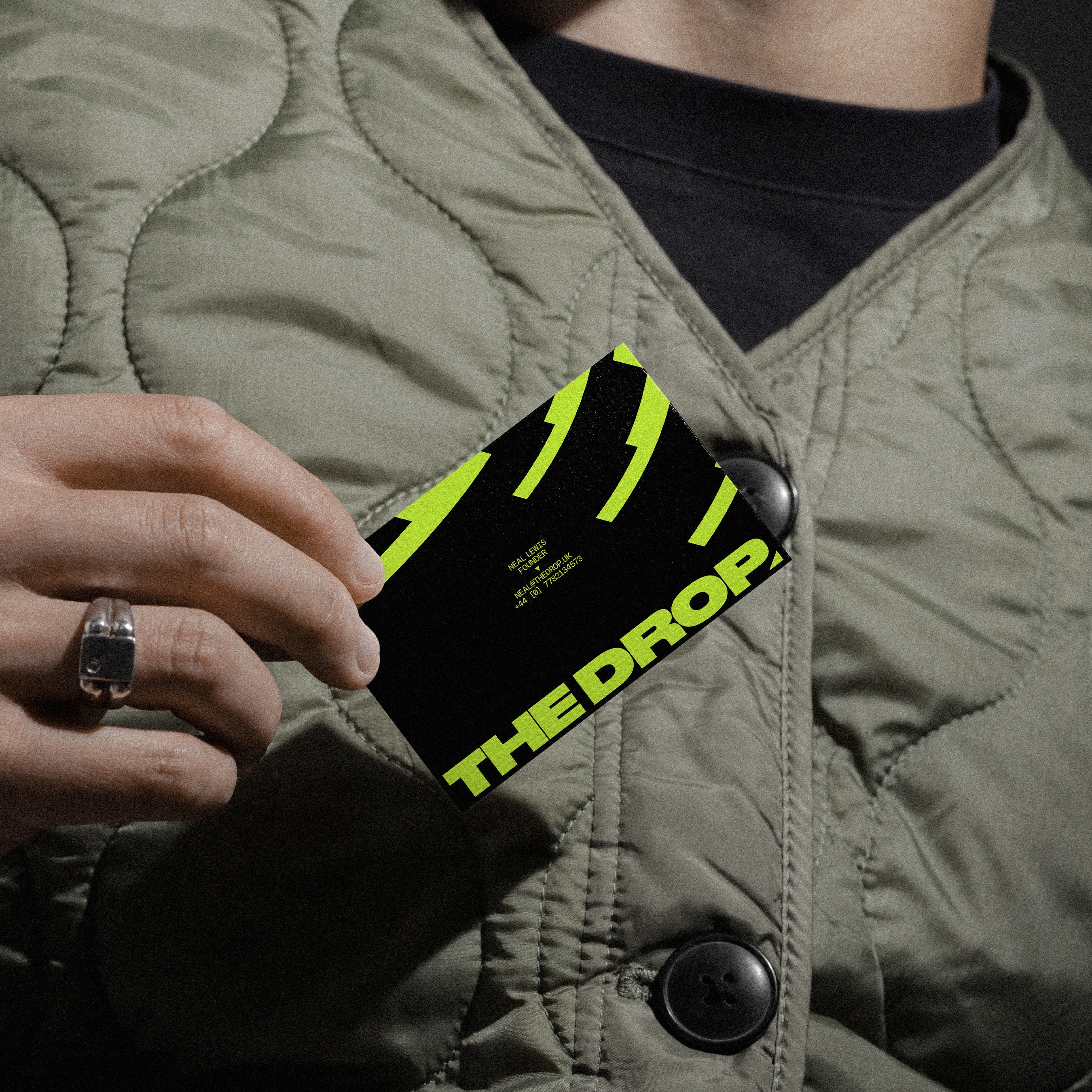
A retro acid yellow, inspired by records and flyers from ‘80s and ‘90s club nights, is one of many big, bold colours that follow the same rhythm as other stylistic choices. Distinct sawtooth patterns beat, wave and move with similar inspirations, rooted in synth waves and equalisers. This sense of movement and amplification also mirrors the new strapline. We designed a modular system that riffed off music equipment and design tropes, creating a flexible system that can be used across promotional material and the website. These dials and digital displays pop up across the brand identity, inspired by the grid-based style of OBI strips, layering an element of analogue onto a digital agency.
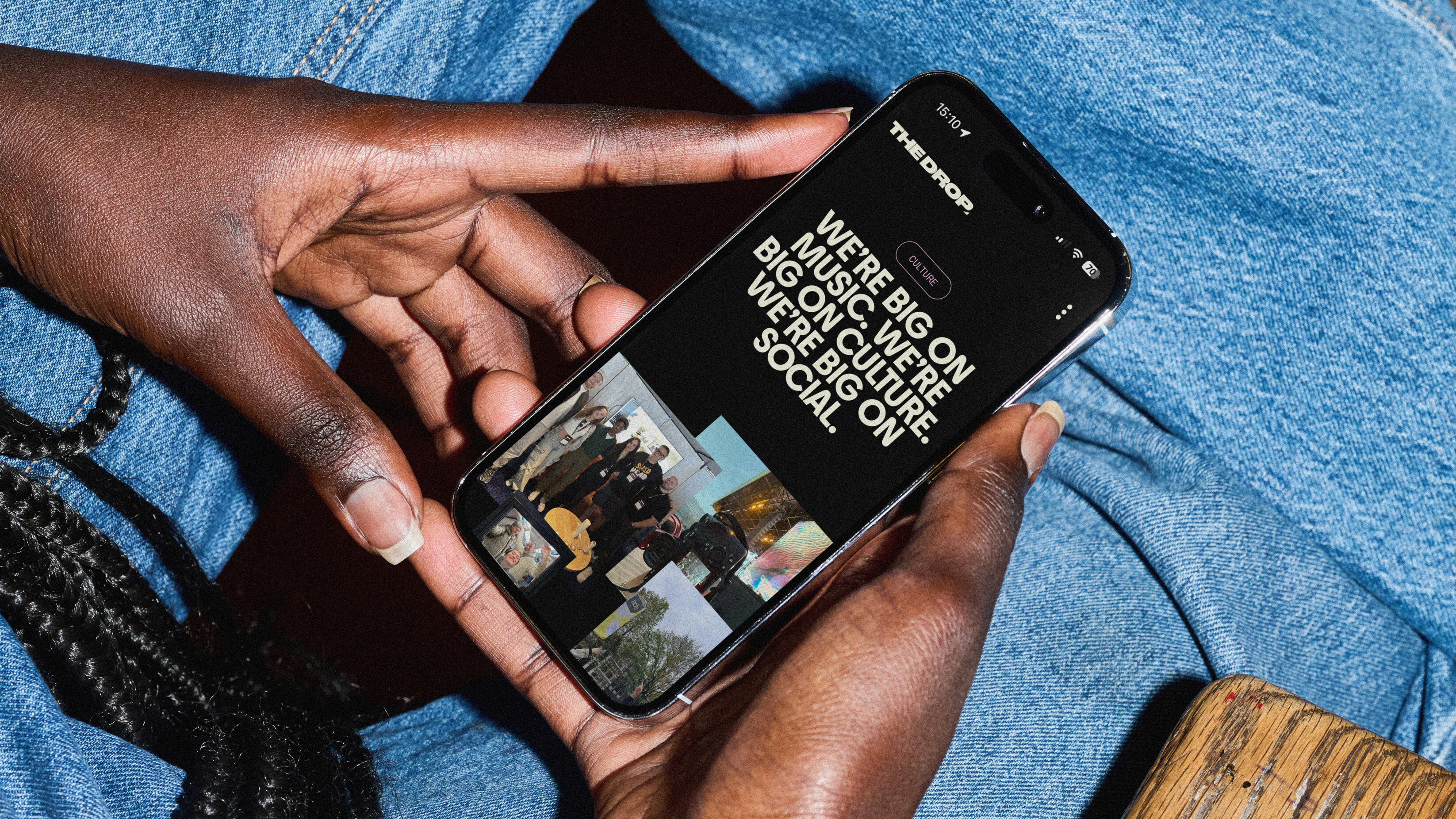
The new tone is alternative, totally immersed and sharp, reflecting an outside-the-mainstream feel, creativity that’s never compressed and a plugged-in, in-the-know attitude. Throughout the verbal identity and website, we’ve continued to weave in words that allude to music culture and production, from the supporting message ‘signalling new levels for your socials’ to ‘turning the tables on off-key socials’.
It’s been the best part of a year in the making, and I couldn’t be happier with the end result. I'm super grateful to the team at UnitedUs for all of the work to get us here.
Neal Lewis, Founder
UnitedUs helped us double down on our mission to amplify artists, labels, festivals and sound spaces online, while staying true to the core values and culture of the team.
Neal Lewis, Founder
Related projects

Farmyard
Helping a nationally-awarded restaurant move into the frozen food market, with electric attitude.
Many people would argue that frozen food isn’t capable of serving up delicious, gourmet, ethically-sourced meals. In fact, frozen food has long been pitched as the antithesis of fine dining with an image of cheap, low-quality food. But with convenience being more important than ever in today’s consumer world, we helped Farmyard put the way people think about gourmet grub on ice, serving up an electric personality to dish out their 3 AA Rosette quality food, and an exciting way for people to discover refined food with attitude.

RM2
Supporting business owners to “own it” when it comes to shifting ownership of their business.
RM2 guides owners through one of the biggest decisions they can make about their business, handing it over to employees. The RM2 rebrand and website embody the clarity and confidence necessary to support people through shifts into employee ownership, restoring brand belief in the UK’s most experienced organisation dedicated to providing these services.
Want to build your brave brand with us?
