Send it to Alex
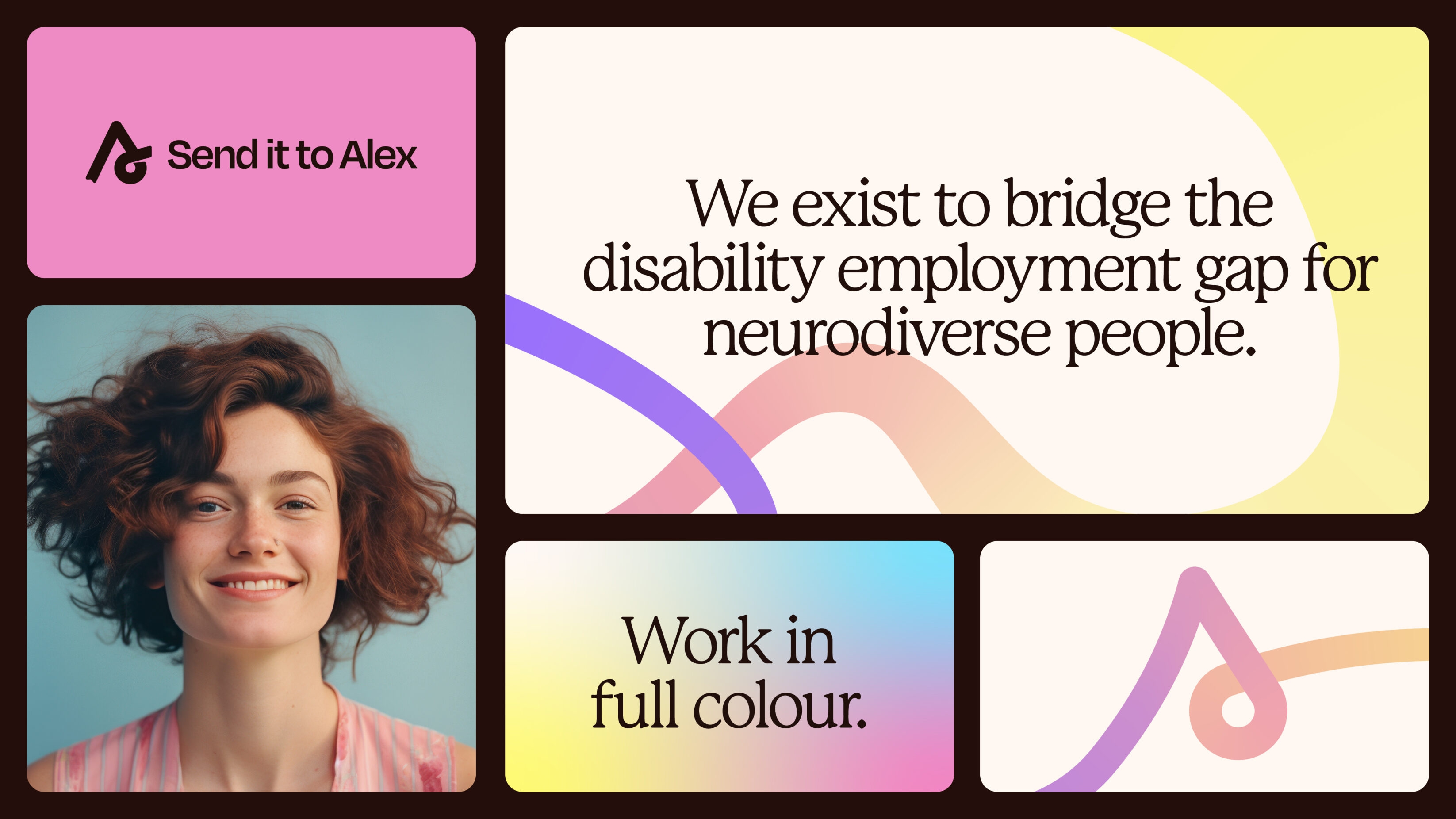
Confident branding that removes neurodiversity masking, for a B-Corp employment support service. Send it to Alex, is the world’s first B Corp-certified employment support service that’s created by, and for, neurodivergent people. We developed a new brand identity and website that provides confidence and removes the need for masking – embracing work in full colour.
Digital design Visual identity Web development
Professional services
UK

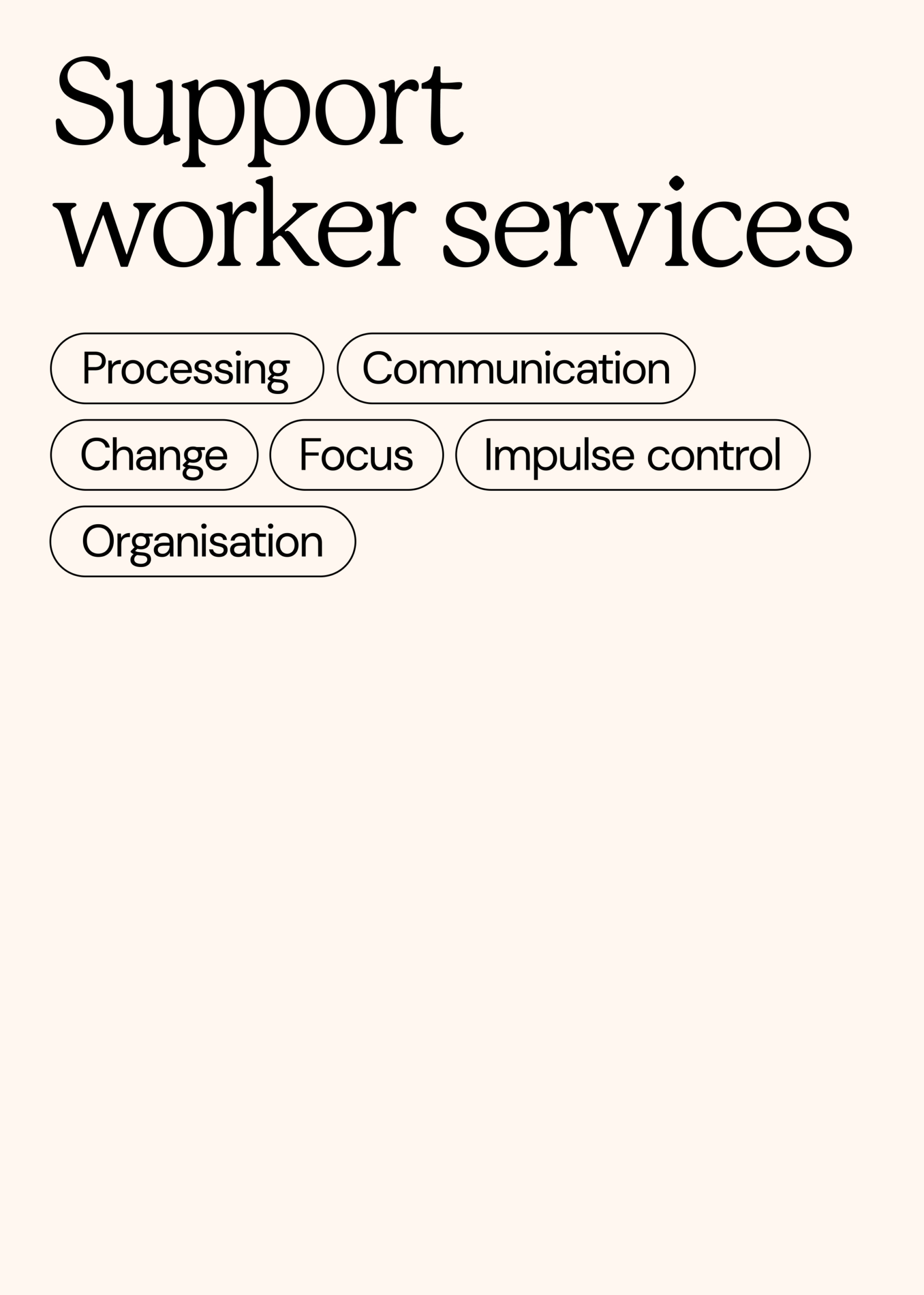
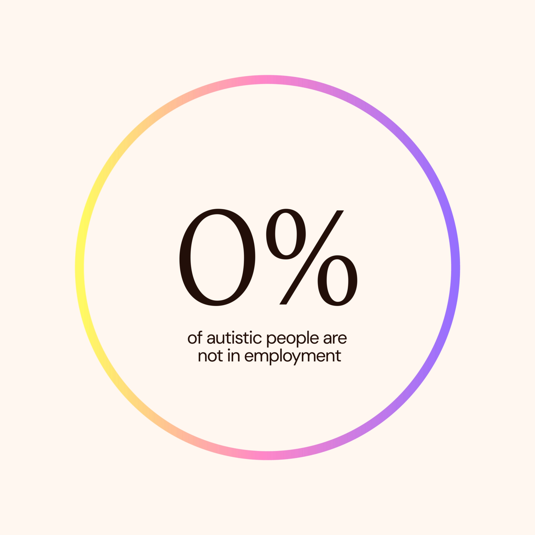
Founded in 2019, Send it to Alex was created by two sisters whose late diagnosis of autism and ADHD put years of personal and professional misunderstanding into perspective. Facing first hand frustrations around the lack of employment support for neurodivergent people, Send it to Alex provides services that enable employees and employers to confidently work with neurodiversity.
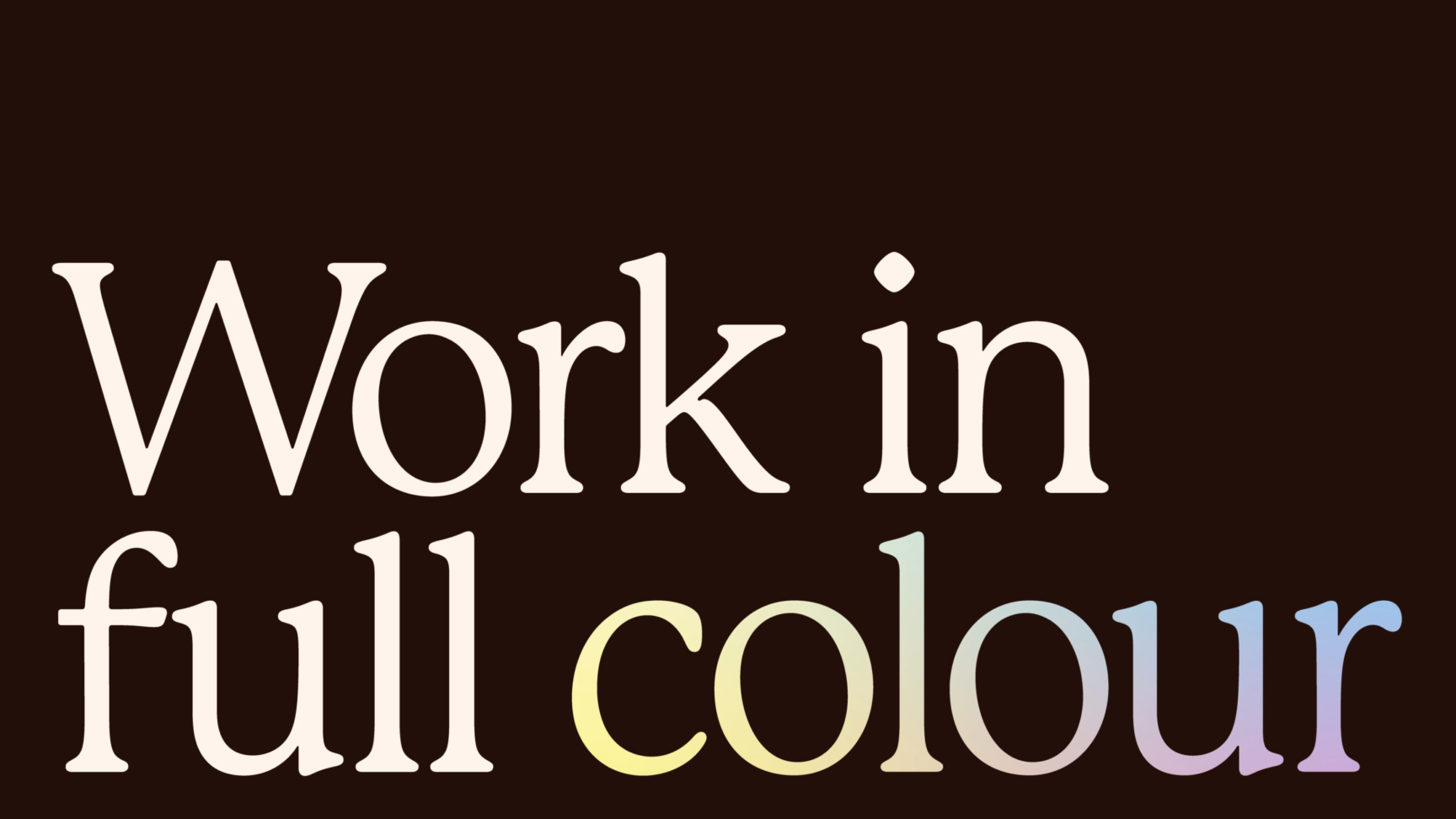
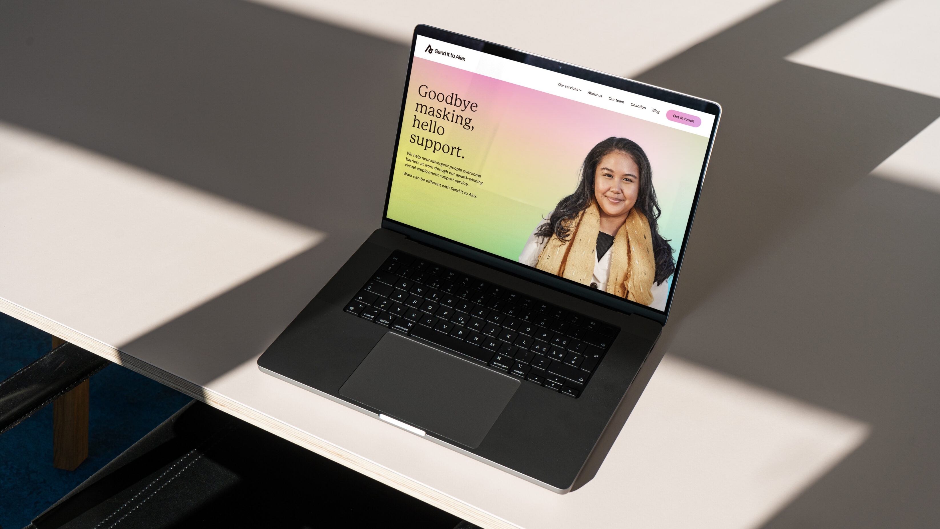
Neurodivergence and the world of work isn’t black and white, there’s myriad nuances of need for each individual, across every organisation. The Send it to Alex brand recognises neurodiverse work journeys that enable people to work in full colour: empowering individuals to be their full selves without the pressure of masking.
Swirls to
success
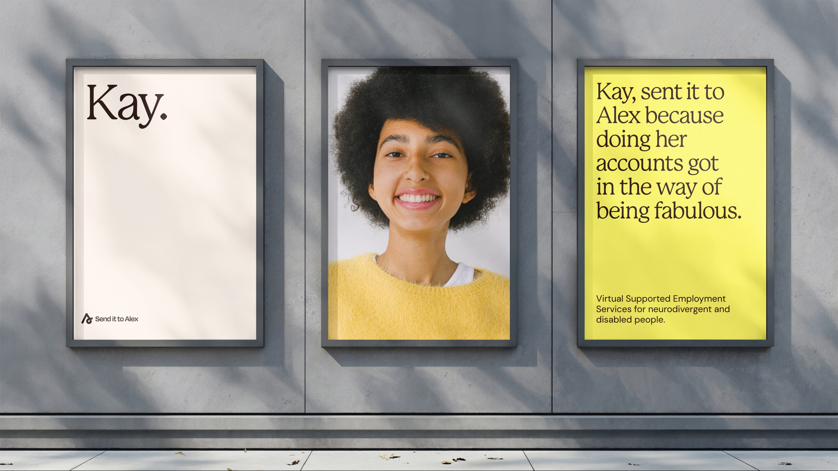
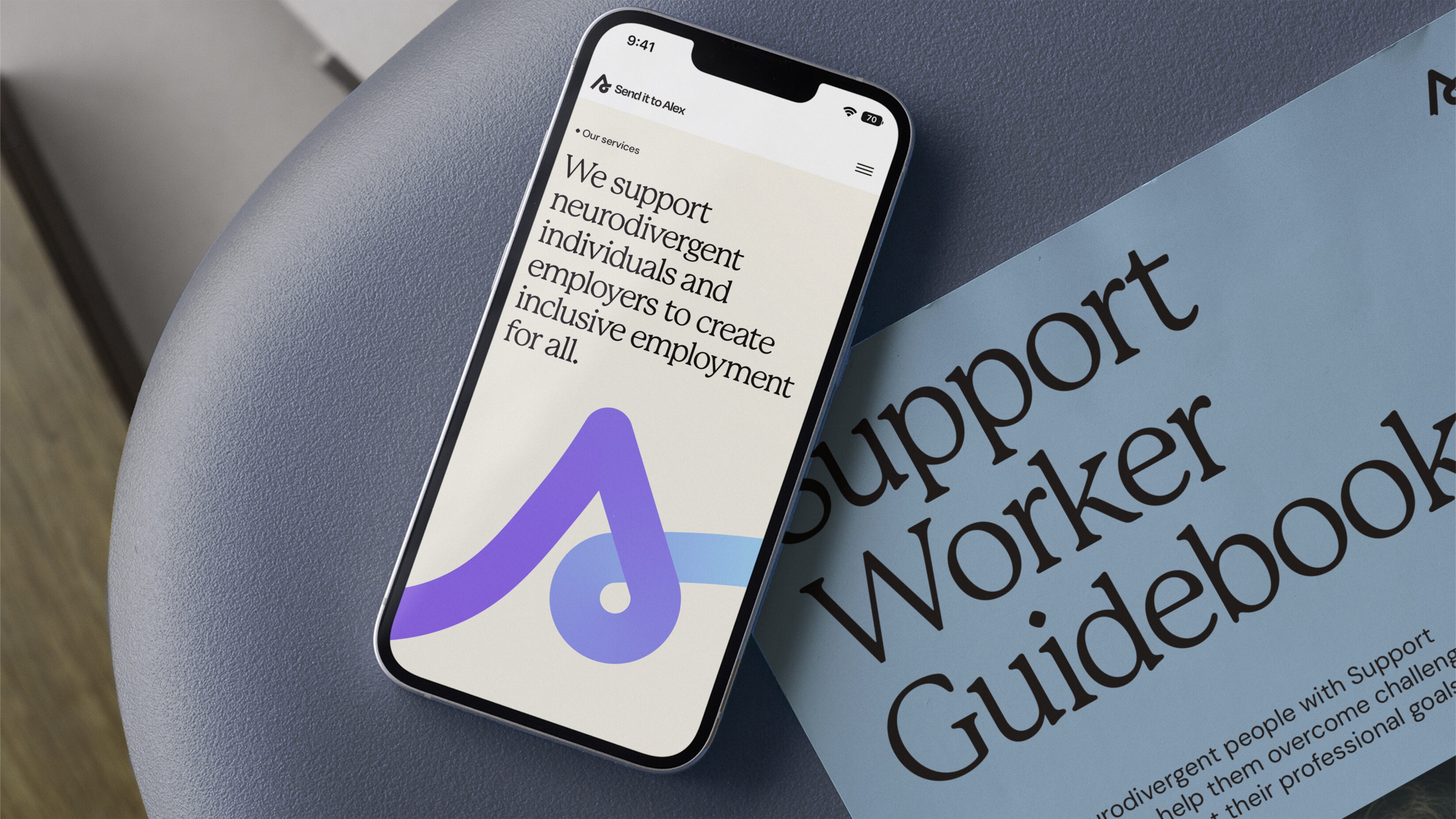
The logo acts as a pinpoint destination for neurodivergent employment support. Highlighting ‘A’ from ‘Alex’ (the name of one founding sister), its letterform logo intentionally features ‘ups and downs’ – representative of struggles neurodivergent people can face in employment – optimistically looping into positive progression.
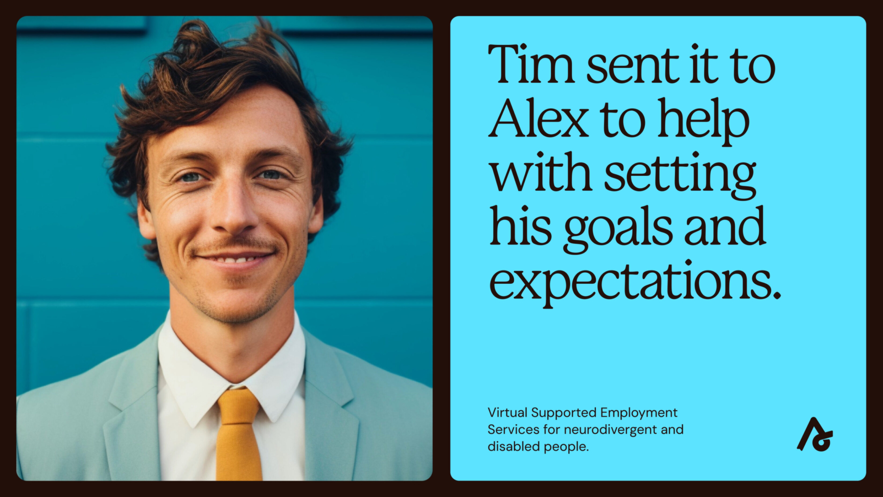
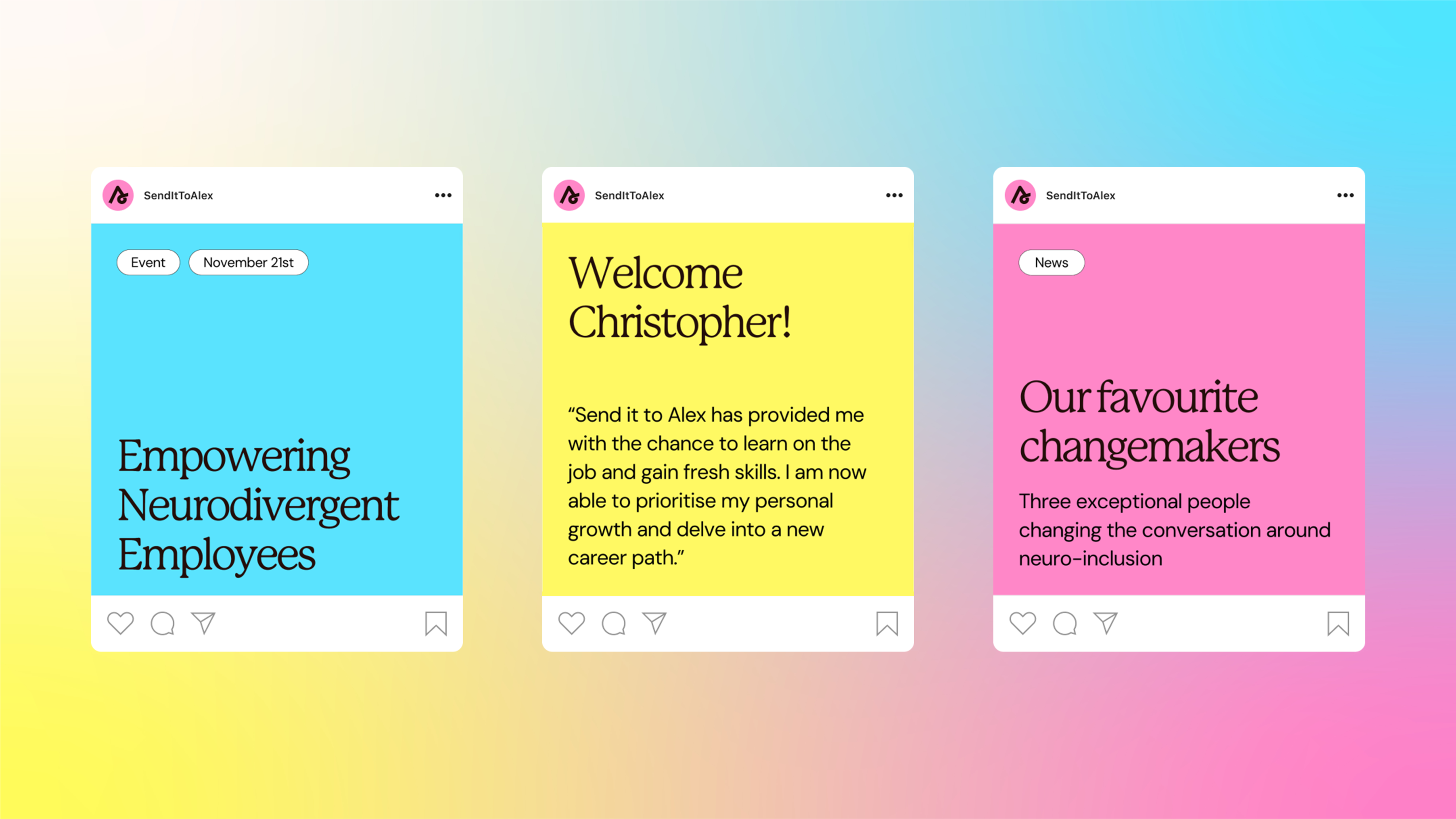
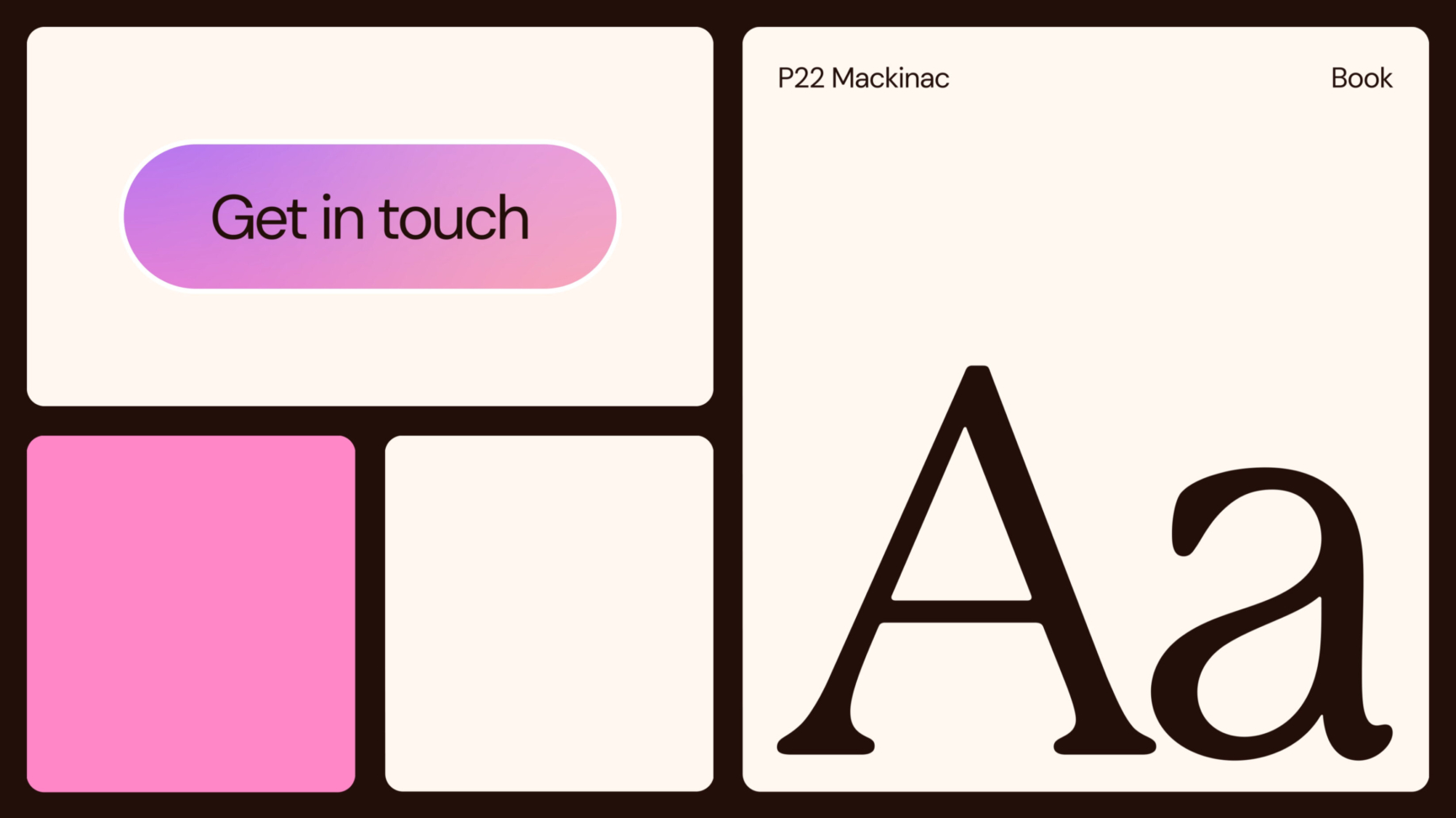
Colour plays a key visual role in the impact of this brand, with gradients reflecting people’s diverse needs, as well as the additive effect of employees and organisations supporting each other. To truly put people at the heart of Send it to Alex’s website we banned stock photography, enabling people from within the organisation to be seen in full colour while avoiding a sterile, dull digital environment.
The wider brand system utilises lines of colour that extend as support swirls, acting as a visual brand vehicle for the journeys that Send it to Alex’s services provide. This, along with subtle motion juxtaposed against the vibrancy of the brand, provides moments of presence and calm to help people reflect on information they’re consuming.

A system
for scaled up support
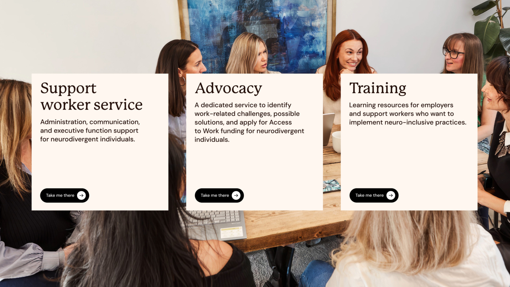
The original Send it to Alex site didn’t reflect the quality of the business, the skills sets of their people. With a need for higher levels of security, we built a secure website that was more than fit for purpose.
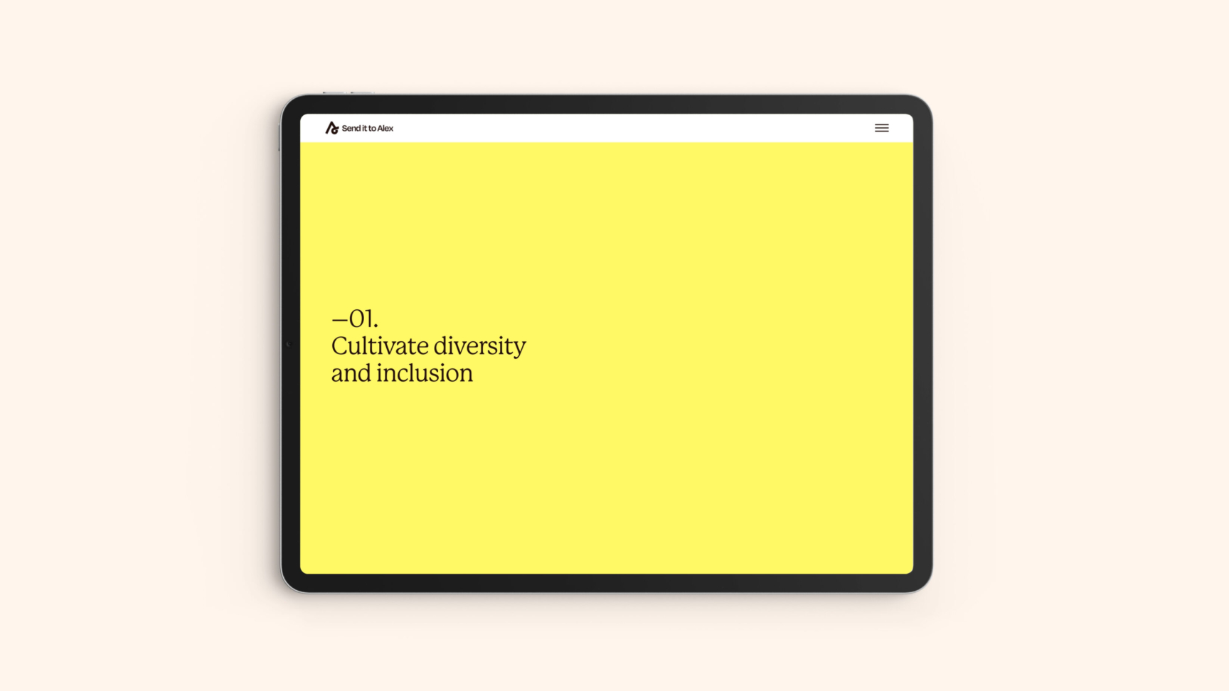
Now the business has a future-proofed, modular platform that can easily scale, from capabilities for users to purchase training to delivering personalised services through a portal. The brochure website also provides a more streamlined way for individuals and organisations to engage with the business and receive the specific service they require.
Intentional collaboration
Balancing vibrant design work and digital experiences – while maintaining usability for diverse users called for a nuanced understanding of accessibility – went deeper than solely following AAA colour accessibility guidelines.
Reflecting on the experience of neurodivergent people in society, the creative industry and within our own organisation, this project enabled us to work with an even more considered collaboration process.
Thanks to Alex and Lillie, for trusting us to communicate their brand as we mutually progressed our understanding of accessibility: to listen, learn and adapt systems so more people can use them for an intended purpose.
Related projects

RM2
Supporting business owners to “own it” when it comes to shifting ownership of their business.
RM2 guides owners through one of the biggest decisions they can make about their business, handing it over to employees. The RM2 rebrand and website embody the clarity and confidence necessary to support people through shifts into employee ownership, restoring brand belief in the UK’s most experienced organisation dedicated to providing these services.

Spectrum.Life
A full spectrum brand for a global healthtech to engage new audiences, internally and externally.
We enabled innovative healthtech, Spectrum.Life, to engage, empower and transform across three main sectors — radiating the new energy needed to fuel international ambition. This identity, website and digital toolkit enhances their ability to communicate full spectrum support as a whole-of health partner.
Want to build your brave brand with us?
