AxClub
Serving up a padel club that hits different, in just six weeks.
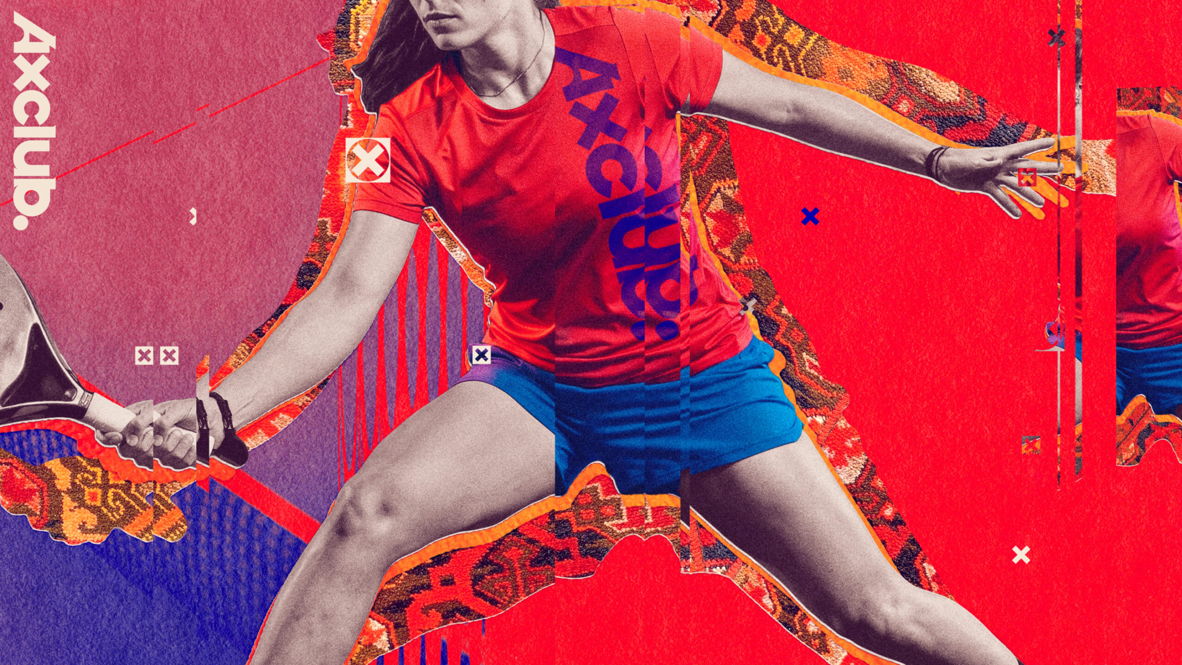
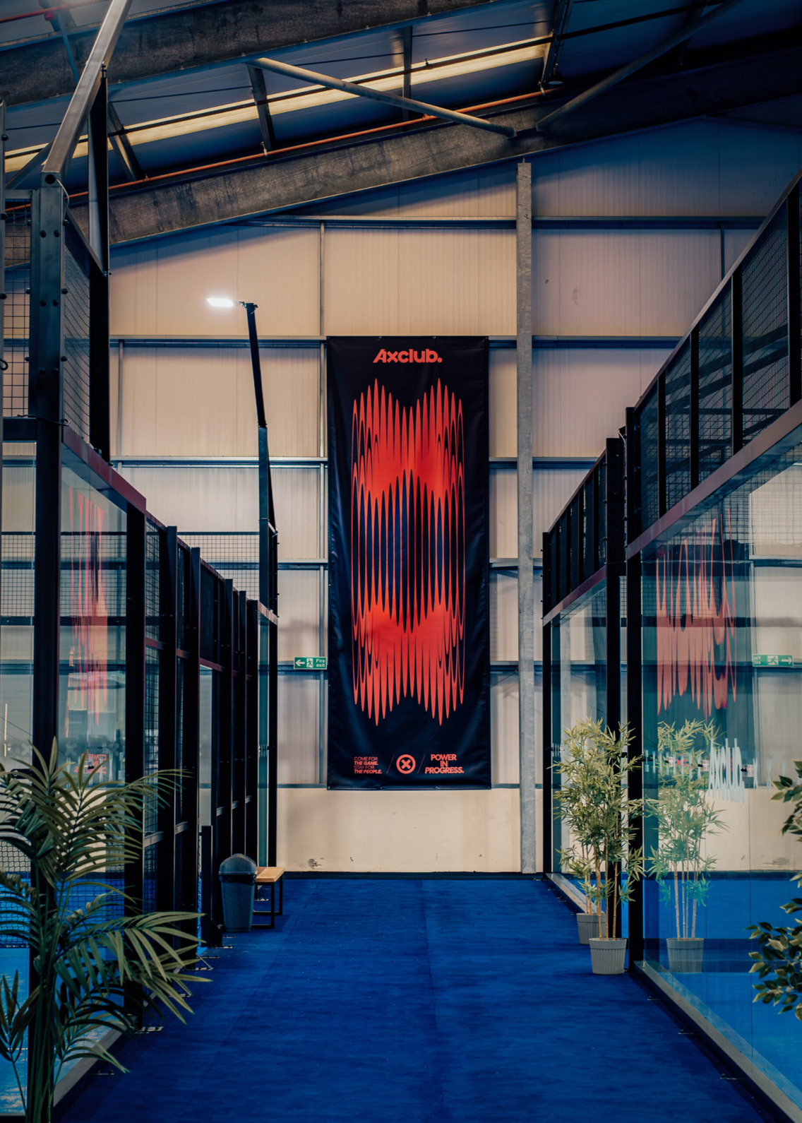
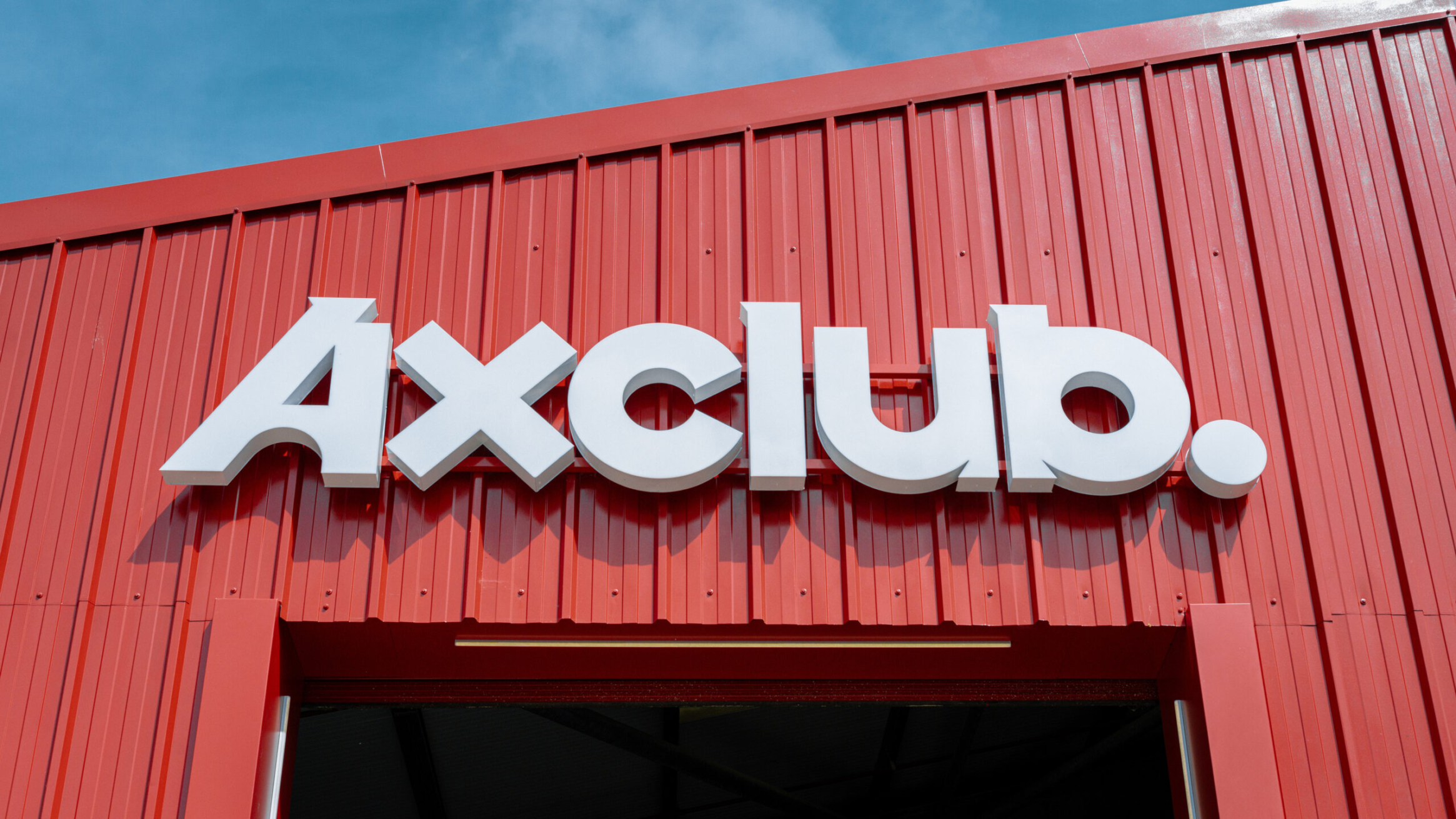
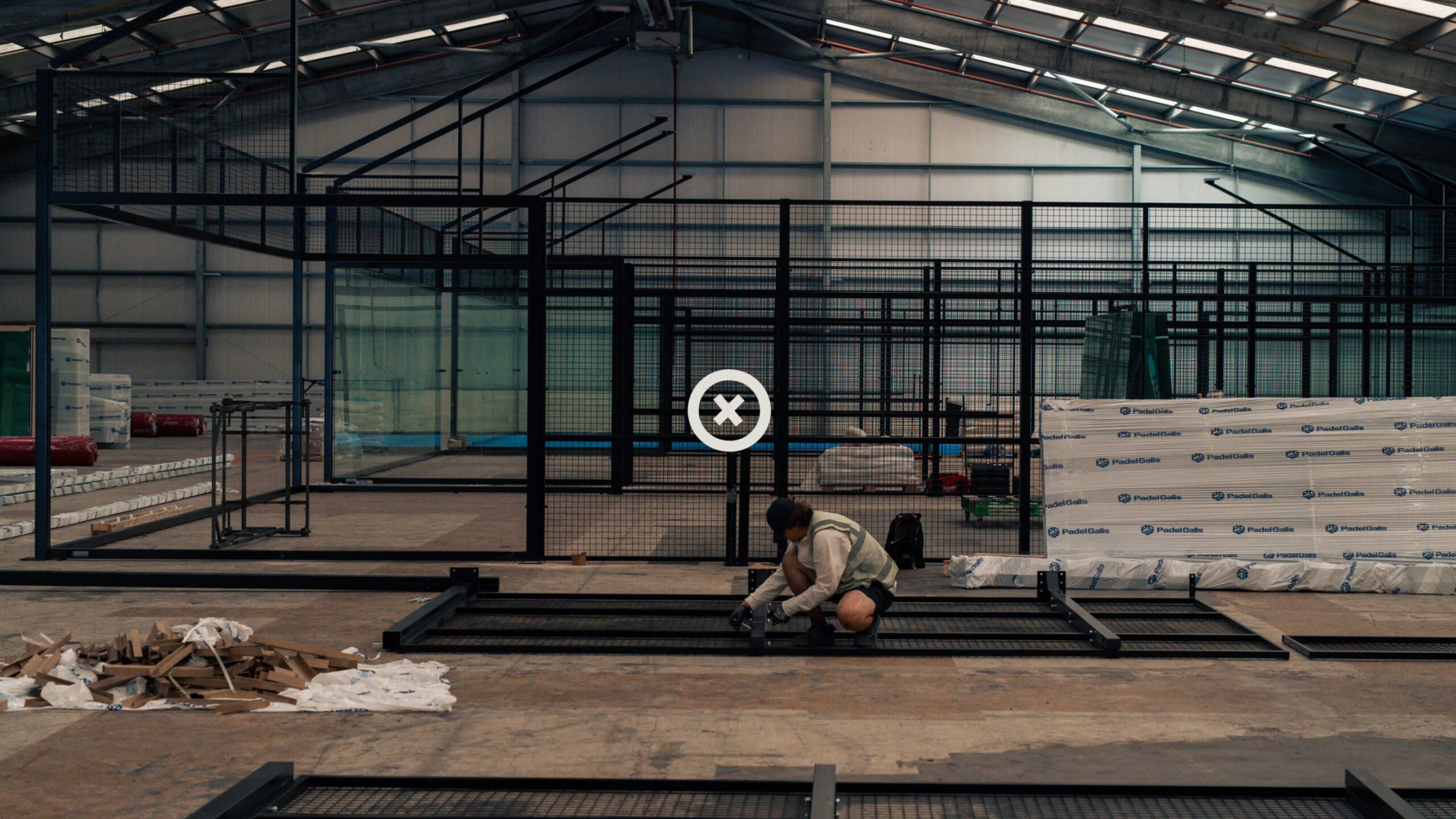
Six weeks. One investment business. Endless opportunities. We built AxClub from the ground up. No brief. No client. Just Partners. From first call to first ball. Playing on our experience with CorteSport, our new Heavy Industries brand is encapsulated in one phrase: power in progress. Built upon the historic Axminster Carpets site, AxClub brings a world-class padel brand to a close-knit local community looking to advance their game, and connect socially.
Case study
THE BRIEF
It started with a call with a long-time friend (and previous client) laying out an opportunity to develop a vibrant visual and verbal identity for a six-court padel club in just six weeks. Alongside the brand identity, building a thriving club experience, direct consumer engagement, and on-court training were key. After our successful exit experience with Corte Sport, we stepped back into the glass to serve up something special. A challenge in such a short timeframe? Sure. Impossible? Nope.

OUR ANSWER
All sports clubs are built from the ground up, and with our Partner Ian on the ground researching potential locations, we were able to deep dive into brand and creative opportunities, setting the foundations for a club like no other — a world-leading club of one, not a cookie-cutter club experience.
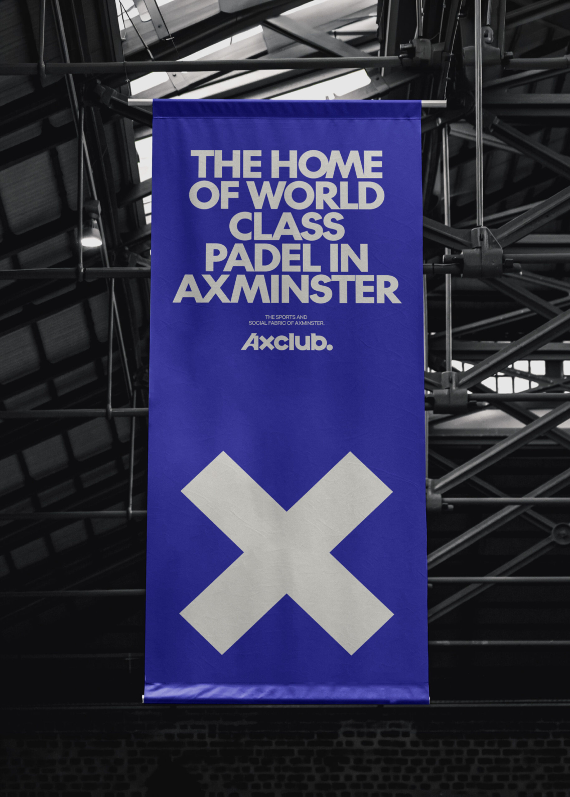
The courts were being built on the Axminster Carpet’s original foundations, a direct link to the cultural fabric that threads through the town. X’s once dotted the old looms that worked away on the site, much like the back and forth on the future padel courts above. These X’s were a natural link to the town’s name, and echoed the precision, the goal setting, and the sense of progress that defines padel at its best. Then came the phrase, “X marks the spot.”
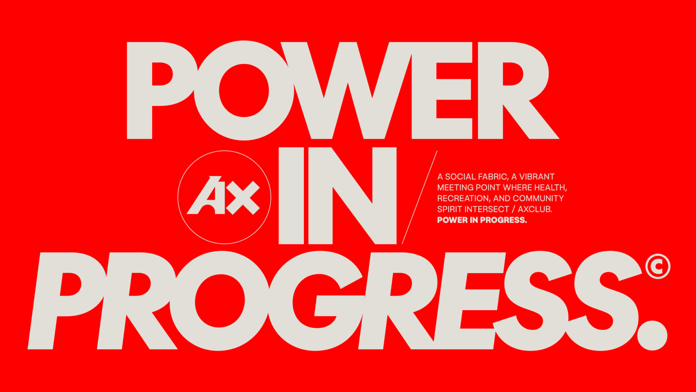
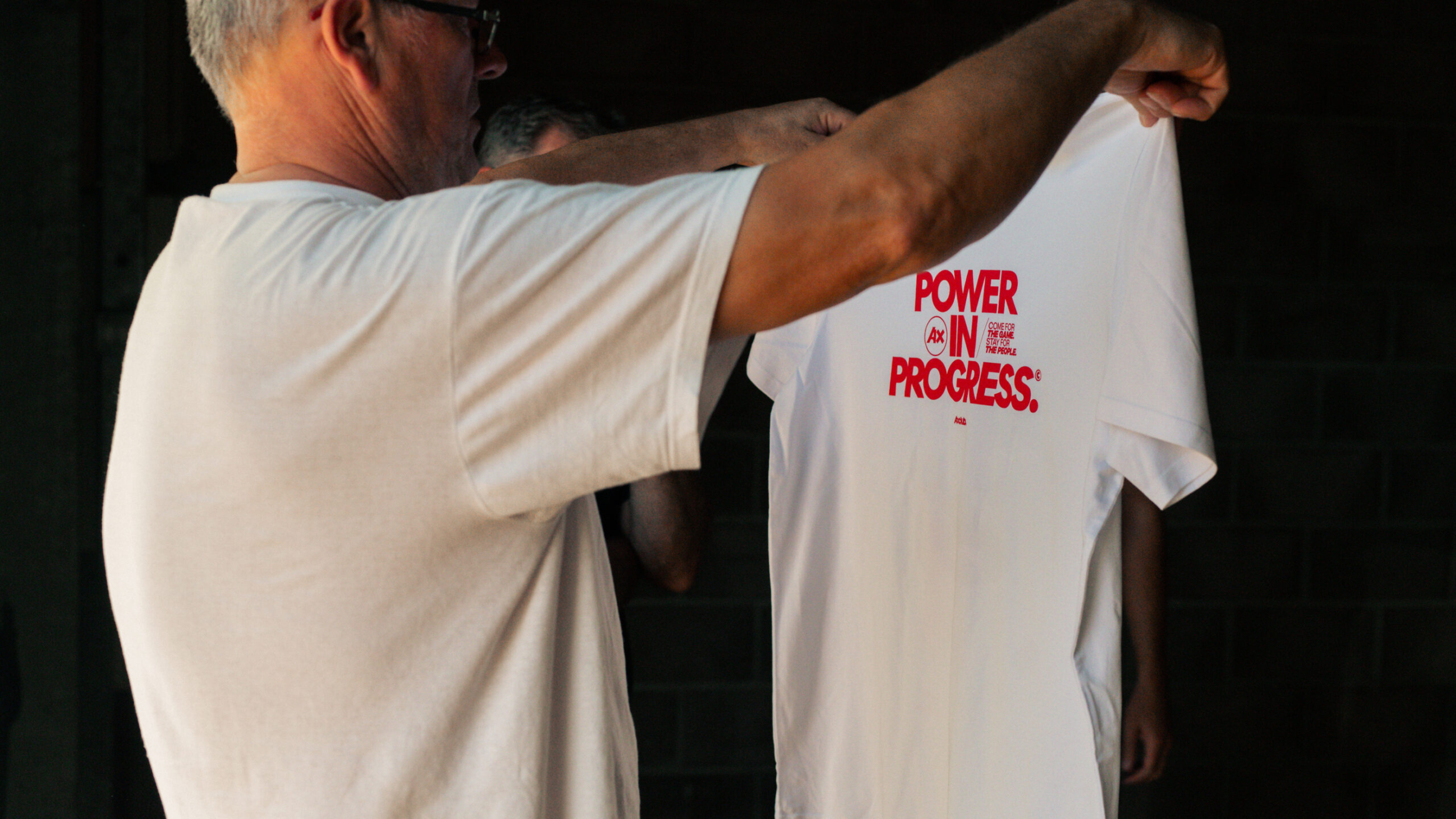
This phrase was a hook for the team throughout brand creation. It alluded to the meeting point that we wanted AxClub to become. A place where different people at different skill levels intersected and connected. From there, the brand began threading together, with a strapline that encapsulated this intention: power in progress.
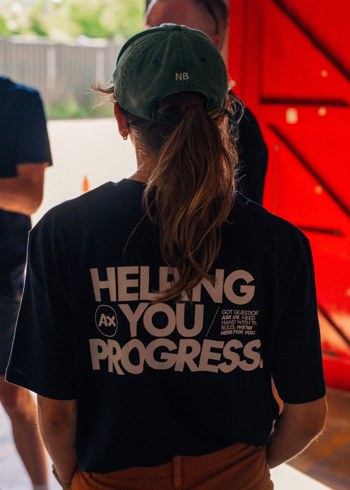
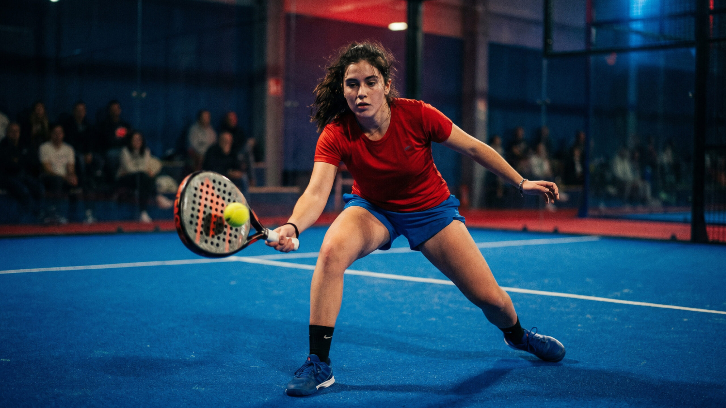
When it comes to padel, progress is lots of things. It’s stepping into the glass for the first time. It’s beating a mate after who knows how many losses. It’s hitting a peach of a víbora shot. It’s beaming in the post-match bar. It’s becoming fitter, healthier, happier all through a welcoming game.
But even after all that, progress never stops. The point is the back and forth. The two steps forward and the one step back. The one win after ten losses. It’s what makes sport so emotive. The constant ambition to be better, and we want to champion that in our players.
Think Nike, but on a hyper-local level. That’s AxClub.
THE OUTCOME
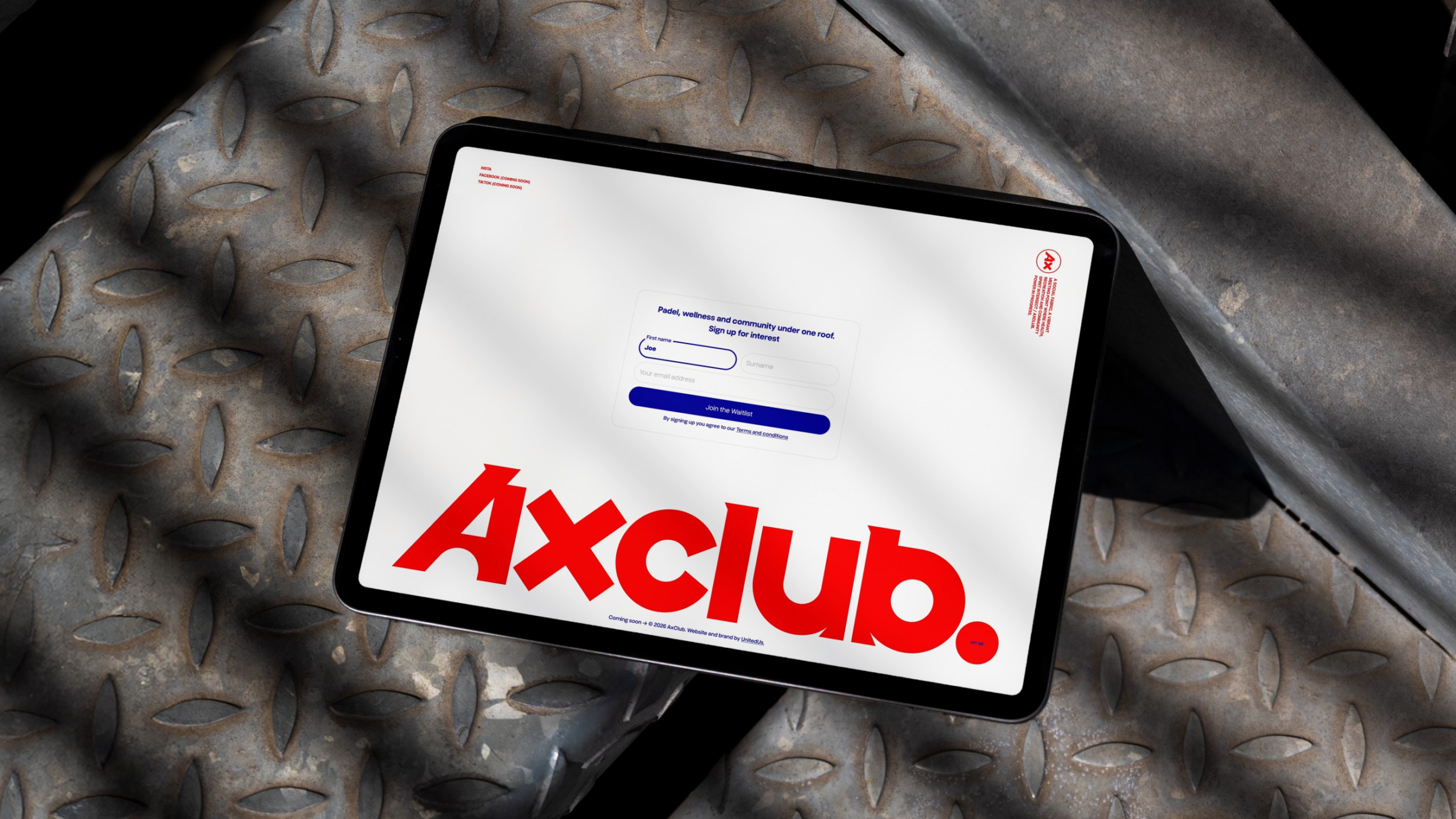
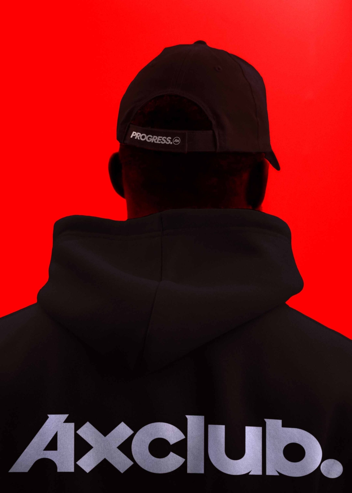
AxClub has been designed to help people see the power in progress. Whether that’s on and off the court, or in and out of the club. It’s rooted in community, helping people find a platform to play with power and progress. Without progress, life on and off the court would get boring. That drive bounces off every word and every visual. It put AxClub on the map straight away, helping us make a racket with various brand activation pieces on socials pre-launch.
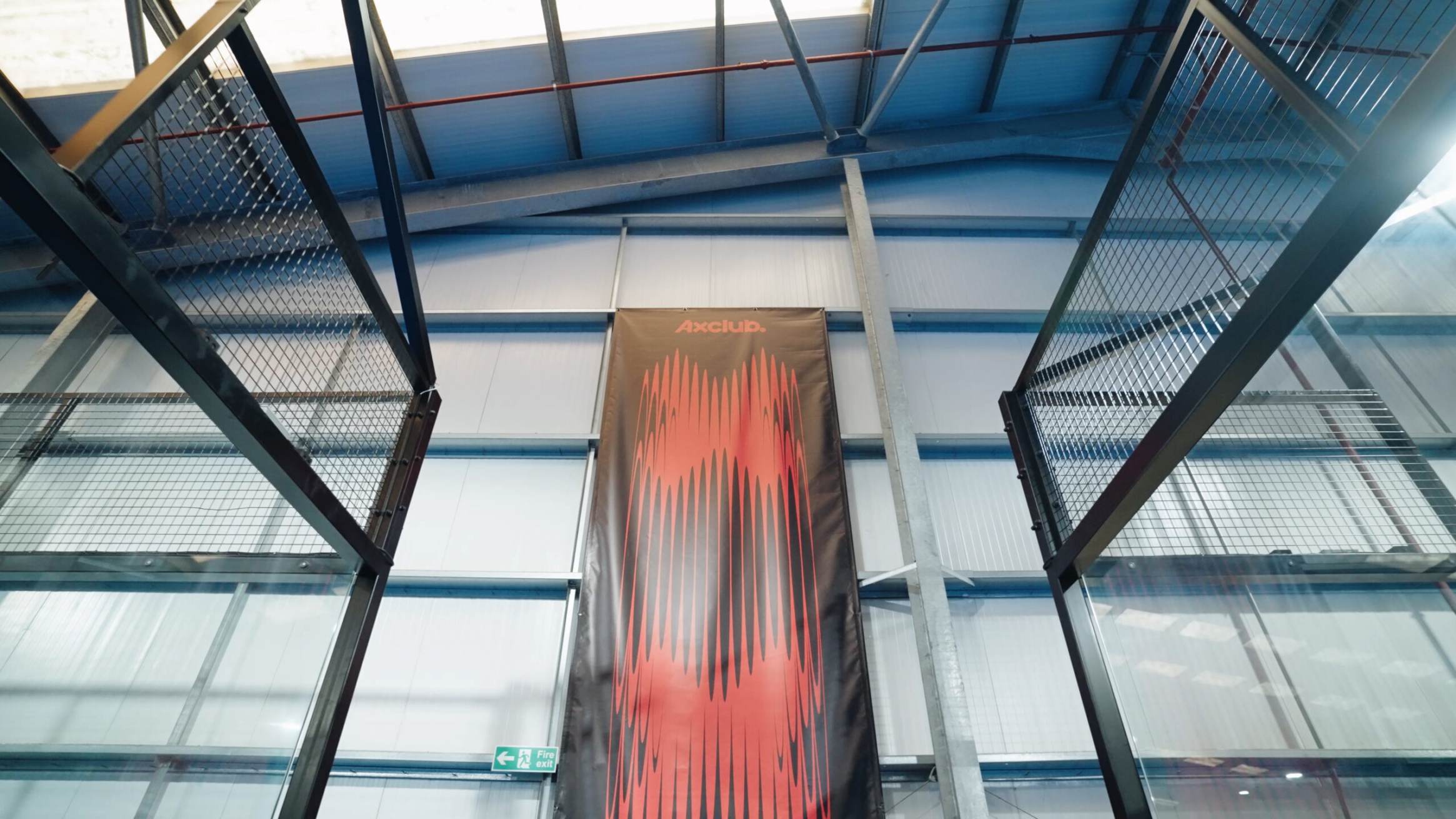
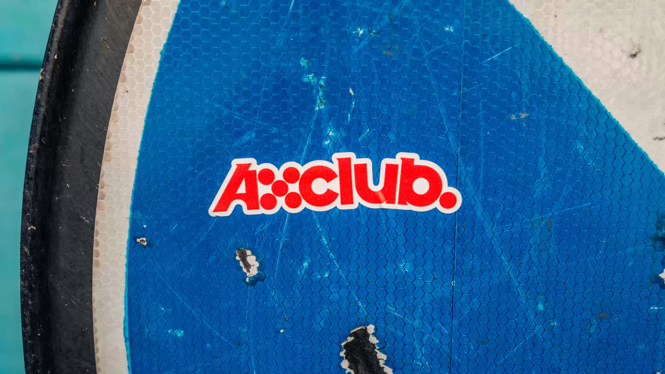
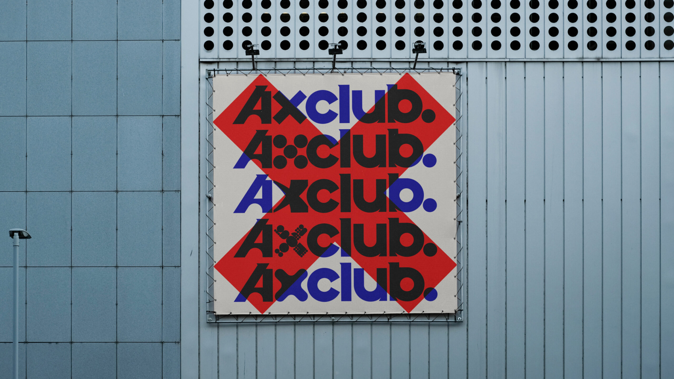
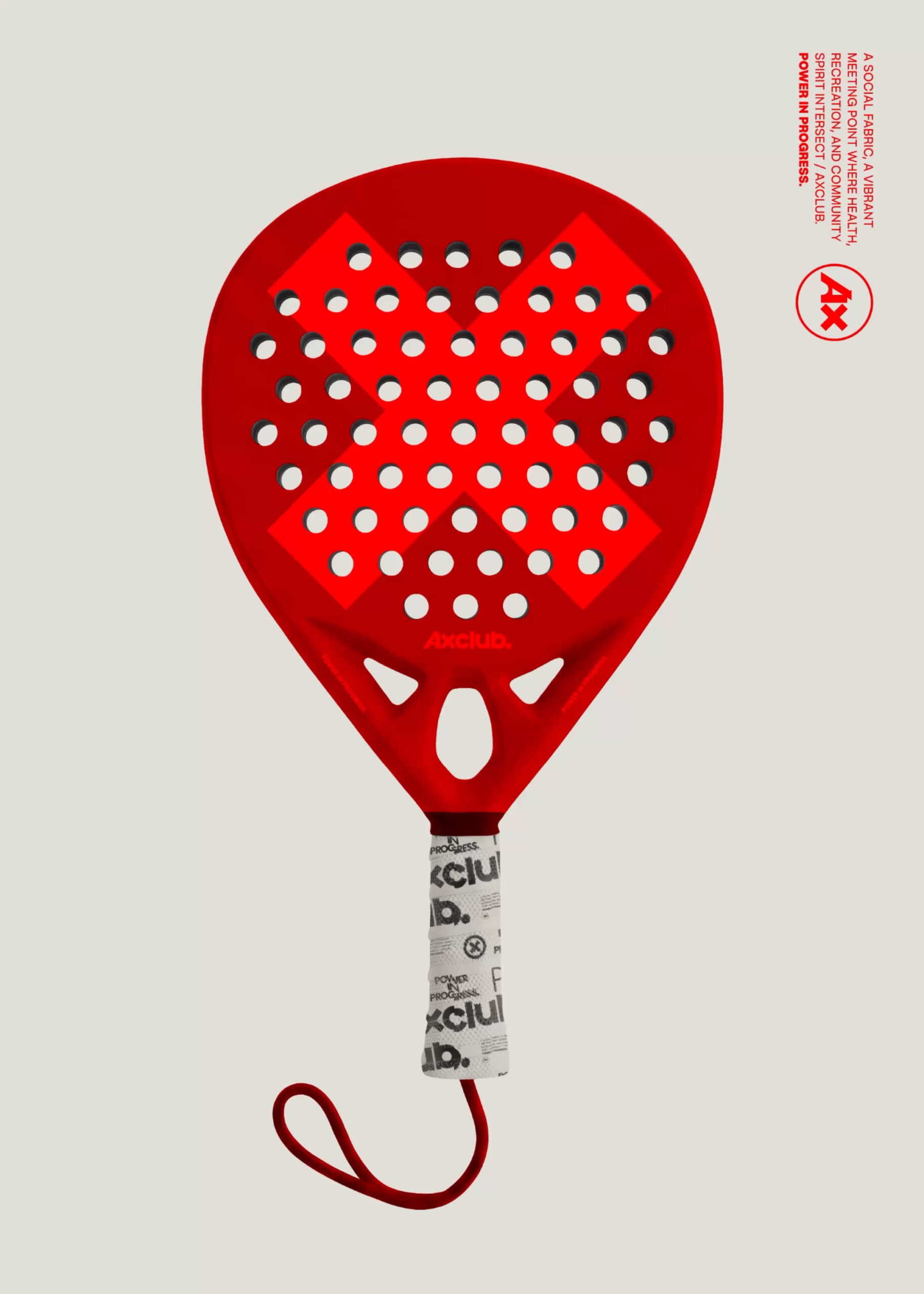
The identity itself seamlessly bounces through ‘X’s’ made of a variety of shapes, from the circle of the padel ball to the straight lines of the court frames. We’ve taken inspiration from the world around the club and echoed it in the infinite ways our identity can evolve and move as we progress as a business. As this is a UnitedUs Heavy Industries business, we are in constant long-term control of our brand, giving us the freedom to play and experiment with how we want the brand to evolve. It’s in that freedom that we can bring our experience to life quicker and more effectively.
Today, the thud thud thud of AxClub players echoes across the sites where Axminster Carpets’ old looms wove back and forth. Even the carpet beneath our players’ feet has been designed in partnership with the world-famous business. Centred around the letter X, this is a brand designed for its destination, built for precision and laser-focused on progression. Always moving forward, always Axminster. Game. Set. Match.