ROKA
UI and brand design for an app to help people align in love, inspired by Indian culture. In the competitive dating app space, we positioned ROKA to communicate their point of difference and show up as the choice for people to find meaningful connections, start committed relationships and ultimately find love. We developed a brand identity and digital app design – influenced by Indian cultures – that speaks universally to people who want to find the ‘one’.
Brand strategy Copywriting Digital marketing Tone of voice UX Visual identity Web design Web development
Technology
Global
We worked with a distributed collective of entrepreneurs, creative producers and media founders to bring their brand and matchmaking app to life. Initially set to arrive in three Indian cities, the brand also had to speak to diasporic audiences in US and UK communicating a USP that means people can not only match to find love for themselves, but their family and friends can support them in their search for love.
Inspired by the eponymous Punjabi ceremony that marks the union of both the bride and groom’s family and friends, ROKA needed a brand identity that could get their venture off the ground and tell their story. Pinpointing a creative hook to build the brand around, we looked at why ROKA really existed – it’s a destination where people can match, connect through shared values and ultimately be in a relationship with someone they love.
Distilling such an emotive topic that encompasses a myriad of deeper feelings, including passion, respect and tenderness is a difficult task. Love means so many different things to different people. We wanted to provide a destination for people to come together and find it for themselves, so that heart-fluttering four-letter word becomes clear to them, on their own terms. People needed to know that ROKA is the place where love aligns. This lead message allowed our team to spark ideas around togetherness, embrace and connection, with ‘where love aligns’ becoming our creative concept to craft a compelling brand identity.


We created a unique language of love for the ROKA brand and translated it into the app environment, accommodating scope for growth as new app features were developed – attracting people to download the application, interact with the brand and be empowered that they can establish meaningful romantic relationships.
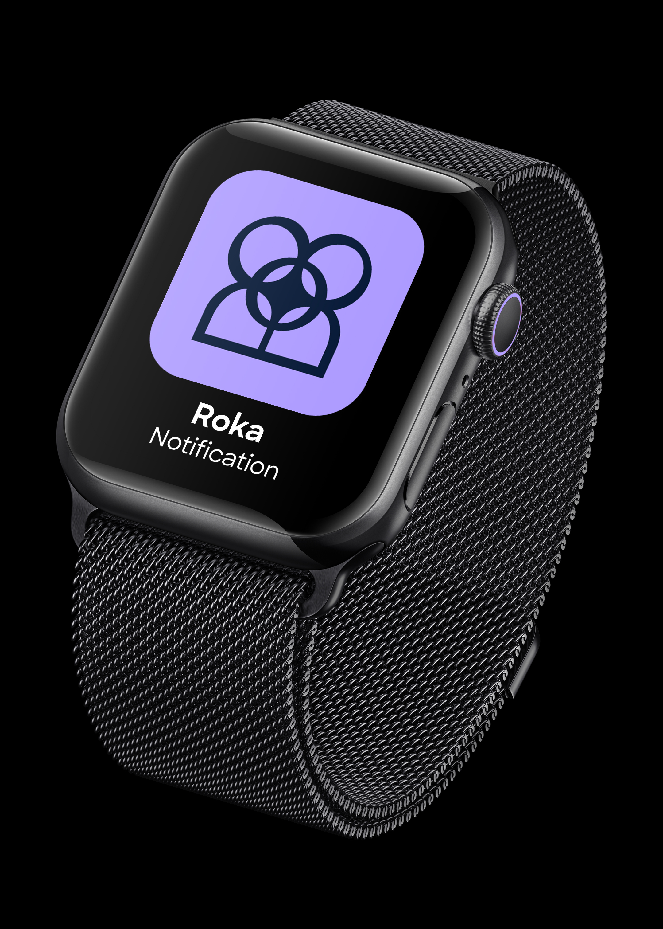
The logo was developed by bringing the outline of two avatars together. As the universal visual language for people in the digital world, avatars coming together signifies the point of connection between two people when they meet. That precise point, where there’s a ‘spark’. This spark forms the central point of the logo and represents a feeling of love that comes from the heart. With a logo consisting of curved lines and rounded shapes, the ROKA wordmark effortlessly complements the icon with a tasteful intimacy that people can expect from the brand. The trailing outstroke of the R offers a supporting embrace for the O, while the leg of the K meets A through a ligature, representing togetherness.
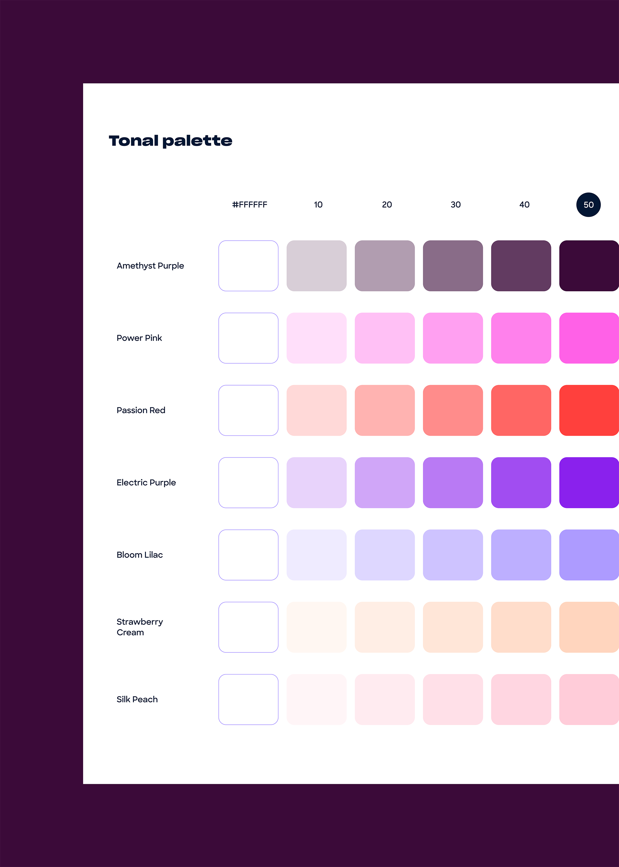
An emotive colour palette personifies a mix of cosmic shades to extend the “written in the stars’ feeling of love, powerful colours that bring hearty energy, as well as silky, softer colours that provide more delicate tones. With the colour mix supporting the feelings that are felt when it comes to matters of the heart, we developed unique artwork that provided a flavour of magic for the brand.
Bringing together unique shapes that represent human values and in-app search criteria – from political views to hobbies and interests – we combined these elements and aligned them around the ‘spark’ central point of connection. Influenced by mandala and henna patterns used in Indian cultural ceremonies – but completely universal for western audiences – this kaleidoscopic pattern not only decorates ROKA’s website but is also used at pinnacle moments experienced by app users, from start-up screens to signalling ‘There’s a spark!’ when a match is made.


As a ROKA team, we have been meeting and working across three countries and time zones for over a year and a half on all aspects of our dream. The teamwork you have shown us has been incredible! We appreciate the collaboration you all have, it’s most impressive.
Karen Young


Thank you ALL for the most impressive results! You all made the branding design for ROKA come alive in so many ways. To put it simply, "you get us". Job well done!
Karen Young


AN ICON OF LOVE
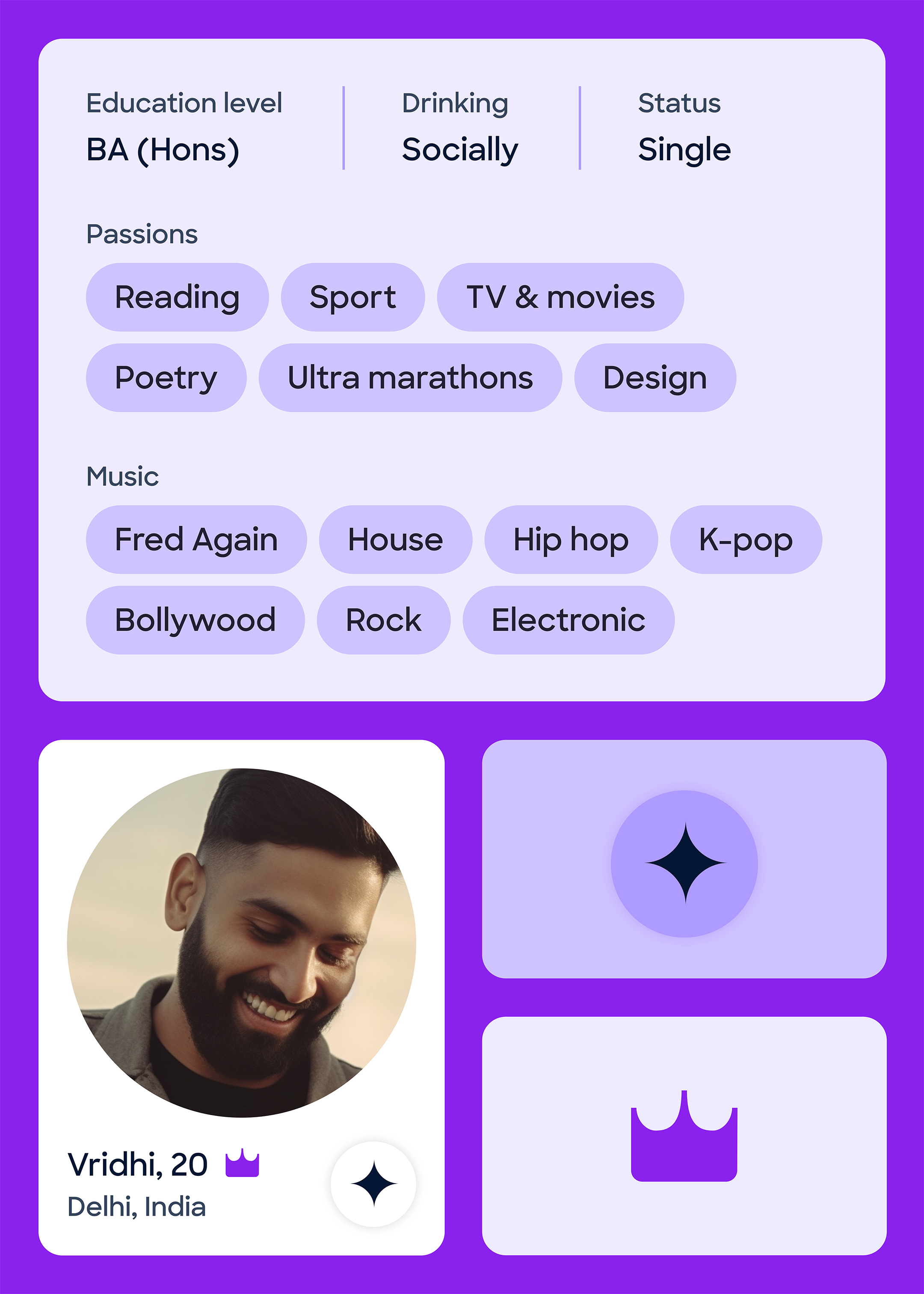
Dating apps have the opportunity to leverage UI and UX design to improve their user’s ability to make matches. We elevated the experience of the ROKA app to ensure people can make better matches through a connection to shared values – brought to life through clear yet emotive verbal messaging and on-brand digital design. Integrating the brand into key points across user journeys and reinforced ROKA’s identity to set it apart in a competitive market.
The brand logo needed to stand out and work as an icon in a range of environments, being simple and identifiable enough at thumbnail size on phone home screens, as well as being scalable for larger brand OOH campaigns. The icon’s versatility and its component shapes are clearly recognisable across the app, from in-app loading screens where two avatars independently signal their presence, to an envelope icon to signpost messages from matches.

This project delivered a culturally relevant and conscious brand in rapid time. The ROKA team needed a design agency that could deliver a fully formed brand with creativity and technical expertise. Leading workshops with C-suite stakeholders, our brand creatives were able to efficiently develop and produce an aspirational identity. Supplying their back-end coding team with brand assets at pace enabled ROKA to enter the dating app space with confidence and brand momentum.
In a move away from the current trends of dating apps becoming business networking platforms or a place to set up fleeting hookups, we aligned with the values of the ROKA business and brand. As empowering people to find individuals they want to build meaningful connections with is at the heart of the brand, we filtered this idea into our collaborative working partnership with their team – embodying values of trust, positivity and commitment.
This project’s success was driven by our excitement to build a cross-cultural brand and digital destination where love can align, helping people to feel a spark, experience meaningful relationships and enable individuals to find togetherness – whether that’s in Mumbai, Manchester, Miami… or beyond.
Related projects

Spectrum.Life
A full spectrum brand for a global healthtech to engage new audiences, internally and externally.
We enabled innovative healthtech, Spectrum.Life, to engage, empower and transform across three main sectors — radiating the new energy needed to fuel international ambition. This identity, website and digital toolkit enhances their ability to communicate full spectrum support as a whole-of health partner.

Player Research
Positioning a brand to sell the science of gaming without losing the fun, from Canada to the UK.
Player Research’s acquisition by a global firm opened the door to a worldwide playtesting arena. Playing at the forefront of the game testing industry stage, they needed an identity that matched their instinct for play and expertise in gaming psychology. We positioned their brand to distil the essence of play, to inspire global audiences to get gaming.
Want to build your brave brand with us?