MPB
Producing a national brand awareness campaign that champions beloved cameras. Second-hand means second best, or so it is often assumed. As a trader of used cameras and lenses, MPB knew this to be false. Since coming into the camera market 7 years ago, MPB has revolutionised the used market – gone are the stickers and dusty shelves replaced with slick digital processes and lightning fast transactions. But in a world where consumers repeatedly line-up to be the first to own the latest off the shelf gadgets, it was clear that despite MPB’s refreshing approach, “tried and tested” needed a makeover to educate the customers on its merits, through a campaign that raised awareness and built advocacy.
Copywriting Digital marketing Marketing Print collateral Tone of voice UX Visual identity Web design Web development
Technology
Germany U.S.A UK
Working with MPB has been an aspiration for a long time. As a photographer and local Brightonian MPB has been my go-to location for camera gear for years so to get the opportunity to champion the fantastic products and process they have created has been a real creative treat.
Luke Taylor


With the used camera market traditionally perceived similar to a pawn shop – full of discount stickers and deals – it was clear there was an opportunity in pivoting perceptions so that camera gear could also be celebrated throughout its life, just like classic cars, instruments and other luxury goods.
This approach not only aligned second-hand splurges with sustainable shopping, but aimed to redefine MPB’s value to its customer. Instead of the benefits being quantified by mere reductions in price, we wanted their camera gear to be valued for its timeless quality.
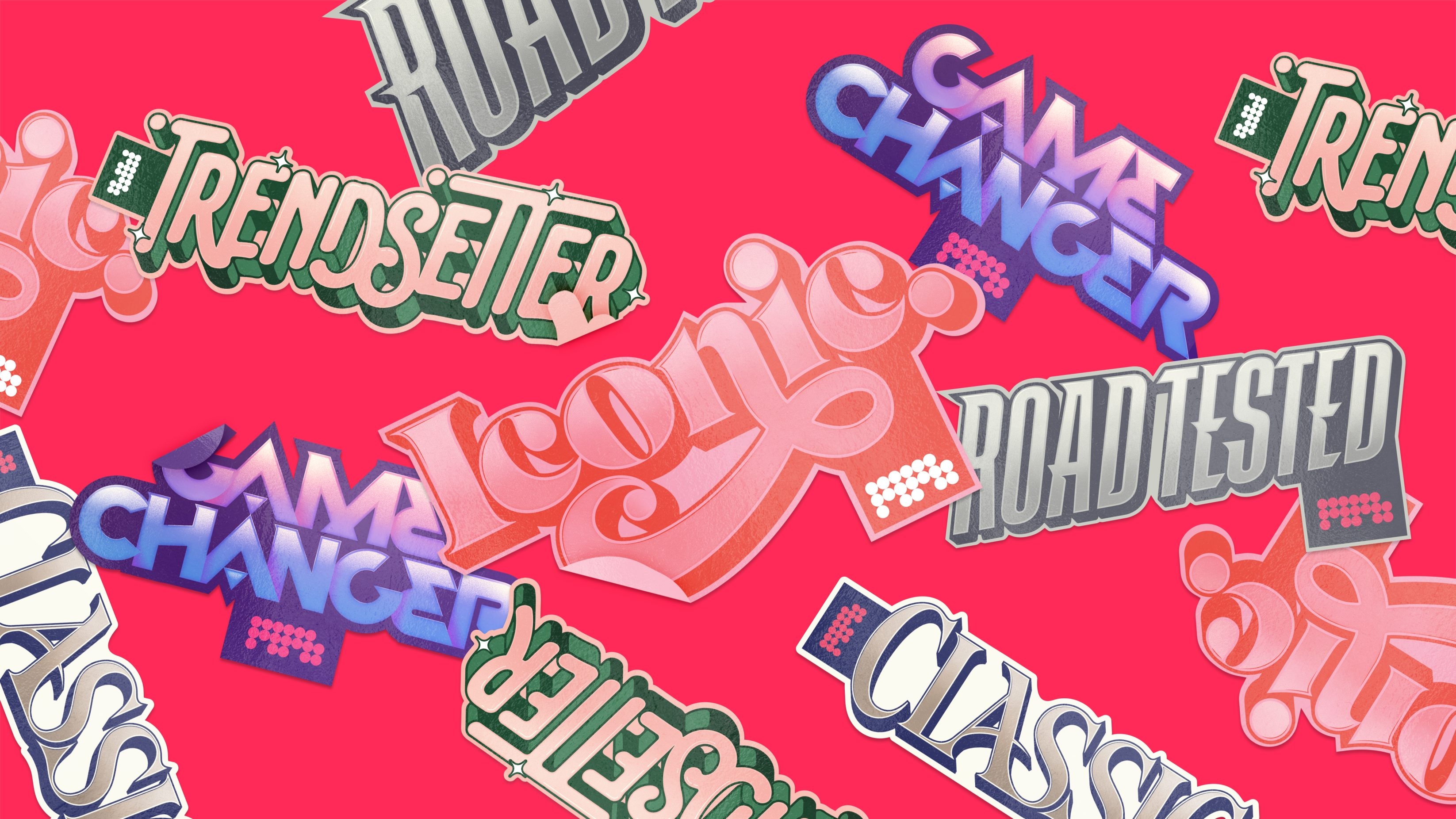
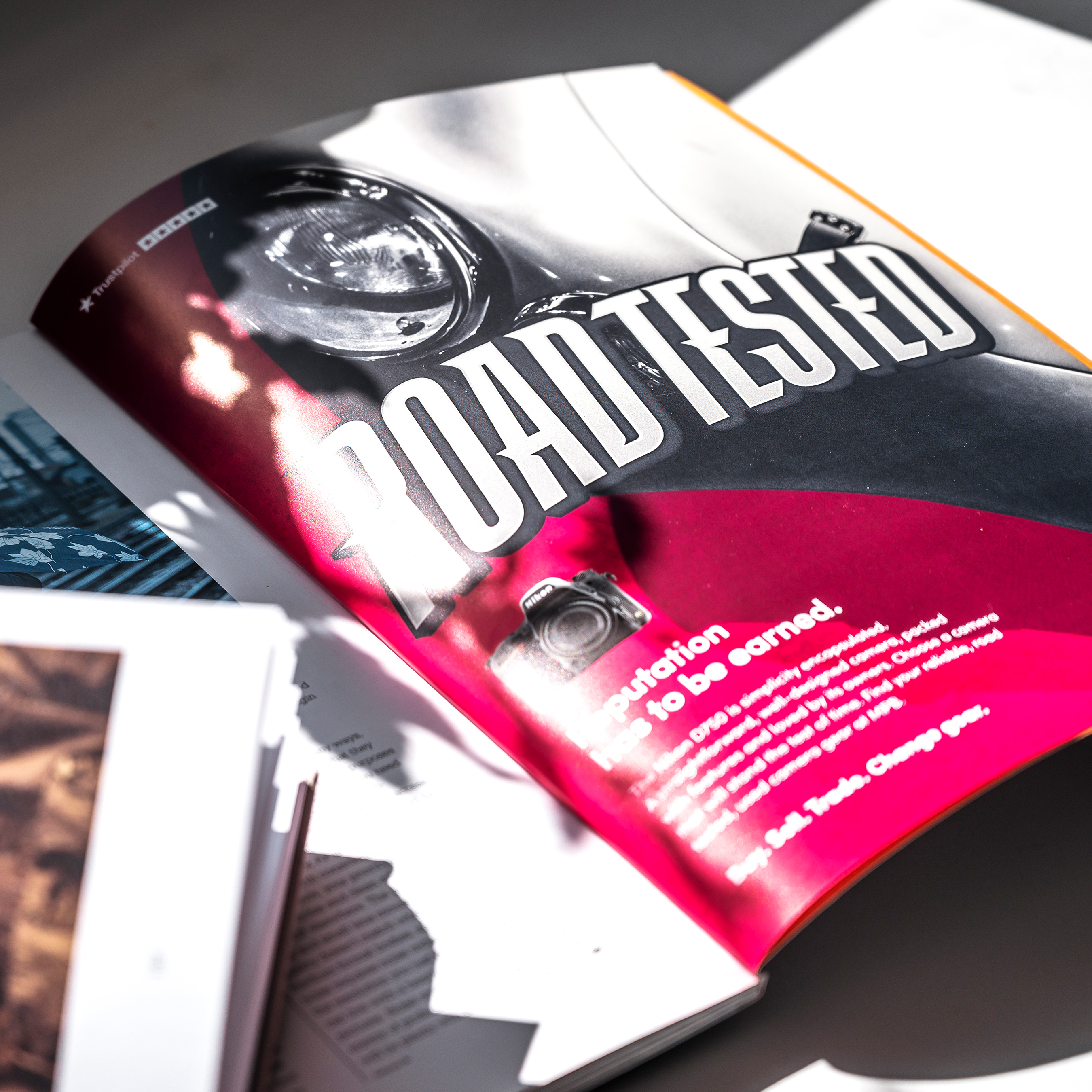
To achieve this our language needed to showcase how things get better with age. As a result, we incorporated more mature messaging, such as iconic, classic, and road-tested, which allowed MPB to hero its own equipment as much as their consumers loved buying and using it. In doing so we created a sense of ownership that trickled down into all aspects of the campaign. To achieve this, we created a suite of custom type brand marks that stylistically drew the link between images from sectors where buying second-hand is not only commonplace but is, in fact, a desirable quality. This approach led to the development of highly impactful, colourful and playful compositions that allowed us to step away from the high contrast, ultra-serious imagery typically used by the majority of camera retailers. This gave the campaign a unique look and tone in the sector which leapt from the pages of the various photographic magazines where the ads were featured.
USED IS BETTER
THAN NEW


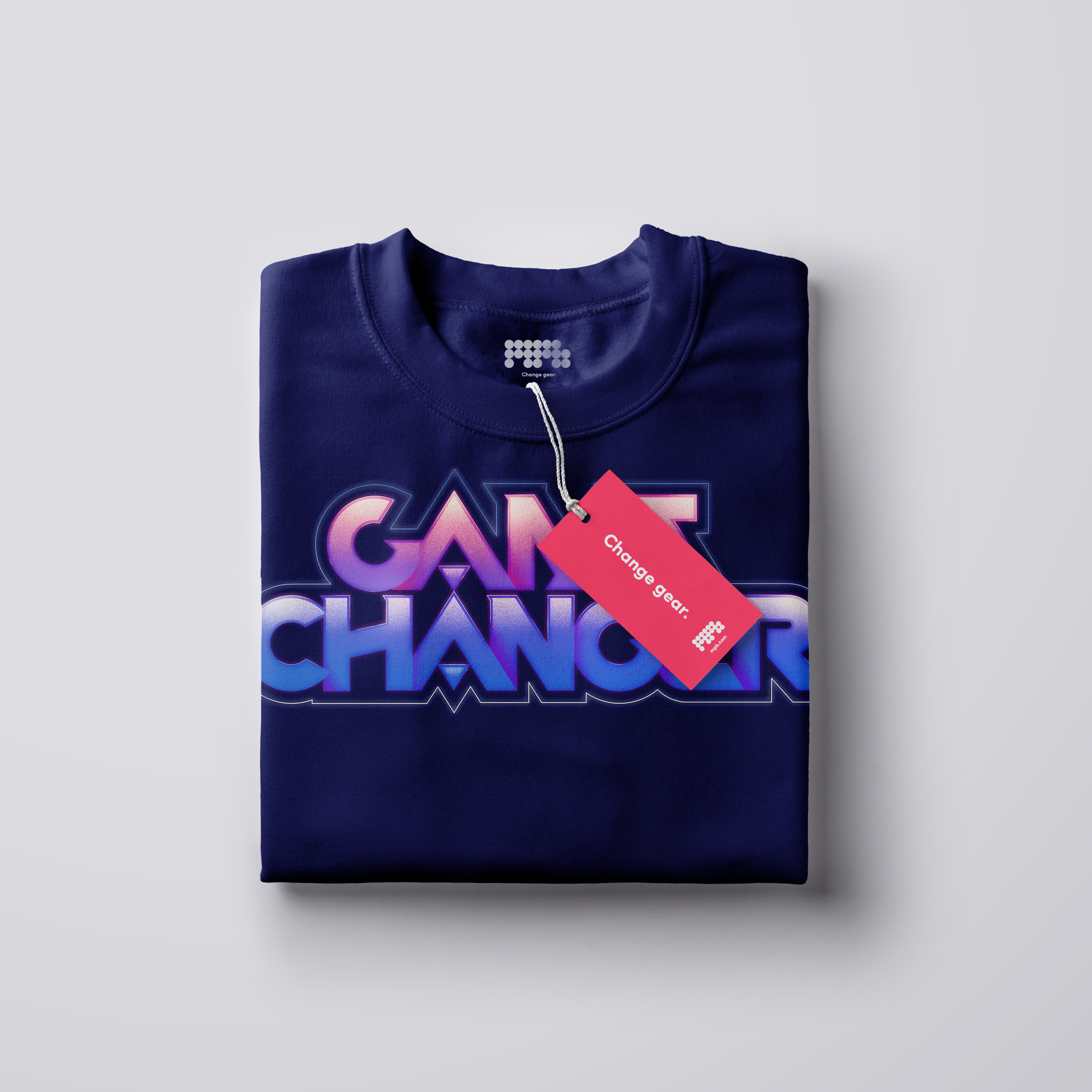
In taking this approach, we gave the campaign not only a distinct identity but also gave MPB a suite of ownable, highly identifiable pieces of collateral that could be translated into merchandise, to be featured across t-shirts, sticker sets and enamel pin badges. Helping to further shed the stigma of used being ‘obsolete’ by using MPB’s customers to advocate that used camera gear is more than deserving of the status as ‘classic’, ‘iconic’ and ‘game changing’.
Taking this one step further, the campaign and collateral led to a “Hall of Fame” microsite, which encourages consumers to vote for their favourite camera gear, under our new category headers – which ultimately resulted in almost 41 thousand votes! In doing so we also asked loyal customers to champion their gear of choice, creating more momentum behind the overarching ‘used is better than new’ campaign message, while positioning MPB at the centre of the photographic gear conversation like no one else.

40,989
total votes

For too long ‘used’ has been a derogatory term in technology - suggesting it’s obsolete or worn, that couldn’t be further from the truth in photography. Yes technology evolves but the fundamentals have remained true - quality is timeless and for many photographers the cameras of our dreams are no longer financially out of reach.
Luke Taylor


Our custom typography brings the personality and uniqueness of MPB and their products to life and stands proud in a market place of grey bodied beasts. It’s a joy to see the adverts jumping out of the photographic magazines and making a positive noise in the industry.
Luke Taylor


With the unique challenge of elevating the resale of photo and video kit past "pre-loved" or "used" language, UnitedUs brought to us the concept of treating the kit with the same reverence as a vintage Porsche, iconic Fender guitar or classic Cartier watch.
Sophie Collins

We're delighted that UnitedUs concepted and created visuals to genuinely set us apart, and which gives us lots of opportunity to develop the campaign in multiple directions in the future.
Sophie Collins

Bringing this to life with striking typography and design work has resulted in a highly-ownable campaign to cut through with a broad photography audience. This is particularly exciting in an industry where we often see similar creative executions across the board.
Sophie Collins
Related projects

Spectrum.Life
A full spectrum brand for a global healthtech to engage new audiences, internally and externally.
We enabled innovative healthtech, Spectrum.Life, to engage, empower and transform across three main sectors — radiating the new energy needed to fuel international ambition. This identity, website and digital toolkit enhances their ability to communicate full spectrum support as a whole-of health partner.

Player Research
Positioning a brand to sell the science of gaming without losing the fun, from Canada to the UK.
Player Research’s acquisition by a global firm opened the door to a worldwide playtesting arena. Playing at the forefront of the game testing industry stage, they needed an identity that matched their instinct for play and expertise in gaming psychology. We positioned their brand to distil the essence of play, to inspire global audiences to get gaming.
Want to build your brave brand with us?